Design
Development
Research
Launch
Evolve
Extend
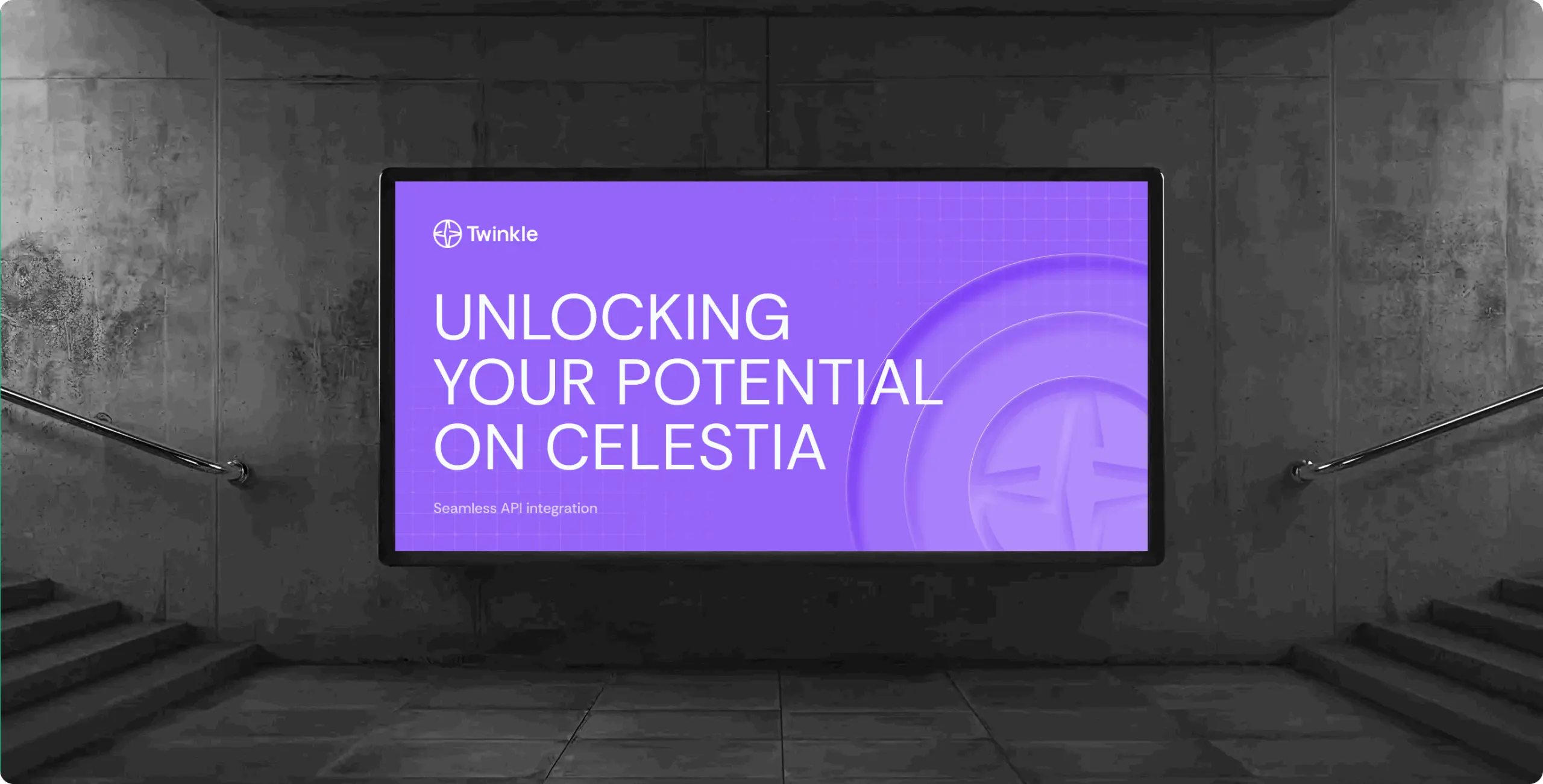
Twinkle: powering reliable Celestia infrastructure
Client
Twinkle
 USA
USA
USA
Services
From a branding perspective, Twinkle needed an identity that reflects the quality of its infrastructure without overexplaining the technology itself.
The brand had to signal enterprise-level reliability, precision, and accountability while remaining calm and accessible to a developer audience. The challenge was not to simplify the product, but to translate its robustness into a visual and verbal language that feels confident and credible.

We began with a detailed review of Twinkle’s competitive landscape, focusing specifically on branding patterns rather than product features.
This helped us identify overused visual tropes and define a clearer, more mature positioning. The insights from this phase shaped the tone, structure, and visual discipline of the entire identity.
We tackled the project through a well-defined branding process, ensuring that every stage played a vital role in creating a cohesive and scalable system. This approach was carefully aligned with the way engineers think and operate, allowing for a seamless integration of ideas and strategies throughout the project.
Stages
- logo design
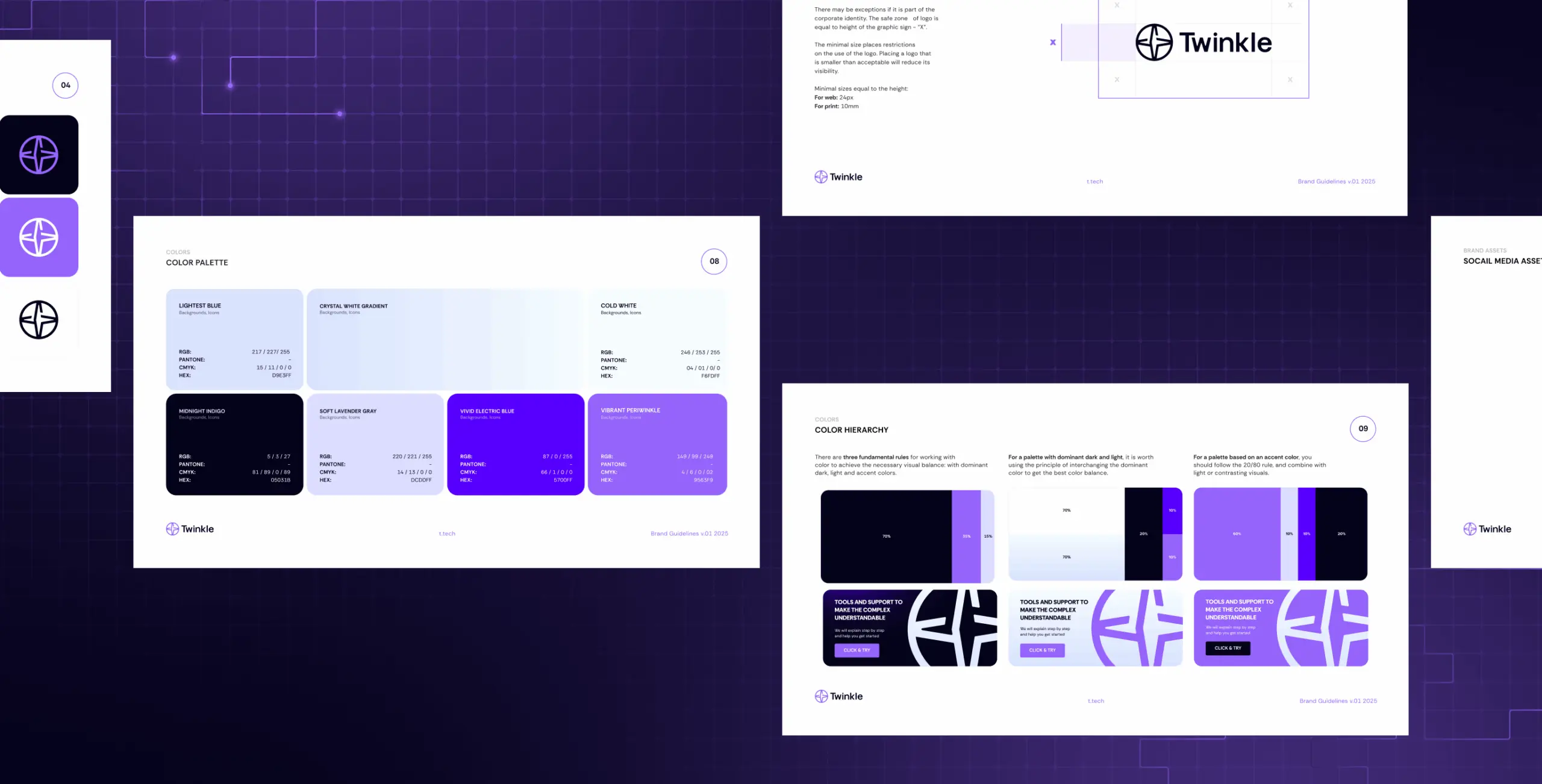
- colors & typography
- brand assets
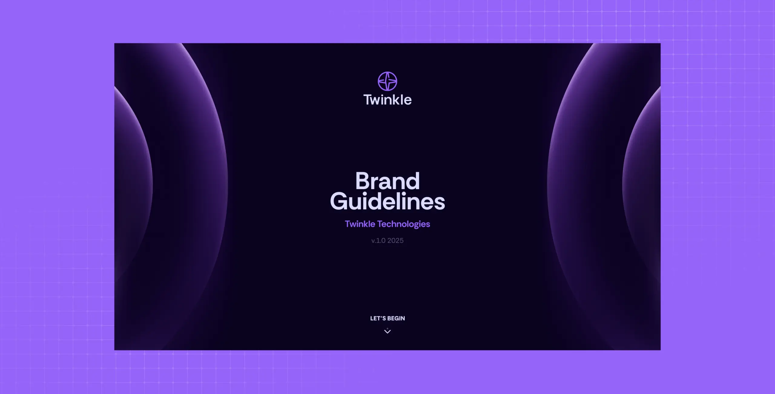
- brand guidelines
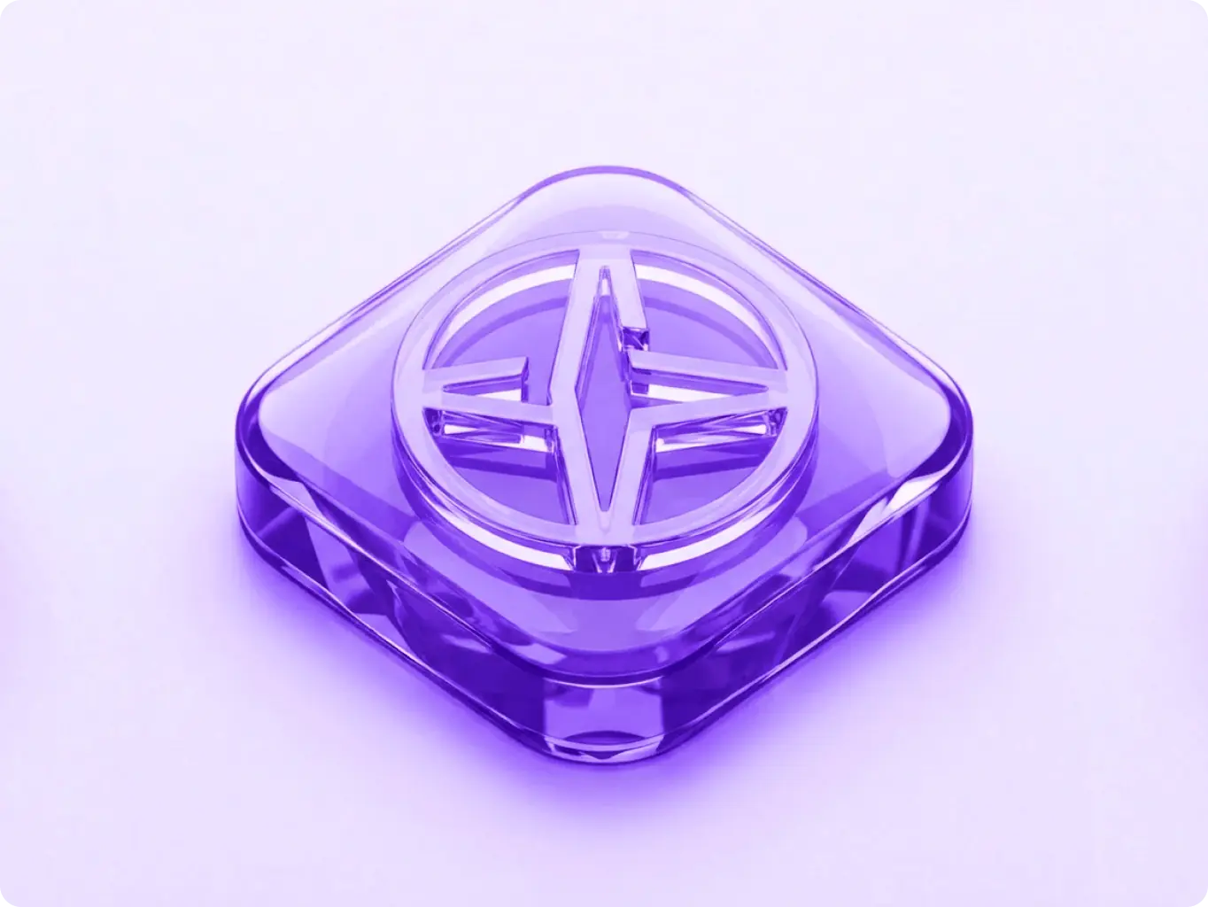
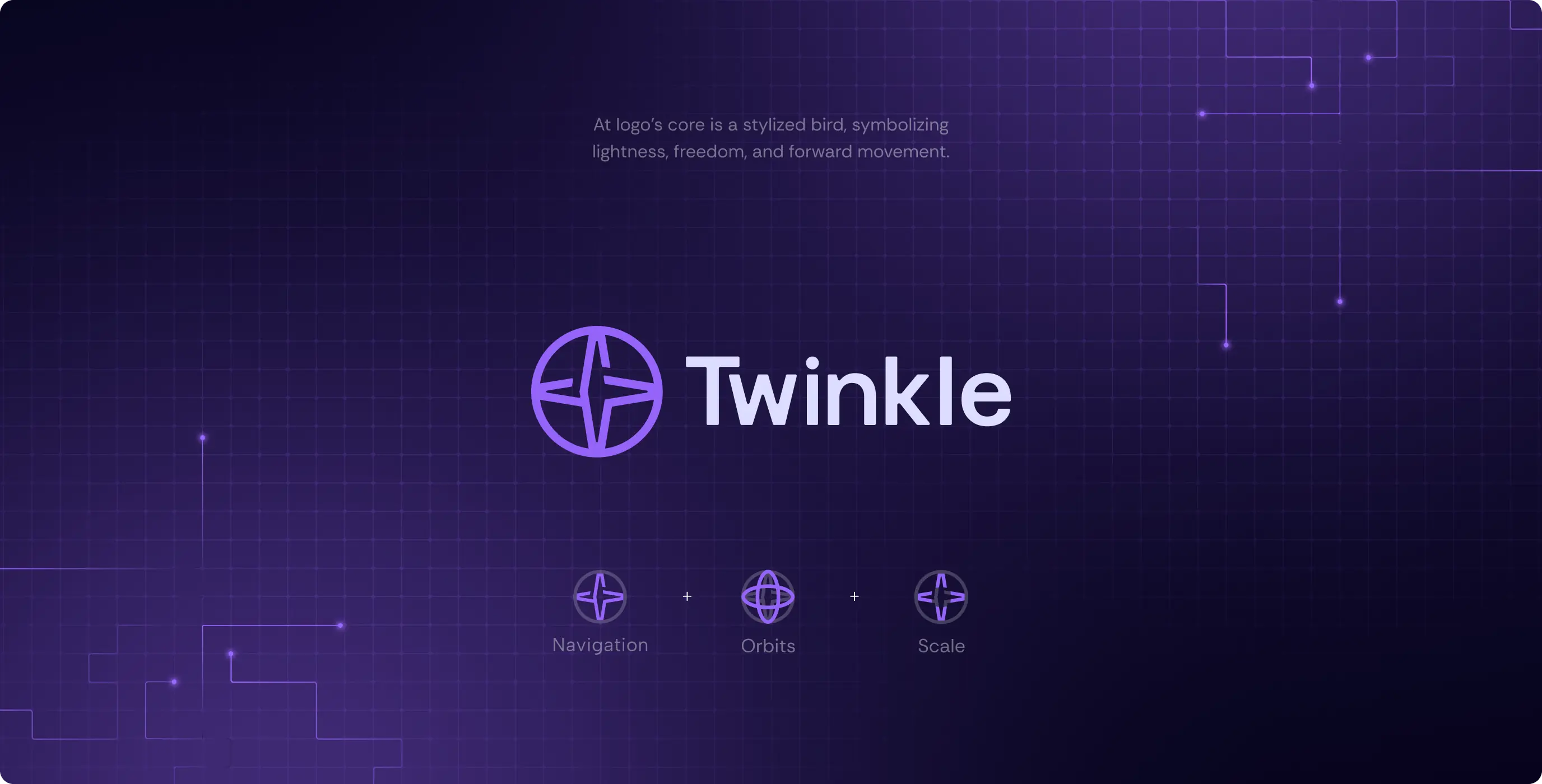
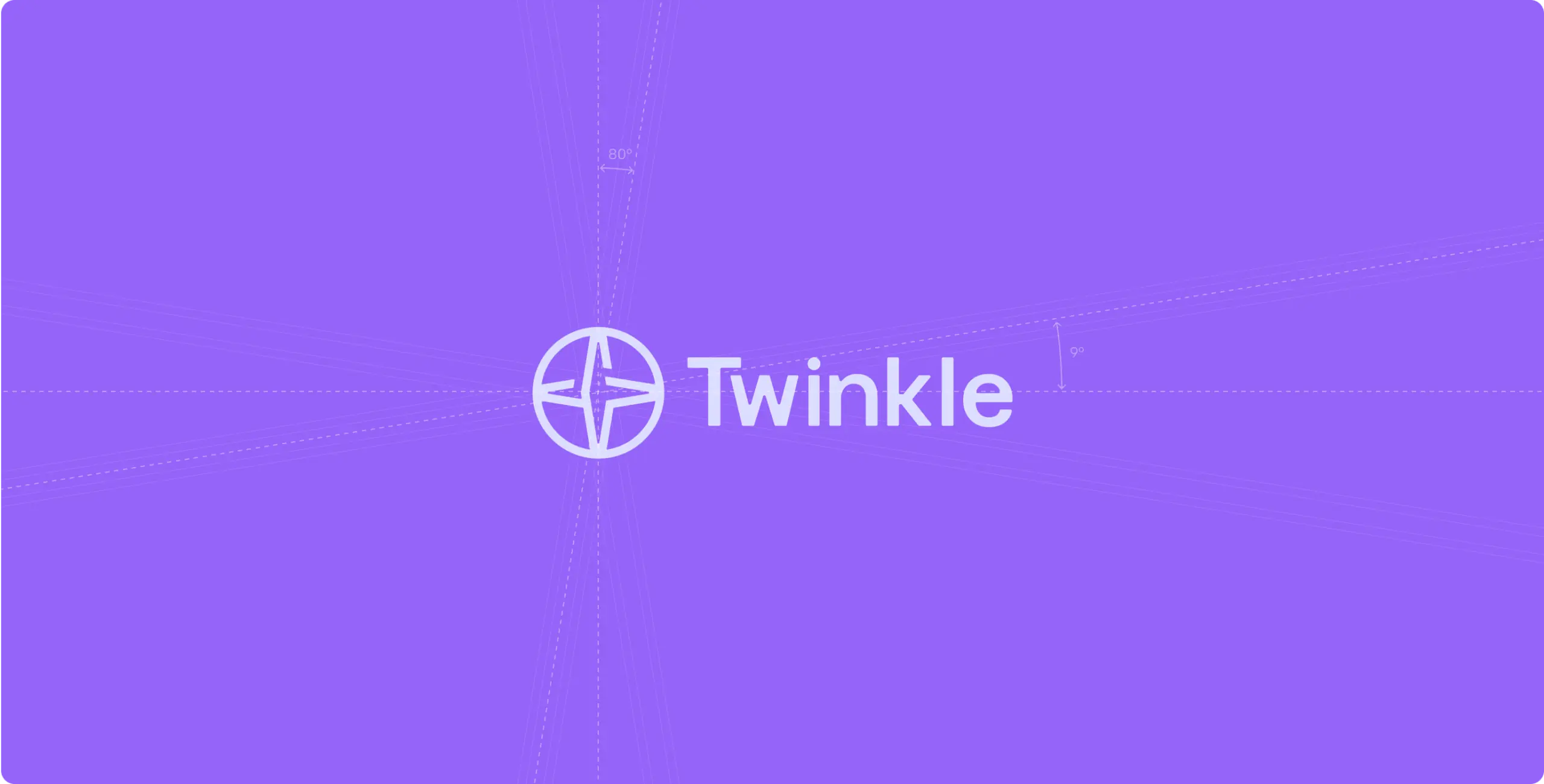
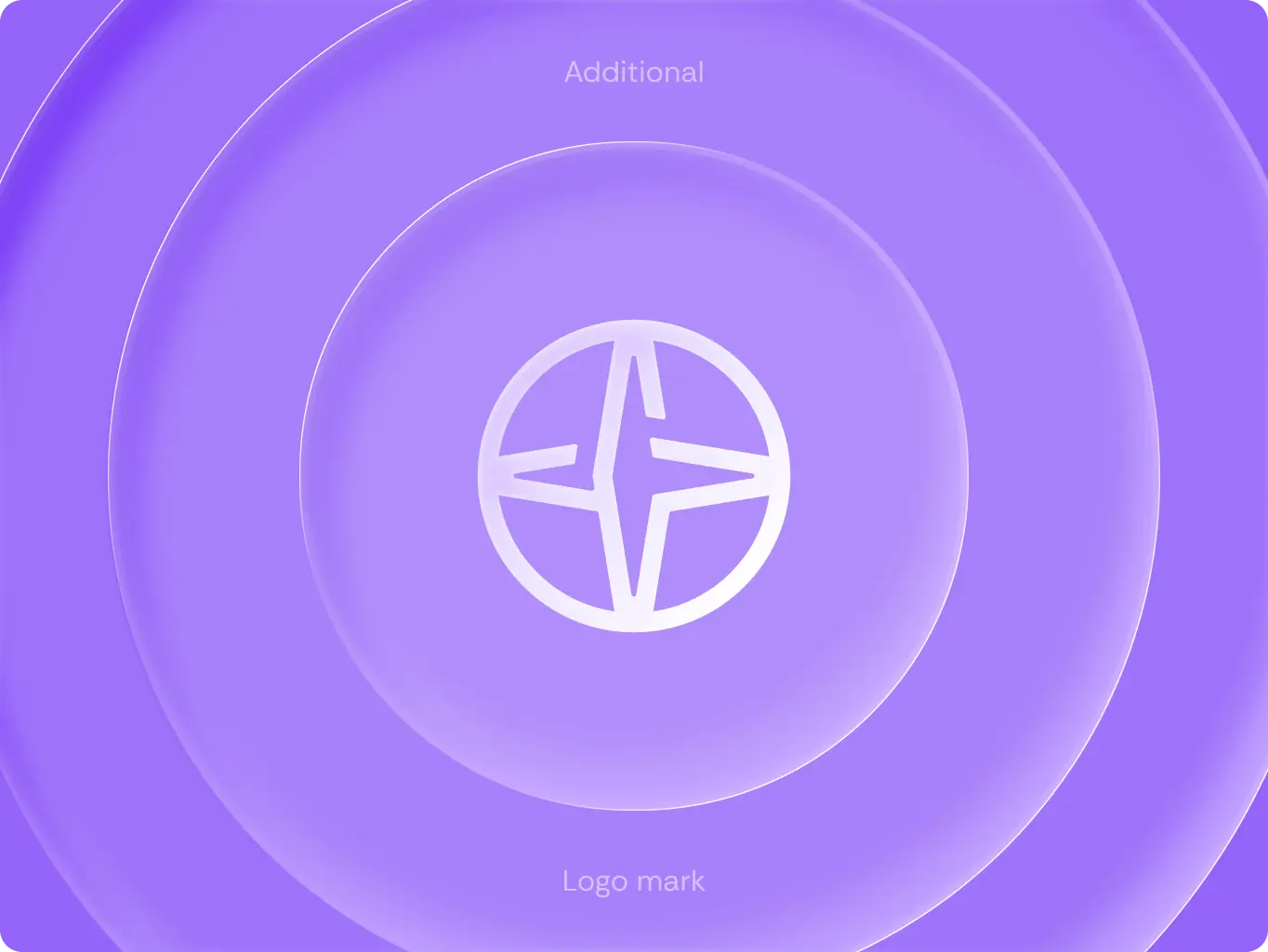
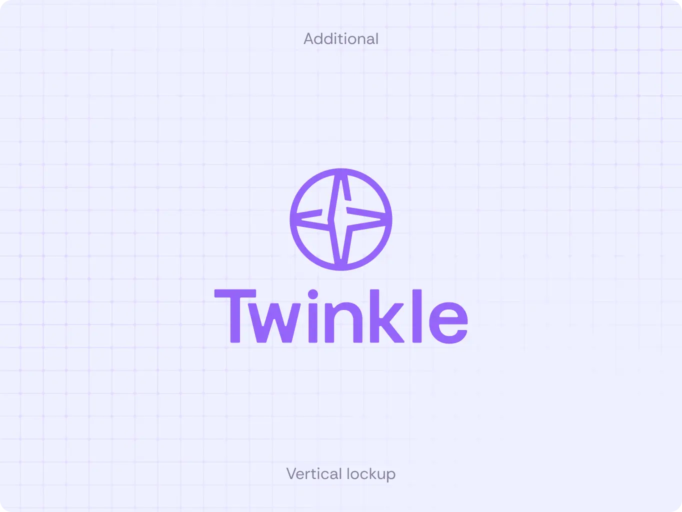
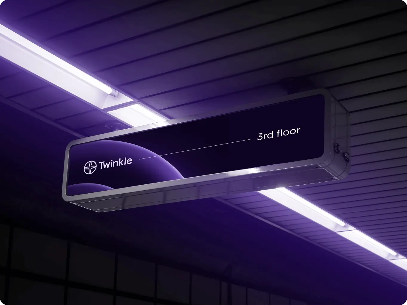
The logo serves as a calm, confident symbol, inspired by space and modular systems. It reflects Twinkle’s technological foundation and forward-thinking mindset. The design balances innovation with clarity, resulting in a modern yet timeless mark.
At its core is a stylized bird form, symbolizing lightness and freedom — key values of Twinkle. Its compass-like structure suggests navigation and guidance, reinforcing progress in digital environments.
The circular frame adds wholeness and stability, with references to orbital paths emphasizing accuracy. The logo works across contexts, maintaining recognizability as an app icon or brand centerpiece.
Overall, it conveys serenity and confidence, representing Twinkle’s mission to guide and empower with clarity.
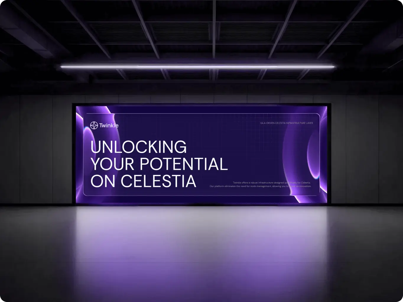
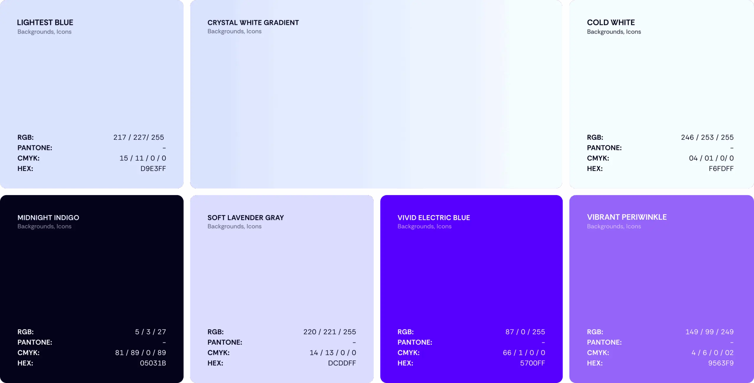
The color palette has been thoughtfully designed to maintain a sense of restraint. The use of deep base tones conveys a feeling of stability, creating a solid foundation for the overall aesthetic. Meanwhile, subtle accents are strategically placed to introduce depth and a hint of innovation, making the design feel fresh and modern.
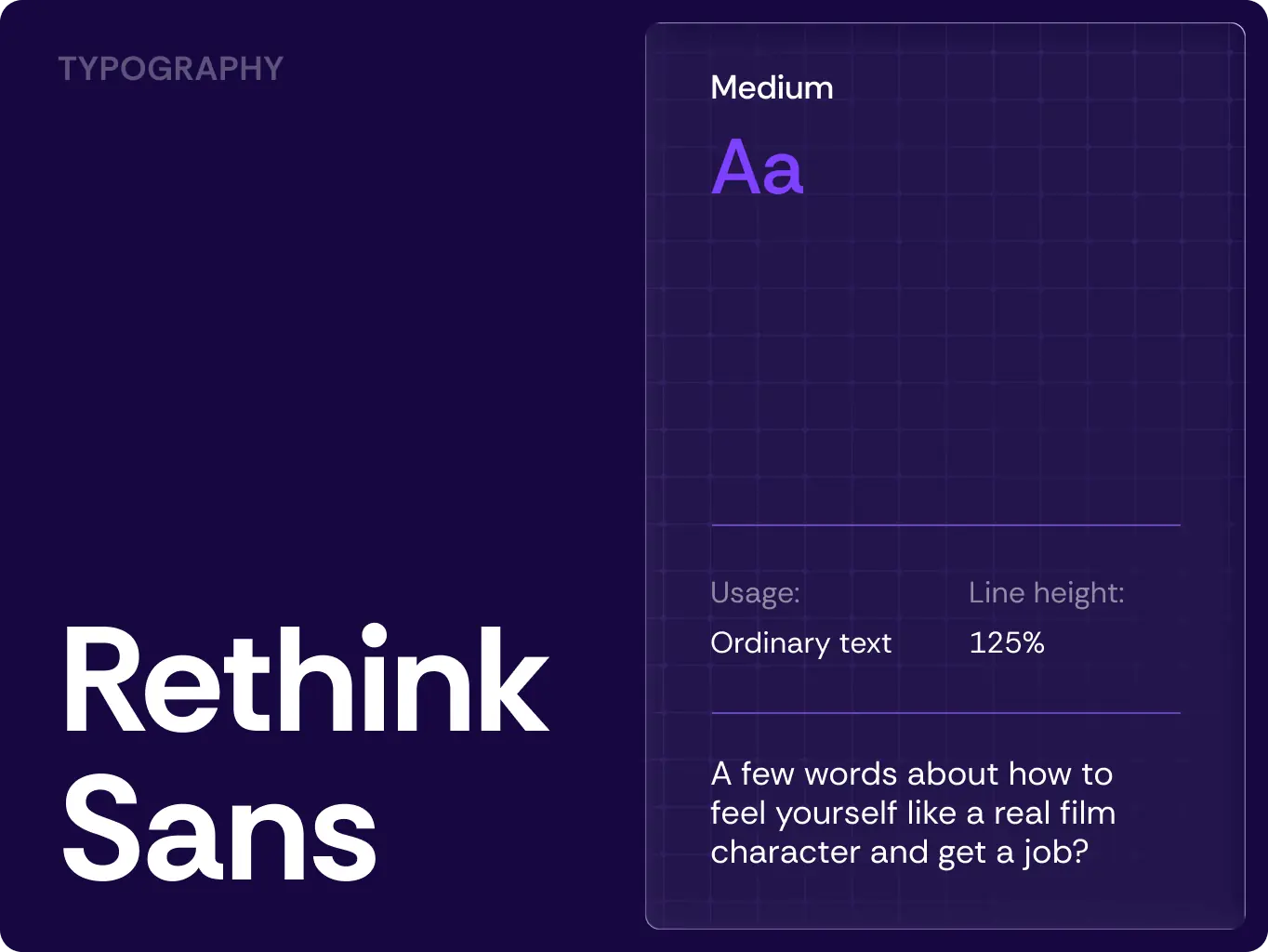
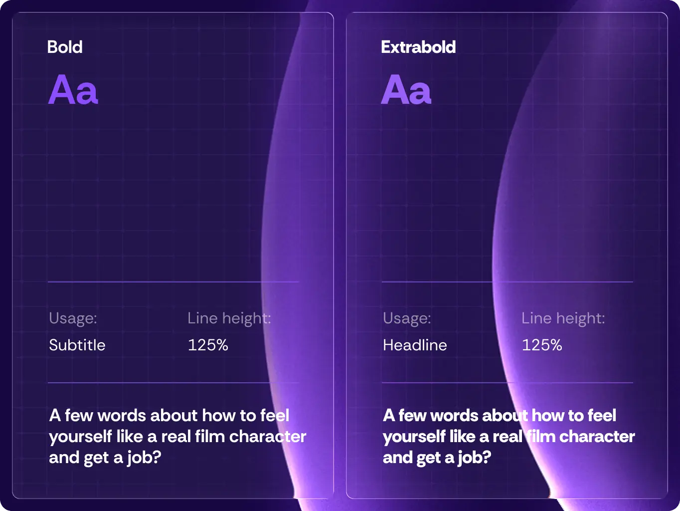
In terms of typography, the choice is both functional and highly legible, ensuring that technical content is easily readable. This not only supports the clarity of the information presented but also reinforces a professional tone that prioritizes the engineer’s perspective.
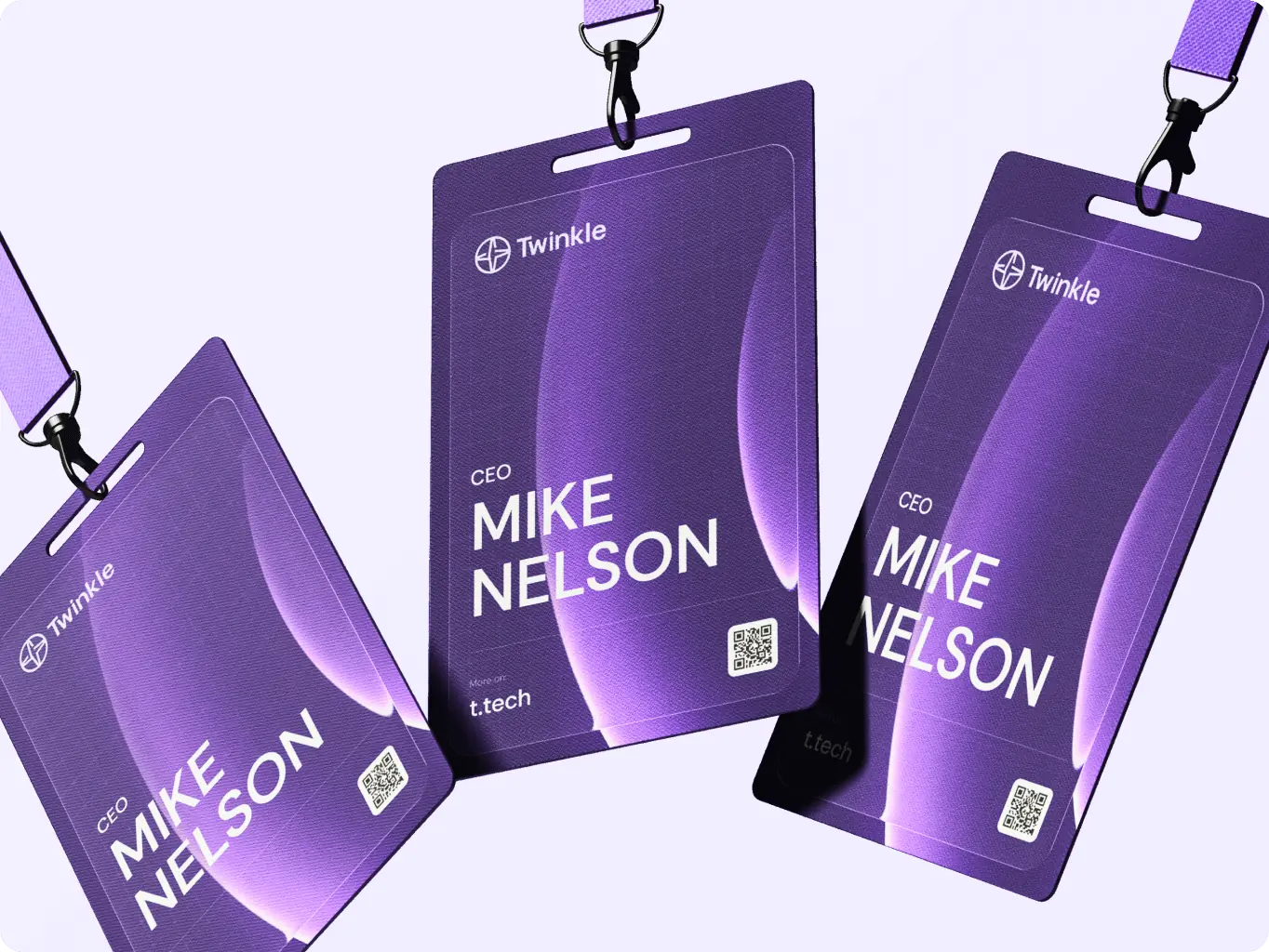
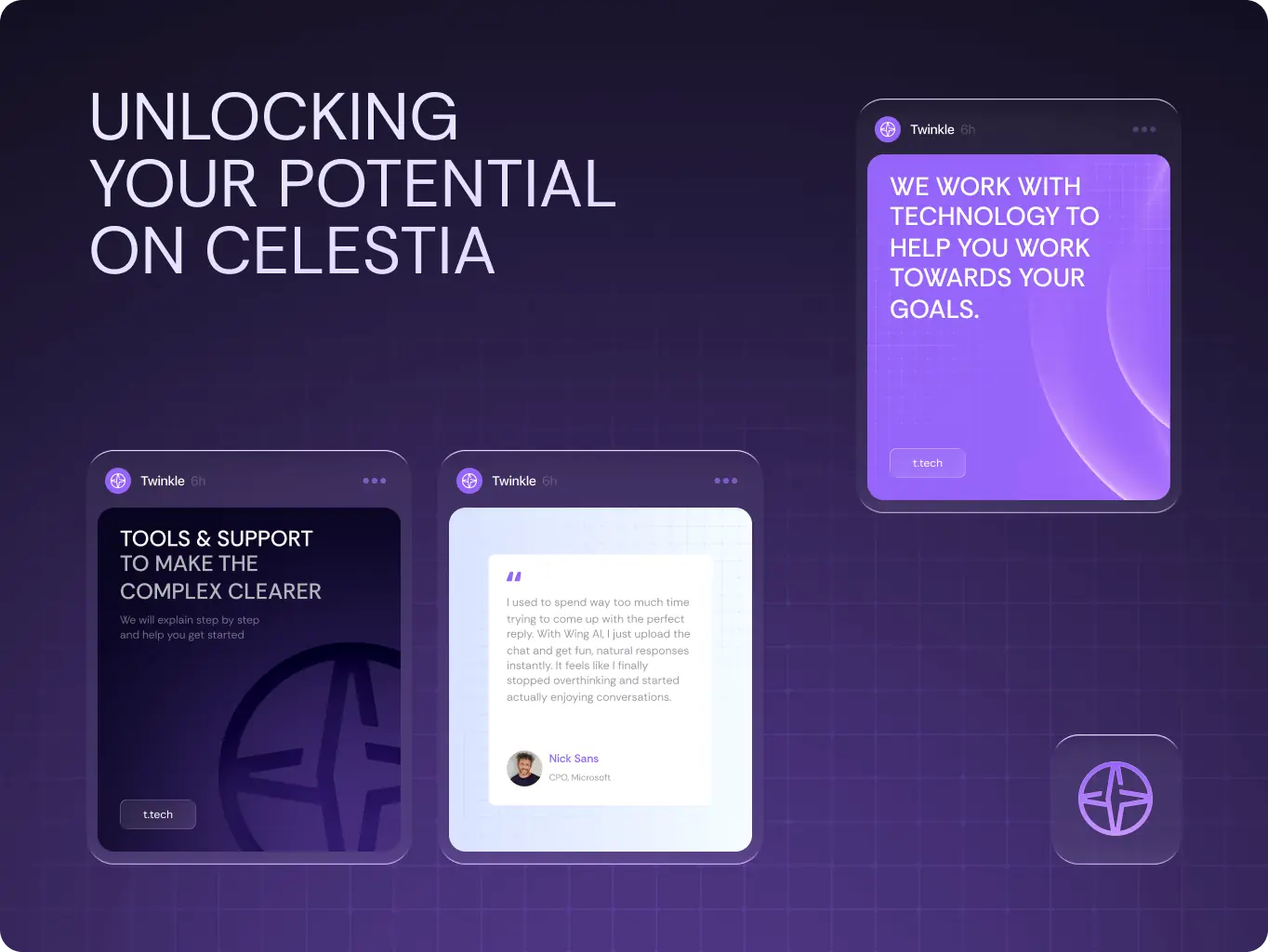
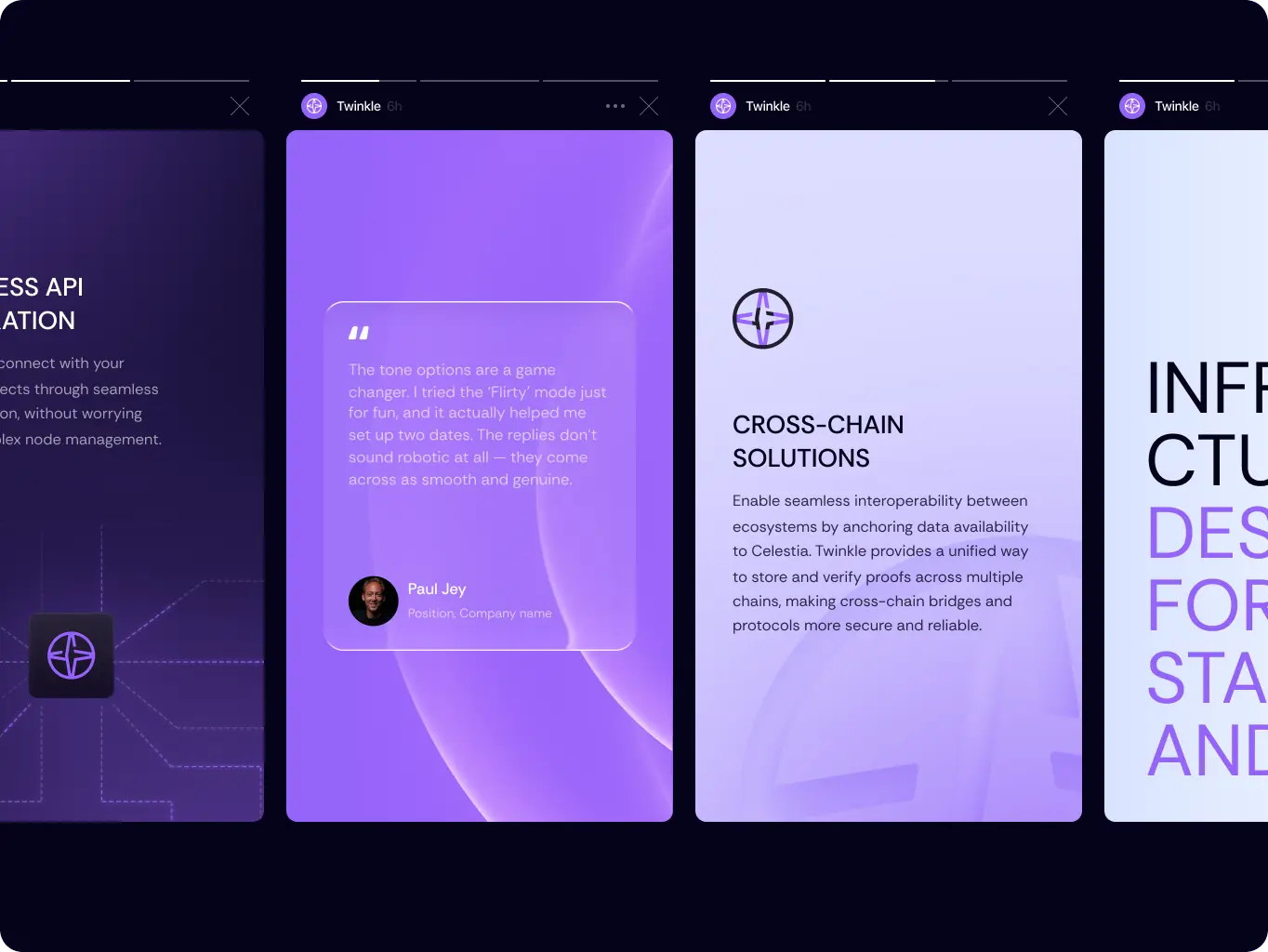
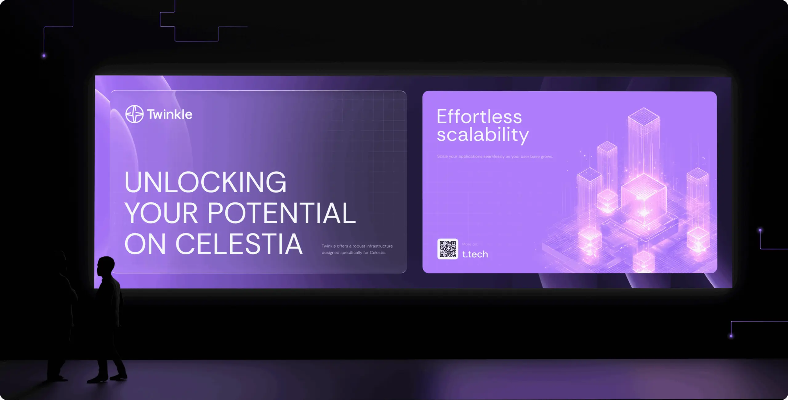
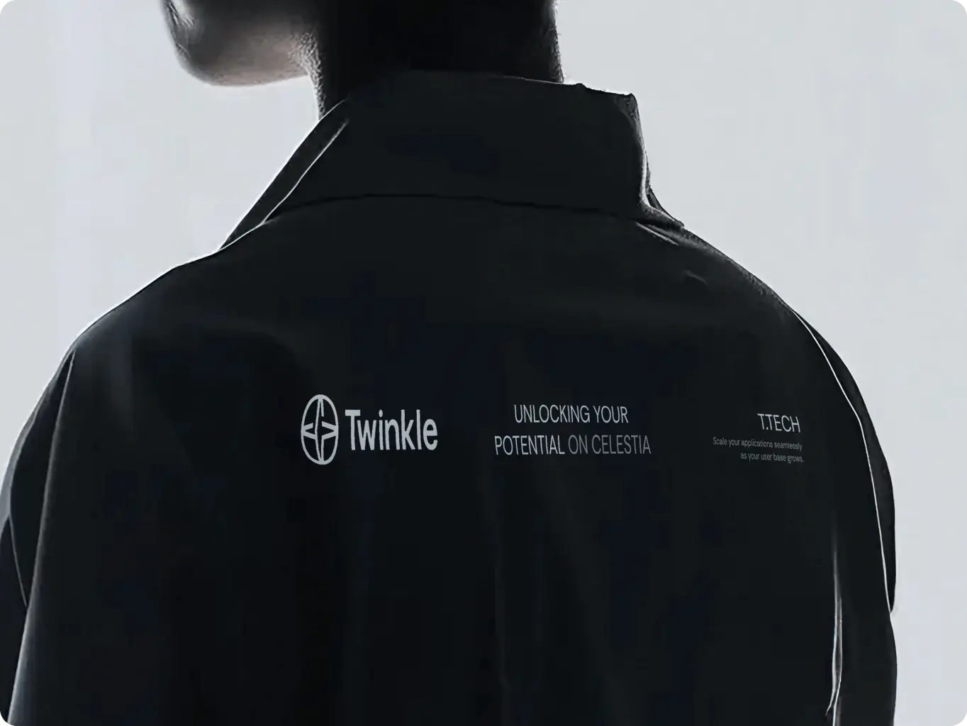
We have crafted an extensive and versatile collection of brand assets that are meticulously designed to maintain consistency across various digital platforms and presentation formats. Our layouts are built upon well-defined grids and modular principles, which not only enhance structural integrity but also foster a sense of predictability.
These elements are crucial as they embody the core values of the Twinkle brand, ensuring that every interaction with our brand feels cohesive and reliable.

To ensure long-term consistency, we delivered clear and practical brand guidelines.
They enable internal teams to apply the identity confidently, preserving clarity, reliability, and visual discipline as the brand grows.

#Branding
Tyler Ussery
 USA
USA
USA
#Website redesign #Website development
marketsnack
USA
USA
#Product redesign
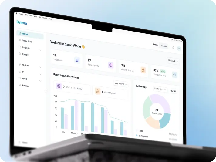
BETERRA
USA
USA
Have a project in mind?
Let's chat
Have a project to
discuss?
discuss?

Have a partnership in
mind?
mind?
