Development
Research
Client
Coinerz Group Internal
 USA
USA
USA
Services
All communication was clear and open, and all team members worked very efficiently towards our goals. The work ethic and UX skills of the whole team really blew us away.
Objectives
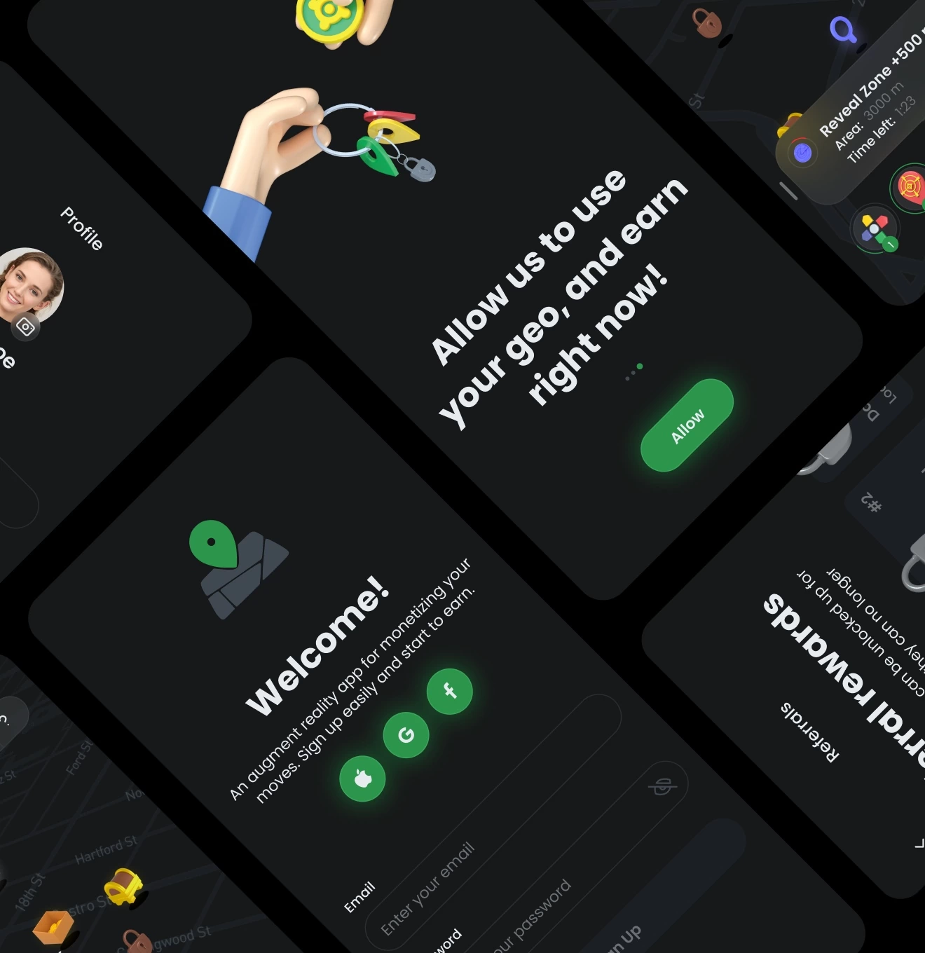
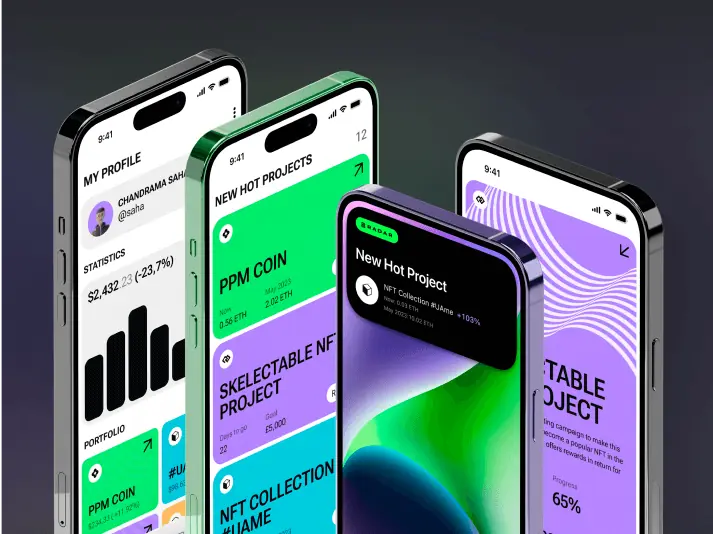
The main objective was to redesign an existing app.
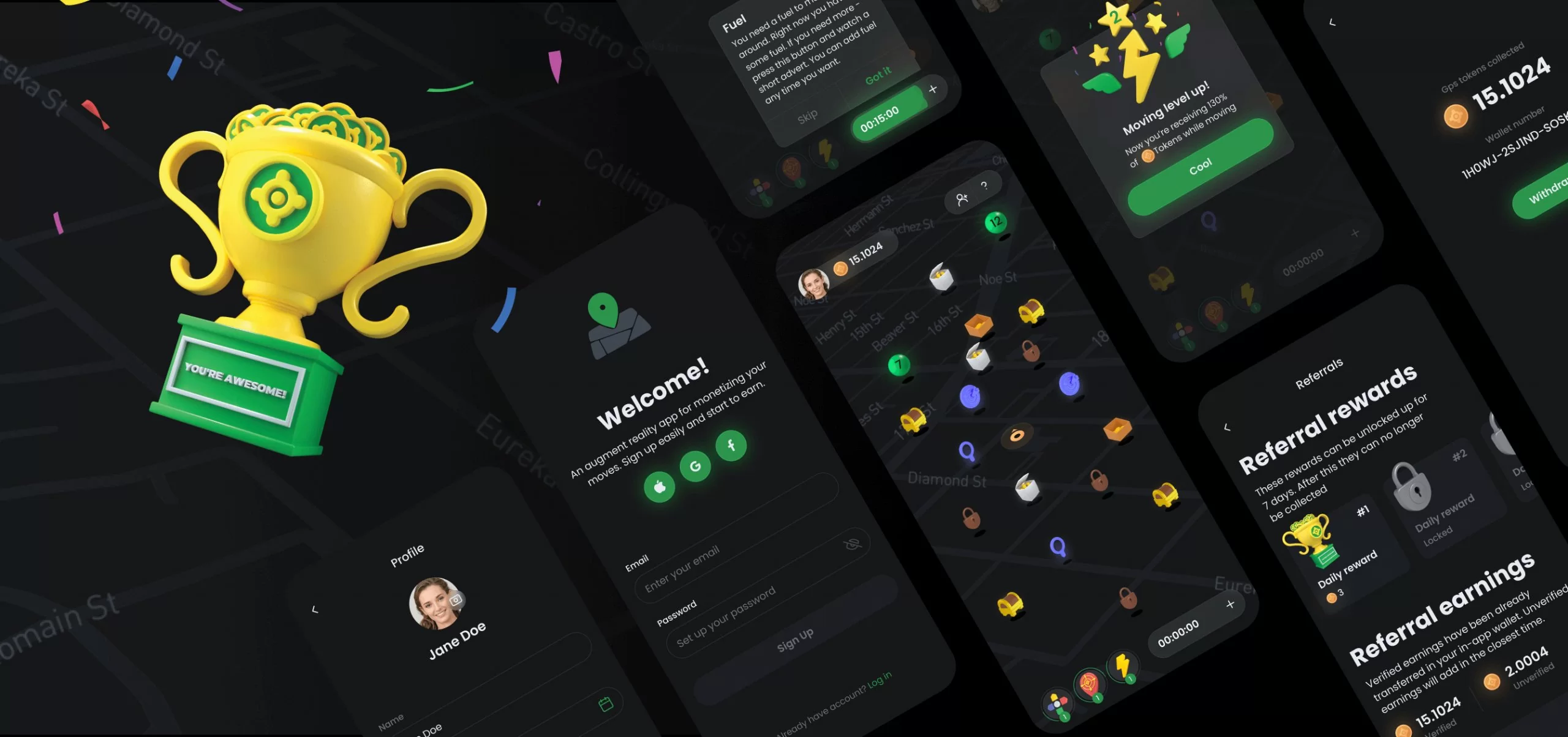
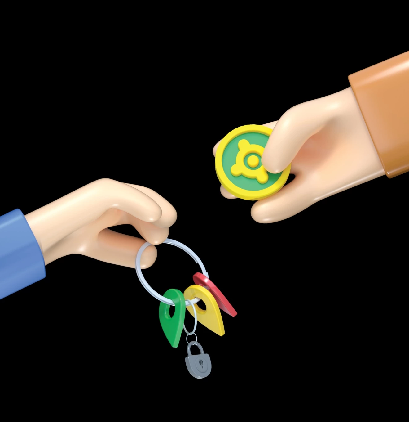
The app was made for users to walk, collect rewards and get cryptocurrency. Therefore, the company promotes their cryptocurrency, for it to reach the global market. The redesign was required with this objective in view. It included a reconsideration of UX solutions and a complete UI redesign leaving the company’s branding untouched.
Solutions
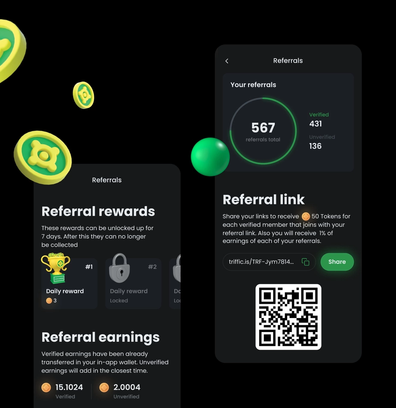
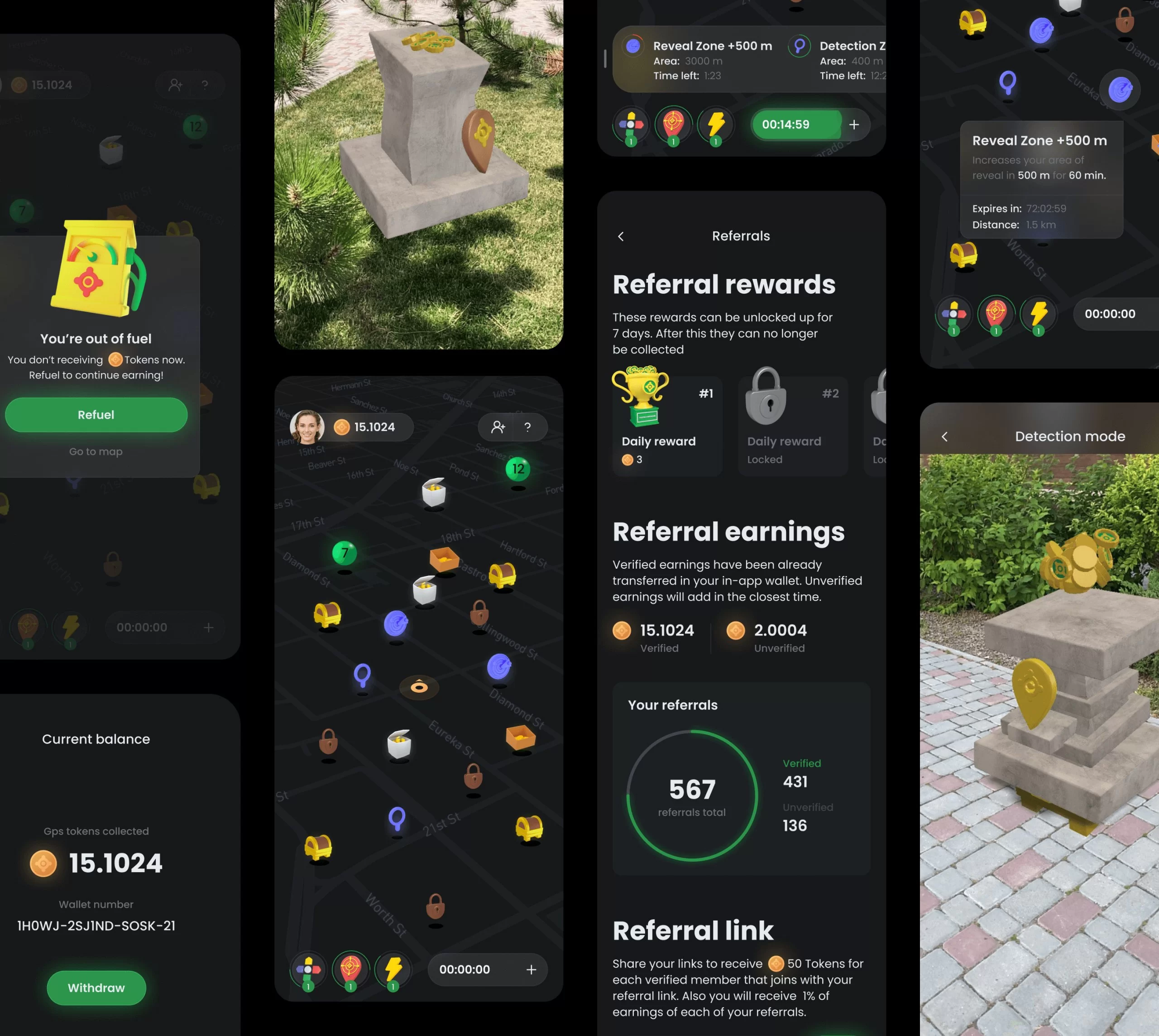
UX audit as well as analysis of app metrics became our reference point. We recognized the main problems among users, such as: a confusing interface, difficulty in understanding the work mechanism and not understanding how to withdraw money.
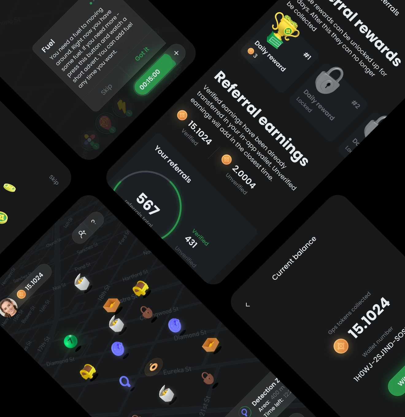
We’ve noticed that over time, users log into the app less and less frequently. We came up with a system of daily rewards to hold their interest and increase the Retention Rate. We also implemented a referral system in order to motivate users to share the app with their friends, thereby increasing the active user base.
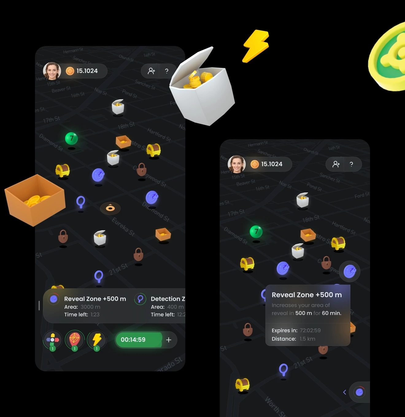
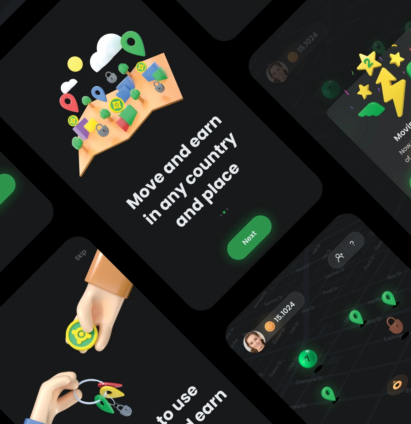
We programmed rewards to appear only once in a certain place, within a certain time, so that users wouldn’t get bored of walking around the same place over and over.
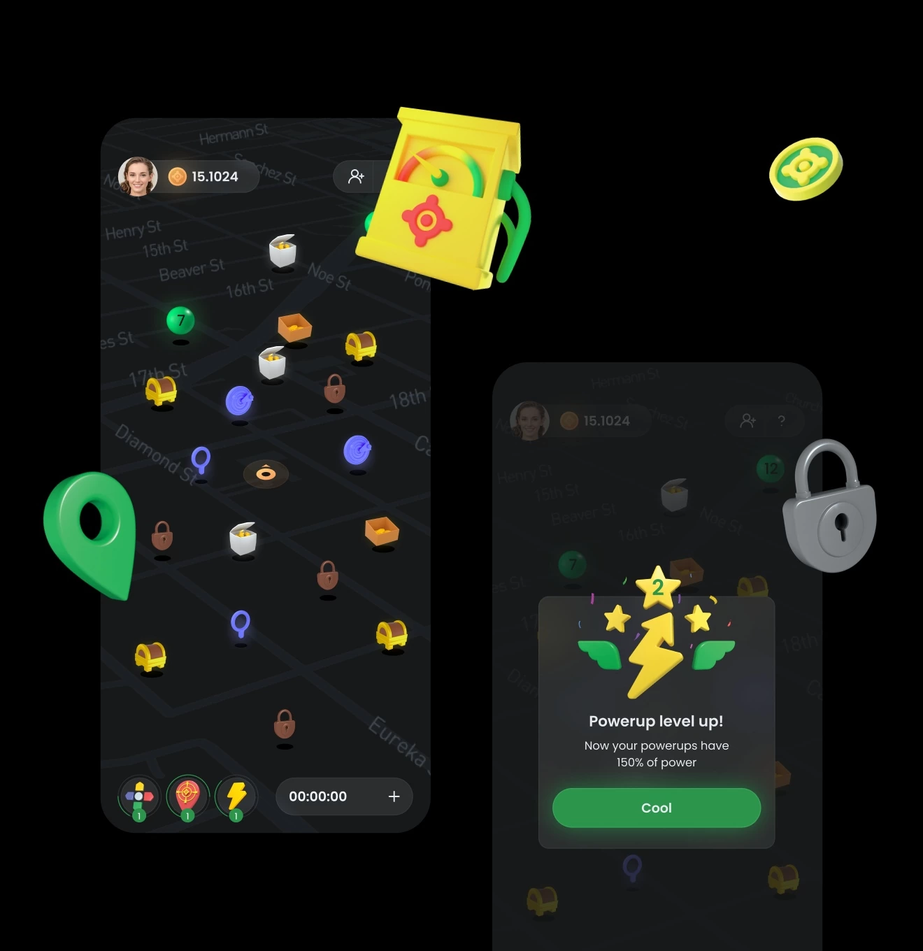
Also, a movement speed rate system was made. I. e. the faster a person moves (by car), the fewer tokens they will collect. The slower a person moves (on foot) – the more tokens they will collect. In this way, we motivated users to walk more, discovering new places in search of rewards.
Levels and upgrades
During the app development, we often turned to game mechanics who work on various games. We incorporated various levels for users that determine the amount of tokens they receive while walking. We also thought about adding various upgrades. I. e. when following the map, the user could find both rewards and upgrades that would help them get more rewards.
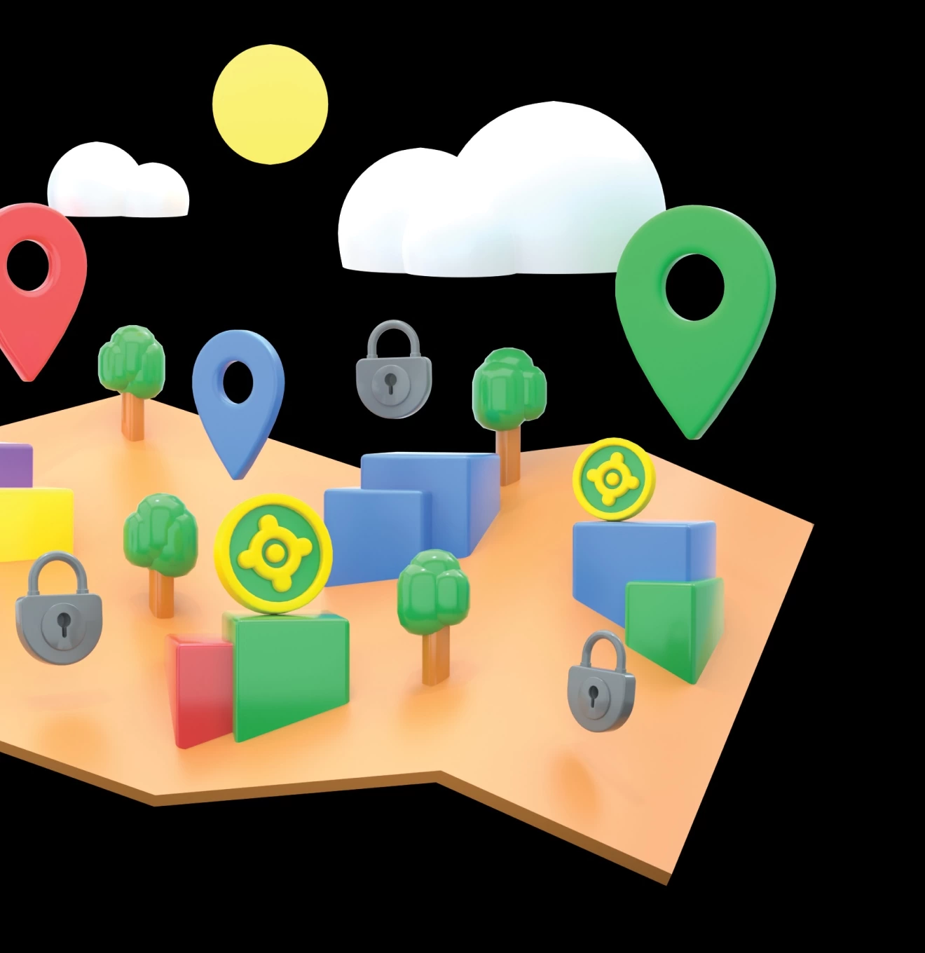
The map
Since the app is geared towards getting users to walk around the area looking for rewards, the map has become the key element here. It was important to make a unique map in such a way that it would not be an issue for developers (both in its implementation and further support). This was achieved by using the map customization service (Mapbox).
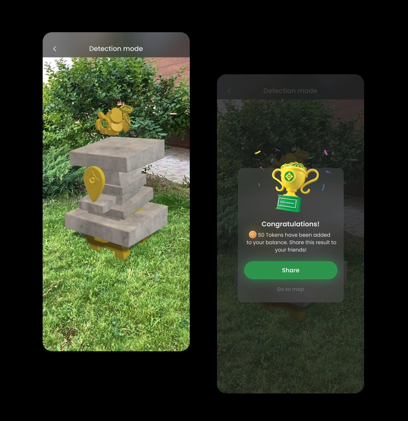
AR
We incorporated several types of rewards and upgrades. Each award has 3 levels, depending on the amount of tokens.
The main challenge was the need to make the reward models look cool, but at the same time, feel light. This compromise was essential for app users not to notice lagging and loading of the models during the reward hunt.
Integral unit
Since the use of the app required constant interaction between the user and the AR reward models, it was necessary to make the transition from the 2D plane of the app to the 3D plane of the real world as natural as possible. To do this, we have implemented 3D icons and illustrations throughout the app.
Final stage
Since the design was developed for 2 platforms (ios and android), the adaptation was necessary. It was important because these platforms have different user behavior patterns and things that are familiar to an ios user would feel strange for an android user. In addition, we made light themes and screen transition animations for apps.
#Mobile app design #Mobile app development
RADAR
 Poland
Poland
#Branding
Frozeverse Softworks
USA
USA
Have a project in mind?
Let's chat
Have a project to
discuss?
discuss?

Have a partnership in
mind?
mind?
