Development
Research
 USA
USA
The key task of our team was to create a website that would explain what a firewall is and why it is needed in simple terms. We set a goal to find different ways of presenting information in order to enable an ordinary person to delve into the topic, while not being tech-savvy in the field of information technology.
During our research, we realized that the best option for presenting content would be to make it easy and accessible without overloading a reader with unnecessary technical information.
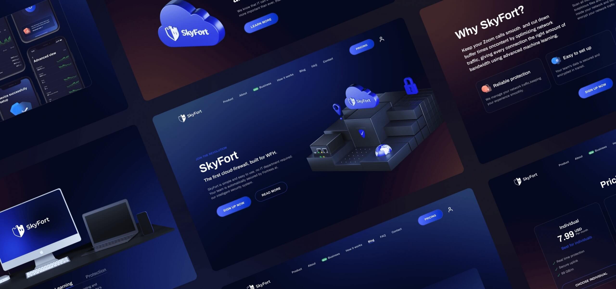
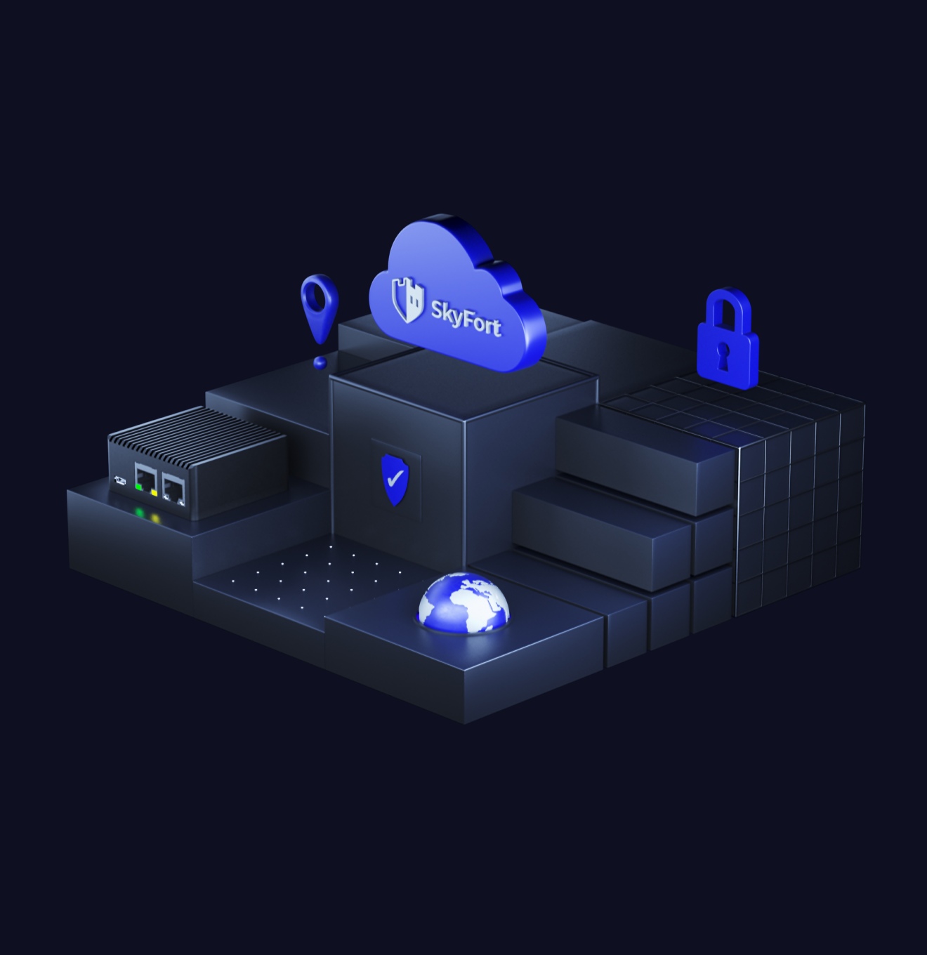
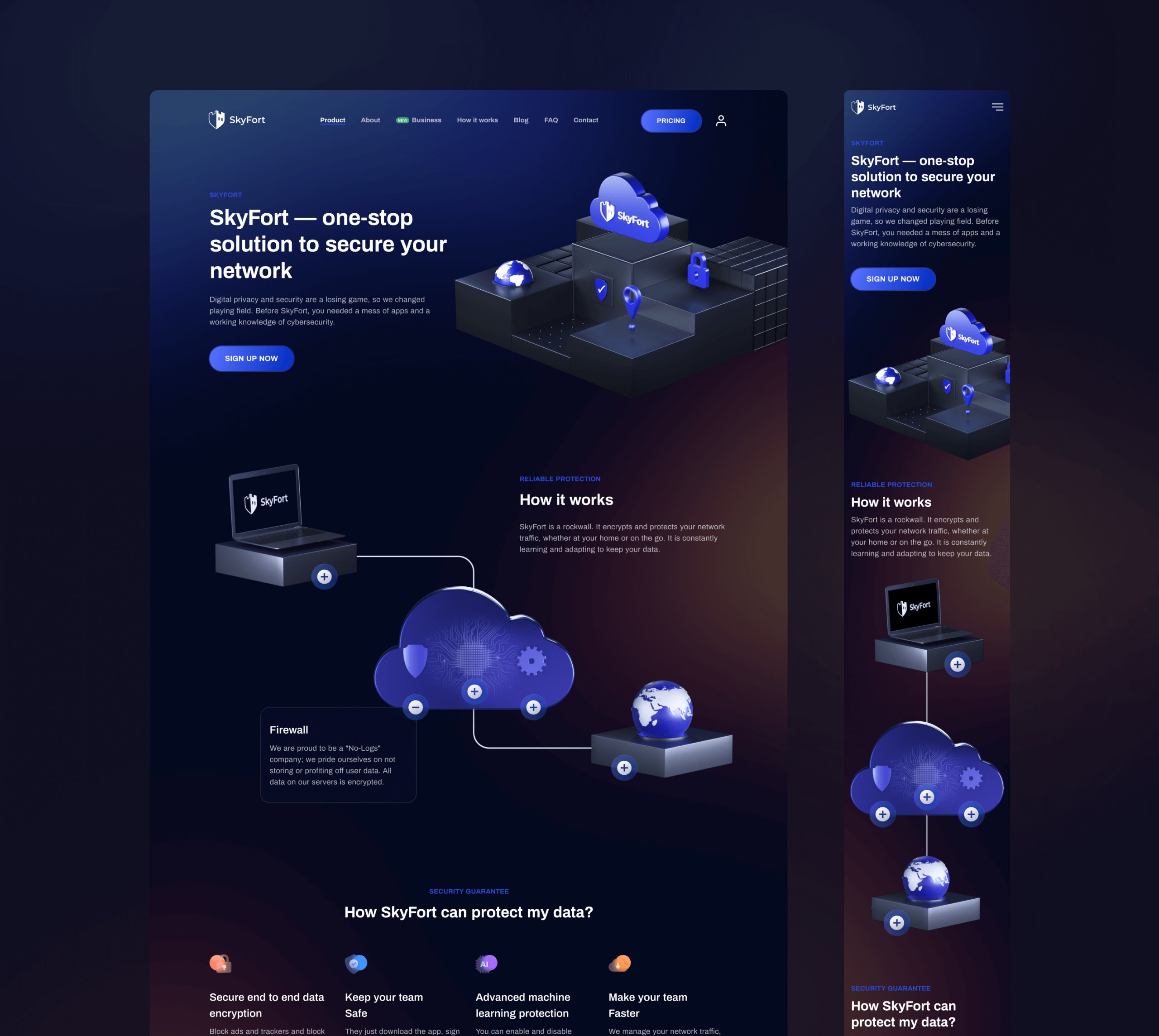
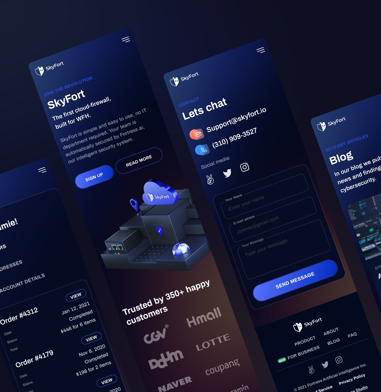
A reader perceives visual information first. Our team made a set of illustrations for SkyFort, which schematically explain what a firewall is and how it works. All website content is hierarchically divided into sections, the texts are written in a simple and exciting way. The illustrations are supported by text blocks and accessible descriptions, thanks to which anyone can easily understand what firewall is all about.
The first thing we did was UX research. We analyzed the main competitors, identified their strengths and weaknesses to understand what solutions other companies can offer in the field of information security, as well as to avoid mistakes that can result in poor product quality.
After we analyzed competitors, we did research on the target audience, found out their pains and needs. This made it clear what people lack in similar products and what we should focus on.
Based on two stages of research, we have made a list of key UX features that should be applied in website design for SkyFort.
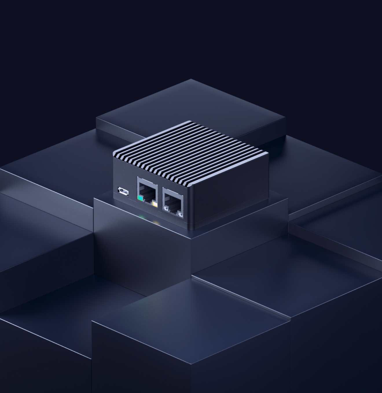
Following the UX research, we updated the old SkyFort logo, as well as selected the appropriate brand colors and typeface. Based on this, we created a style guide that includes the logo and its use in different scenarios, font hierarchy, brand colors, and gradients, as well as basic design elements such as buttons and cards. In the future, the style guide was supplemented with custom illustrations and icons that we drew for SkyFort.
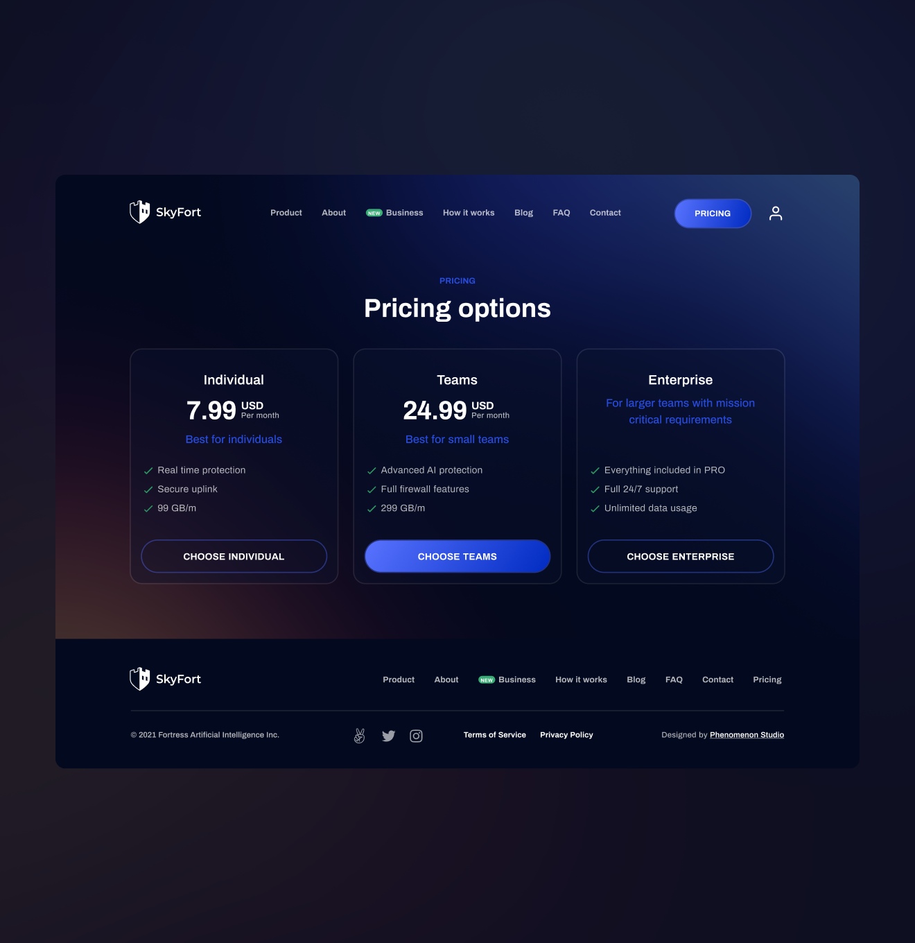
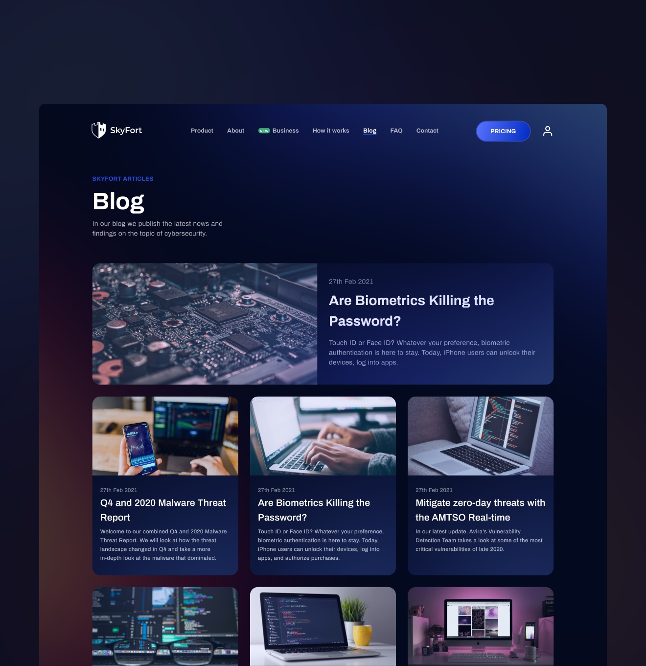
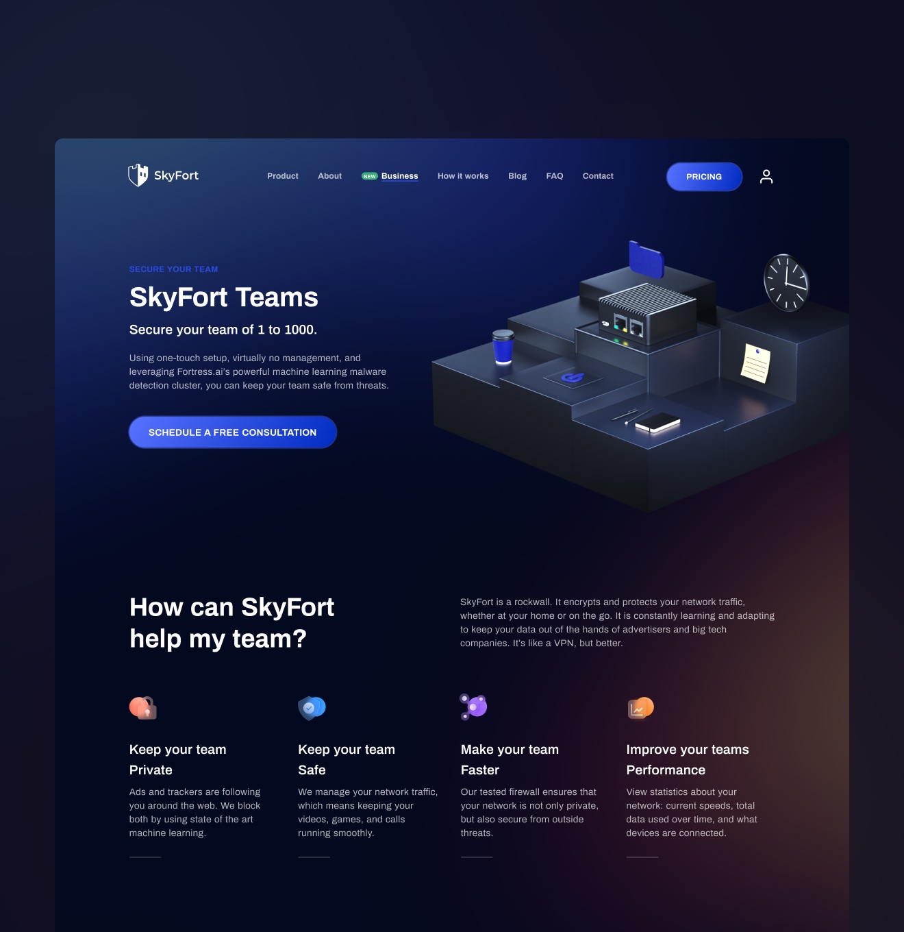
Guided by the findings from the research and the new style guide, we started designing the main website pages. First of all, we created the design of the homepage and approved it with the client. After that, the artist moved on to create illustrations for the home page, while the UI/UX designer was creating internal pages.
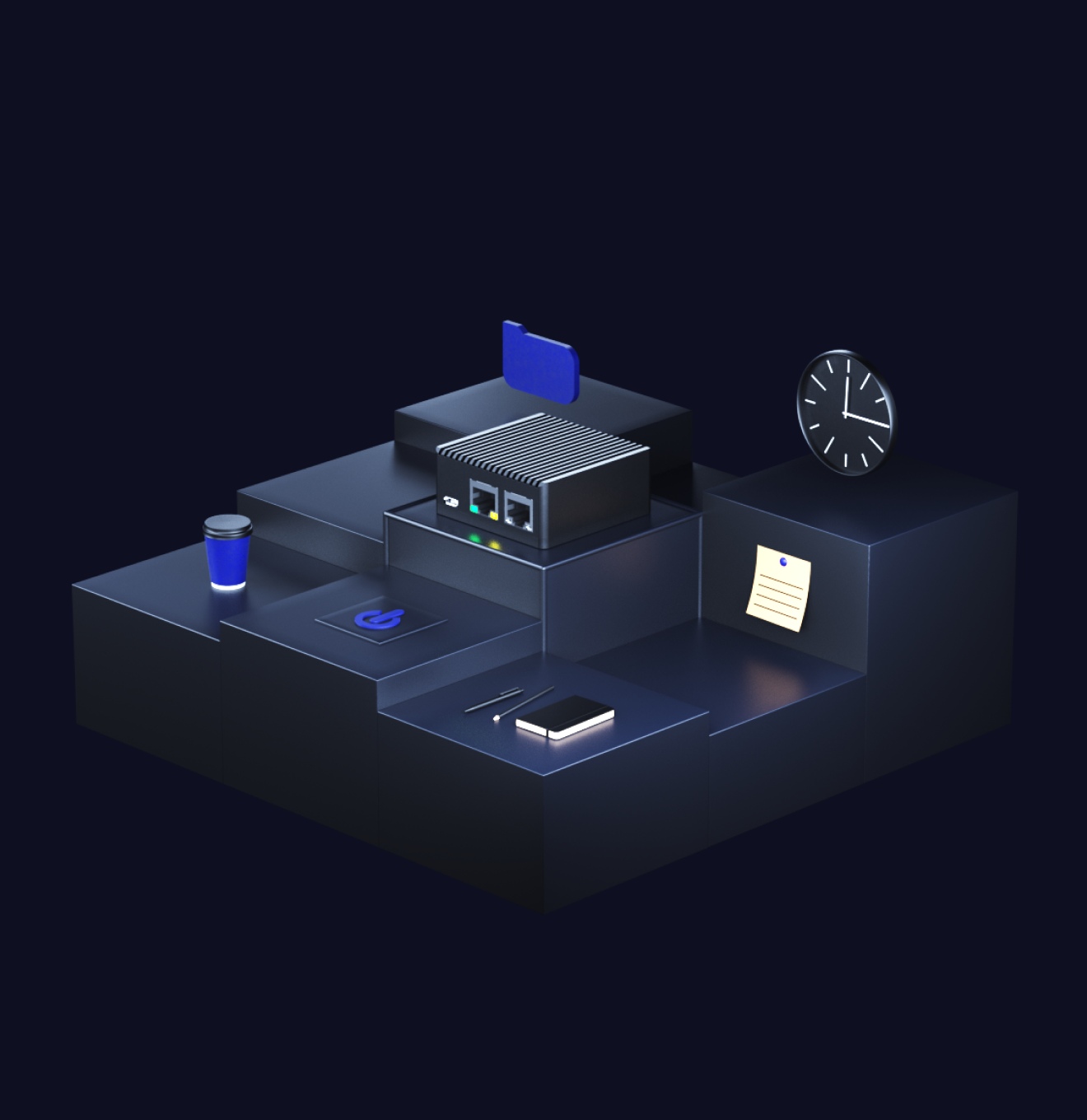
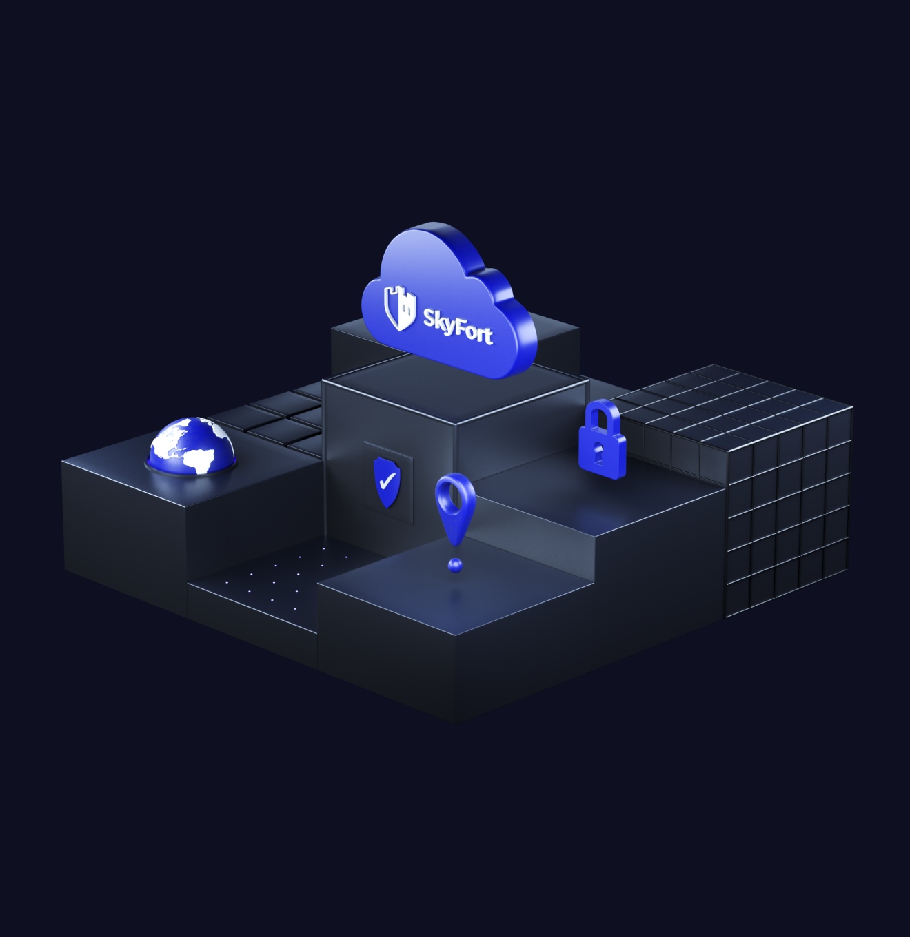
We set the goal to tell about a complex system in simple terms. The best assistant in this case was illustrations that clearly demonstrate the work of SkyFort and harmoniously complement the blocks with text keeping the reader excited. Our team drew the set of animated 3D illustrations that highlight the SkyFort branding by schematically demonstrating the cloud firewall features.
The share of mobile devices in the network has long exceeded 50%, so our team has focused on adapting the display of the website to any screen.
We have created responsive versions of the website for tablets and mobile devices. Additionally, we have also created versions that would look nice on a PC but were not quite suitable for mobile devices. Finally, we developed alternative versions of the tables to avoid horizontal scrolling on smartphones and tablets.
Cybersecurity has become a hot issue lately. Many companies suffer from hacker attacks. We have created and launched a user-friendly website that communicates to us about the features and benefits of a cloud firewall in plain language, and also has user confidence in this brand. We sincerely believe that SkyFort will help many teams establish a security system for their data and avoid any hacker attacks.
#UX Audit #Website design #Website development
USA
Maintain visibility into multi-cloud security, compliance, cost, and drift with automated infrastructure diagrams, change tracking, and a GraphQL API.

