Development
Research
 USA
USA
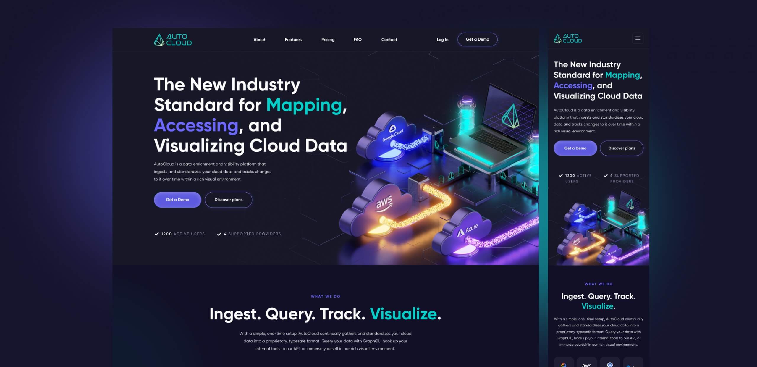
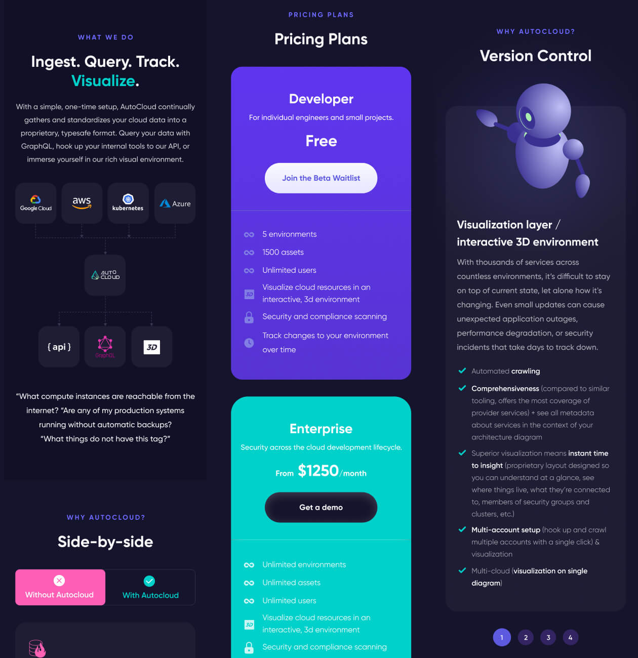
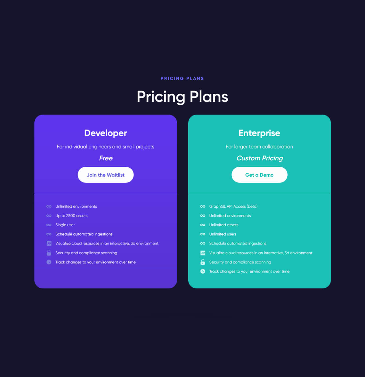
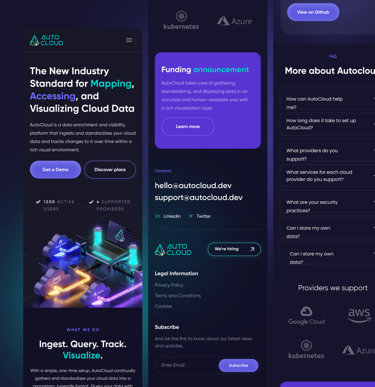
The work on the project was not only about providing a complete redesign of the platform and improving the UX but also in a comprehensive approach to laying out the advantages, understandable price plans with a detailed display of the services included in them.

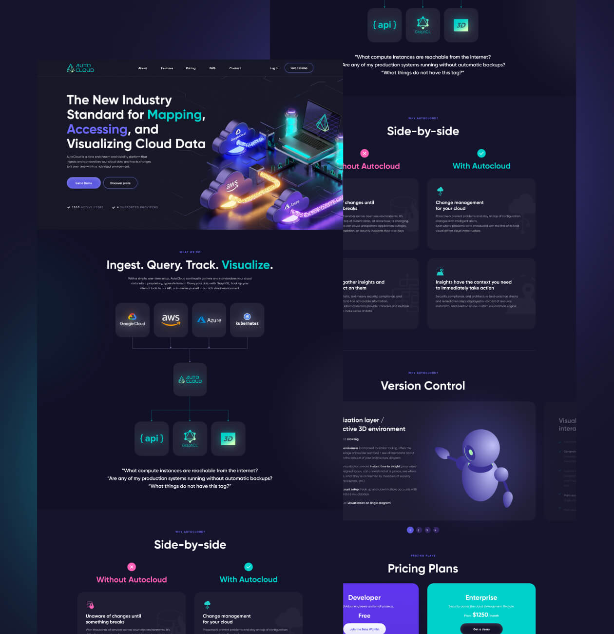
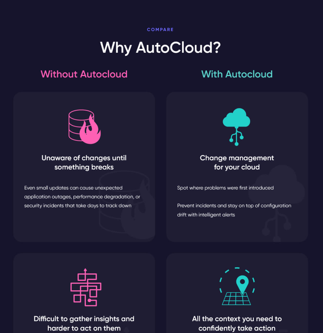
To that end, we analyzed the approach of similar platforms to displaying information and ended up with a structure that ultimately provided the basis for the landing page. We have drawn particular attention to the side-by-side display of the use of services with and without AutoCloud, what errors can be avoided, and what are the key advantages of AutoCloud.
Having studied the platform features and after we analyzed competitors and target audiences, we concluded that it’s important to visually display how Autocloud works, use the services supported by the platform in visual materials, and also lay out the advantages of the platform and price plans in an illustrative way.
Even though there is a visual and textual display of how the service works, users may raise questions that need to be clarified by the company representatives or developers. We made sure that a separate block covers the main issues on how AutoCloud works. In case something needs to be clarified, you can make an appointment with the platform representatives on the website.
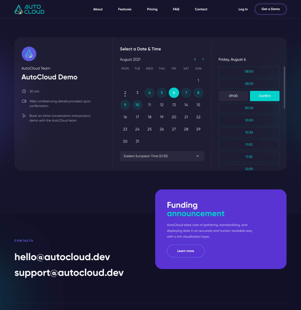
We drew all graphic materials, customized the calendar planner, and prepared an adaptive version of the website.
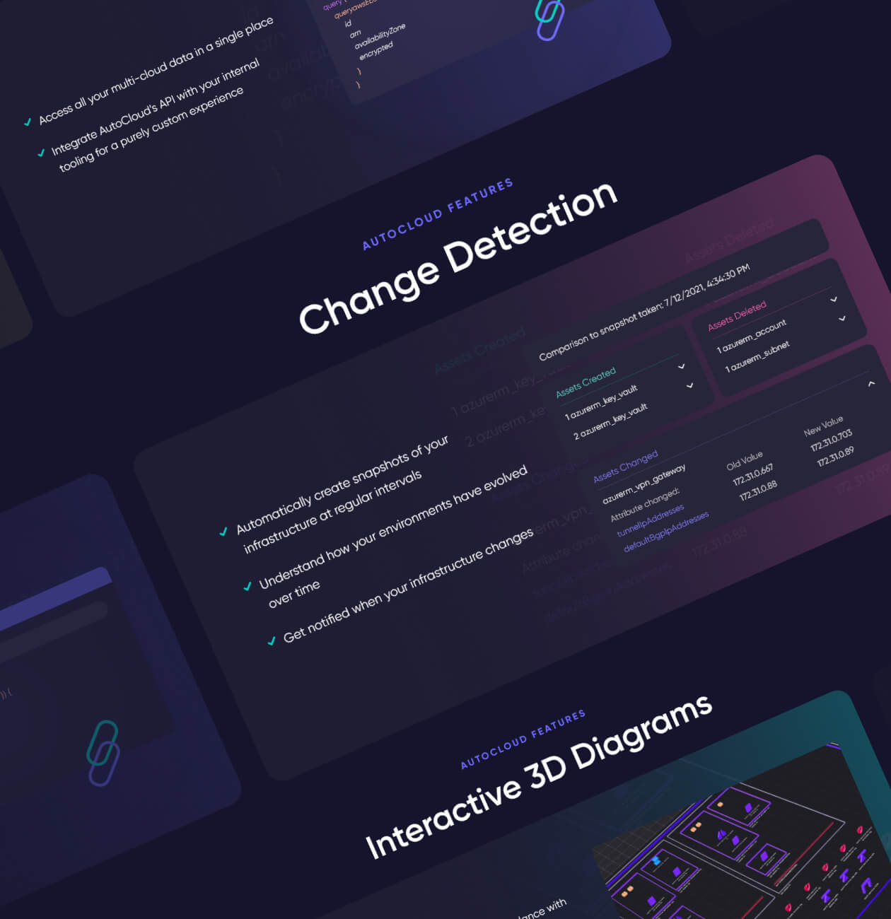
It not only gives users the information they need but also makes it accessible and interactive, highlighting the key points and at the same time does not overwhelm users with long texts. It shows how easy and convenient it is to use the platform and integrate it into working with data.
#Website design #Website development
USA
A new cloud firewall that secures personal data and boosts users’ web connection

