Scrambly – rewarded discovery platform for games and apps
Clearer brand positioning

Established a bold, expressive brand identity that increased awareness and made Scrambly instantly recognizable across platforms.

Consistent visual system

Developed a flexible design system that streamlined visual communication and ensured alignment across marketing, product, and merchandise.

Improved market perception

Introduced playful character work and gamified visuals that helped boost interaction rates and emotional connection with the brand.

Overview
Turning simple actions into real rewards

Scrambly is a gamified platform that turns simple digital actions into engaging challenges. Designed to spark curiosity and reward participation, it creates a playful environment where users explore new products, complete tasks, and collect points. The experience feels light, fast, and fun — like a game, but with real value behind every interaction.

Client
Scrambly Icon - imageItaly
Services
branding
Review
What client says
Illia Frantsevskyi
CTO & Co-Founder
They demonstrated a high level of expertise and efficiency in every phase of the project.
Business needs
Client request & business goals

Scrambly approached us with the ambition to stand out in a crowded market of reward-based platforms. Their goal was to build a brand that would feel engaging, youthful, and instantly memorable — without losing clarity or trust. They needed an identity that could communicate both playfulness and reliability, appealing to a wide audience from early adopters to casual users.

We worked on evolving the existing logo and visual direction, giving it a bolder, more polished look while preserving the recognizable form. The rebranding extended to a complete redesign of the visual system — from typography and colors to mascot, illustrations, and motion elements. This allowed the Scrambly brand to feel more unified, energetic, and ready for wider-scale communication across digital and physical touchpoints.

Challenge
Problems & soulutions
Problem
The original brand lacked a strong emotional hook and failed to capture the playful nature of the platform, making it harder to resonate with a younger, engagement-driven audience.
Solution
We refreshed the identity with bolder visuals, vibrant colors, and a mascot system to reflect Scrambly’s energetic personality and enhance emotional connection with users.
Problem
The existing logo and visual system didn’t scale well across formats and often lost impact in marketing and product interfaces.
Solution
We evolved the logo and typography, improving legibility and flexibility across digital and physical mediums without losing brand recognition.
Problem
There was no unified design language to ensure consistency across communications, leading to a fragmented brand experience.
Solution
We developed a comprehensive design system with clear guidelines for color, type, and visual assets — helping the team maintain consistency across all touchpoints.
Icon - process-1
Wondering about the price? We’ll help you find the best solution!
branding stages
A playful brand refresh for a growing digital world

Our task was to breathe new life into the Scrambly brand without losing its original spirit. The update needed to feel natural, not like a reinvention, but an evolution. We focused on sharpening the visual identity, making it more expressive, cohesive, and scalable across all digital surfaces. From refining the logo to building a flexible design system, every element was crafted to better reflect the product’s playful nature and fast-growing.

Stages

  • logo design
  • colors & typography
  • brand assets
  • mascot
  • brand guidelines
Scrambly – rewarded discovery platform for games and apps - Website Development - Photo 5
Stage 1
Logo design

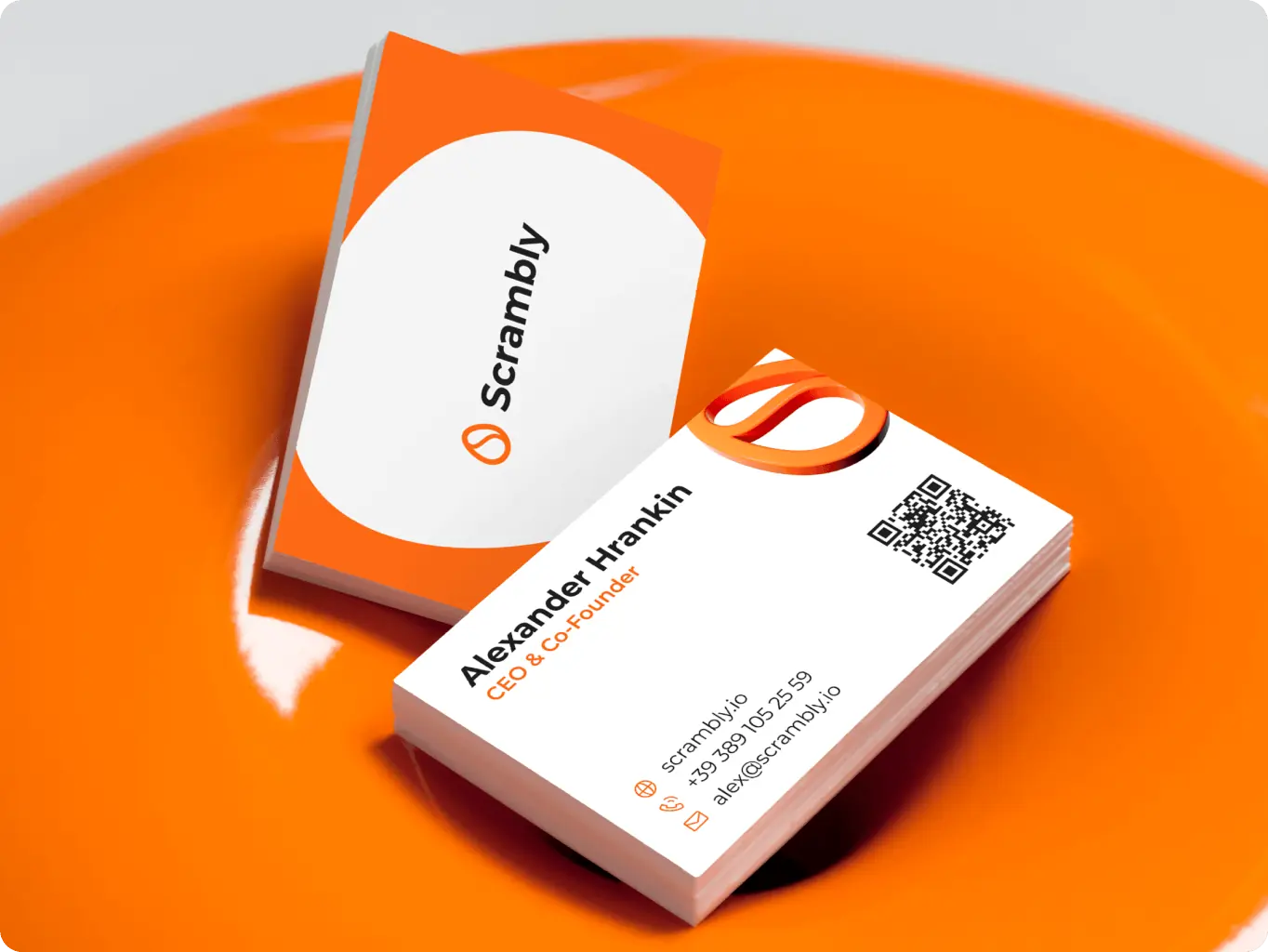
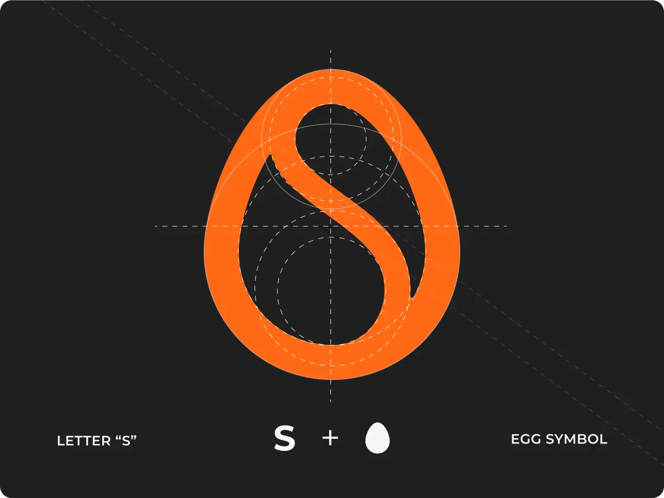
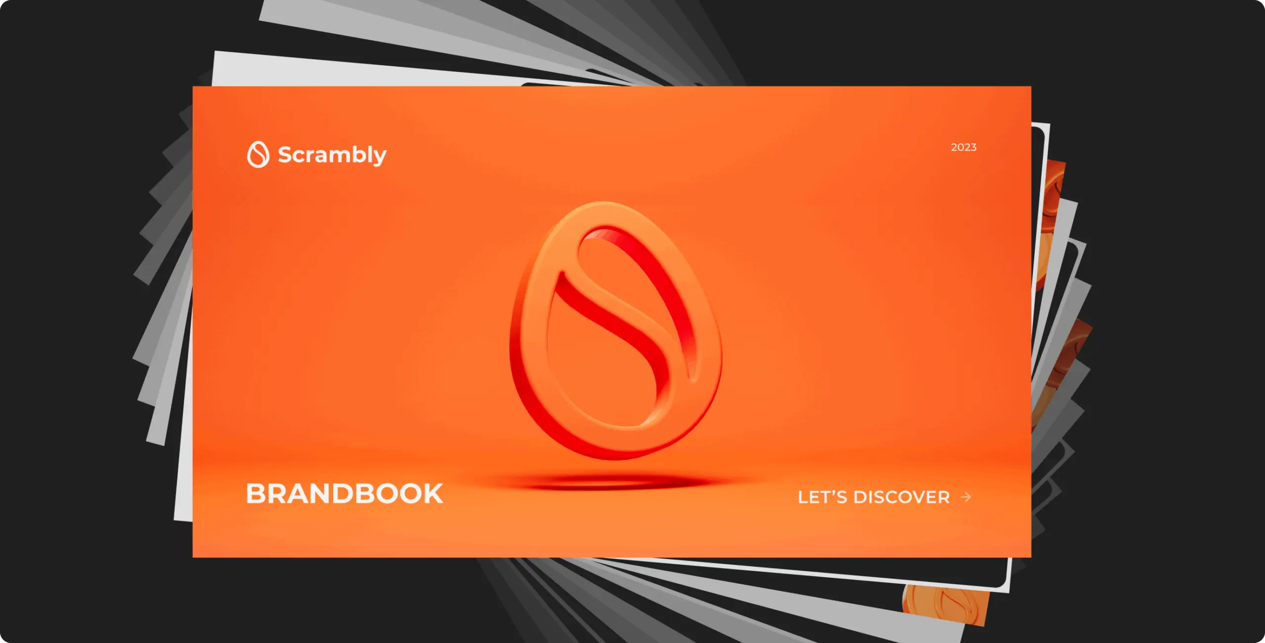
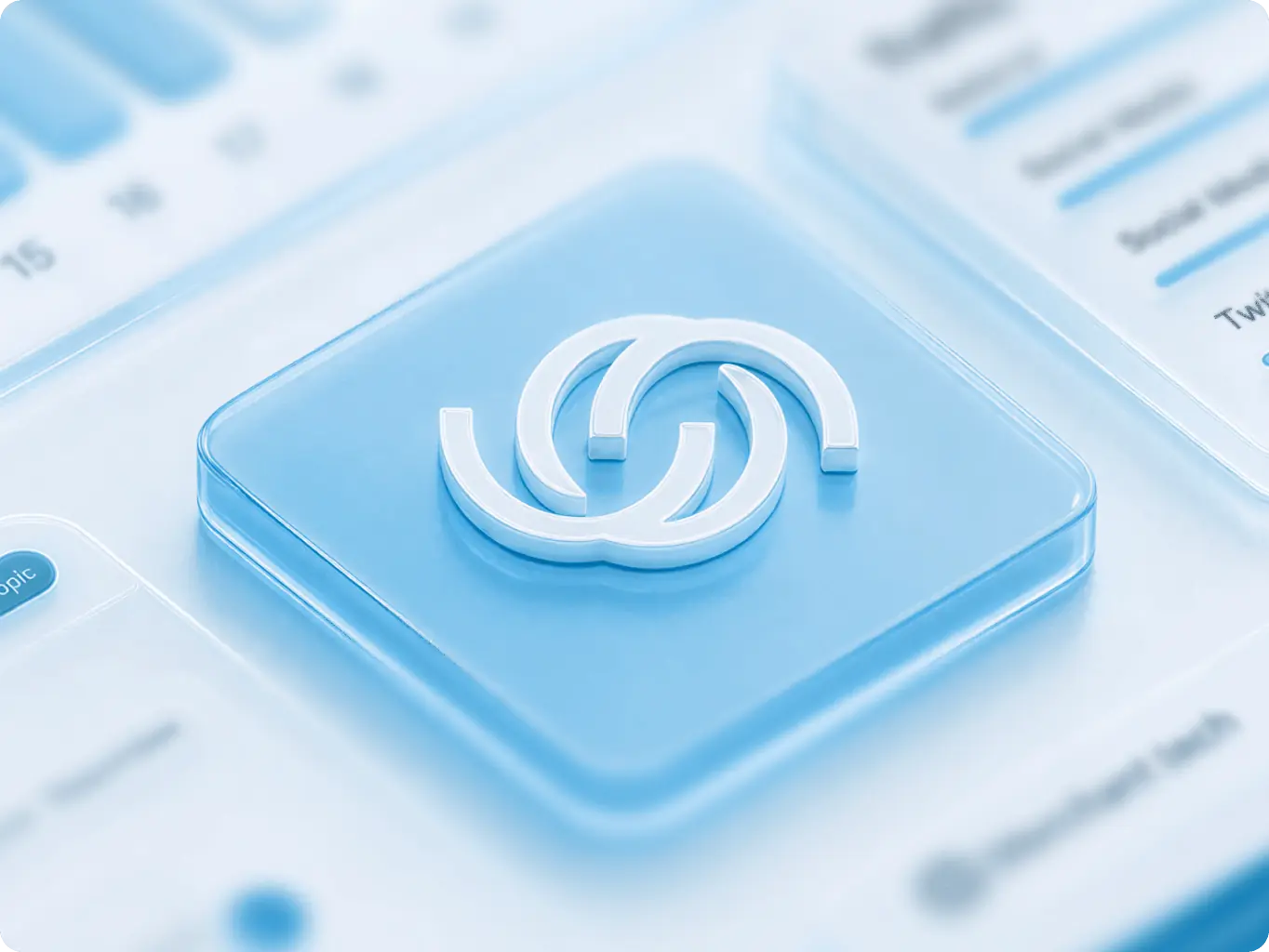
The updated Scrambly logo preserves the core shape of the original symbol while refining its overall balance, weight, and clarity. The icon — an abstract ‘S’ enclosed in a egg-like form — now feels more confident, scalable, and modern.

The refreshed mark pairs with a custom wordmark that introduces stronger geometry and smoother rhythm, enhancing legibility across digital and physical use. This subtle but impactful evolution helps maintain recognition while giving the brand a sharper, more expressive identity.

Scrambly – rewarded discovery platform for games and apps - Website Development - Photo 6
Scrambly – rewarded discovery platform for games and apps - Website Development - Photo 7
Stage 2
Colors & typography

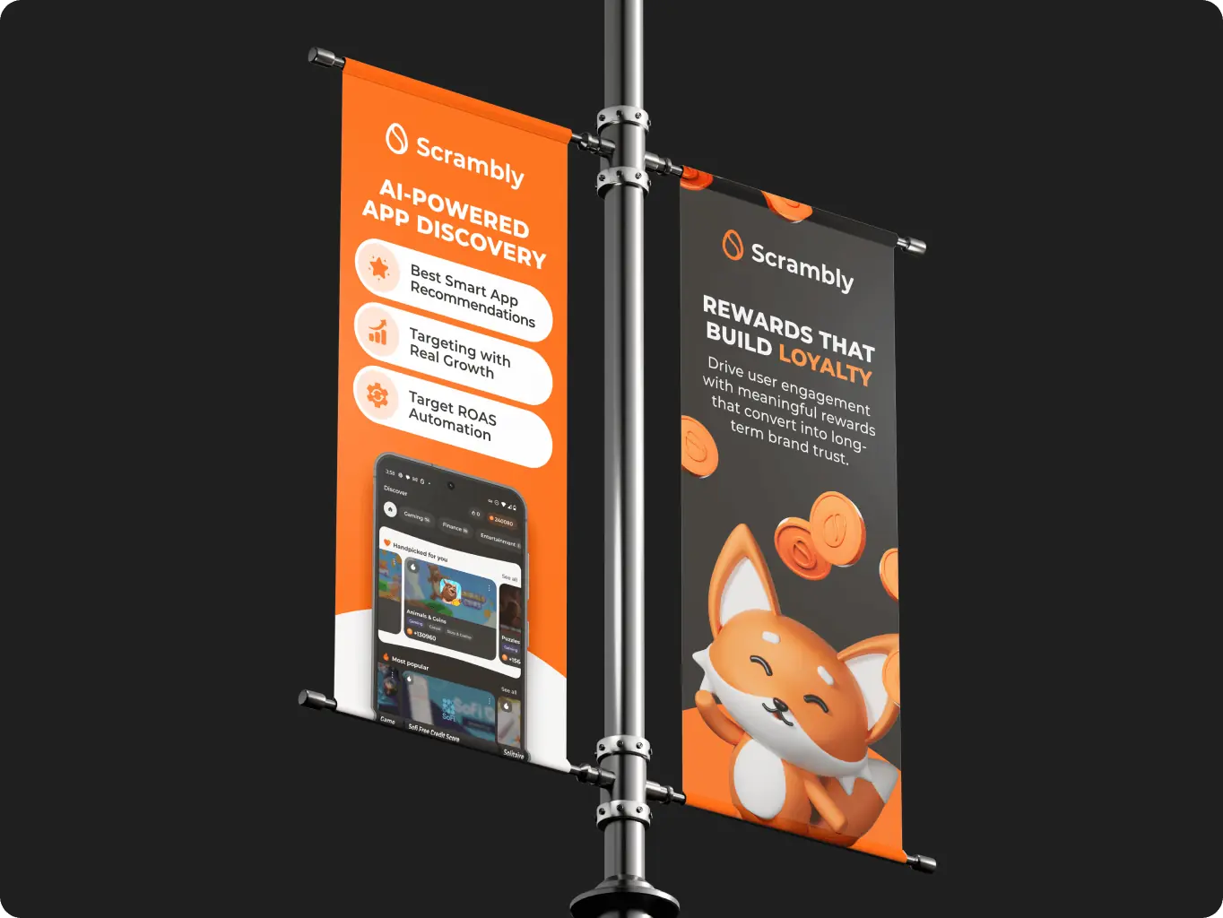
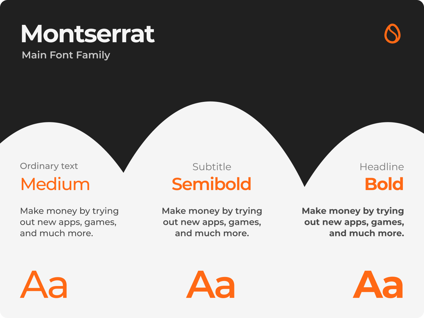
Scrambly’s visual identity blends boldness with simplicity. The use of Montserrat brings structure and clarity to every message — it’s modern, geometric, and easy to read across sizes, making it a perfect match for a digital-first product.

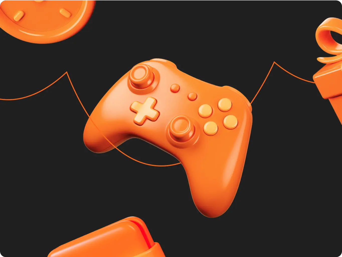
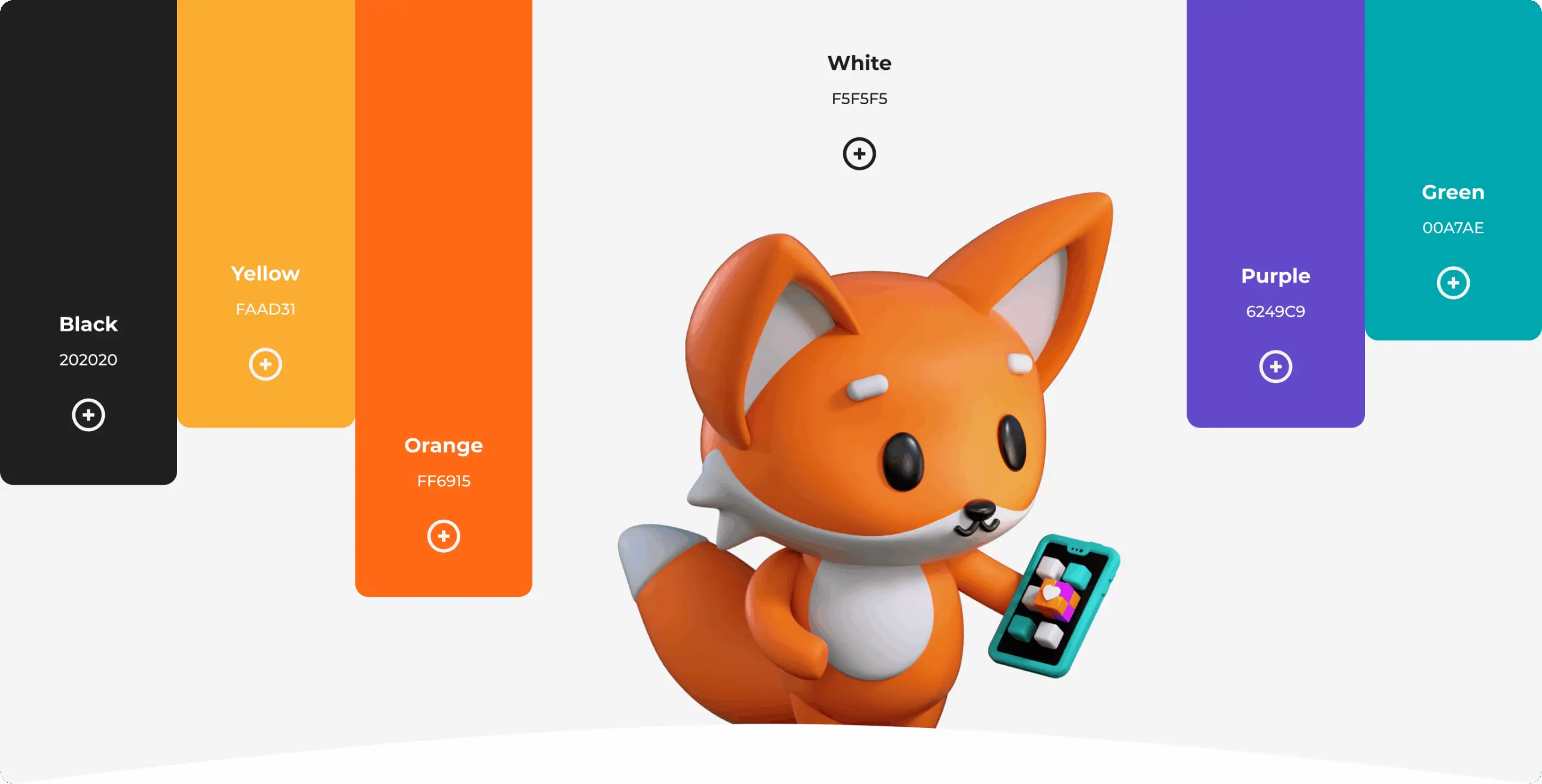
The color palette centers around high-contrast combinations: vibrant orange brings energy and urgency, while deep black and bright white ground the composition. Supporting shades like green, purple, and yellow introduce playful accents that echo the brand’s gamified experience. Together, these elements build a visual language that feels confident, dynamic, and unmistakably Scrambly.

Scrambly – rewarded discovery platform for games and apps - Website Development - Photo 11
Stage 3
Brand Assets

As a tech startup our goal was to build and obtain meaningful leads within the snow industry. We were tasked with an exciting brief to build an immersive experience that reflects the innovative nature of slope solutions.

We were tasked with an exciting brief to build an immersive experience that reflects the innovative nature of slope solutions.

Scrambly – rewarded discovery platform for games and apps - Website Development - Photo 14
Icon - process-1
Wondering about the price? We’ll help you find the best solution!
Stage 4
Mascot

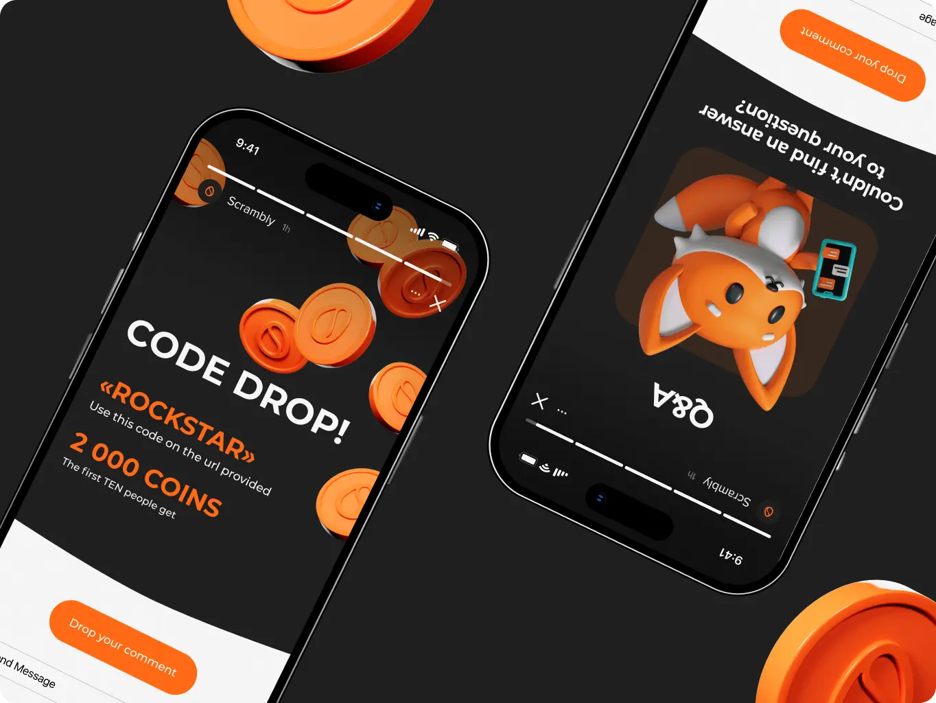
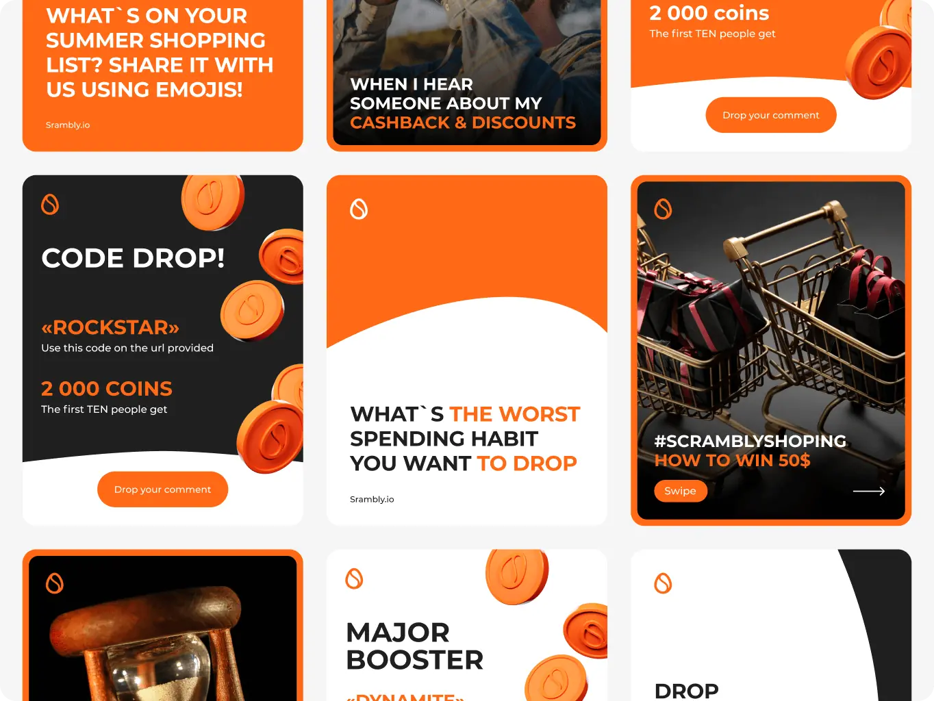
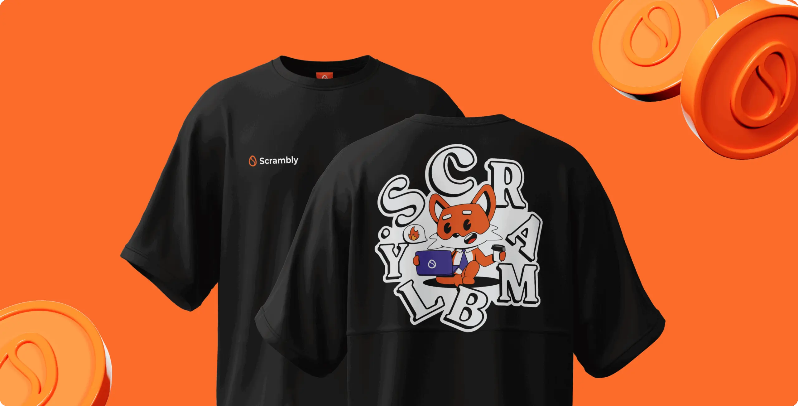
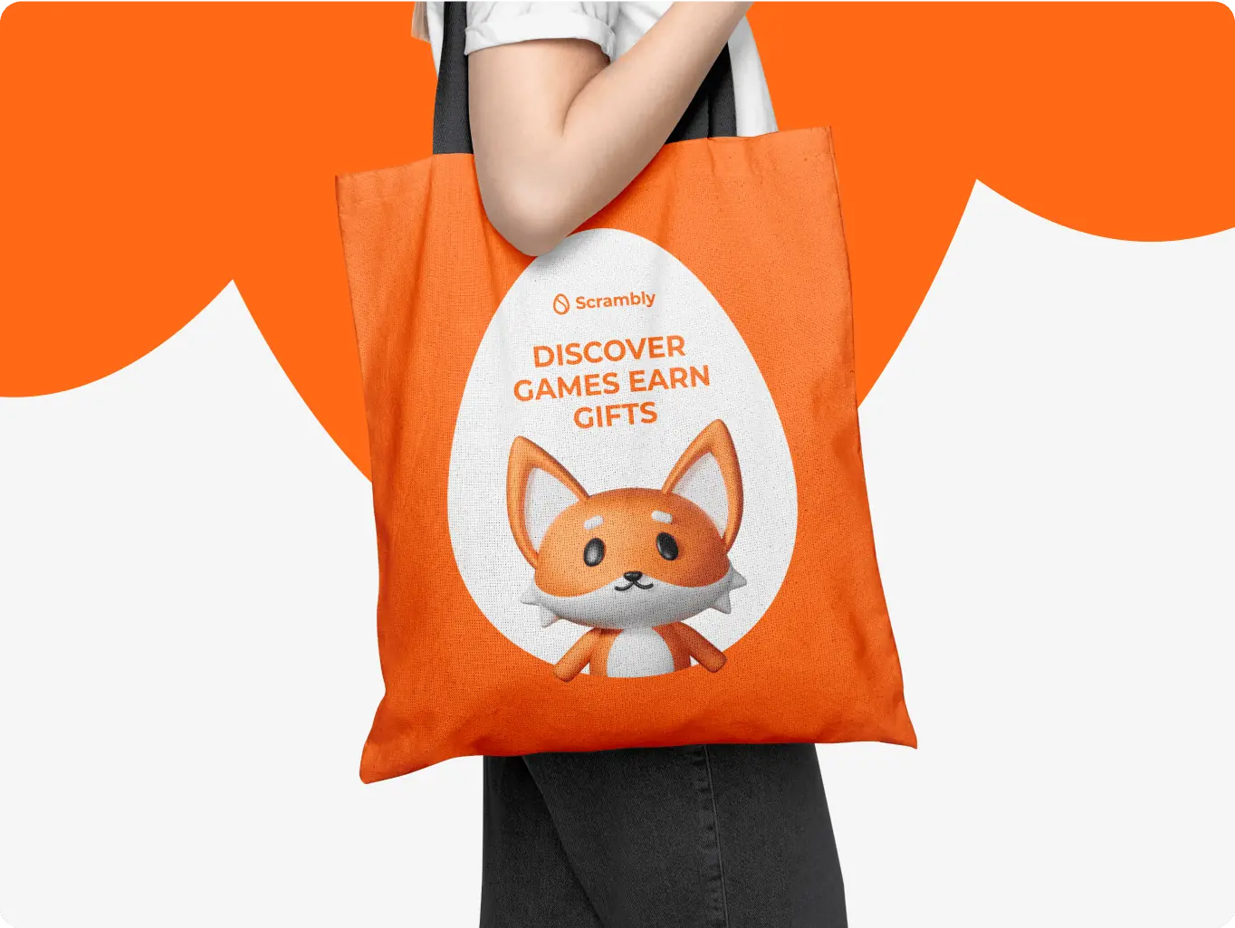
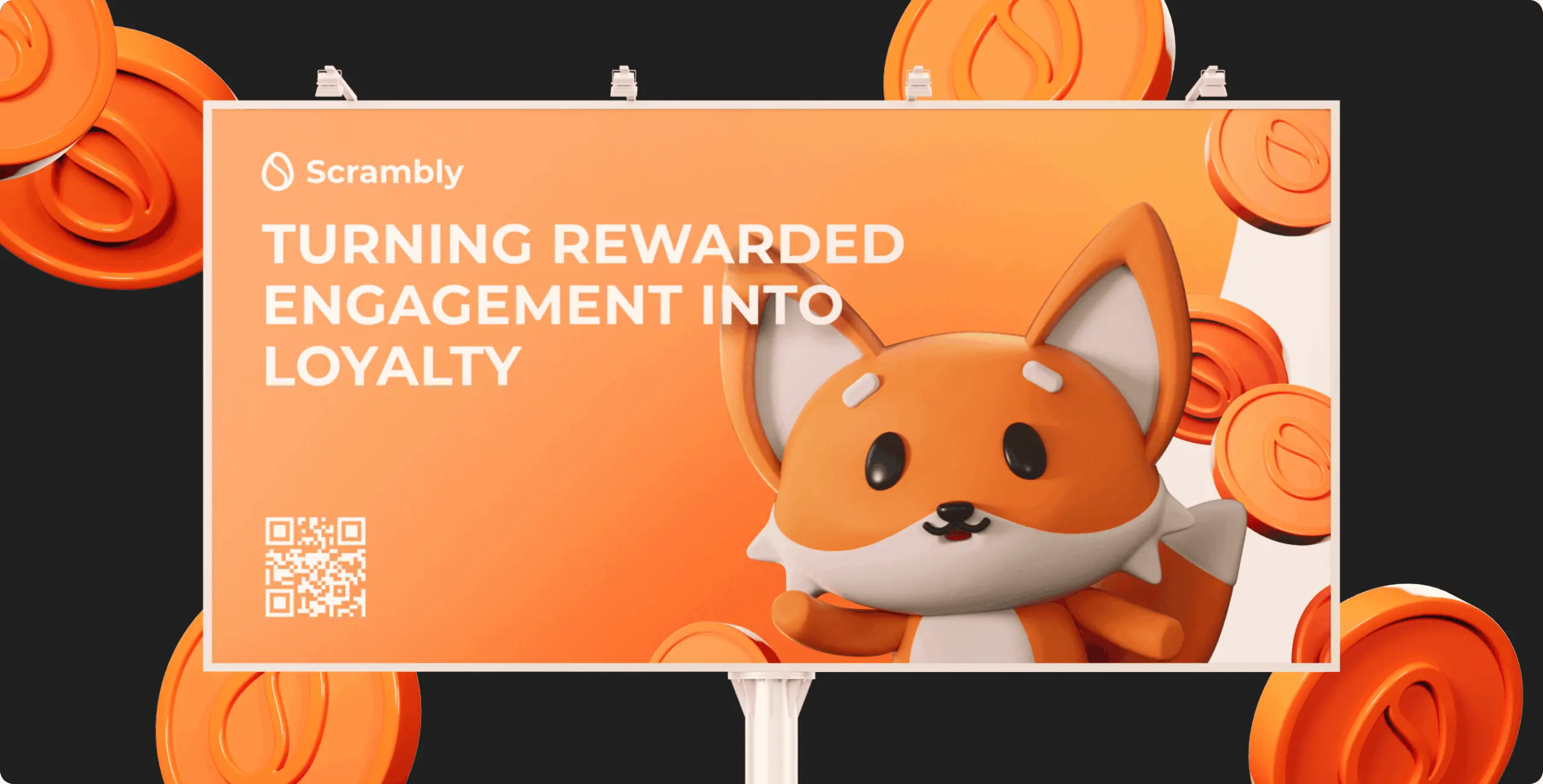
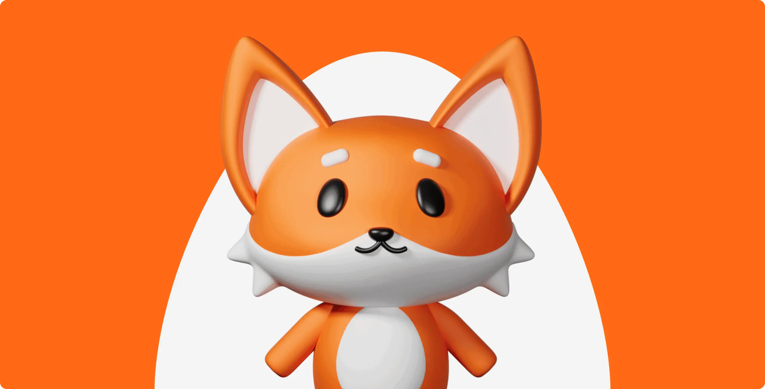
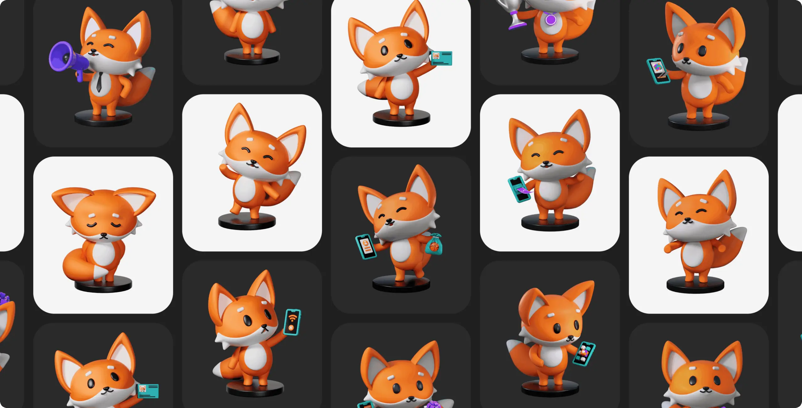
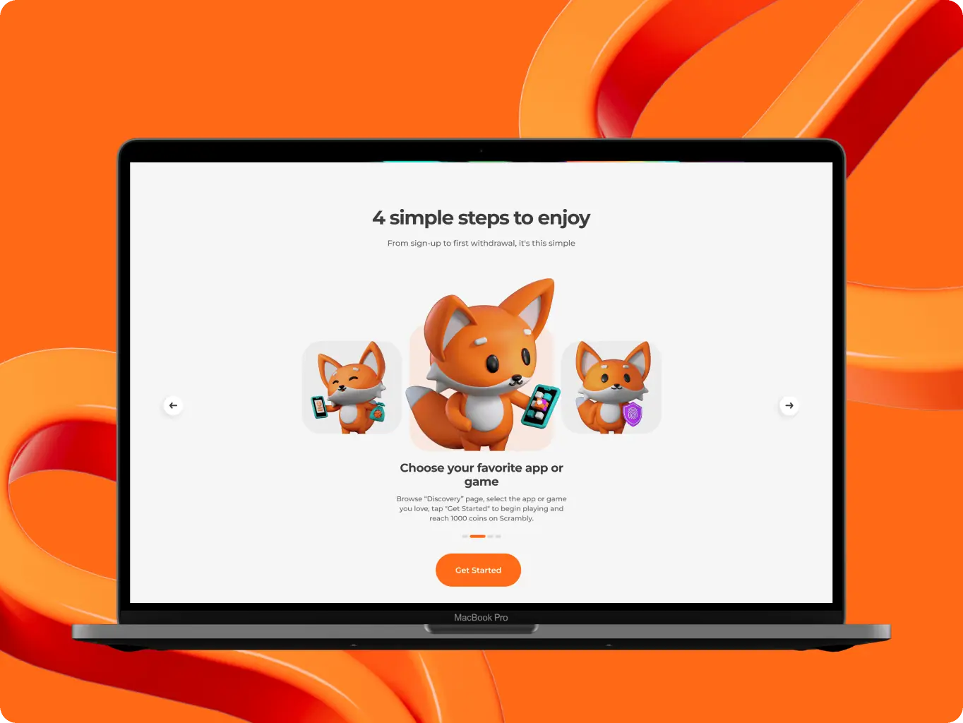
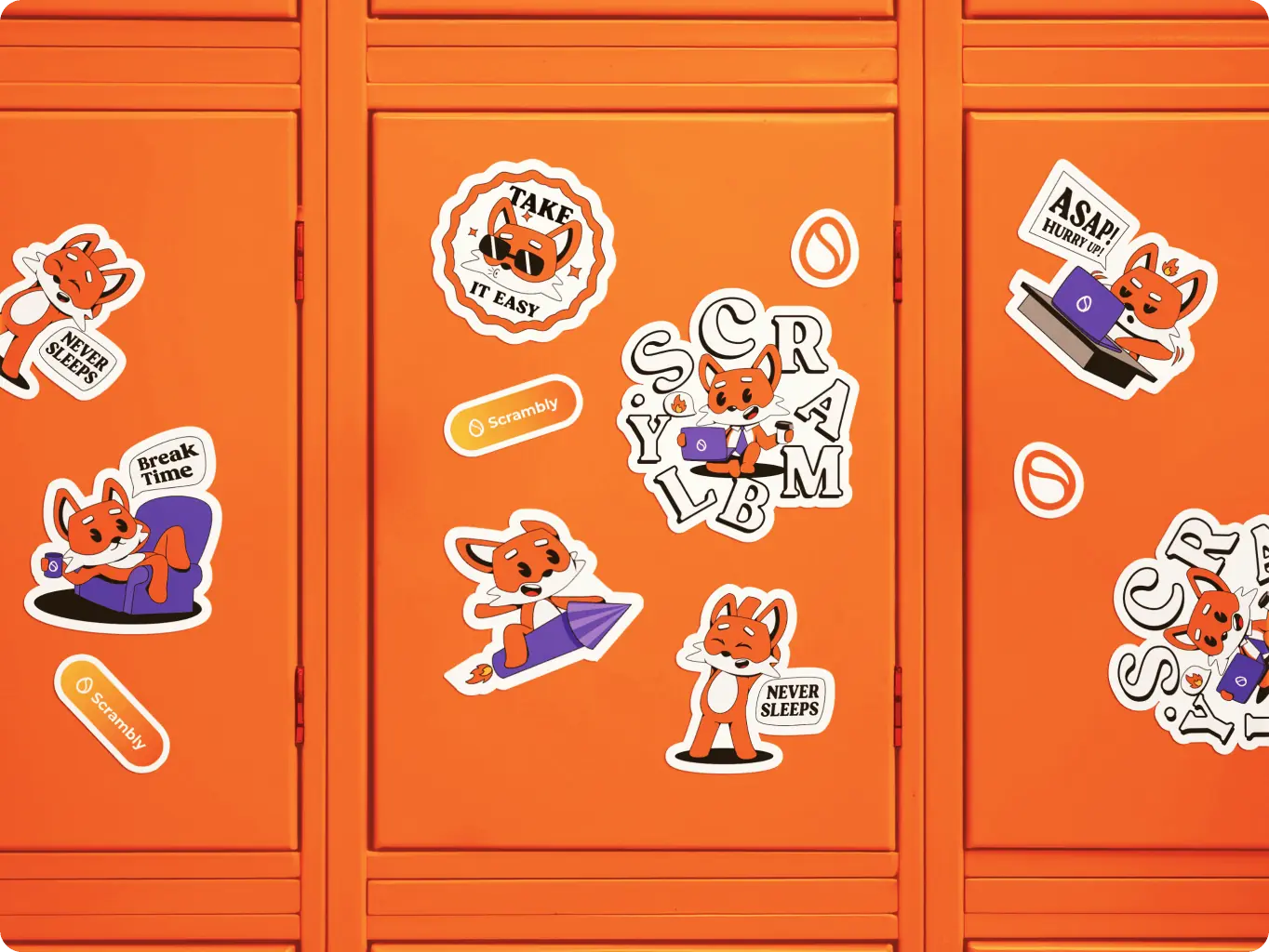
To bring the brand to life and strengthen its gamified character, we developed a series of illustrations centered around a custom mascot. The fox character appears in both 3D and 2D styles — from expressive hero poses to collectible sticker formats — becoming a recognizable symbol of the Scrambly universe.

Additional visuals like 3D coins and a stylized logo were created to enhance product storytelling and add motion-ready assets for marketing. These illustrations help turn the interface into a playful environment, reinforcing engagement and encouraging exploration at every touchpoint.

Scrambly – rewarded discovery platform for games and apps - Website Development - Photo 15
Scrambly – rewarded discovery platform for games and apps - Website Development - Photo 16
Stage 5
Brand guidelines

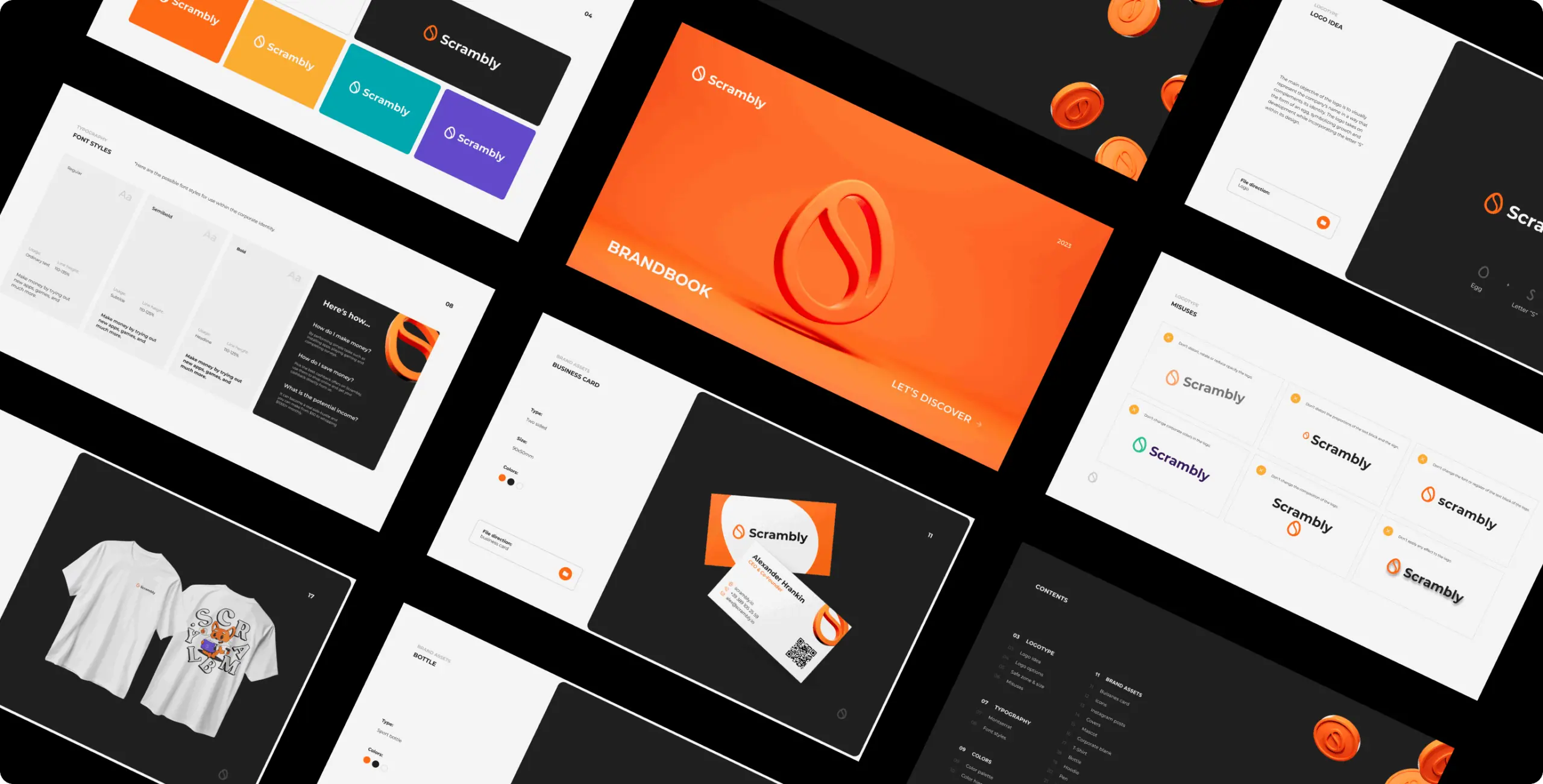
The Scrambly brand guidelines were created to ensure consistency across all touchpoints — from in-app visuals to marketing campaigns and merchandise. They define clear rules for using the logo, typography, colors, illustrations, and mascot system, helping the team maintain a unified voice as the brand scales.

By organizing visual elements into a flexible, easy-to-use system, the guidelines support both internal teams and external partners, ensuring every piece of communication feels distinctly and recognizably Scrambly.

Scrambly – rewarded discovery platform for games and apps - Website Development - Photo 19
Scrambly – rewarded discovery platform for games and apps - Website Development - Photo 20
Icon - process-1
Wondering about the price? We’ll help you find the best solution!
Rusults
Rebranding for clarity, cohesion, and creative growth
Stronger visual recognition

Established a bold, expressive brand identity that increased awareness and made Scrambly instantly recognizable across platforms.

Improved brand consistency


Developed a flexible design system that streamlined visual communication and ensured alignment across marketing, product, and merchandise.

Increased user engagement


Introduced playful character work and gamified visuals that helped boost interaction rates and emotional connection with the brand.

The rebranding of Scrambly helped elevate its identity by reinforcing clarity, cohesion, and emotional appeal. The updated system provided structure for scalable communication while unlocking new creative potential — making the brand more memorable, more engaging, and more future-ready.

More cases
We have dozens of products & hundreds of websites developed by our studio. We're happy to share the results with you!

#Website design #Website development

Pretty Patty: a deliciously interactive fast food experience
Pretty patty Icon - image (2)Switzerland
Results

Brand alignment & vibrant design

Improved сonversion opportunities

Customer-centric approach

Image - image (15)

Adrian Smith

Co-Founder, PRETTY PATTY

They always respected deadlines, were super reactive, and were super helpful.

#Web app design #MVP building #Web development #Blockchain development #Dedicated team

GlobalX – DEX
GlobalX Image - fi_4628635 (3)USA
Tech Stack

TypeScript, React, Wagmi, Ether.js, Tanstack Query, Radix UI, Framer Motion, D3.Js, Redux, GraphQL, Apollo, Zustand, Magic SDK, Jest

Timeline

5 month

Results

Enhanced usability

Responsive performance

Scalability and security

Image - Rectangle 34624326

Joshua Caleb

We reached out to this team for the development of our cryptocurrency exchange web app (DEX Swap), and the result exceeded all expectations. We’re very pleased with how everything turned out in terms of both functionality and design. The app works flawlessly, and its interface is very user-friendly.

#Branding

Hyperbridge – redefining cross-chain connectivity
Hyperbridge Icon - fi_4628635USA
Results

Clearer brand positioning

Consistent visual system

Improved market perception

Contact us

Have a project in mind?
Let's chat

Your Name

Enter your name *

Your Email

Enter your email *

Message

Tell us about your project

You can upload maximum 5 files
Some of your file not loaded, because maximum file size - 5 mb
Your budget for this project?

By clicking this button you accept Terms of Service and
Privacy Policy

Icon - launch
Thanks for taking time to reachout!
Stay connected with us by subscribing to our LinkedIn account. By following, you’l be the first to hear about our latest updates, news, and exciting development. We look forward to sharing our journey with you!
Icon - launch
Thanks for taking time to reachout!
We’d love to hear more about your project! Feel free to schedule a call using the link provided. This will help us better understand your vision and ensure we’re aligned on all the details.
Have a project to
discuss?
Image - ksenia
Kseniia Shalia
Account Executive
Have a partnership in
mind?
Image - polina
Polina Chebanova
Co-Founder & CPO