Orryx – rewriting the rules of finance
Enhanced user experience

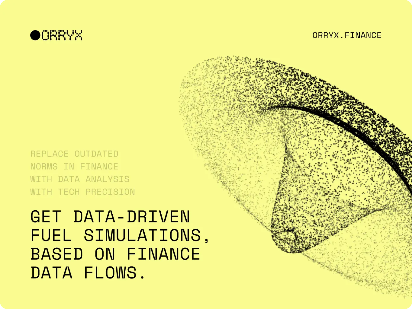
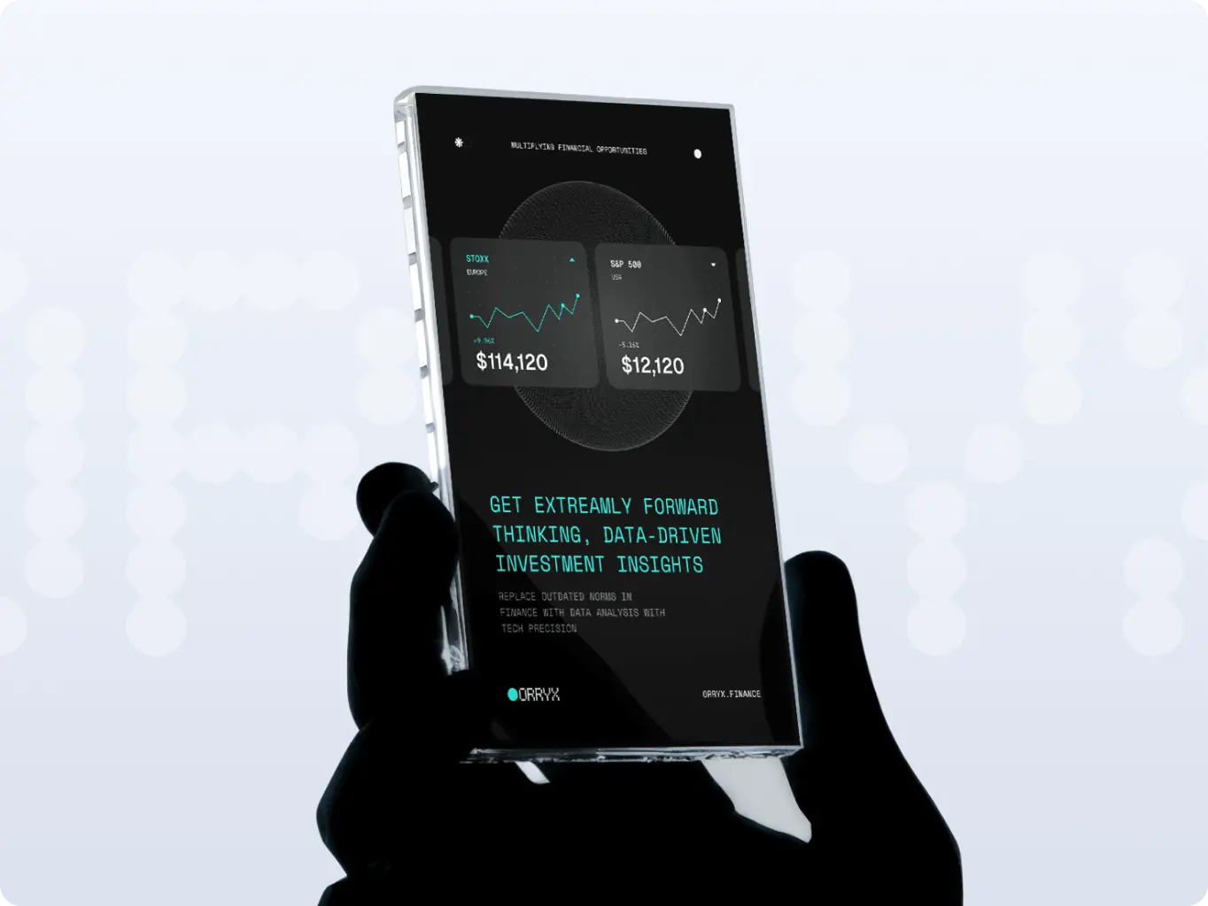
The new visual identity transformed complex fintech data into clear, engaging touchpoints. By introducing a dot-matrix system and bold digital aesthetics, we made ORRYX interactions more intuitive and appealing for its audience.

Stronger brand trust

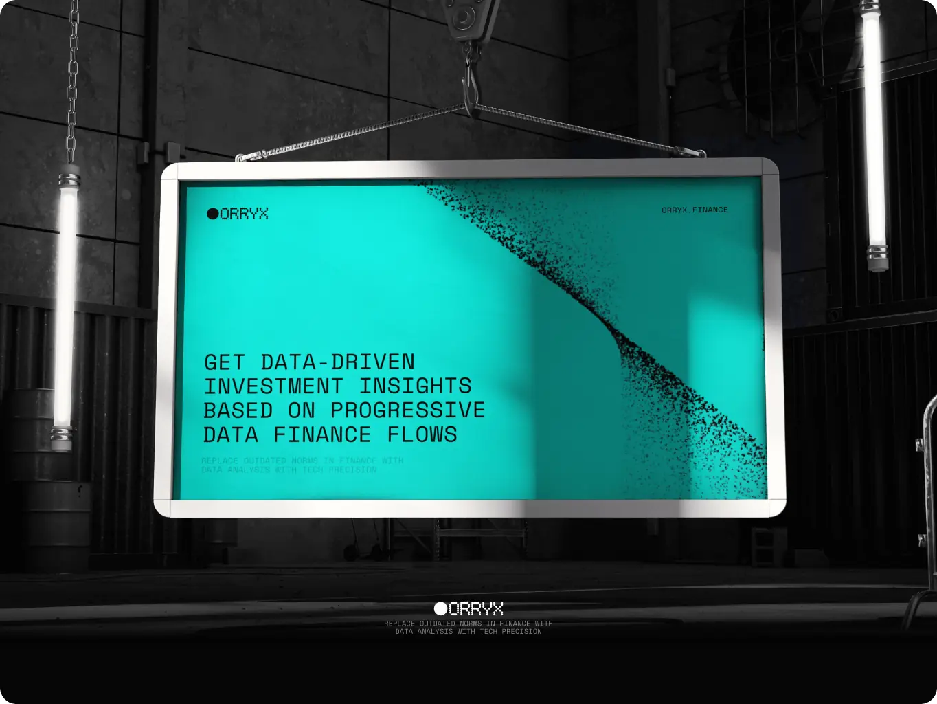
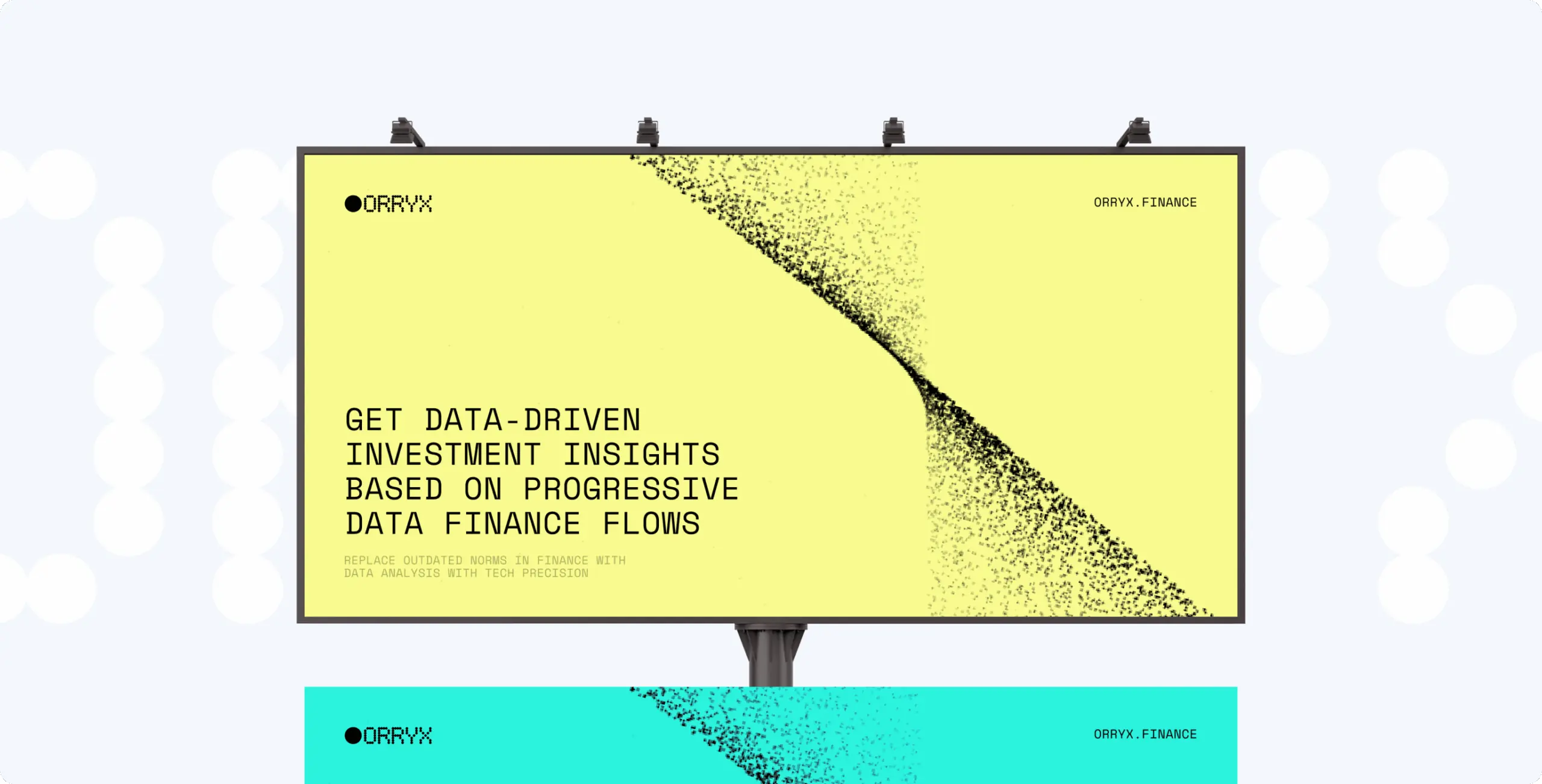
Consistency across assets: from digital dashboards to outdoor ads, we built a reliable brand image. The precise, data-driven design system helped us to represent credibility and help users feel confident engaging with the platform.

Market differentiation

By challenging outdated norms in finance with a futuristic, disruptive look, we helped ORRYX position itself as a bold alternative to traditional fintech players. This unique brand voice now resonates with a younger, innovation-driven demographic.

Overview
Turning complex financial data into clear investment opportunities

ORRYX is a radical fintech startup challenging outdated norms in the financial industry. Focused on delivering forward-thinking, data-driven investment insights, the company needed a brand identity that would reflect its disruptive vision while remaining trustworthy to a wide audience.

Our task was to build a bold, future-oriented brand system, the one that communicates precision, innovation, and confidence, while making complex financial data both clear and engaging.

Client
Orryx Icon - fi_4628635 (4)USA
Services
Business needs
Client request & business goals

As a fast-growing fintech startup, ORRYX set out to disrupt outdated financial norms and offer a bold alternative to traditional investment platforms. Their goal was to build a brand identity that would reflect their data-driven approach, communicate precision and trust, and connect with a younger, innovation-oriented audience.

The client asked us to create a visual and verbal system that could scale across digital dashboards, marketing, merchandise, and outdoor campaigns, ensuring consistency while keeping the brand dynamic, disruptive, and future-focused.

Challenge
Challenges & solutions
Challenge
Finance platforms often feel outdated and overloaded with complexity, making it hard for users to engage with confidence.
Solution
We built a bold, futuristic identity powered by a scalable visual system that translates complex data into clear, intuitive brand expressions.
Challenge
Lack of trust and recognition is a major barrier for fintech startups entering a competitive market.
Solution
From digital assets to outdoor campaigns, we established a brand language that communicates precision, reliability, and authority.
Challenge
ORRYX needed to stand out from traditional players and connect with a younger, innovation-driven demographic.
Solution
We positioned ORRYX as a radical fintech challenger, combining vibrant digital aesthetics with disruptive messaging to resonate with a new generation of investors.
Icon - process-1
Wondering about the price? We’ll help you find the best solution!
Branding stages
How we shaped a radical fintech identity through design stages

To bring ORRYX’s disruptive vision to life, we structured the process into clear design stages. Each step, from defining the logo and typography to building brand assets and consistency tools, ensured the identity was not only visually striking, but also scalable and future-proof.

Stages

  • logo design
  • colors & typography
  • brand assets
  • brand guidelines
Orryx – rewriting the rules of finance - Website Development - Photo 5
Stage 1
Logo design

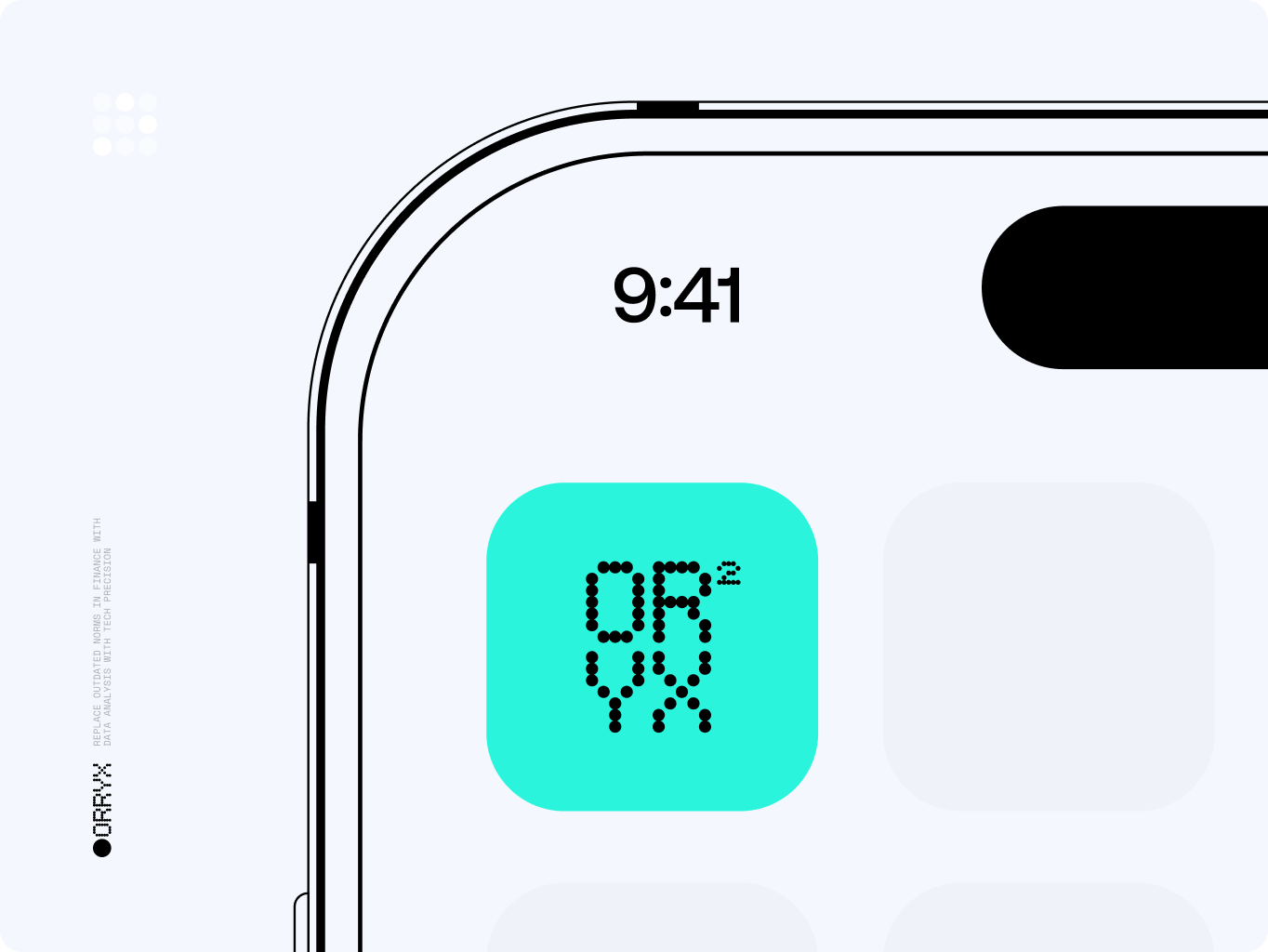
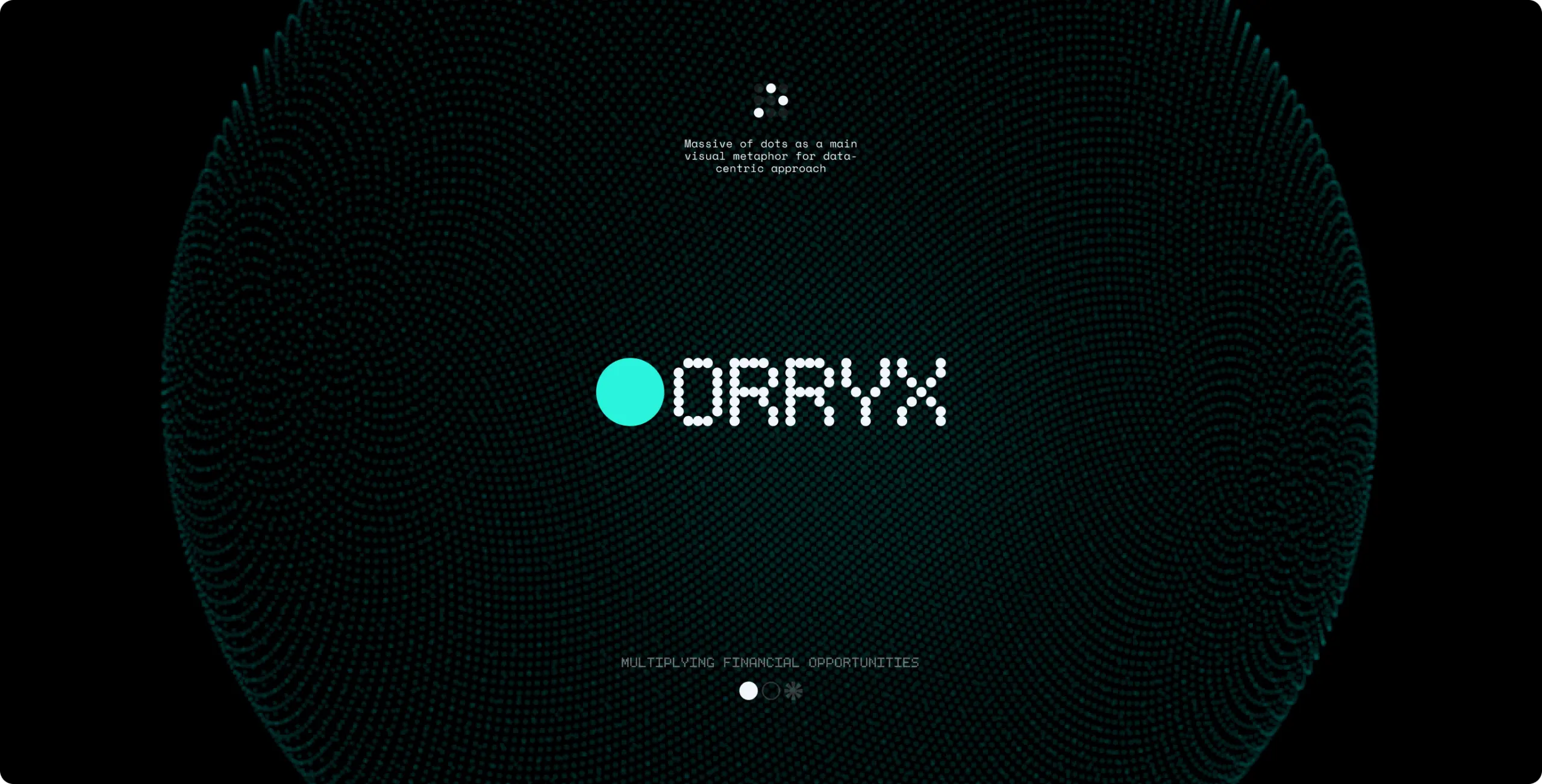
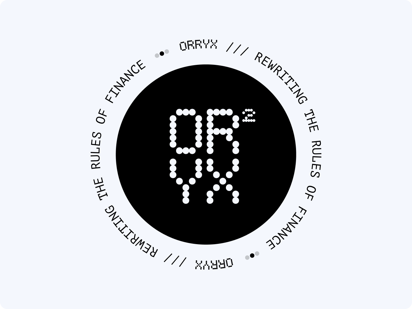
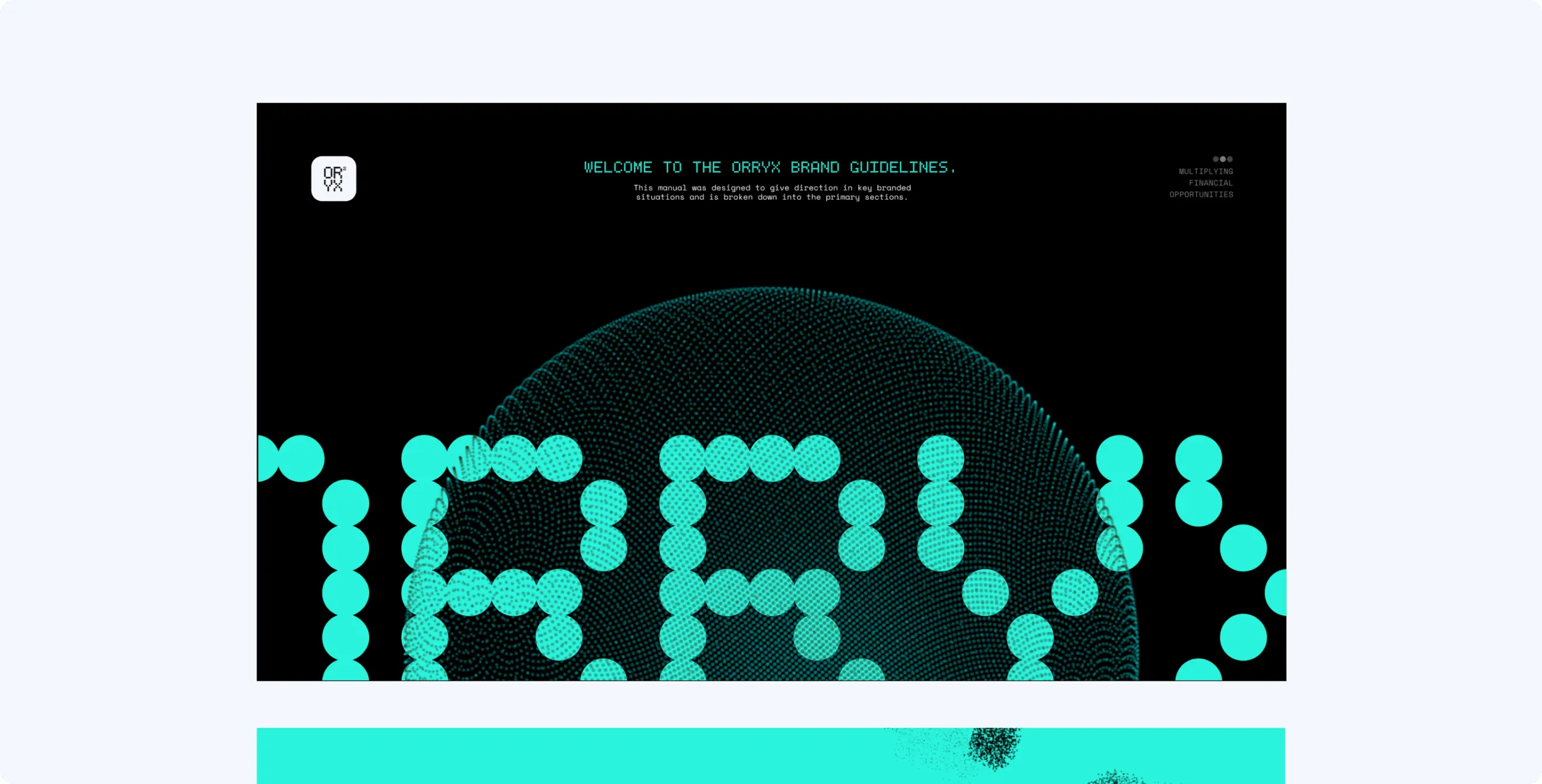
The ORRYX logo was built on a dot-matrix system, turning data itself into a visual identity. This structure clearly represents precision, scalability, and connectivity — the very qualities that define the platform’s fintech approach.

By using a circular structure, the logo becomes both futuristic and stable, symbolizing ORRYX’s mission to rewrite the rules of finance while staying trustworthy. The result is a bold mark that instantly conveys innovation and data-driven clarity.

Orryx – rewriting the rules of finance - Website Development - Photo 6
Stage 2
Colors & typography

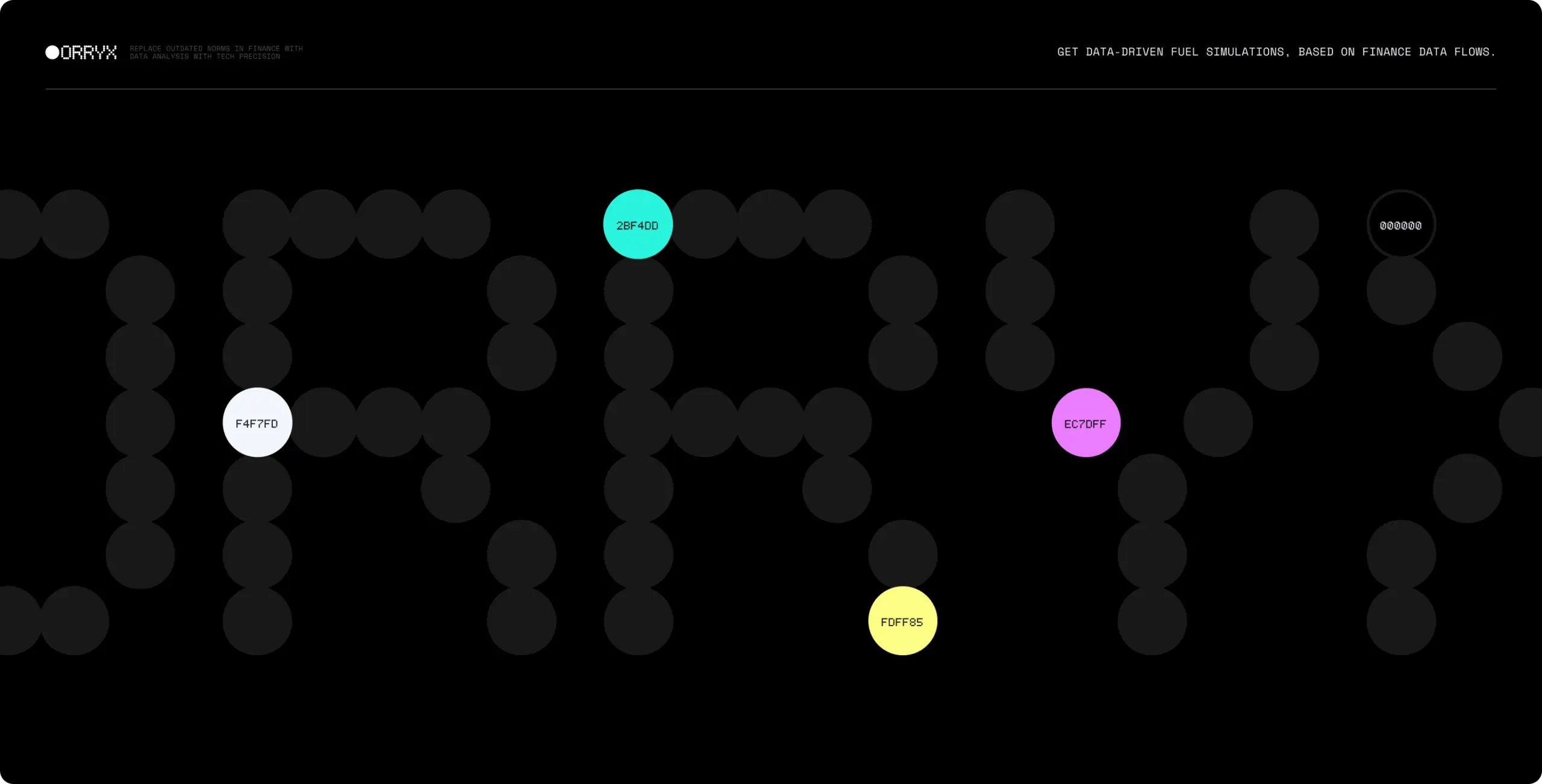
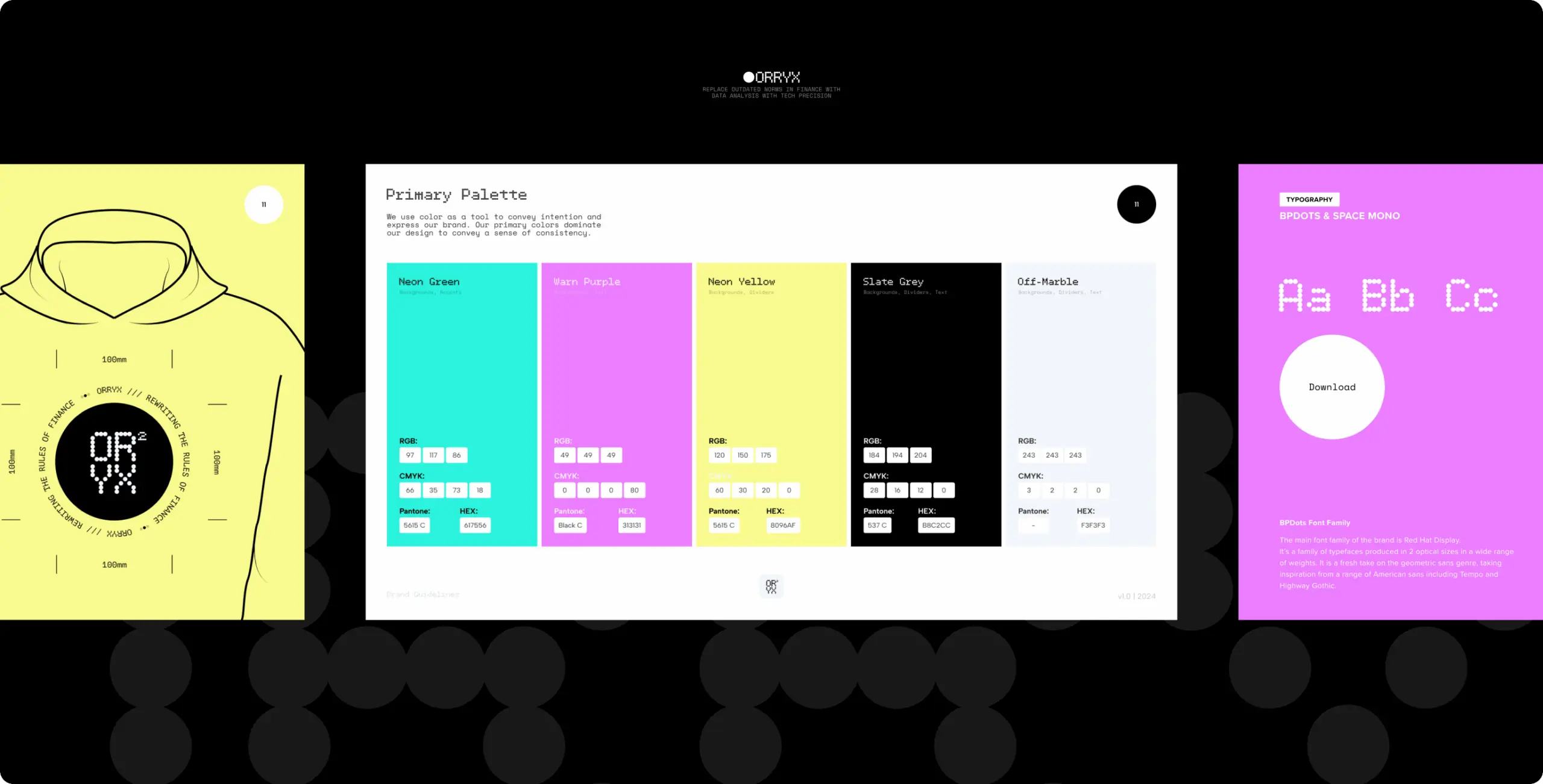
We built the visual system that combines bold digital-neon accents with high-contrast black and white, creating an aesthetic that feels both futuristic and precise. Each color, from electric cyan to vibrant magenta and yellow, reflects energy, disruption, and the dynamic nature of financial flows.

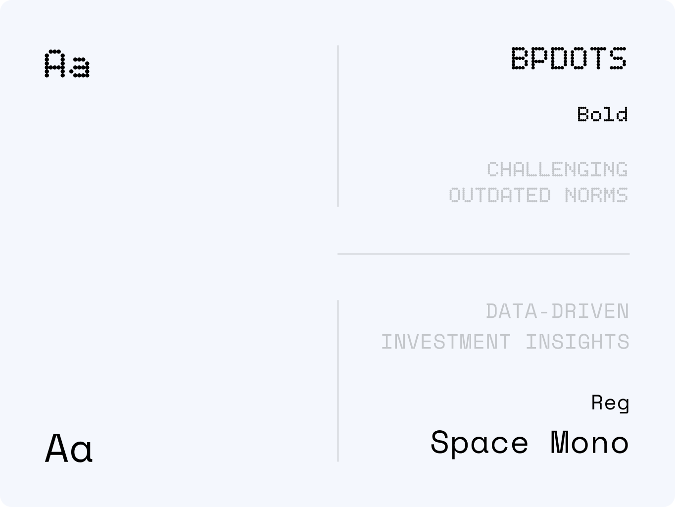
Typography blends BPDots, echoing the dot-matrix identity, with Space Mono, a typeface chosen for its technical clarity and trustworthiness. Together, they balance disruption with reliability, giving ORRYX a voice that feels radical yet credible.

Orryx – rewriting the rules of finance - Website Development - Photo 10
Stage 3
Brand assets

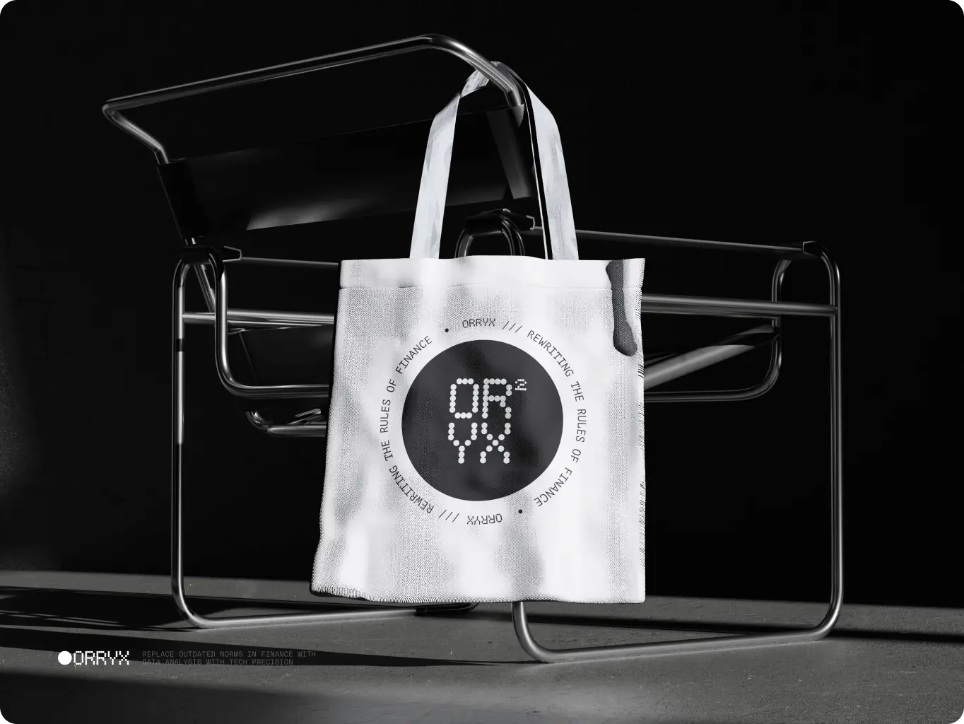
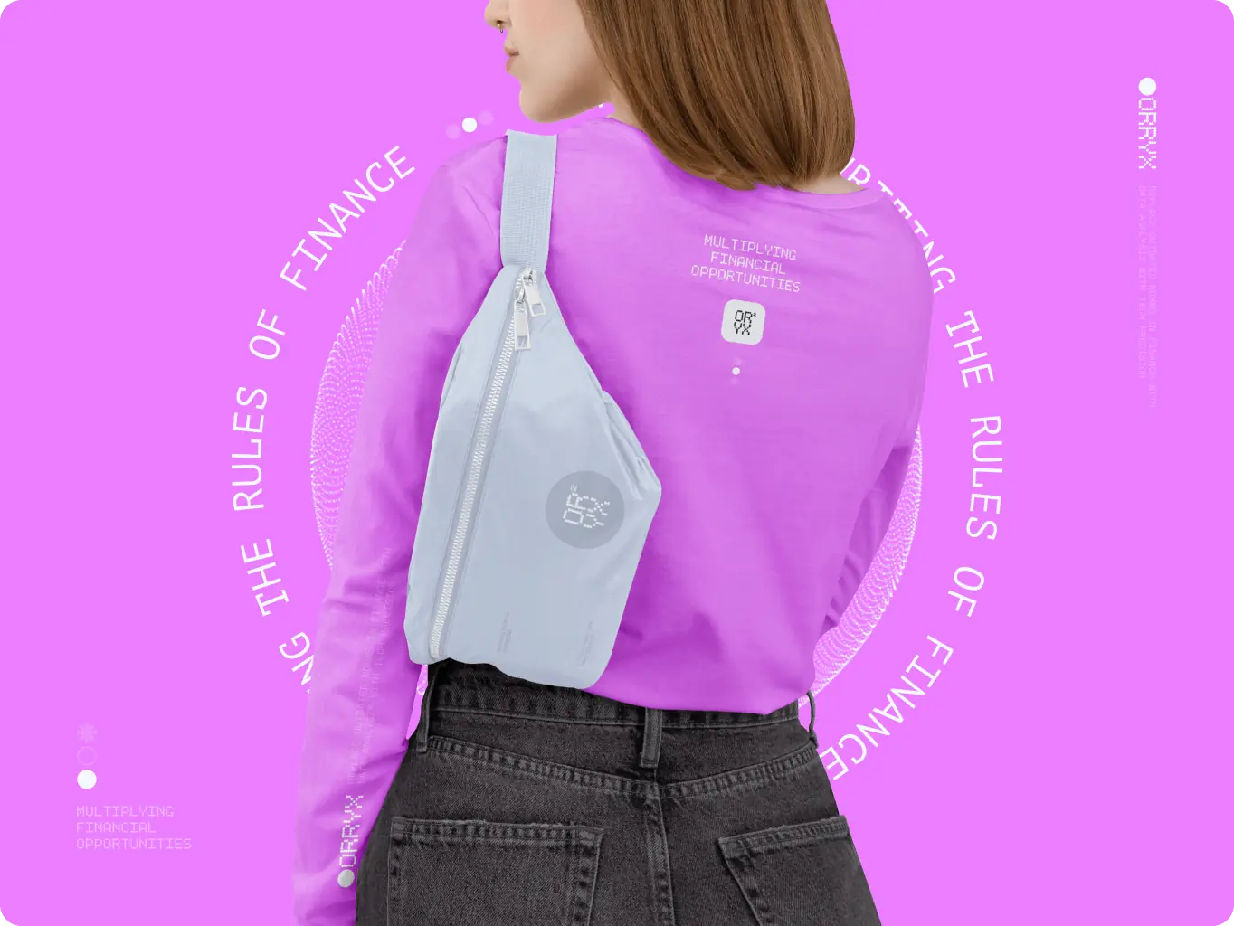
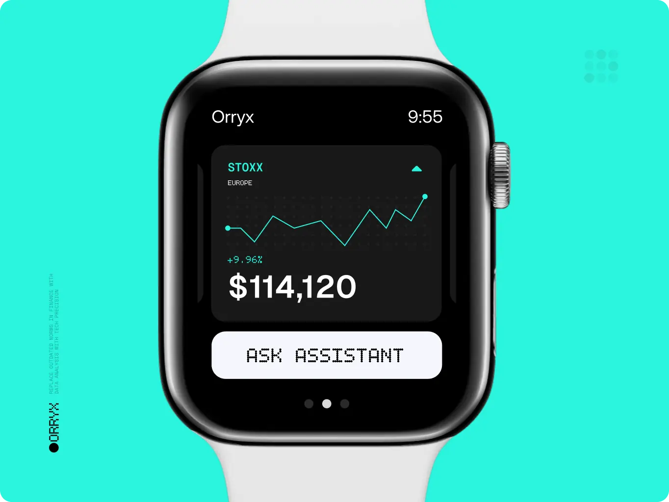
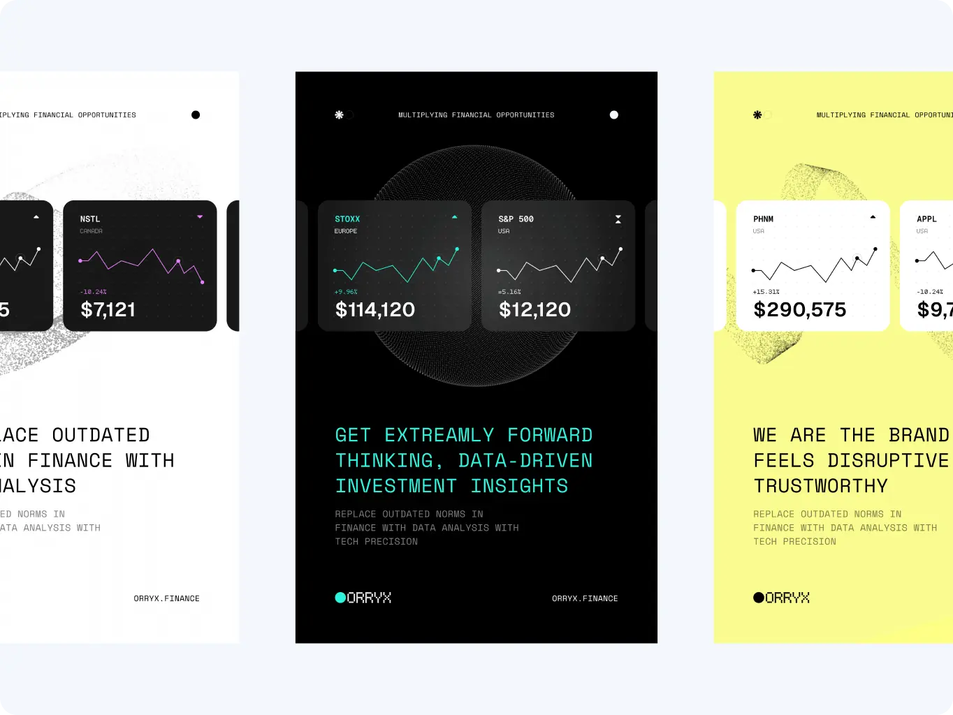
To make ORRYX’s disruptive identity truly scalable, we extended the brand system across every medium, from merchandise and wearables to digital dashboards, outdoor advertising, and marketing campaigns. Each application reinforces the same data-centric language, ensuring clarity and recognition no matter the channel.

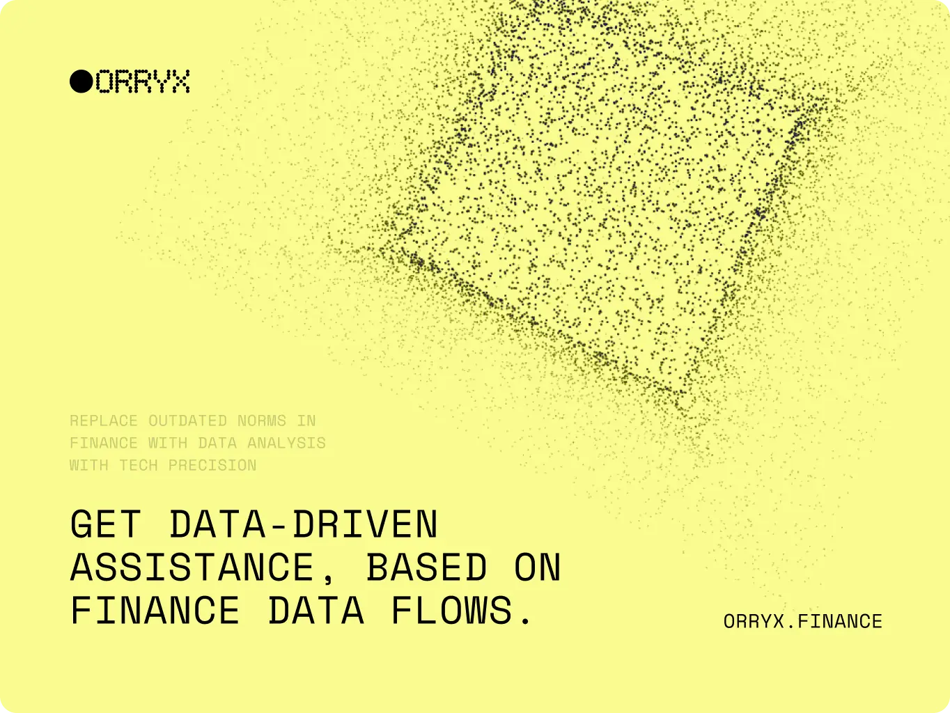
A key part of this stage was the creation of the Assets Generation Tool v.001 — a custom software that empowers ORRYX to generate an endless variety of supportive brand visuals. Built on the dot-matrix system, the tool allows precise control over shape, scale, color, and motion. This guarantees consistency across all assets while giving the brand room to evolve dynamically.

The result is a cohesive ecosystem where every touchpoint, whether on a smartwatch, billboard, or digital feed — feels unified, future-proof, and unmistakably ORRYX.

Icon - process-1
Wondering about the price? We’ll help you find the best solution!
Stage 4
Brand guidelines

To ensure long-term consistency, we created a comprehensive set of brand guidelines. The system defines how ORRYX’s dot-matrix identity, color palette, typography, and generative visuals come together across digital, print, and physical touchpoints.

The guidelines serve as a practical toolkit for the client’s team — making it easy to scale the brand across new platforms, campaigns, and markets while preserving its disruptive yet trustworthy character.

Orryx – rewriting the rules of finance - Website Development - Photo 16
Orryx – rewriting the rules of finance - Website Development - Photo 17
Icon - process-1
Wondering about the price? We’ll help you find the best solution!
Rusults
Reshaped ORRYX connection with its target audience
Enhanced user experience

The new identity turned complex fintech data into clear, engaging visuals, making the platform more accessible and intuitive.

Stronger brand trust

Consistent design across all touchpoints built credibility and positioned ORRYX as a reliable player in the disruptive fintech space.

Market differentiation

The radical, data-centric identity helped ORRYX stand out from traditional competitors and connect with a younger, innovation-driven audience.

The new branding gave ORRYX more than just a fresh look — it created a scalable ecosystem for growth. With a clear visual language, generative design tools, and comprehensive guidelines, the brand can adapt seamlessly across digital products, marketing campaigns, merchandise, and large-scale media.

This consistency built trust and recognition, while the bold, data-centric identity positioned ORRYX as a true disruptor in the fintech space. Today, ORRYX speaks to its audience with clarity, confidence, and vision — turning complex financial insights into engaging experiences and multiplying opportunities for the future.

We were tasked with an exciting brief to build an immersive experience that reflects the innovative nature of slope solutions.

More cases
We have dozens of products & hundreds of websites developed by our studio. We're happy to share the results with you!

#ux audit #Product redesign #web development

AirlineSim — realistic online airline management simulation
Airline sim Image - de-circle-01.pngGermany
Tech Stack

Vite, React, Typescript, SCSS, Framer motion, React Router, Redux

Timeline

5 month

Results

Faster time-to-market

Built with scalability in mind

Deeper engagement

#branding

Scrambly – rewarded discovery platform for games and apps
Scrambly Icon - imageItaly
Results

Clearer brand positioning

Consistent visual system

Improved market perception

Image - Rectangle 34624328 (2)

Illia Frantsevskyi

CTO & Co-Founder

They demonstrated a high level of expertise and efficiency in every phase of the project.

#Website design #Website development

Pretty Patty: a deliciously interactive fast food experience
Pretty patty Icon - image (2)Switzerland
Results

Brand alignment & vibrant design

Improved сonversion opportunities

Customer-centric approach

Image - image (15)

Adrian Smith

Co-Founder, PRETTY PATTY

They always respected deadlines, were super reactive, and were super helpful.

Contact us

Have a project in mind?
Let's chat

Your Name

Enter your name *

Your Email

Enter your email *

Message

Tell us about your project

You can upload maximum 5 files
Some of your file not loaded, because maximum file size - 5 mb
Your budget for this project?

By clicking this button you accept Terms of Service and
Privacy Policy

Icon - launch
Thanks for taking time to reachout!
Stay connected with us by subscribing to our LinkedIn account. By following, you’l be the first to hear about our latest updates, news, and exciting development. We look forward to sharing our journey with you!
Icon - launch
Thanks for taking time to reachout!
We’d love to hear more about your project! Feel free to schedule a call using the link provided. This will help us better understand your vision and ensure we’re aligned on all the details.
Have a project to
discuss?
Image - ksenia
Kseniia Shalia
Account Executive
Have a partnership in
mind?
Image - polina
Polina Chebanova
Co-Founder & CPO