Design
Development
Research
Launch
Evolve
Extend
MyWisdom — a digital platform for safer, more connected aging
Client
MyWisdom
 USA
USA
USA
Services
Technologies
 Flutter
 Java
Java
 Spring Boot
 Python
 WebSocket
 Computer Vision
 AWS
AWS
 PostgreSQL
 Redis
Redis
 Docker
 Swagger
 Liquibase
UX Design Awards - Nomination 2026

The client asked us to redesign the mobile part of their existing care platform. Their goal was to make the experience easier for older users and more reliable for families. The new design needed to feel calm, clear, and trustworthy — without changing how the system works underneath.

We began by reviewing the existing app and comparing it to four popular monitoring tools. This helped us identify common UX issues, missing patterns, and features users struggled with. We focused on how people interact with care platforms during everyday use – not just ideal conditions.
We also explored accessibility guidelines and emotional triggers for both older adults and caregivers. These insights shaped the tone of the new interface: calm, focused, and easy to understand for people of different ages and tech skills.
We analyzed four products — Ring, AlfredCamera, Faceter, and Camy — to understand how existing platforms approach remote monitoring. Our focus was on user roles, interface clarity, accessibility, and how well these tools support everyday caregiving tasks.
The biggest insight: most platforms are built around property protection, not people. They offer strong technical features, but often overlook the needs of older users and their families. This helped us define a clear direction for MyWisdom — less about surveillance, more about support and ease of use.
We started with a moodboard to align on tone, color, and visual style. Once the direction felt right, we explored several design concepts to test structure, rhythm, and interaction patterns.
After final approval, we moved into detailed UI work — building out screens, refining components, and creating a system that feels calm, supportive, and easy to navigate.
Stages
- Moodboard
- Design Concept
- UI Design
- Usability testing
To set the right visual tone, we created several moodboards exploring color, typography, and interface references. Each option focused on a different emotion — from clinical clarity to friendly warmth. This helped us visualize how the product should feel before making any design decisions.
Together with the client, we chose a direction that feels calm, balanced, and easy on the eyes. Soft contrasts, rounded shapes, and muted tones became the foundation for a visual language that supports trust and reduces stress during everyday use.
With the moodboard approved, we moved into concept design. Our goal was to explore how the chosen style works across key screens — alerts, camera views, wellness check-ins. We tested different layouts, touch targets, and flows to see what feels intuitive for both older adults and caregivers.
These early concepts helped us define the structure of the app. We focused on reducing noise, guiding attention, and making space for moments that require quick action or emotional clarity.
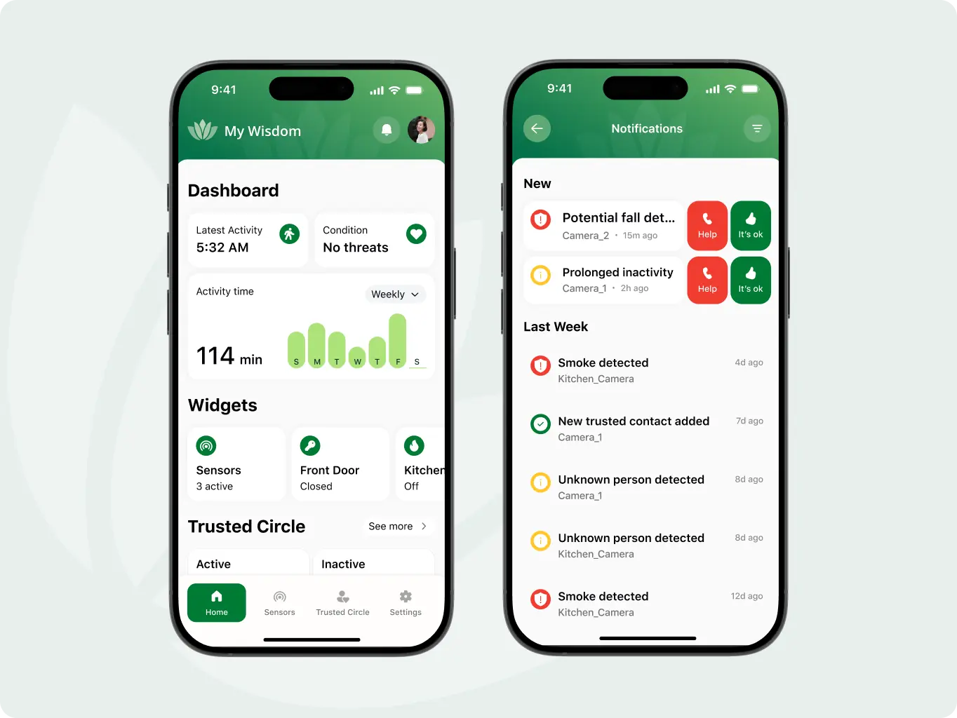
Once the core structure was in place, we focused on building a clear, accessible interface for both user roles. We created layouts with generous spacing, simple icons, and readable typography to support older adults, while giving caregivers quick access to key information.
Every detail was refined to reduce cognitive load. From colour states to button hierarchy, we aimed to create an interface that feels quiet, focused, and reliable — especially in moments when users need to act without hesitation.
We conducted usability testing with older adults and family caregivers from our target audience. Each participant was asked to complete three key tasks: adjust readability settings, send an invitation to the trusted circle, and deactivate a specific sensor in the bedroom.
The sessions showed that users were able to complete each flow without confusion. The interface felt easy to navigate, even for those with limited experience. This confirmed that the design is clear, approachable, and ready to support real-life use.
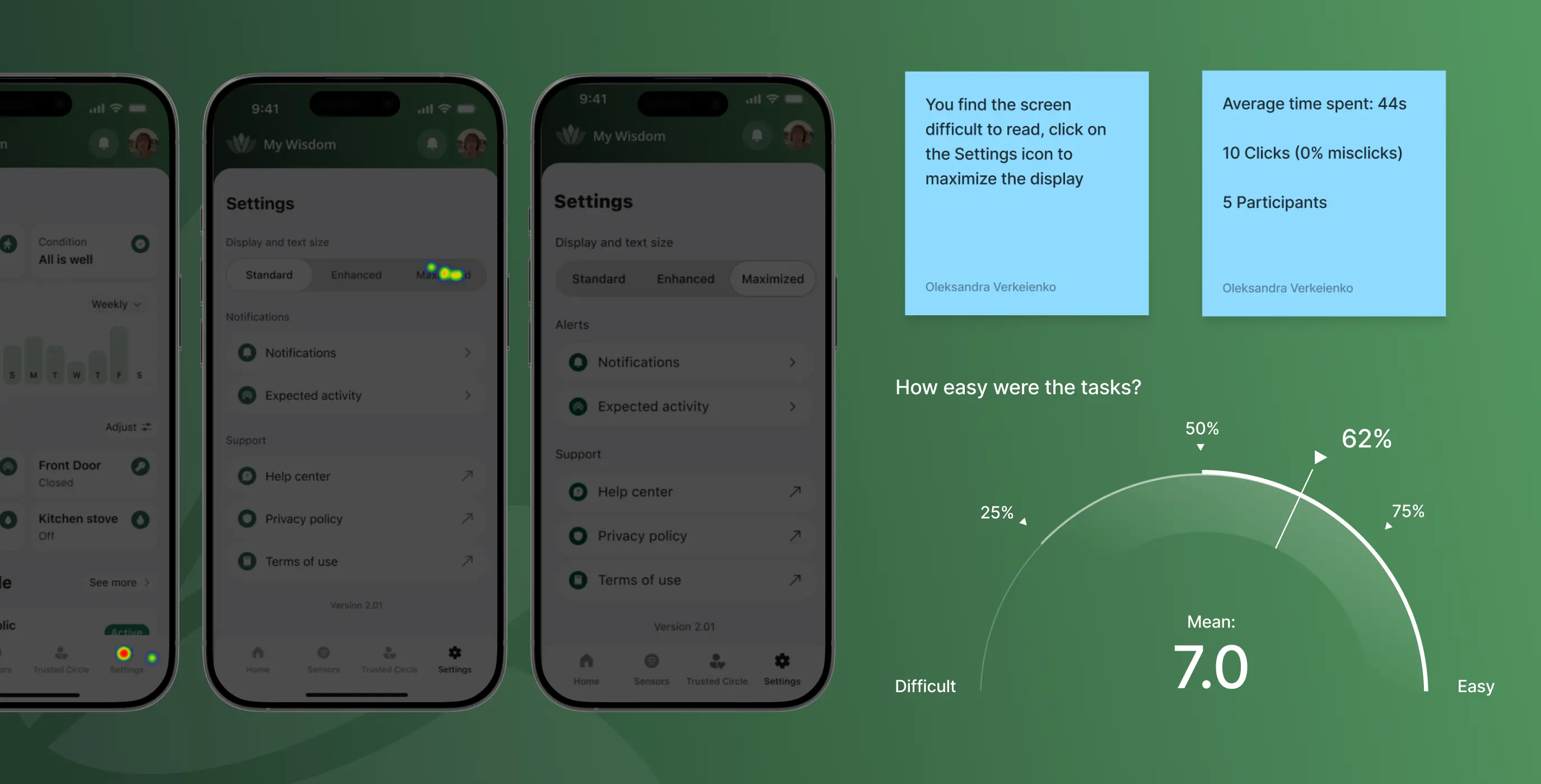
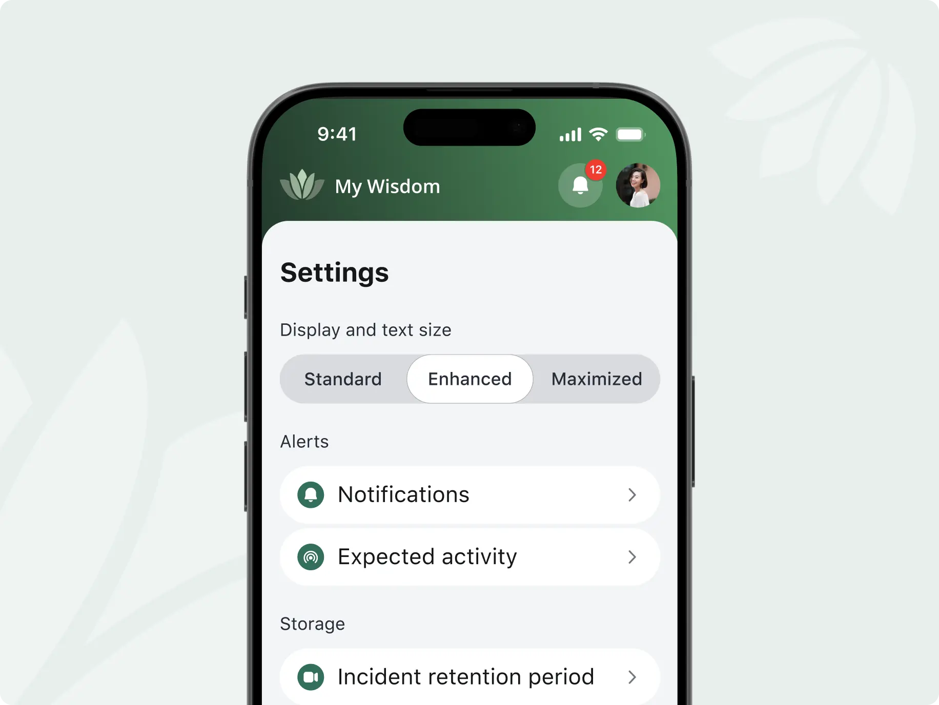

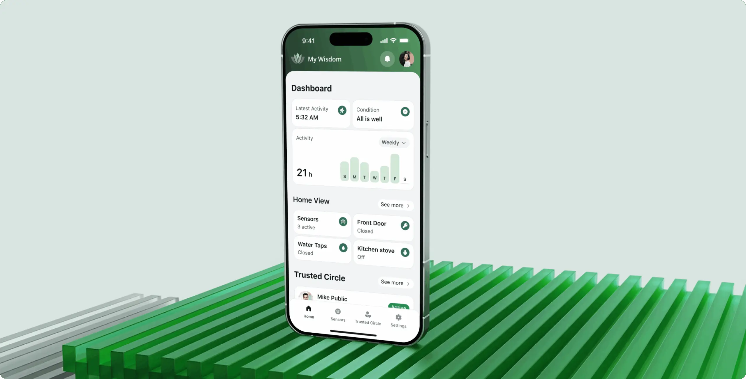
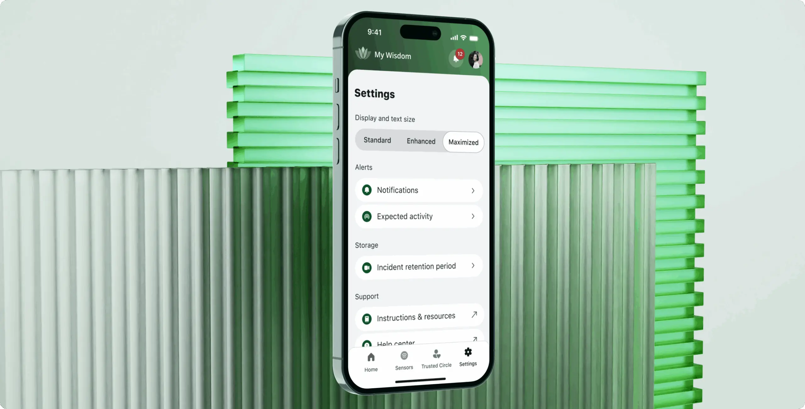
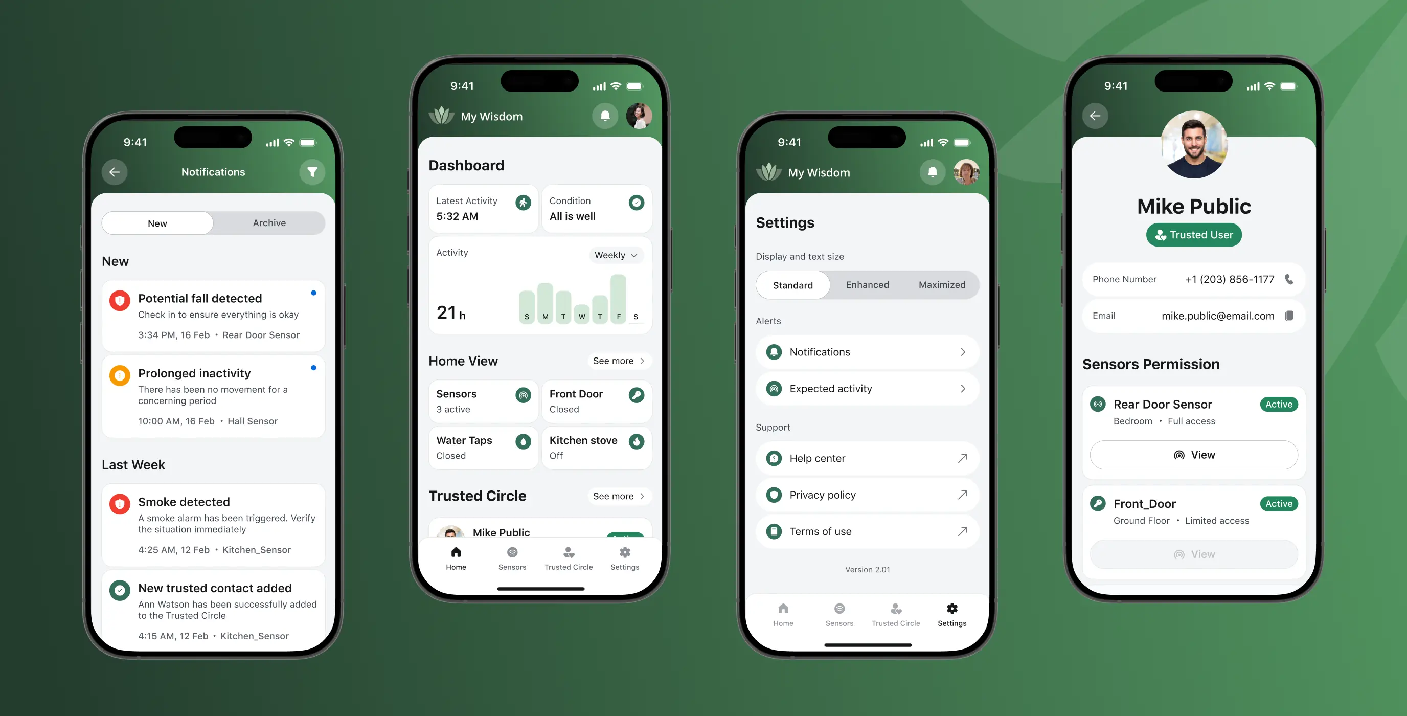
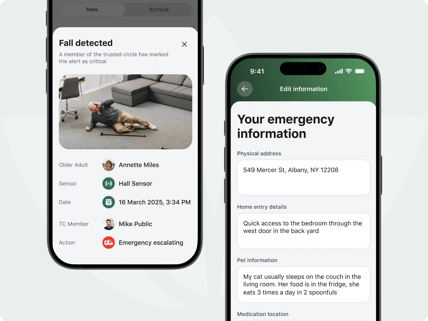
Accessibility settings
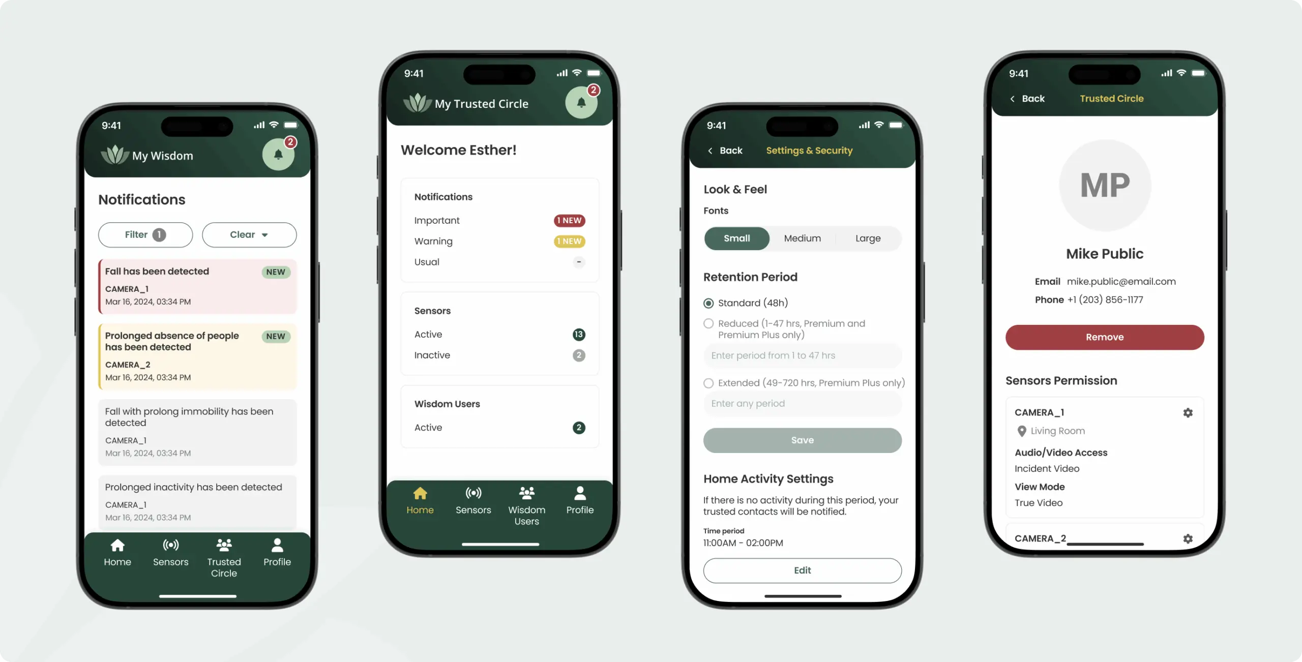
Older adults can adjust text size, contrast, and visual settings to match their needs. These options are easy to find and help make the app more usable for people with different abilities.
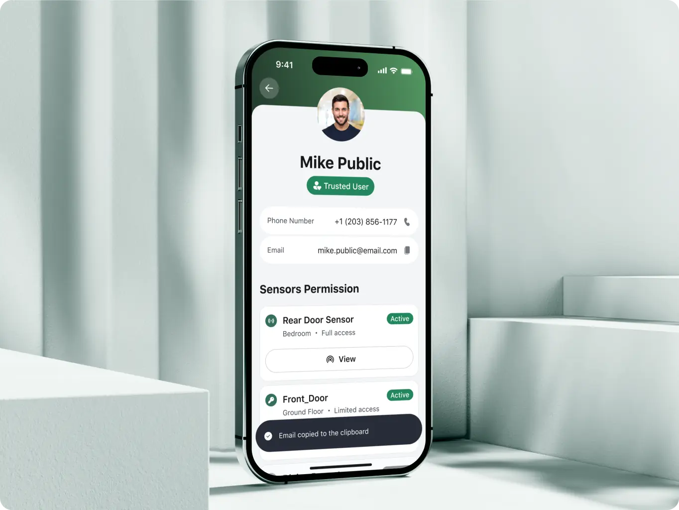
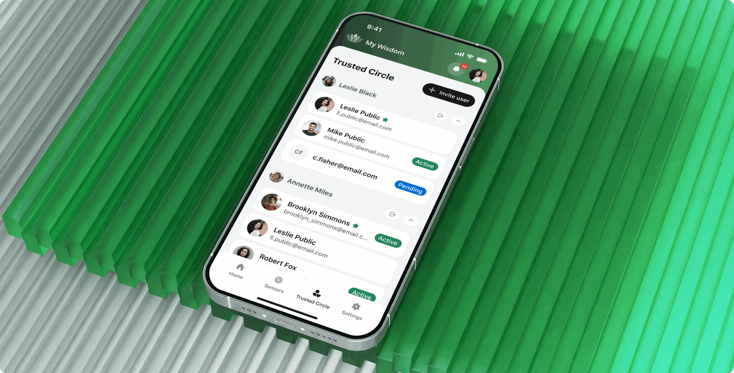
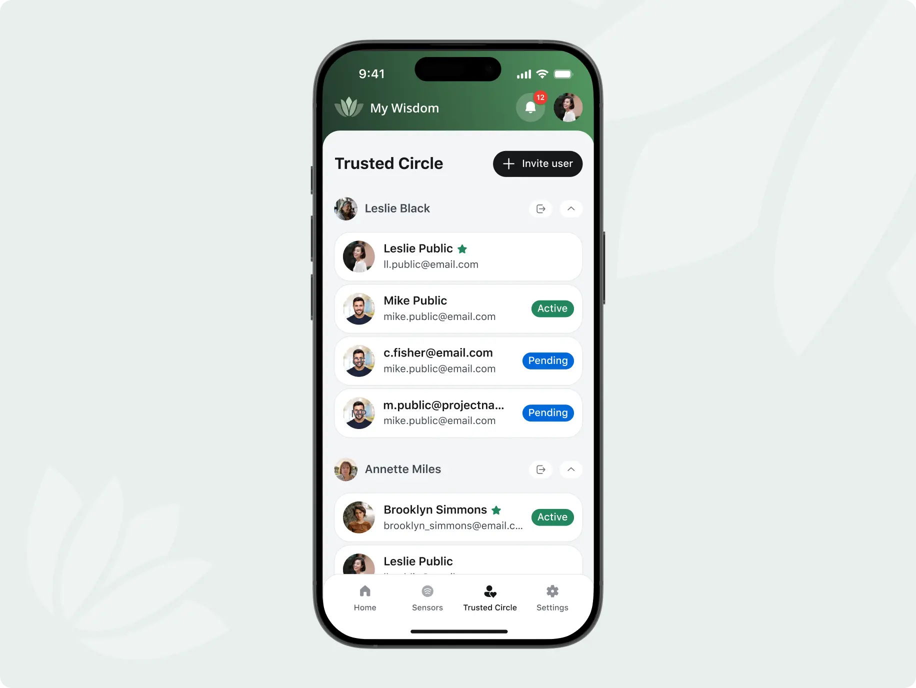
Trusted circle management
Each older adult can build a circle of trusted people who help monitor their safety. The app makes it easy to invite members, assign roles, and control who gets notified in different situations.
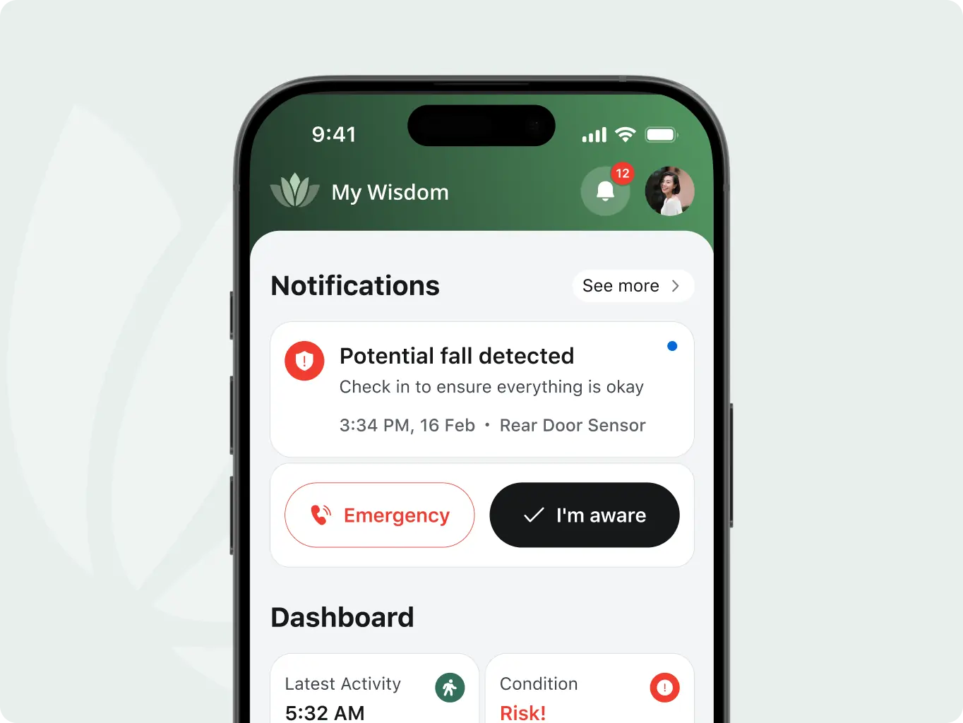
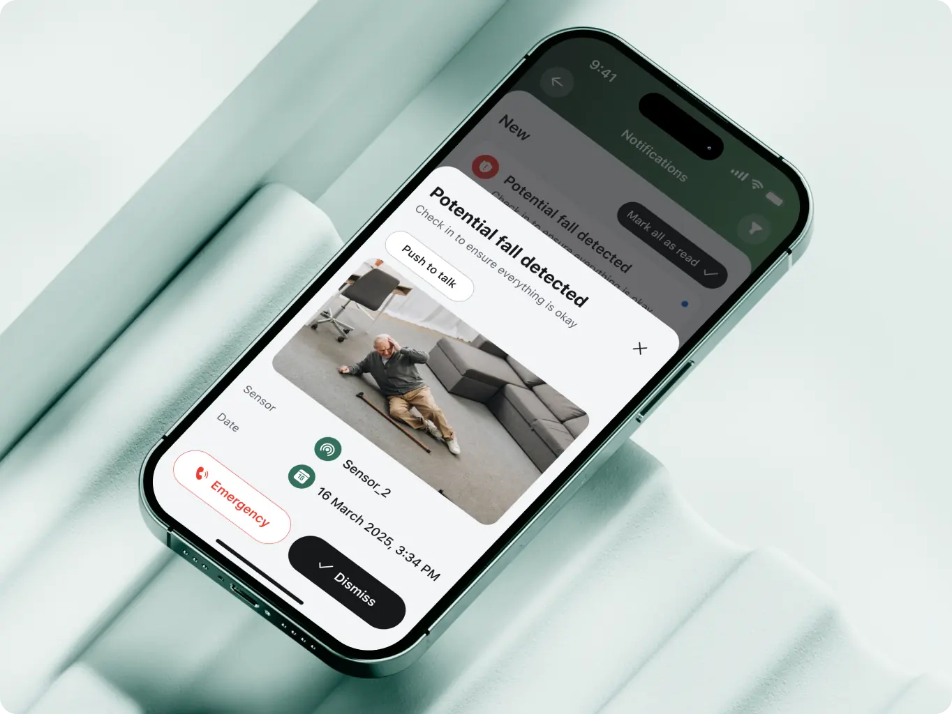
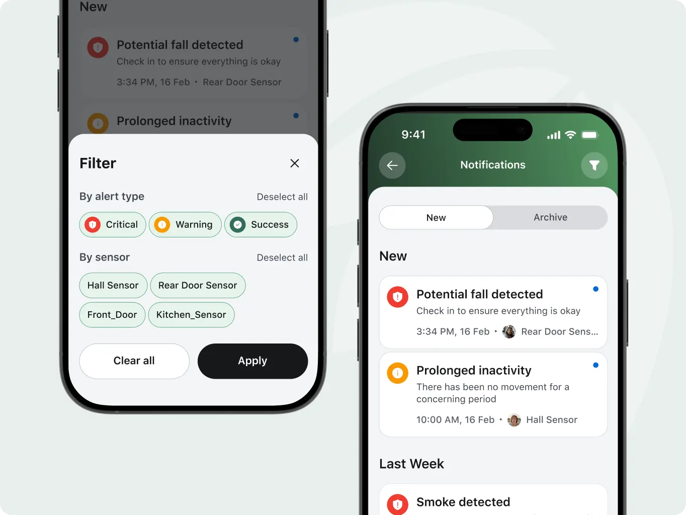
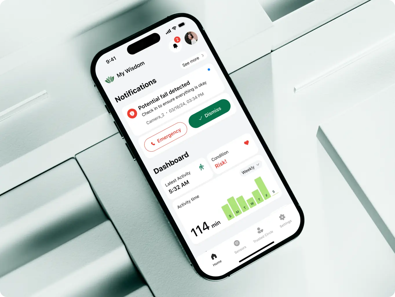
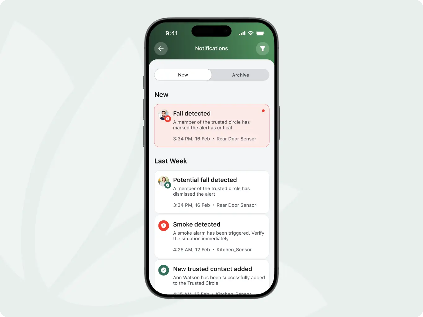
Smart alerts and escalation
The system detects unusual activity, like a fall or long silence, and sends alerts to trusted contacts. If no one responds in time, the alert can automatically escalate to emergency services.
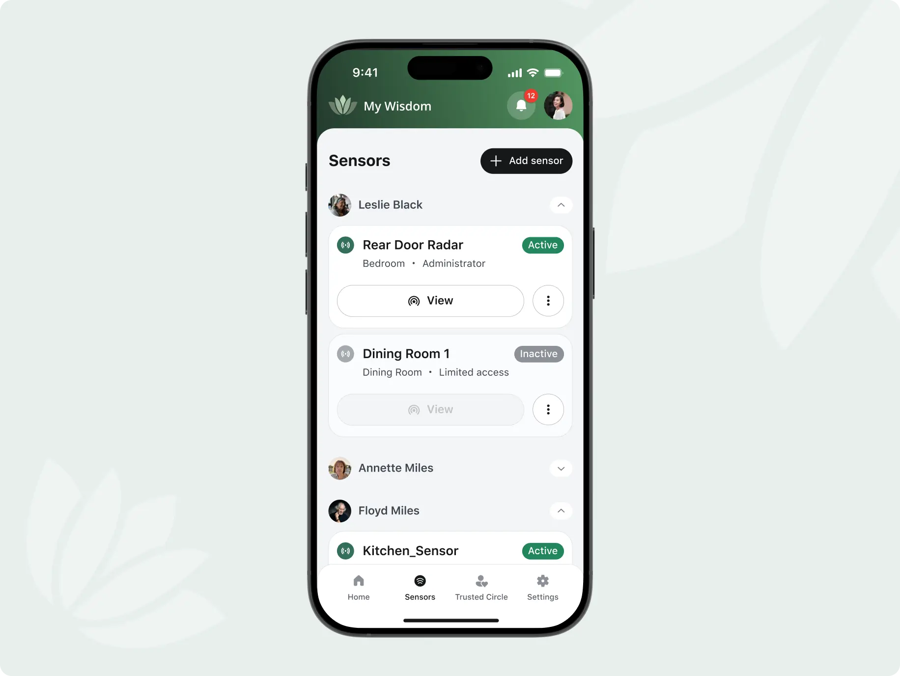
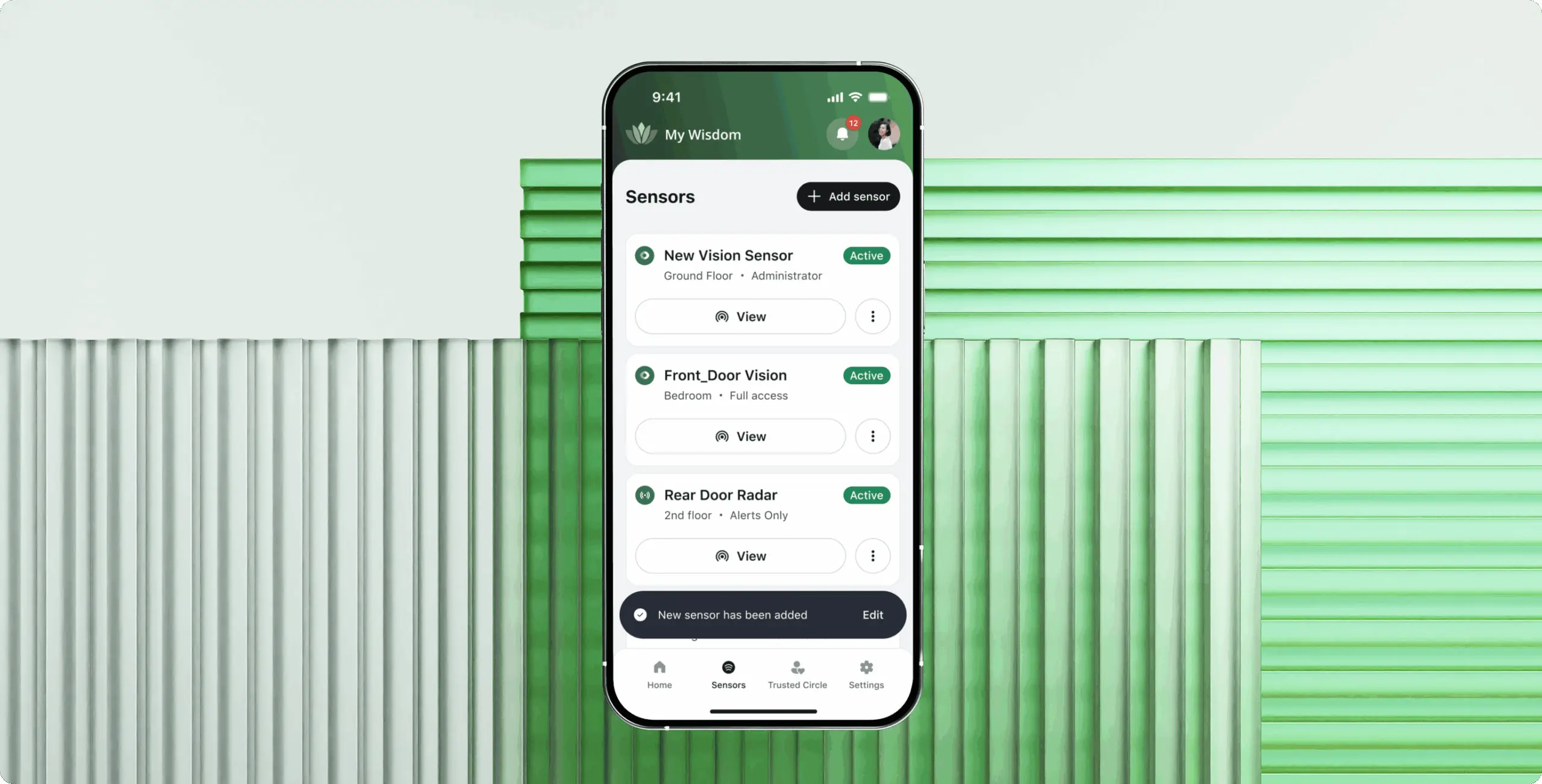
Sensor and camera control
Users can manage sensors throughout the home—activating or disabling them room by room. Camera feeds are available based on permissions, supporting safety while respecting privacy.
After completing the two-sprint redesign of MyWisdom, we were tasked with the front-end development using Flutter for a cross-platform app. Initially, we expected the back-end to be fully implemented, but we discovered that some workflows were still pending, leading to iterative redeployments and retesting.
Despite these challenges, our seamless collaboration with the original development team allowed us to quickly address issues, enhance the app’s logic, and deliver a modern, efficient solution to support families in their caregiving journey.

Flutter

Java

Spring Boot
Python
WebSocket

Computer Vision
AWS

PostgreSQL

Redis

Docker

Swagger

Liquibase
#website design
Tyler Ussery
 USA
USA
USA
#Branding
Tyler Ussery
USA
USA
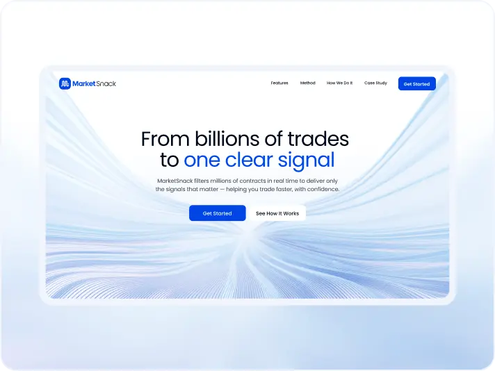
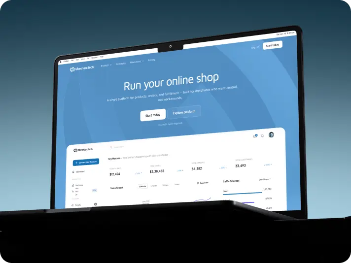
#Website redesign #Website development
marketsnack
USA
USA
Have a project in mind?
Let's chat
Have a project to
discuss?
discuss?

Have a partnership in
mind?
mind?
