Design
Development
Research
Launch
Evolve
Extend
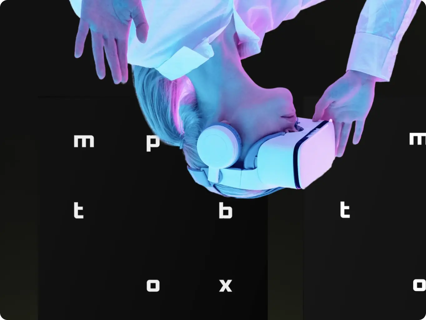
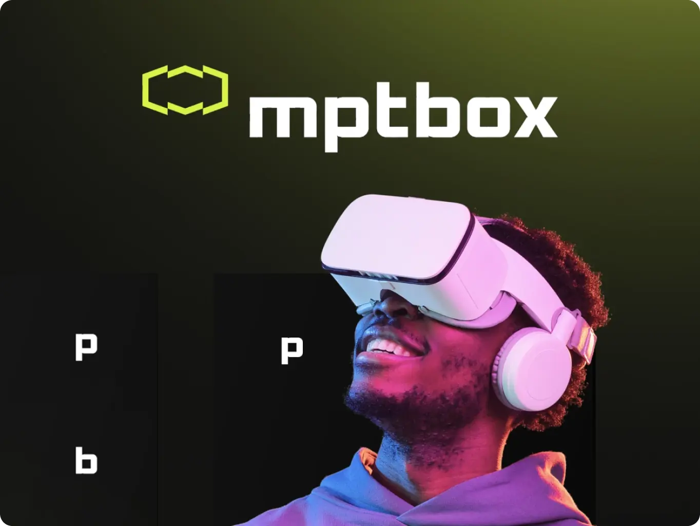
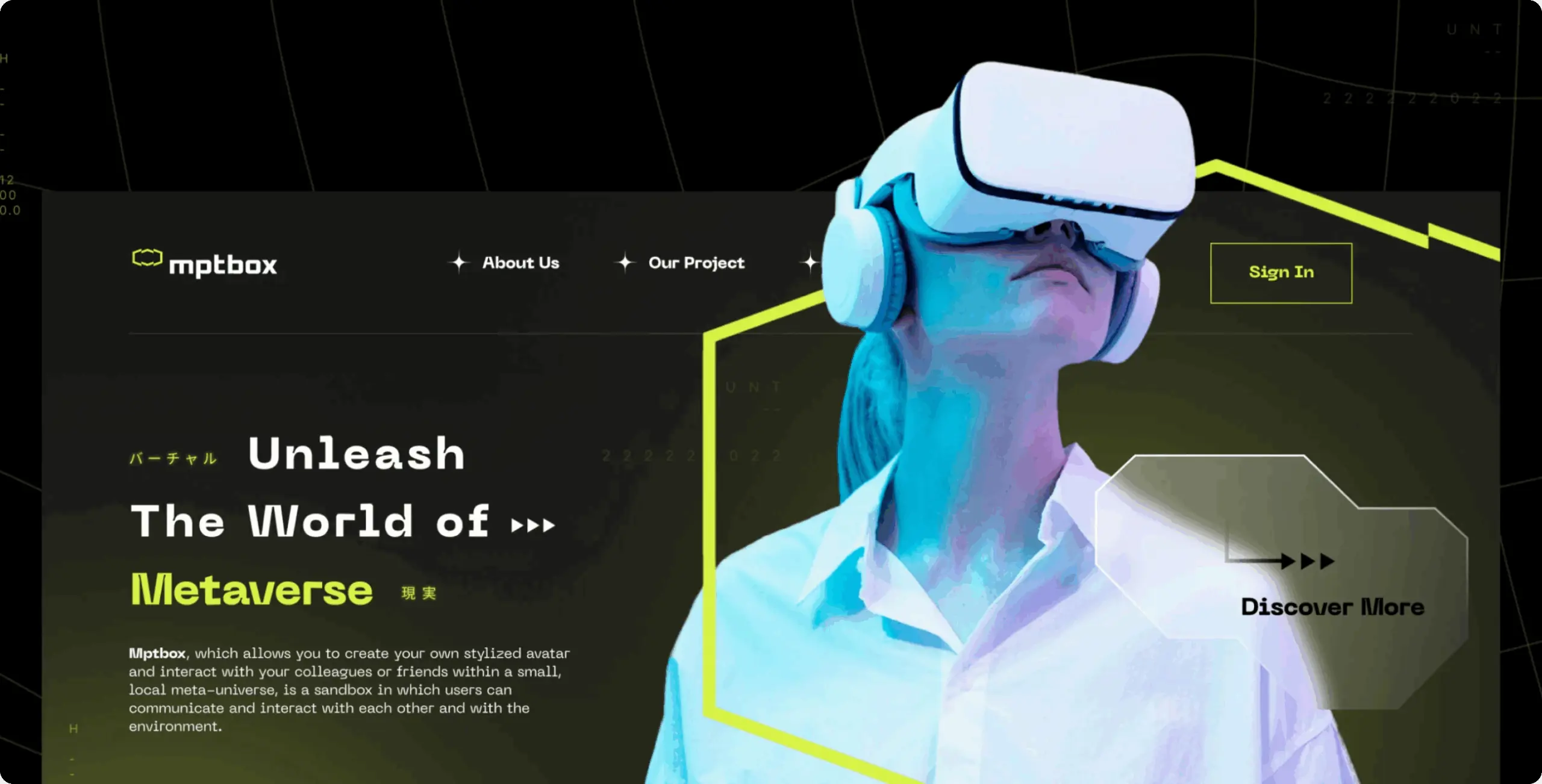
Mptbox – branding for the VR-driven metaverse
Client
Mptbox
 USA
USA
USA
Services
The main idea was to create an outstanding visual form for a VR-driven metaverse brand. As a versatile tool that allows users to communicate with each other through means never possible before, Mptbox has enormous potential in the market. Strong brand identity was a crucial in helping Mptbox stand out and attract users.
We were entrusted by Mptbox to develop a fundamental and useful brand identity, and we are thrilled to unveil the final outcome.
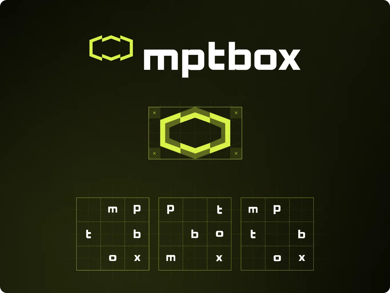
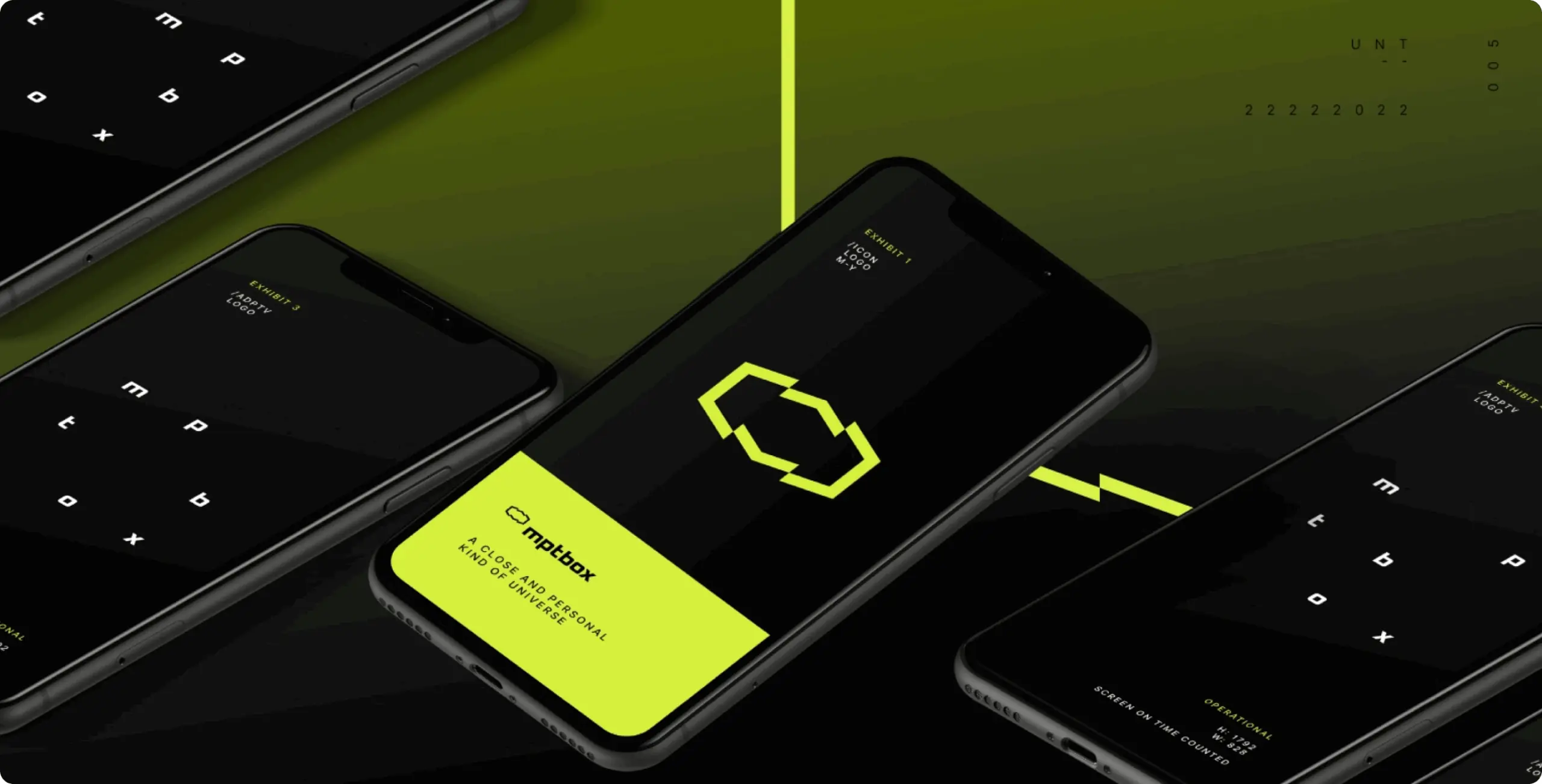
Logo idea and execution
Our goal was to create a versatile brand identity that reflects the futuristic essence of our service without resorting to cliches associated with “cyberspace.” The logo effectively conveys the connection between real and digital spaces, showcasing our innovative approach to the metaverse through a hexagonal shape inspired by the six-cornered voxel shape used in digital environments.
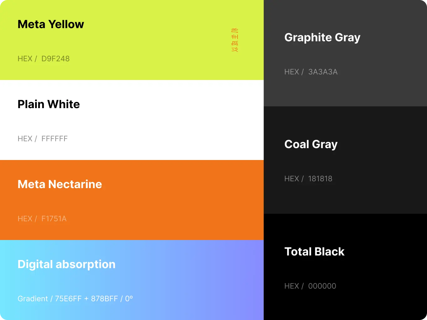
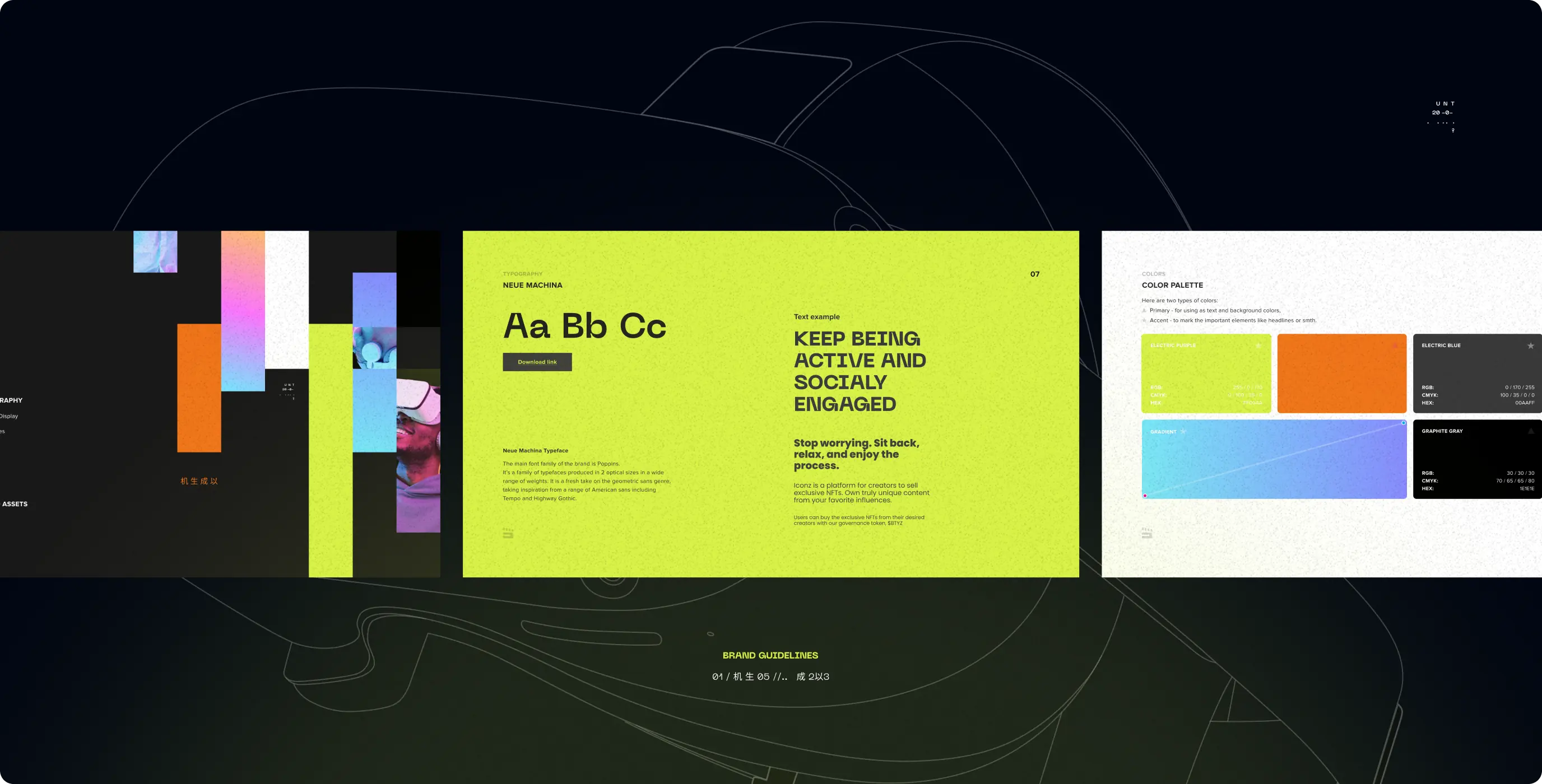
Brand colors
Color is a powerful visual instrument and a great way to communicate and enhance a brand’s message.
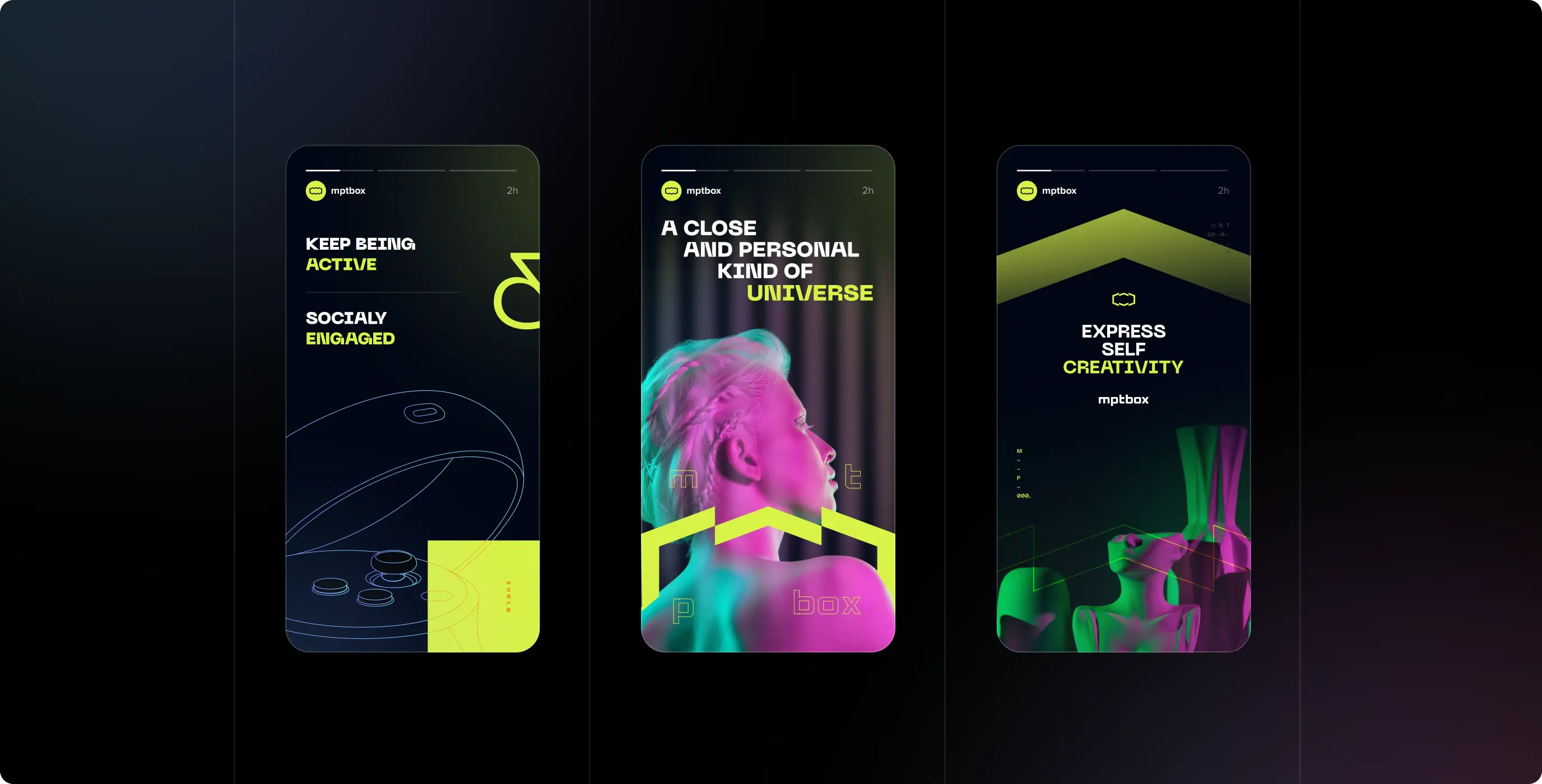
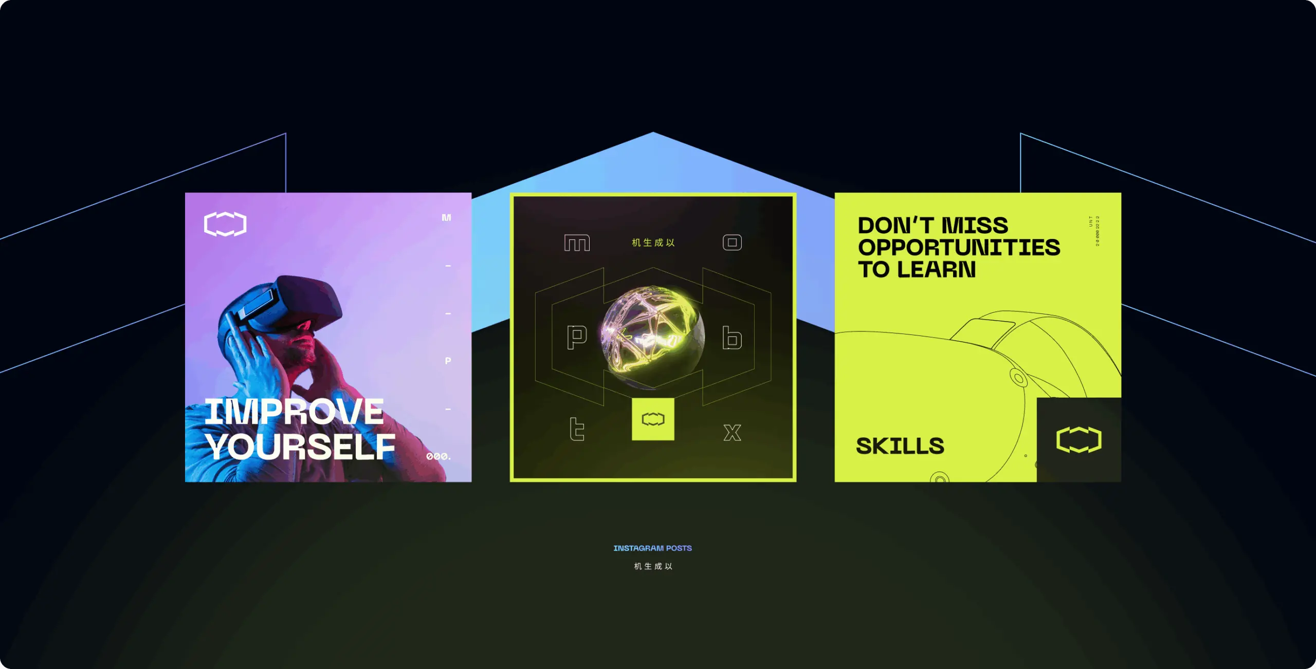
We used accents of lime and orange as a metaphor for innovation and creativity, and a blue-absorbtion gradient to convey the Mptbox digital affiliation.
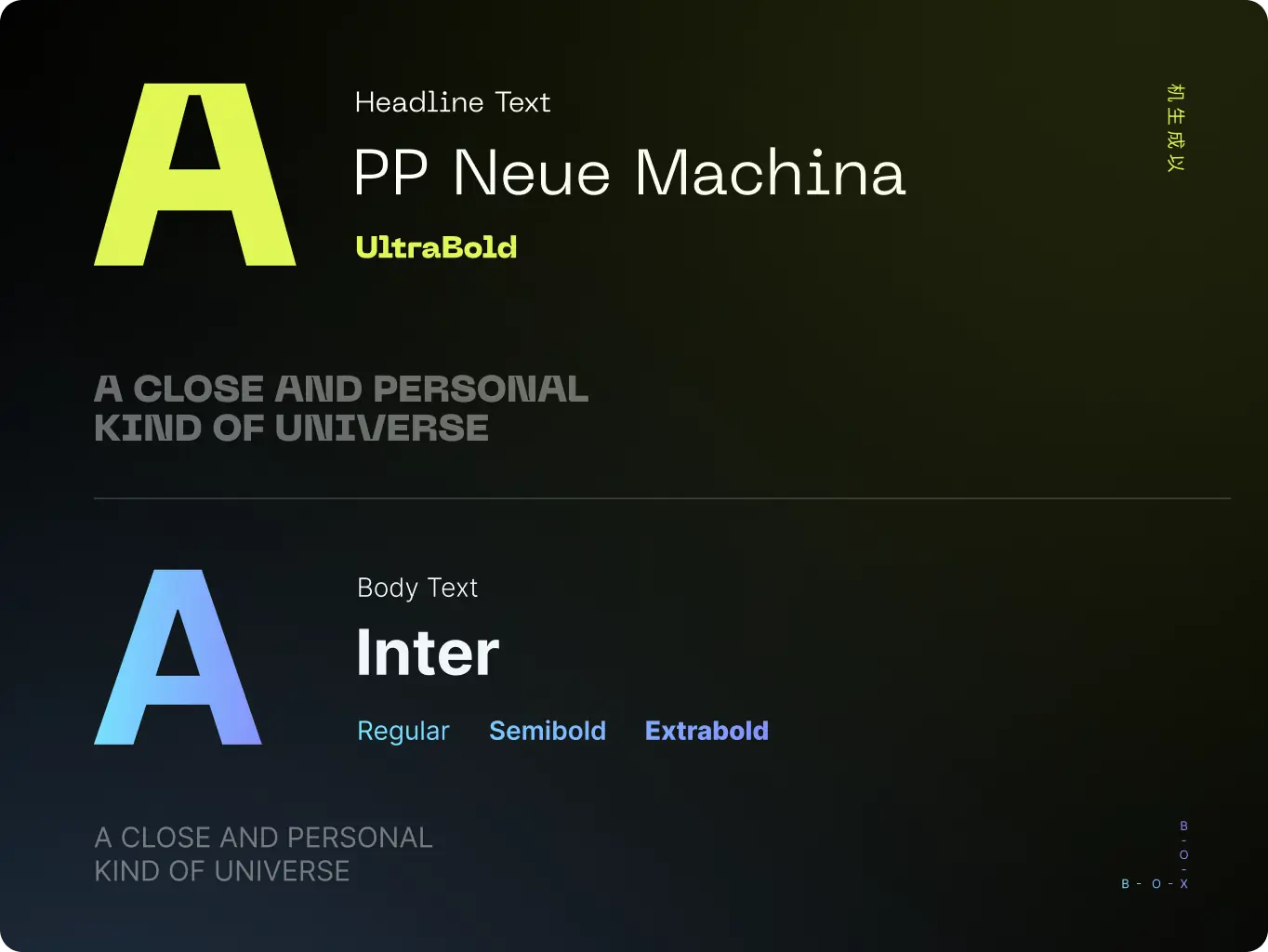
Typography solution
Brand typography is another important attribute of brand.
We selected Neue Machina font family for a titles because of it’s techy typing and to reinforce the brand’s visual affiliation with the digital and tech sphere.
For body cope we choose Inter because of readability and better organization of the content.
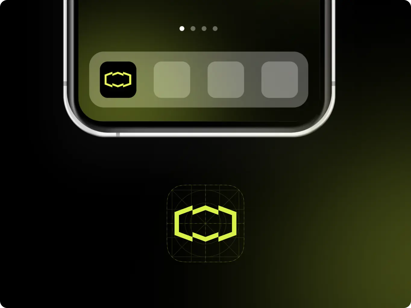
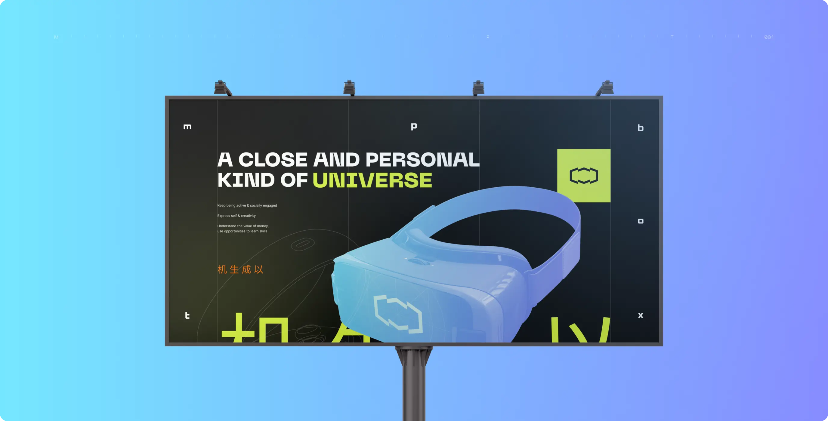
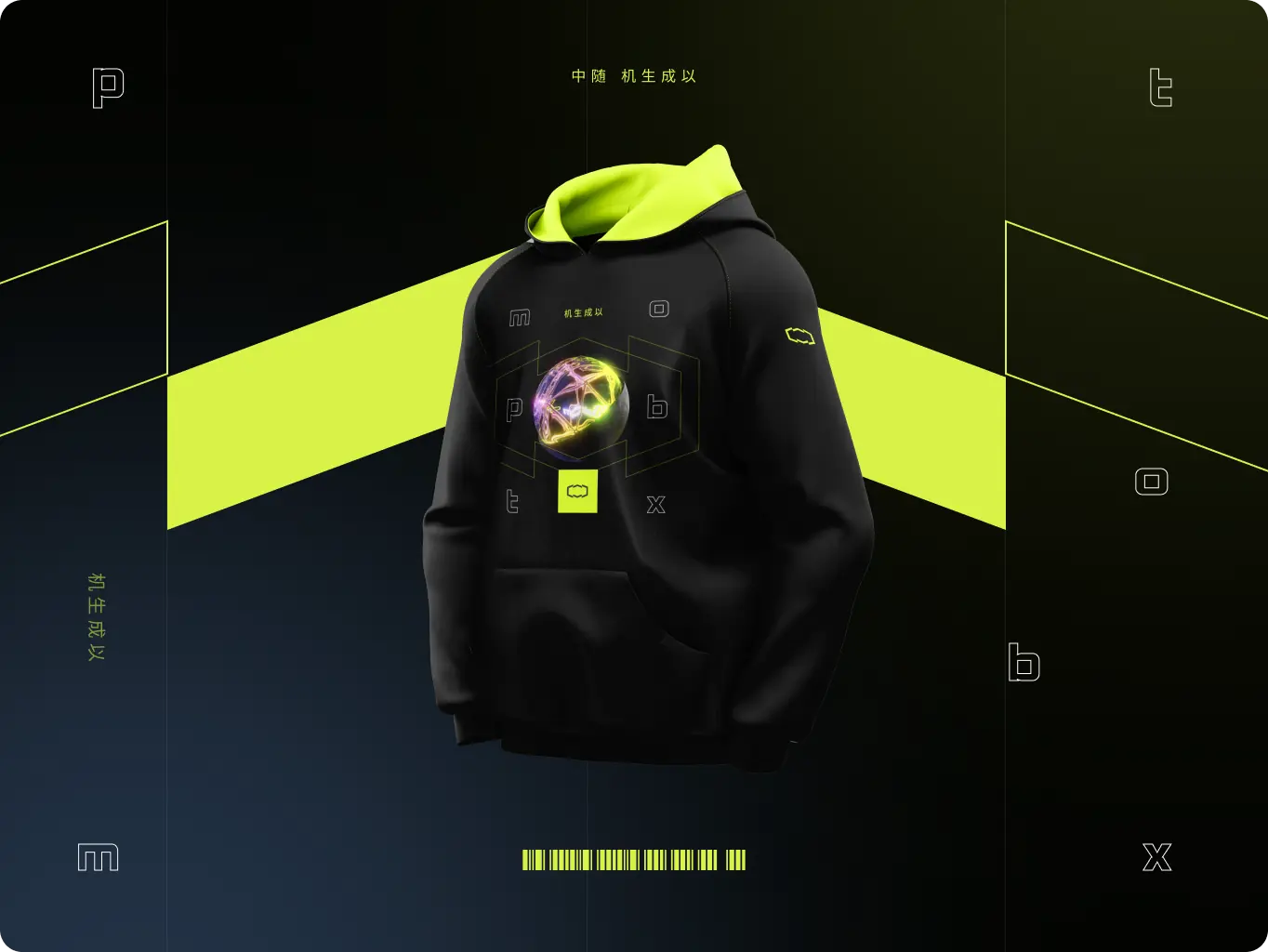
To communicate with a Target Audience in a right way we always consider the various types of brand assets in advance, from the digital sphere to material things. That’s why we have created the brand assets that cover the most important types of communication areas to represent the brand in the most appropriate way, from merch to outdoor advertising.
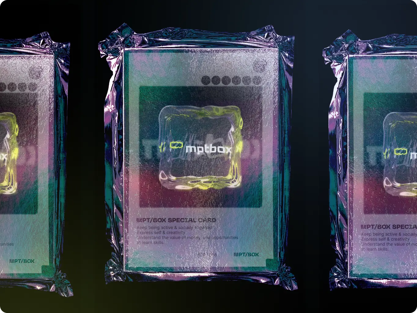
We understand the importance of consistent social media brand design with the brand’s identity and values, which is why we payed close attention to details and created a perfect visually organized social media branding, that represents Mptbox in digital in a right way.
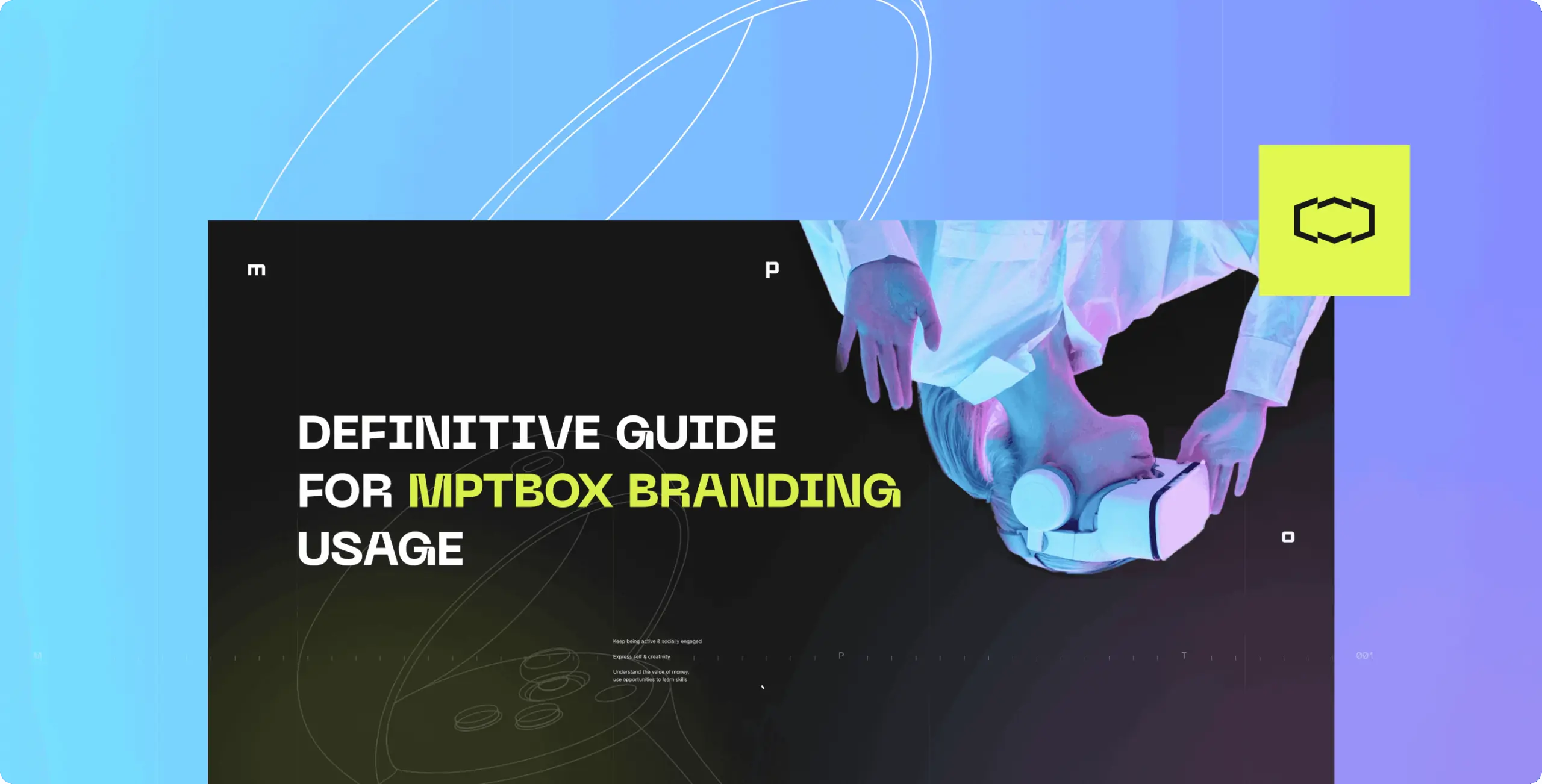
To ensure the brand’s proper usage, we created basic brand guidelines that clarify the appropriate use of logo, color palette, typography, and other graphic elements, collected in a complete folder with all brand assets, readily available for use.
We built a brand identity that sets the next development direction for the brand. Elements such as colors, fonts, social media design and outdoor advertising were used as a starting point for the creation of various digital assets, allowing the brand to scale across platforms and media.

#Branding
Tyler Ussery
 USA
USA
USA
#Website redesign #Website development
marketsnack
USA
USA
#Product redesign
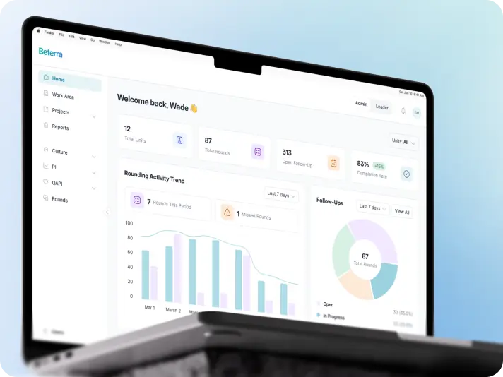
BETERRA
USA
USA
Have a project in mind?
Let's chat
Have a project to
discuss?
discuss?

Have a partnership in
mind?
mind?
