Have an idea?

Kollo – Financial mobile app

Kollo – Financial mobile app - Website Development - Photo 1
Overview

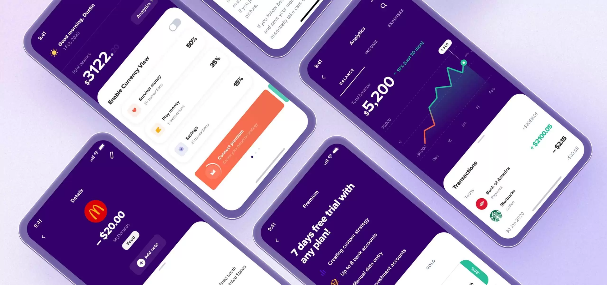
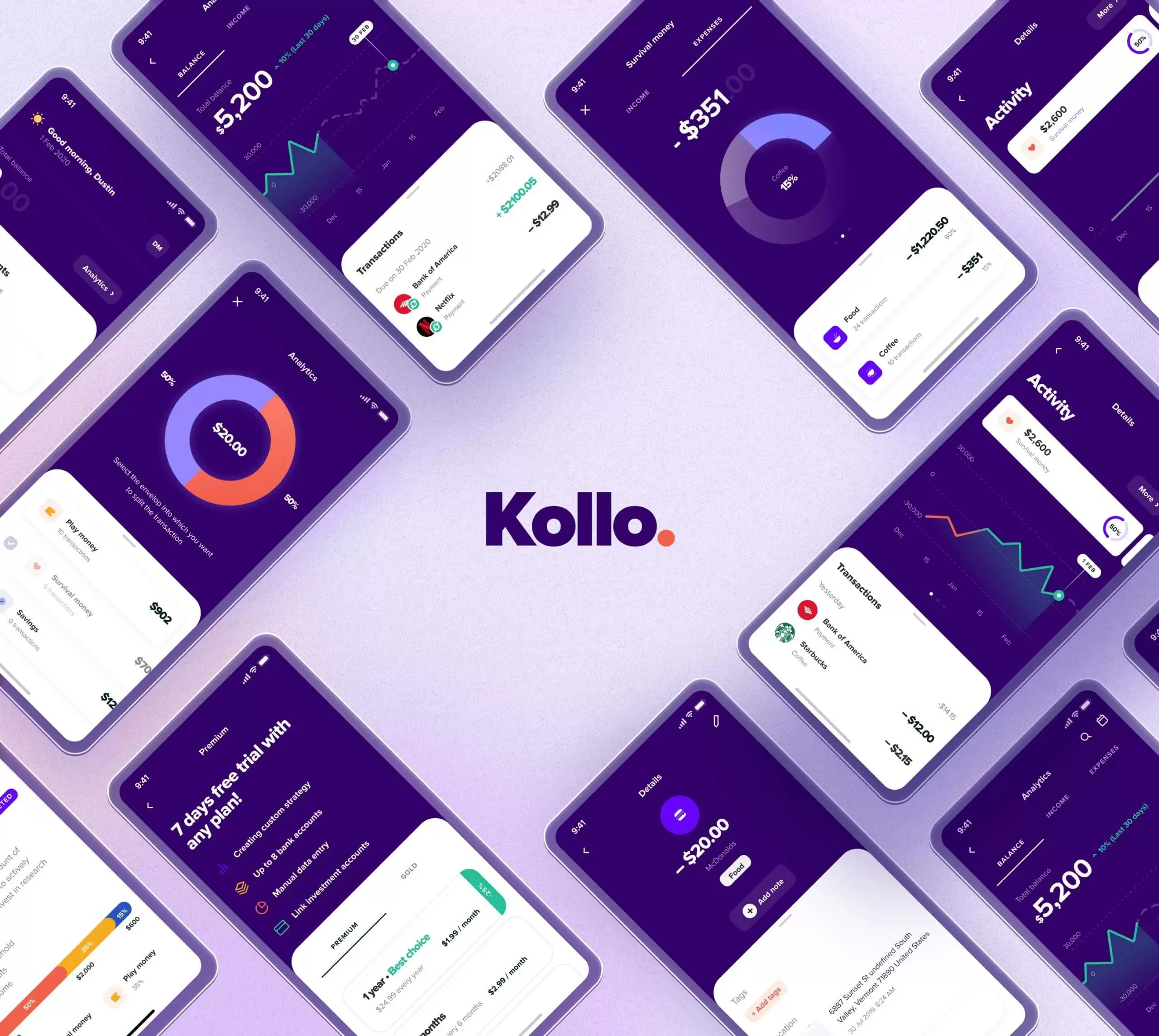
A modern and innovative mobile application for the savings, and control of finances

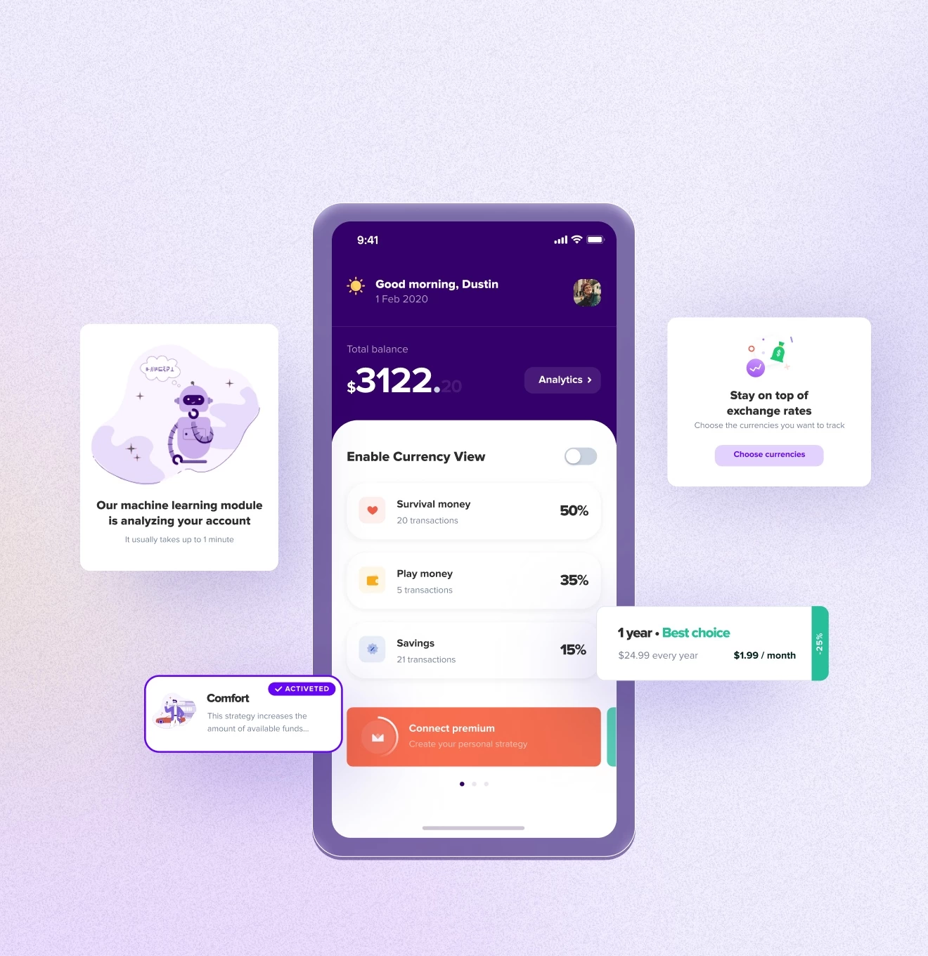
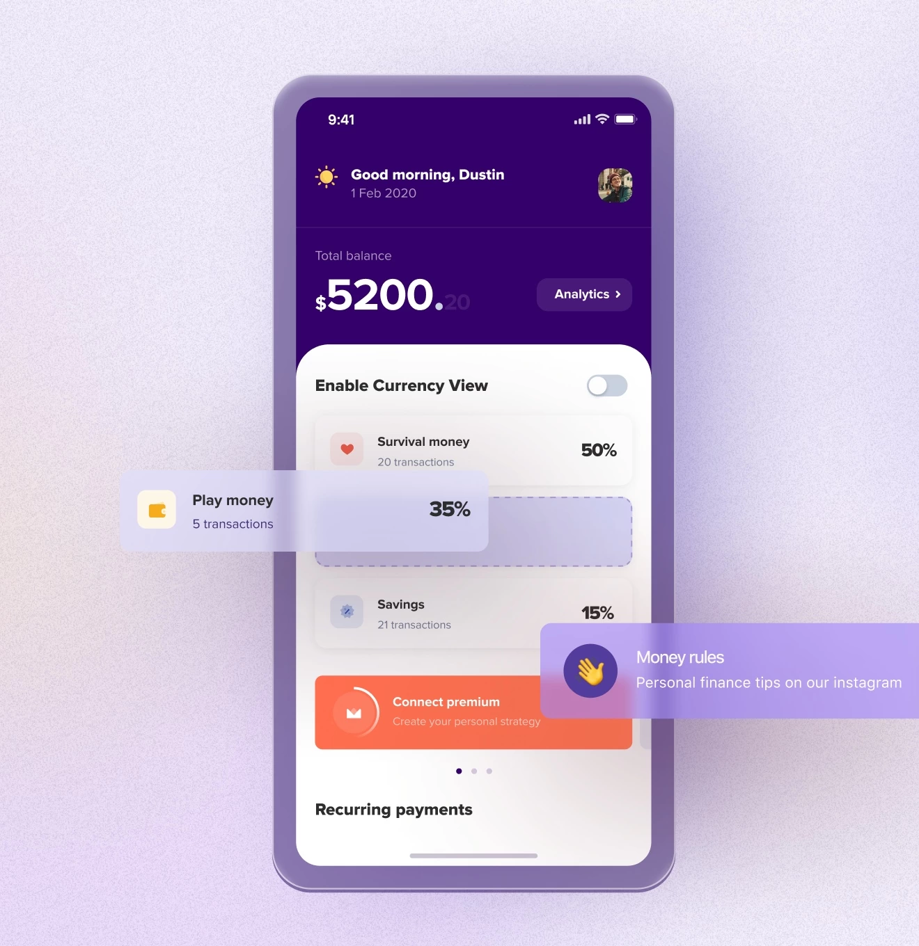
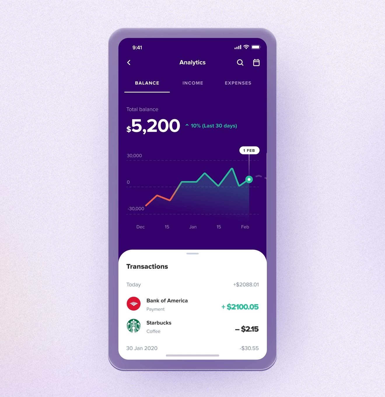
We’ve developed an MVP version of the application that helps US residents manage their budget, monitor their funds, make recurring payments, and accumulate money using unique savings programs.

Client

Kollo

Services
  • Research
  • Wireframing
  • UI design
  • Branding
  • 2D illustrations
In detail

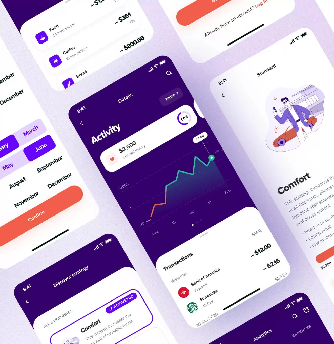
Project covers these fundamental steps of experience

Tasks

The client has set forth several main objectives. Users should have access to manage all their funds through a single application, the application should teach users how to accumulate money more efficiently, and make the expenses more transparent.

Solutions

While we worked on the solution, we had to take into account the specifics of the US market with its large number of competitors and high entry bar. Therefore, we started with defining clear milestones for the product, which functions we will start with, and what will be the key features that will make users love this app. We have offered several ways of monetization and suggested 3 versions of the application.

Kollo – Financial mobile app - Website Development - Photo 5
Working process

The first and most important step is to put yourself in the user's shoes and show empathy for them.

UX Research

The target audience of the Kollo app is the US residents who either have been living there for a long time or have just arrived and don’t understand how the financial system works in the States. During the research, we figured out the main pains and goals of users, and also compiled user stories and job stories, which allowed us to determine hypothetical motivations. 

User flow

We have done a complete user flow structure for all our types of users and how they will interact with our entire product. This is one of the most important steps before the wireframing part.

Wireframing

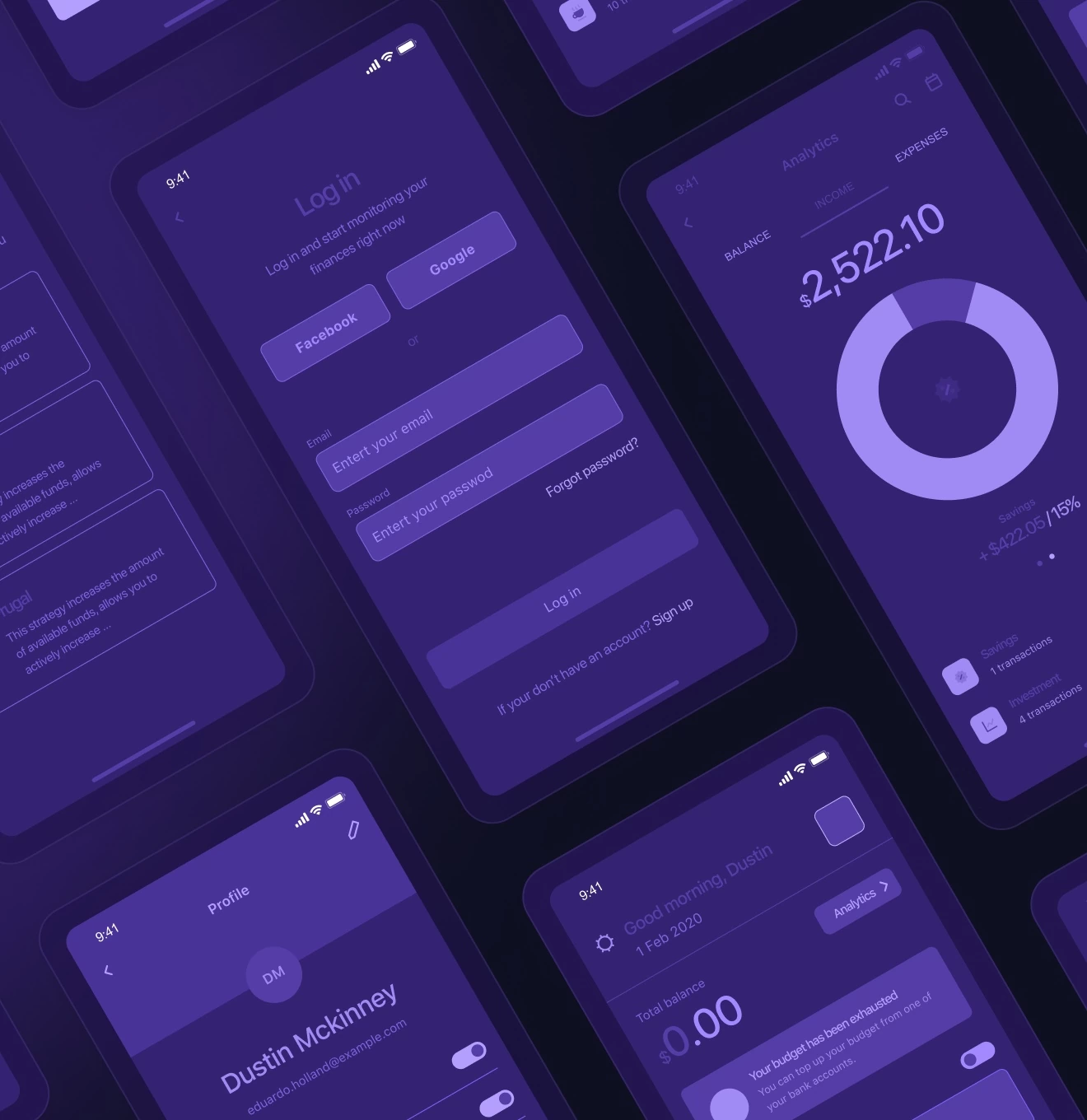
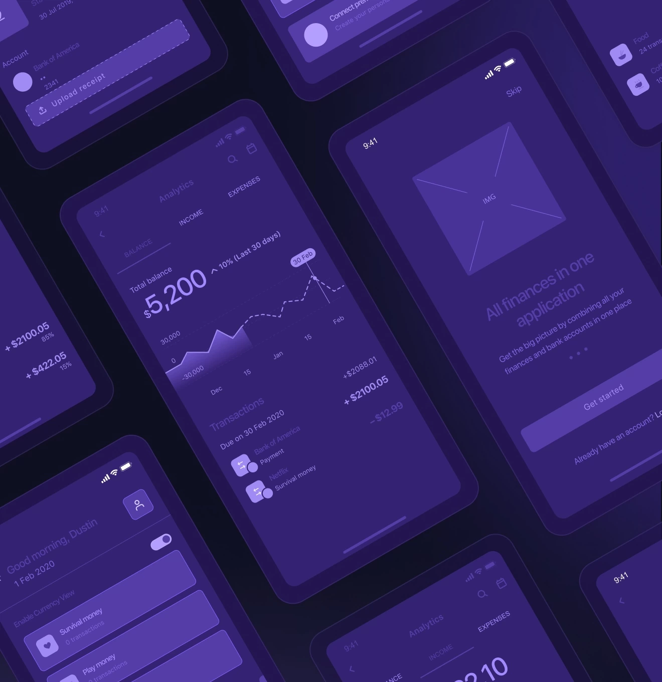
Before creating the visual concept, we completely created the wireframes of the main user flow in order to focus on the functionality and solve the user’s pains, without being distracted by the shape or color of the UI elements

UI Design

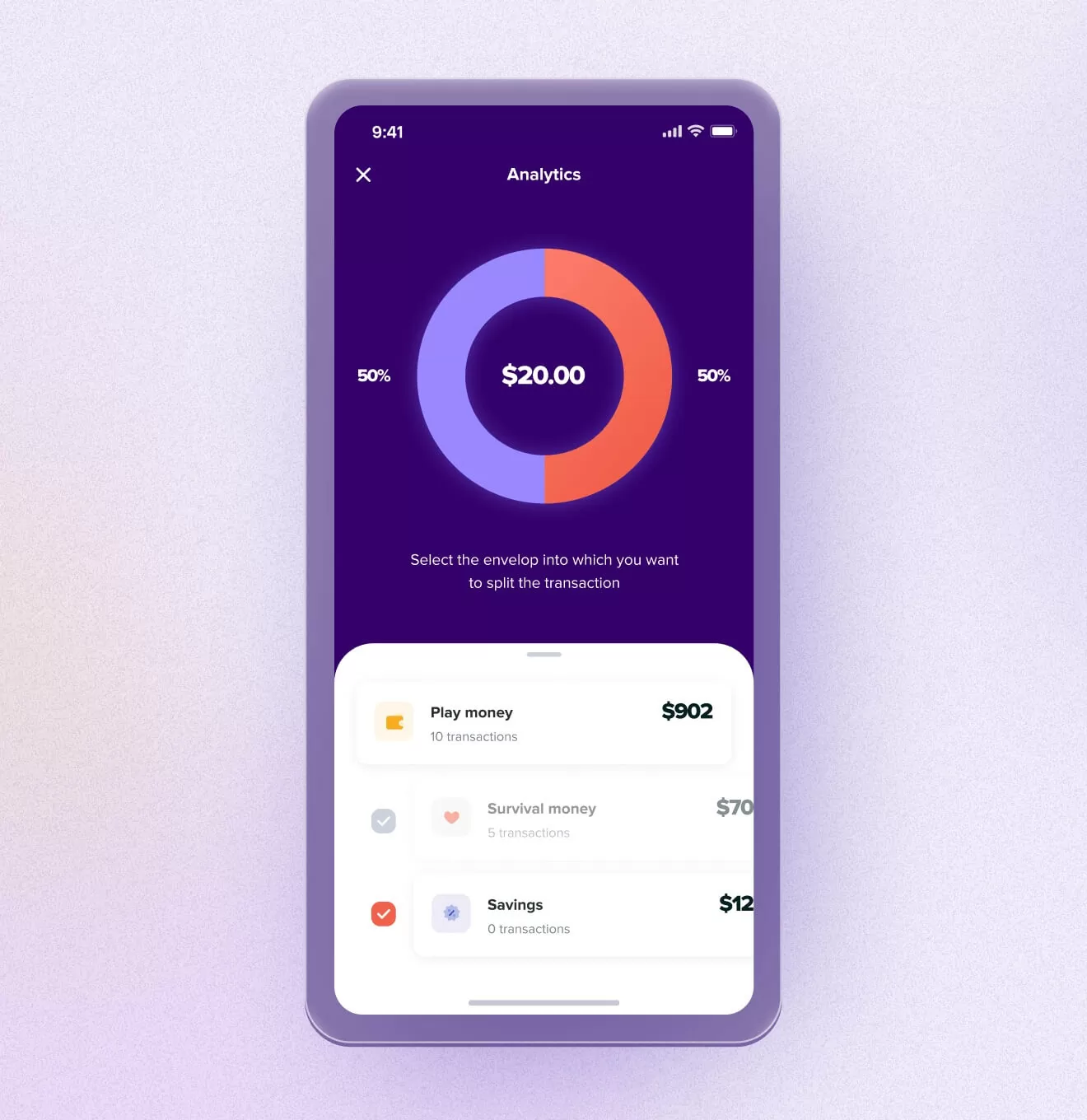
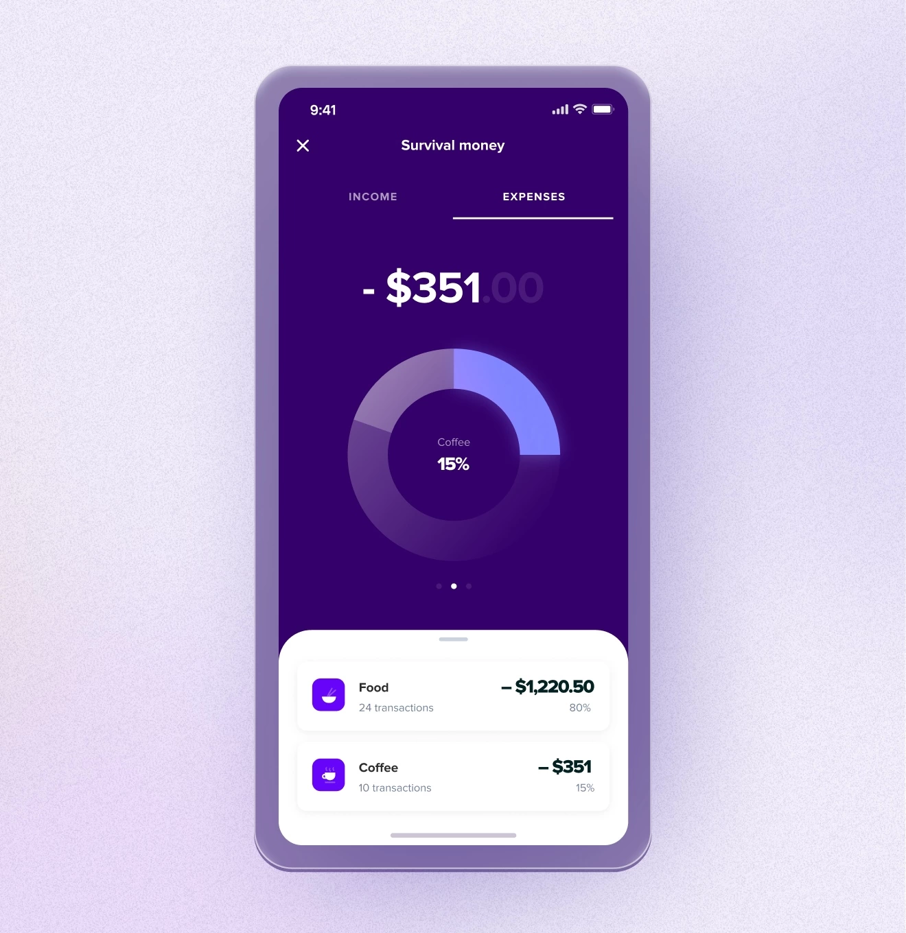
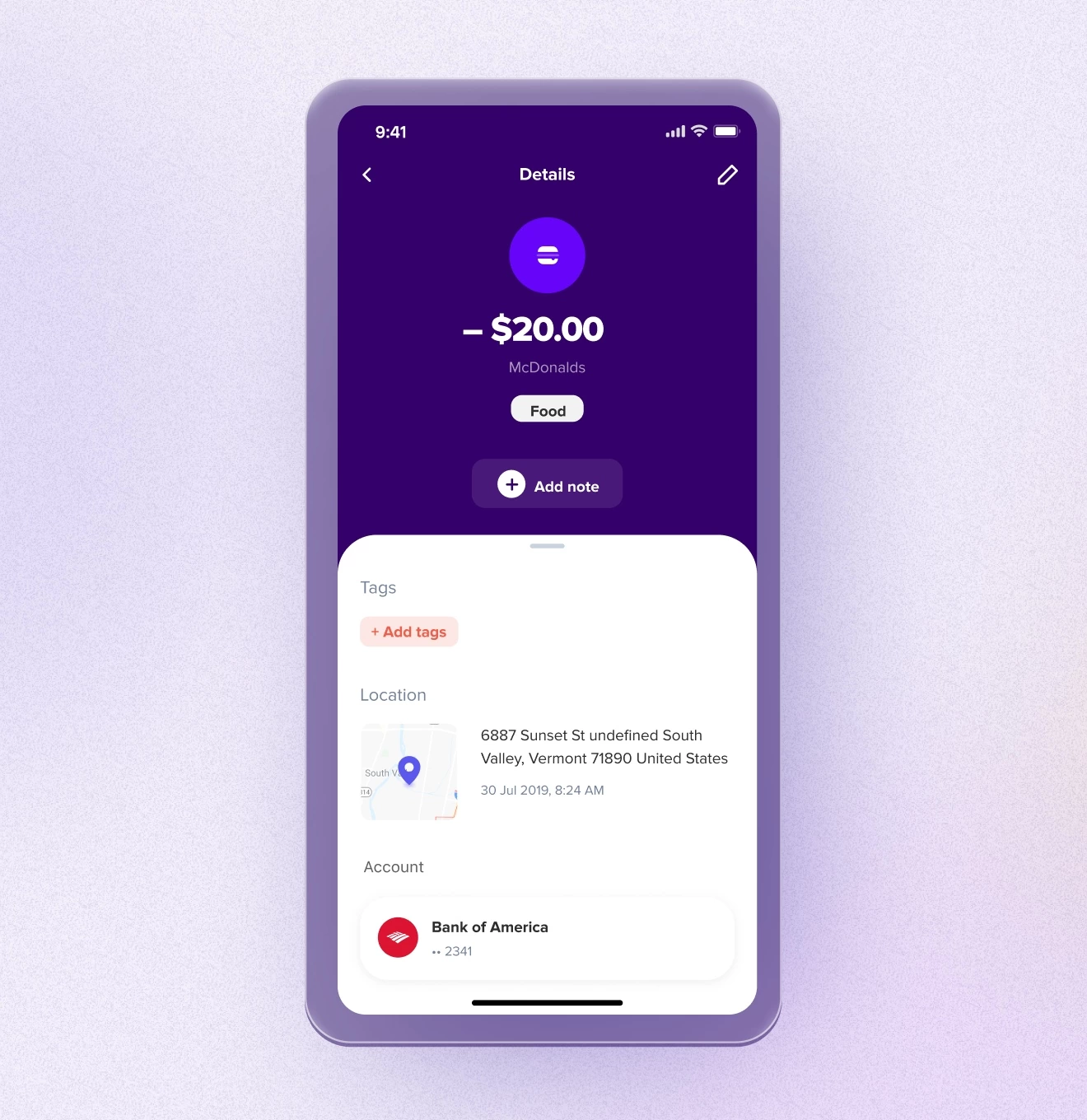
Once we’ve built the entire information architecture of the application and approved its wireframes, we proceeded to the visual design. Working on visual solutions, we used a simple and modern font, Proxima nova, which reflects purity and clarity that complements our concept of transparency in managing your own budget. Also, we used juicy, clean, and modern colors to highlight the main fixtures of the app.

Results

A ready-made design solution for a financial monitoring application for US residents and non-residents.

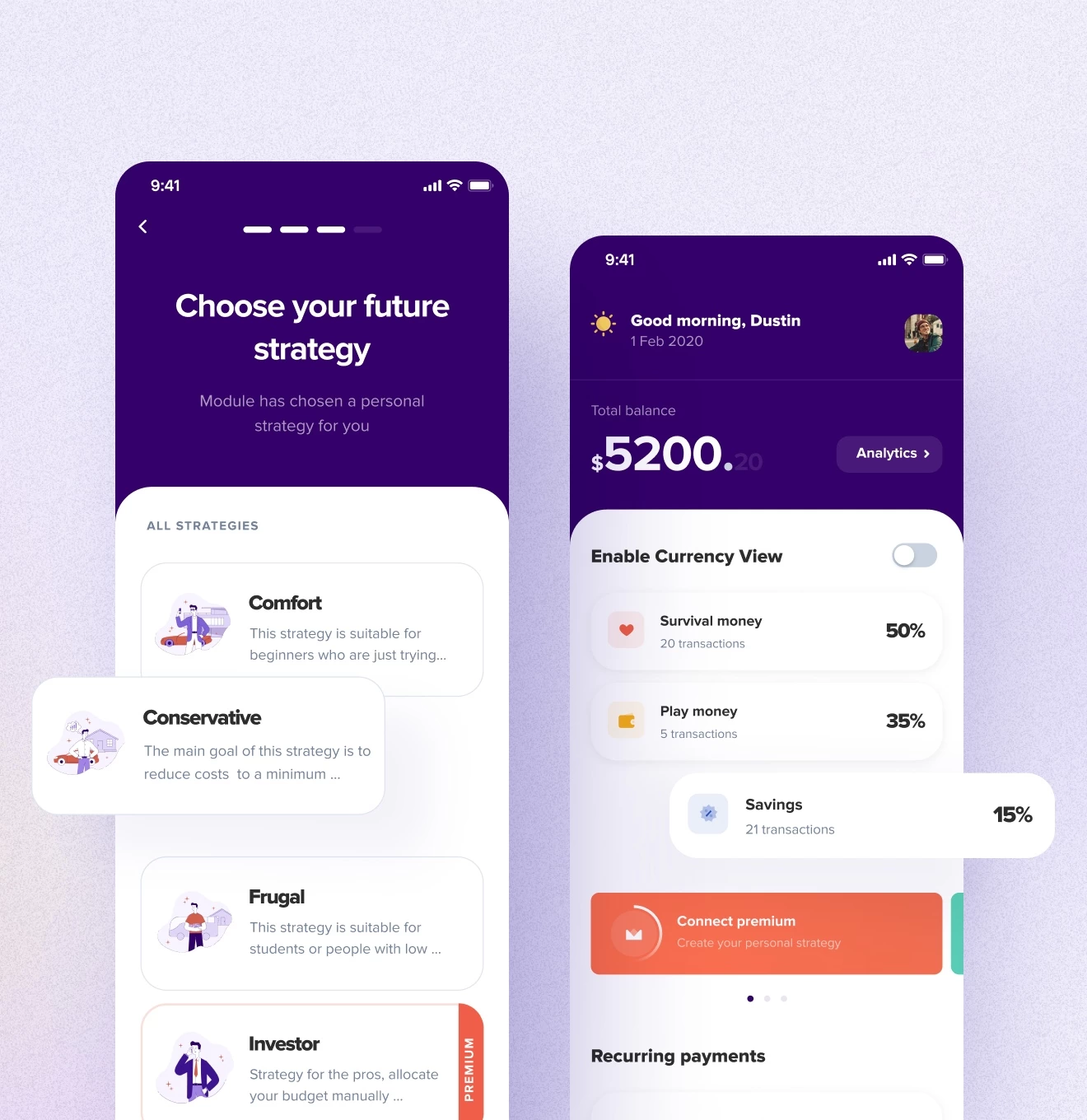
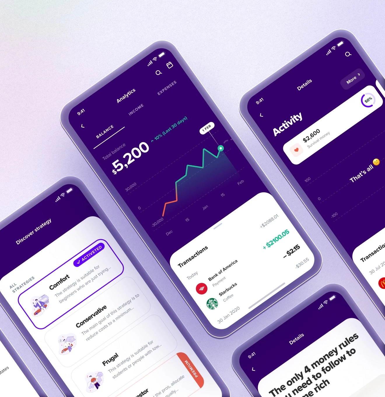
As a result, we have developed a unique application with personalized strategies for budget-saving, which will allow future users to significantly increase the growth of their savings and teach them to understand how finance works even better. Moreover, we have added an analytics feature set and an option of recurring payments, which will significantly reduce most people’s troubles. To make it easier for the user to track their finances in one place, we offered integration with a popular service in the United States for attaching bank accounts, which added transparency to their everyday life.

214

Screens

1

Month

20

Illustrations

Our cases
More cases
We work with both small startups and large corporations.
Keap – Family budgeting mobile app - Website Development - Photo

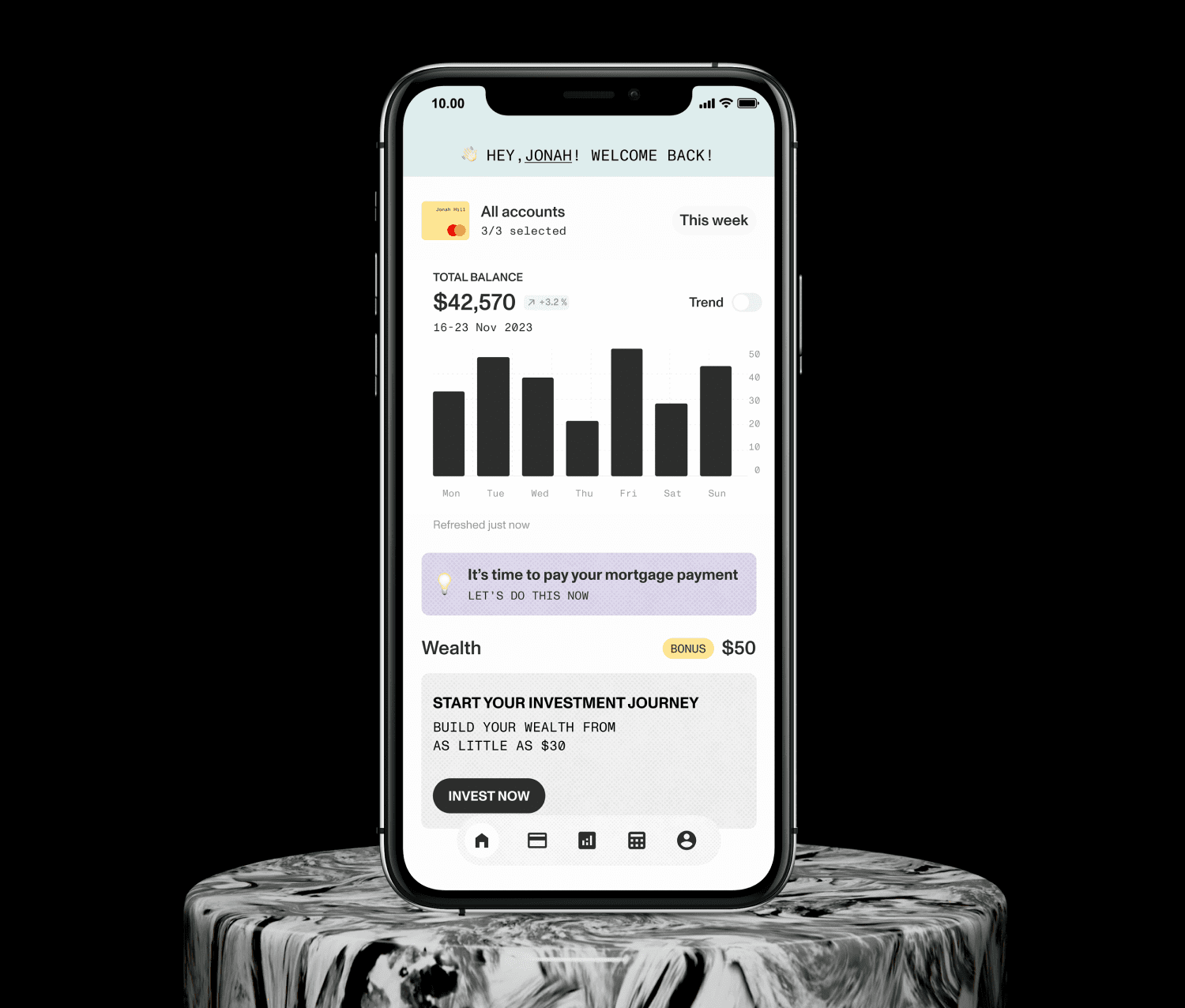
Simple mobile banking and long-term wealth building.

Contact us

Ready to bring

your idea to life?
Ready to
bring
 your
idea to life?

You can upload maximum 5 files
Some of your file not loaded, because maximum file size - 5 mb
What is your budget for this project?
How did you hear about us? (optional)
Project Talk - Kseniia Shalia
Account Executive
Partnership - Polina Chebanova
Co-Founder