Development
Research
Client
Keap, LLC
 USA
USA
USA
Services
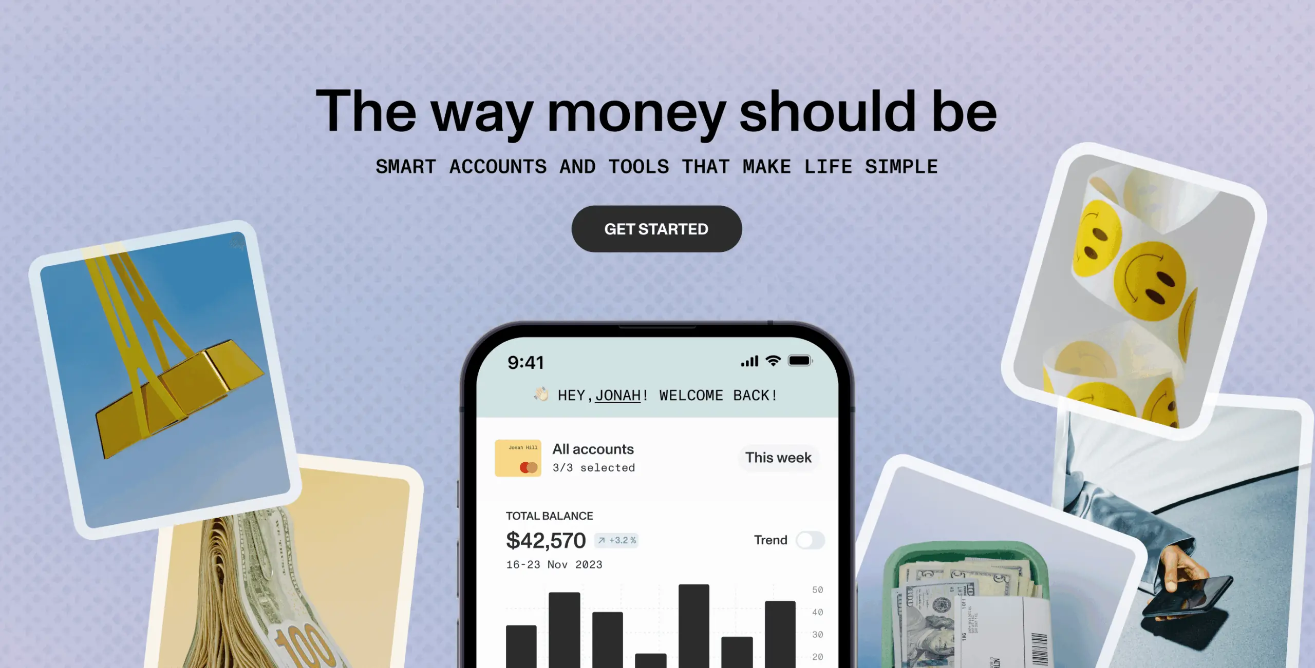
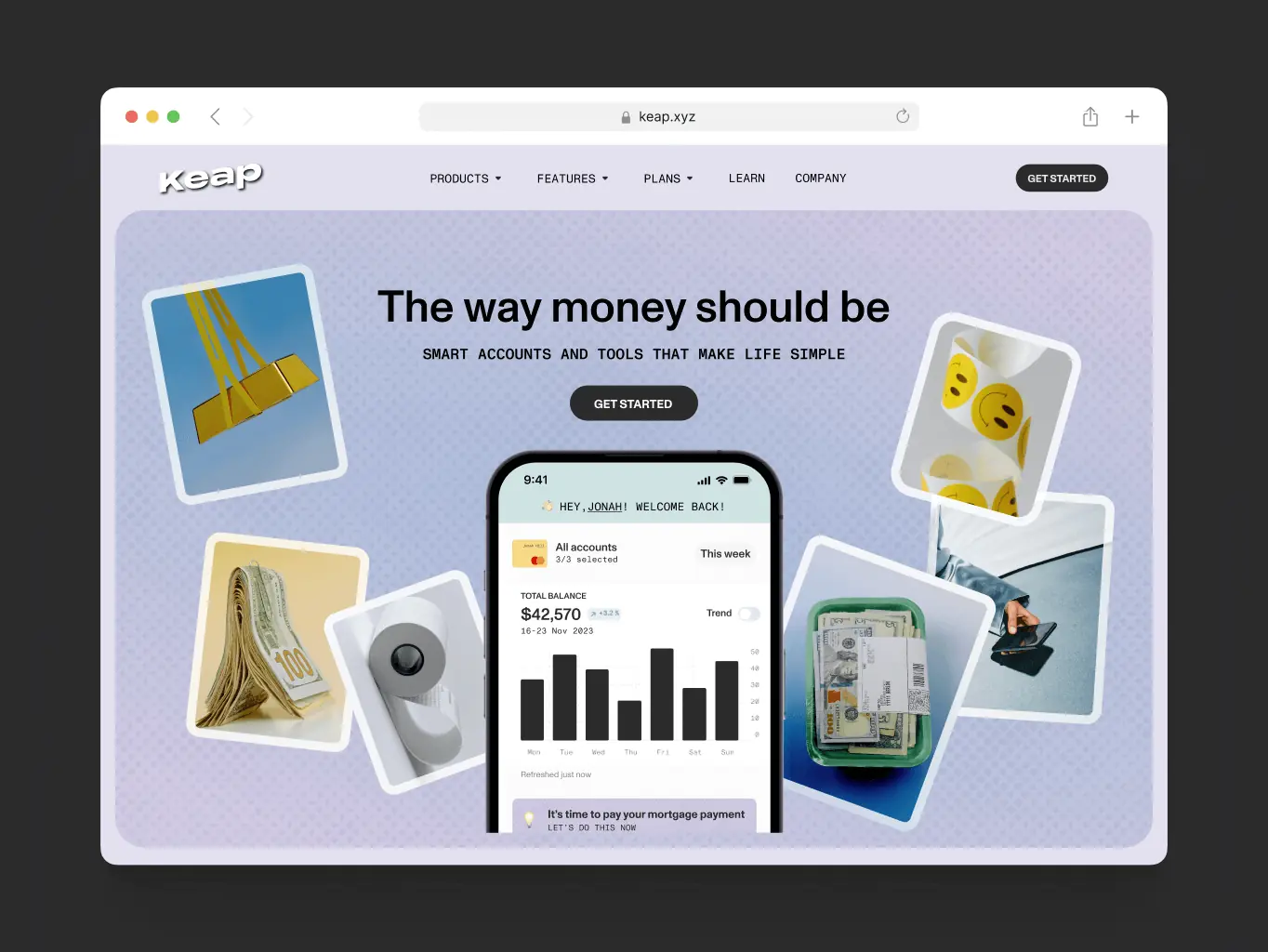
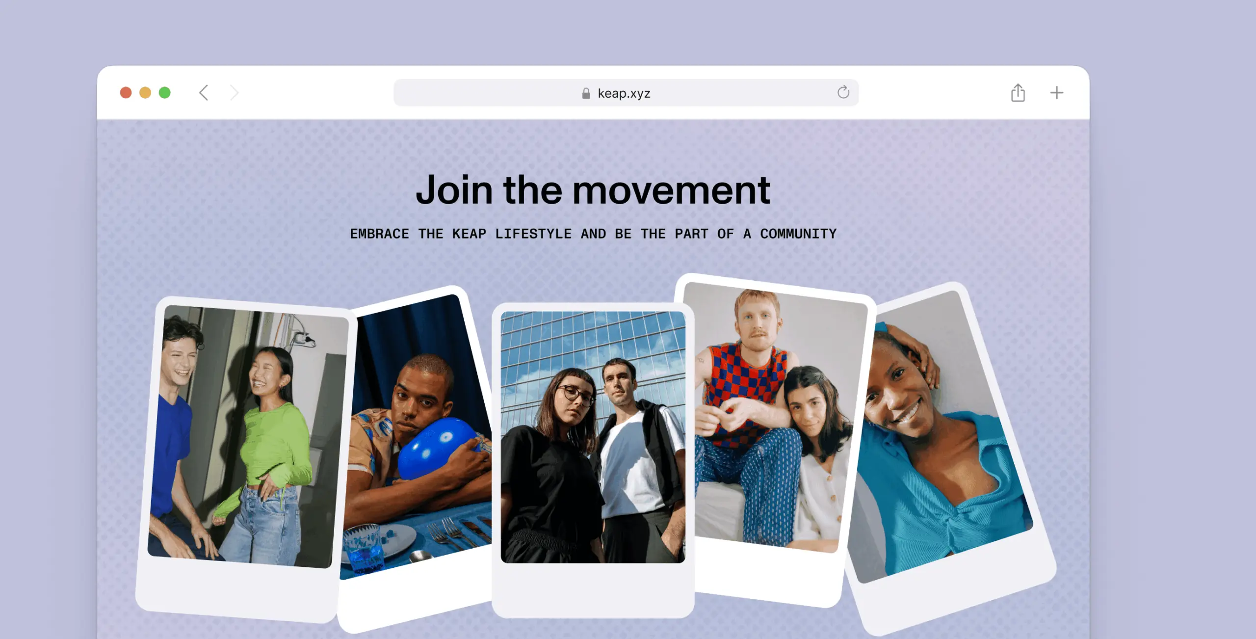
The client sees the future site as an energetic and visually captivating, which aim is to communicate the app’s standout features, benefits, and distinctive qualities.
The primary objective is to engage the target audience, with a focus on millennials and Gen Z, creating an immersive experience that resonates with their lifestyle.
Our role
We were the creative minds behind the Keap promo site. Our job was to design a cool website that shows off what Keap can do. We made sure the site is easy to use and looks awesome to grab the attention of millennials and Gen Z.
Our goal was to make finance exciting and accessible on the site, matching the client’s vision for a modern and lively promotional platform.
As we started the project, we looked at what similar services were doing and understood who our potential users are and what they need through a Persona Analysis.
This helped us make Keap stand out and give users exactly what they want. It’s all about creating a promo site that’s not just different but also perfectly matches what our users are looking for.
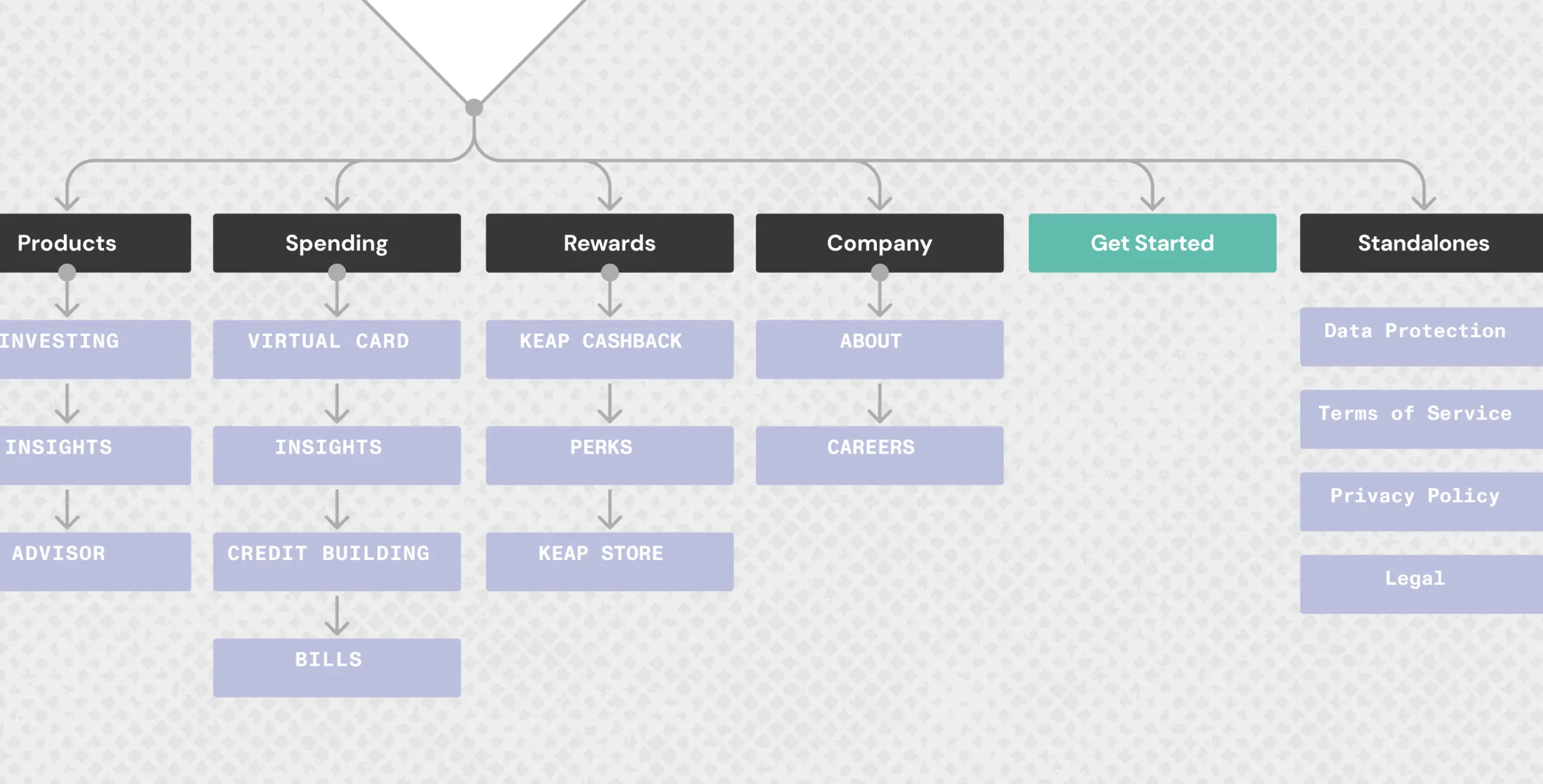
To make sure it’s easy to use, we carefully designed the site structure using insights from our Site Map analysis, ensuring everyone can navigate it effortlessly.
- Competitors analysis
- Business analysis
- Mapping
Competitors analysis
During Competitors Analysis, we studied similar services to understand what they were doing and identify opportunities for Keap. We looked at their strengths and weaknesses, gaining insights to make Keap stand out and better meet users’ needs.
Persona Analysis
During Persona Analysis, we conducted an in-depth examination to identify and understand our potential users, with a particular focus on the unique characteristics and preferences of both Gen Z and Millennials.
By delving into their lifestyles, needs, and behaviors, we gained nuanced insights into what resonates with these specific demographics. This comprehensive understanding allowed us to tailor Keap to not only meet the general user needs but also align with the distinct preferences of Gen Z and Millennials.
As a result, we crafted a more personalized and engaging experience that speaks directly to the expectations of these key user groups, ensuring that Keap is not only user-friendly but also resonates profoundly with the younger generations.
Mapping
During the Site Map stage, we organized and designed the structure of Keap’s promo site to make it easy to navigate. This involved planning the layout and flow of information so that users can find what they need quickly and efficiently.
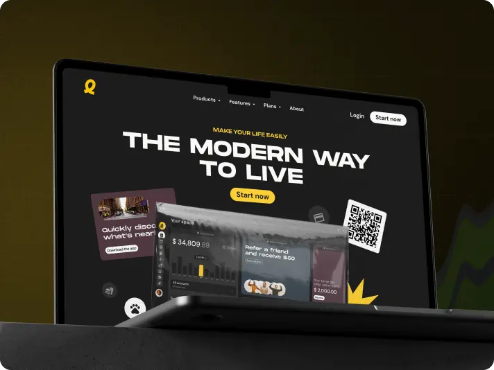
We were tasked with an exciting brief to build an immersive experience that reflects the innovative nature of slope solutions. As a tech startup, our goal was not only to build and obtain meaningful leads in this industry, but also to create a design that stands out from the competition while being user-friendly and appealing to our audience.
We focused on developing an intuitive interface and a visually compelling layout that will captivate and engage our users. By prioritizing their experience, we aimed to create a lasting impression that will keep them coming back for more.
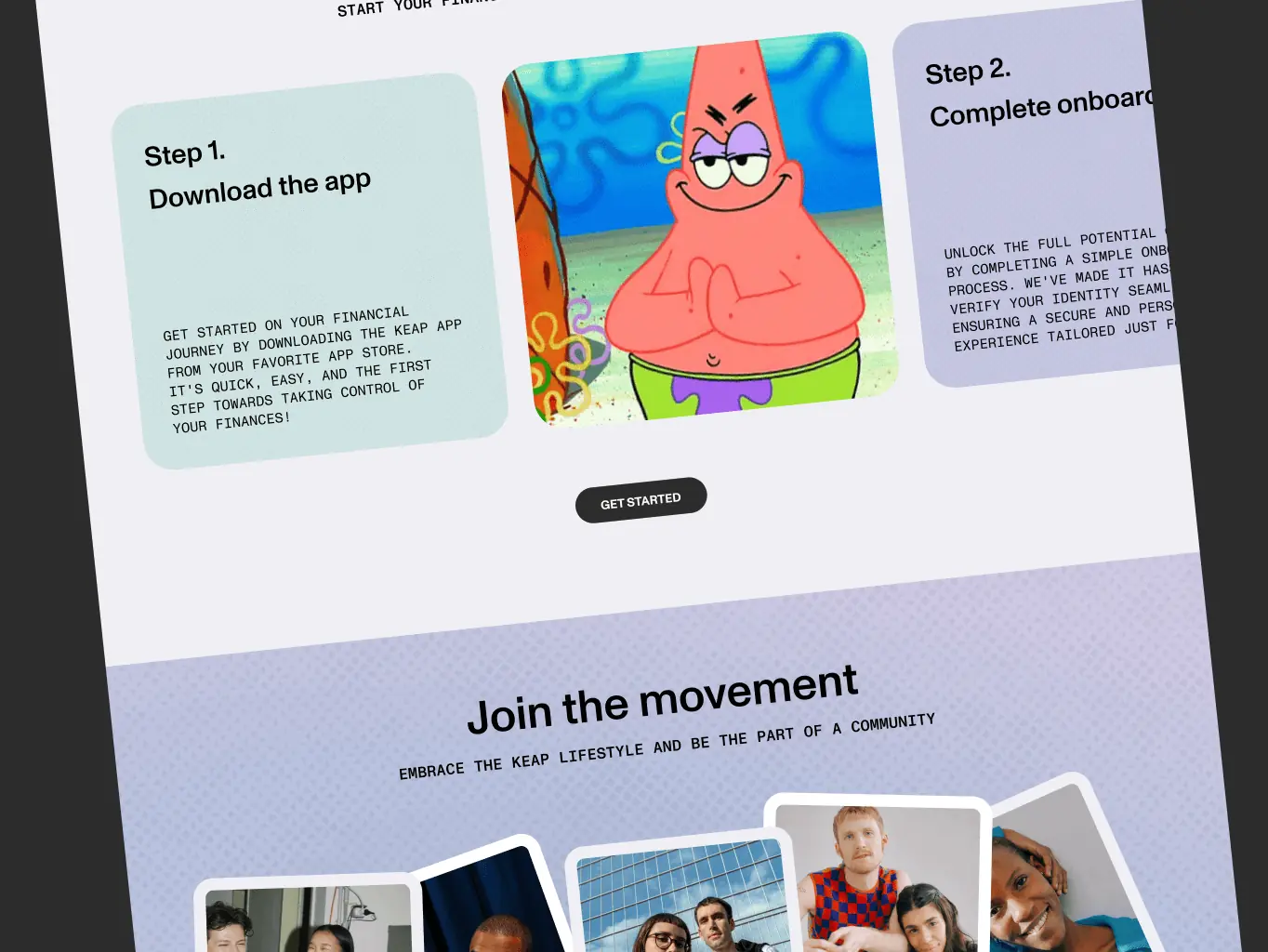
- Wireframe
- Moodboard
- Design Concept
- UI Design
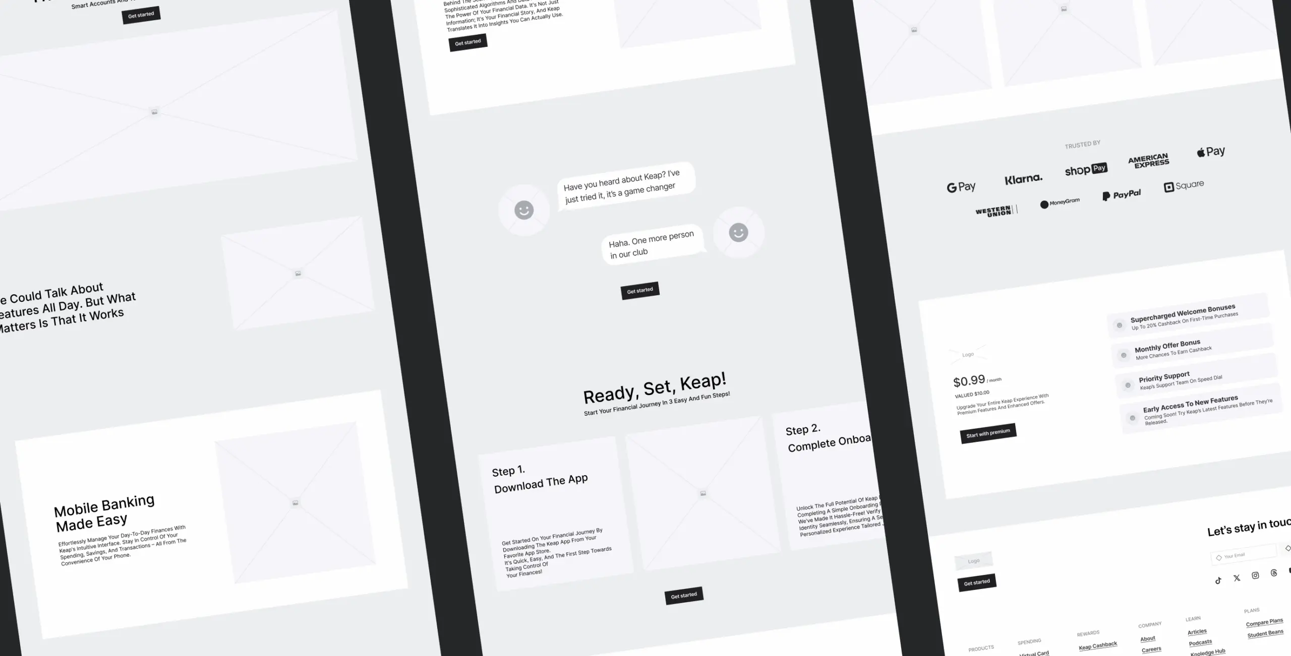
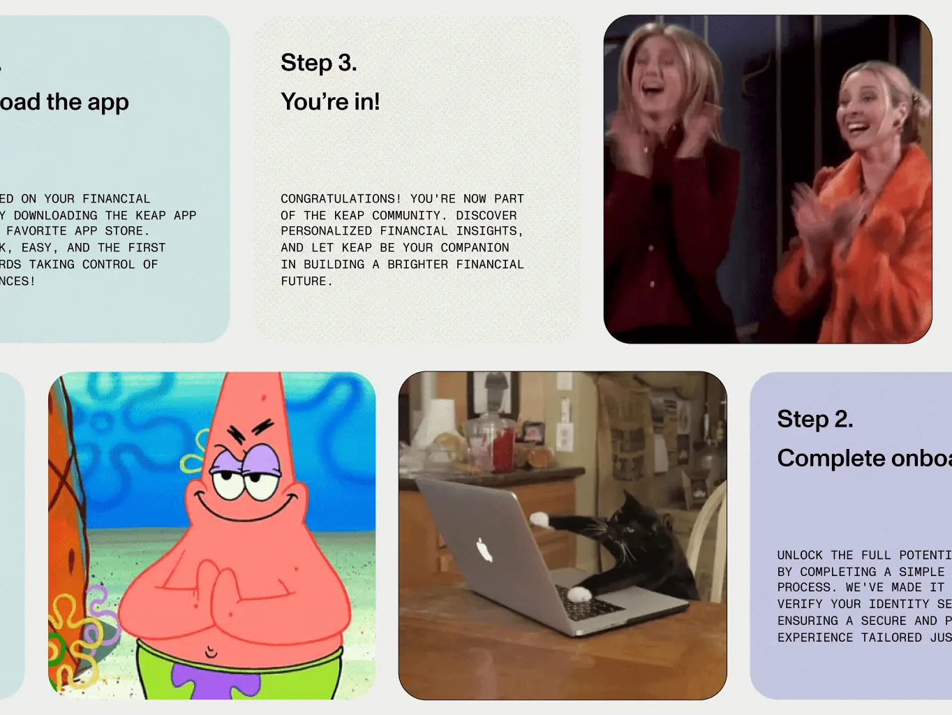
Wireframes
At the wireframe stage, we created a simple blueprint of the Keap promo site. Think of it like a rough sketch that shows where different elements, like buttons and information, will be placed. This helps us plan the basic layout before diving into the detailed design.
Moodboard & Design Concept
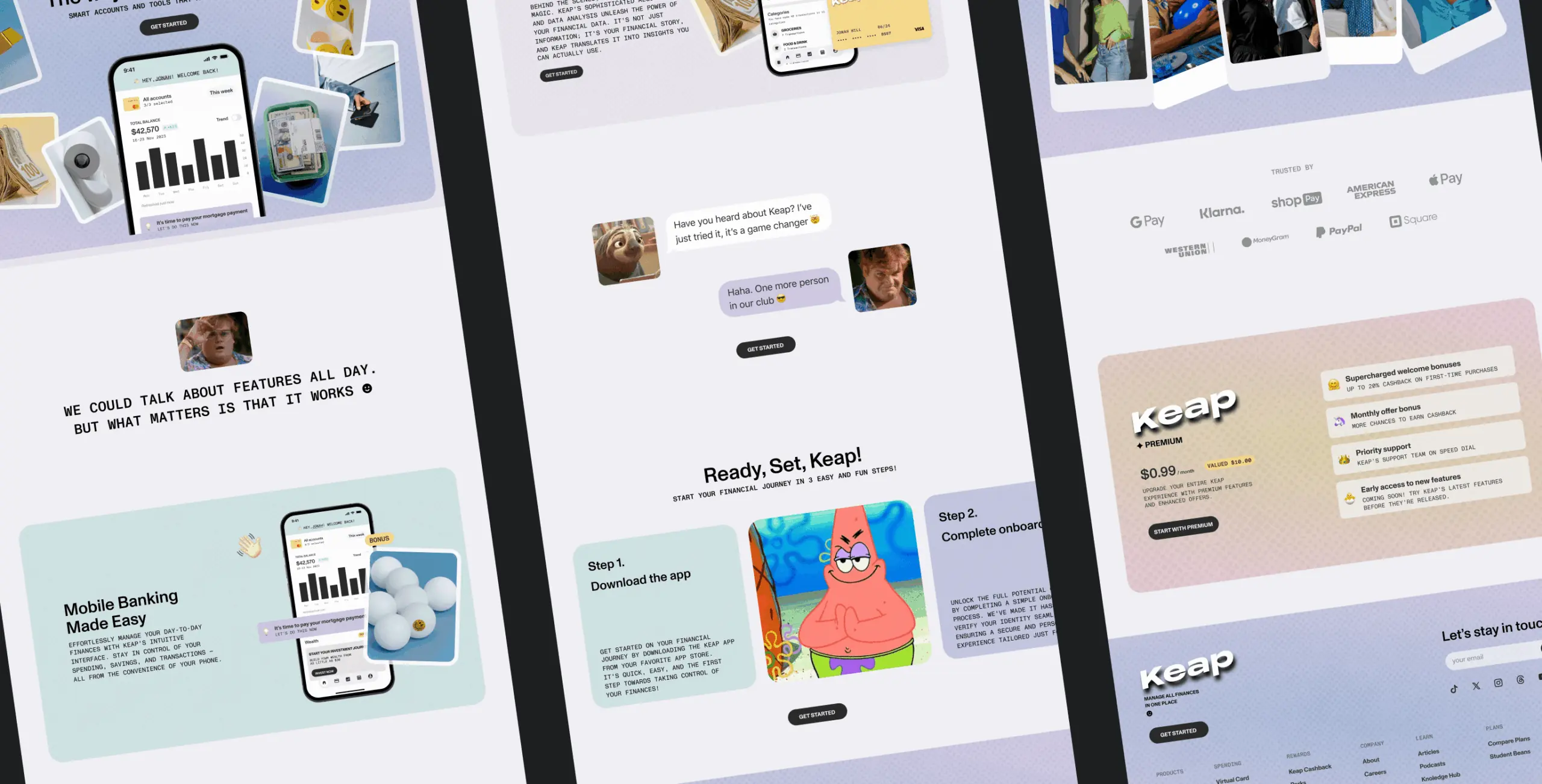
In the moodboard stage, we curated a visual mood for Keap. This involved selecting colors, styles, and images that represent the overall look and feel we want for the promo site. It’s like creating a visual guide that sets the tone for the design.
Design Concept
Moving on to the design concept stage, we took the moodboard and wireframes to create a cohesive big picture for Keap’s promo site. This is where we decided how everything would come together, ensuring a consistent and appealing design that aligns with Keap’s identity and goals.
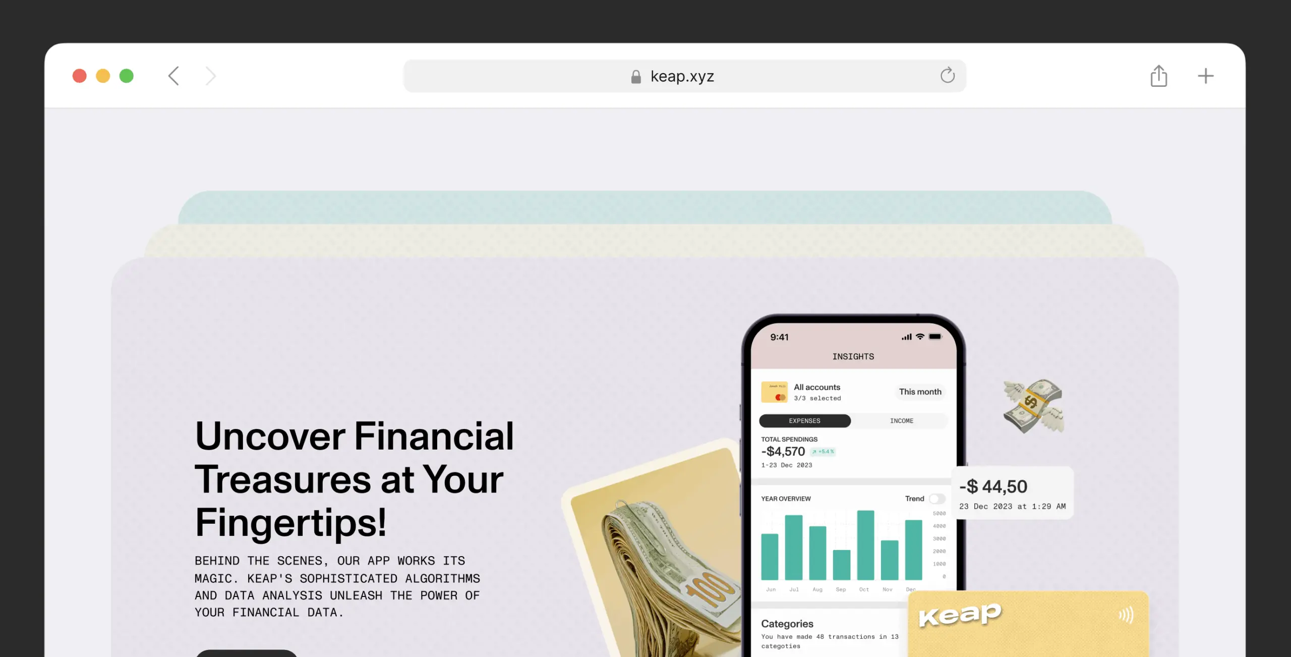
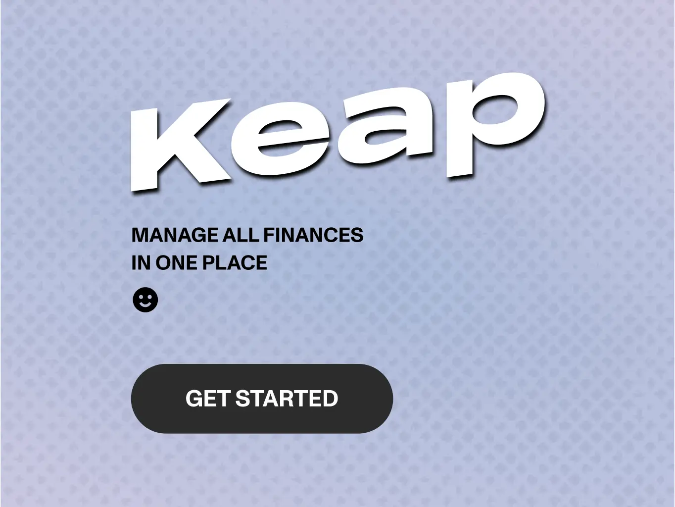
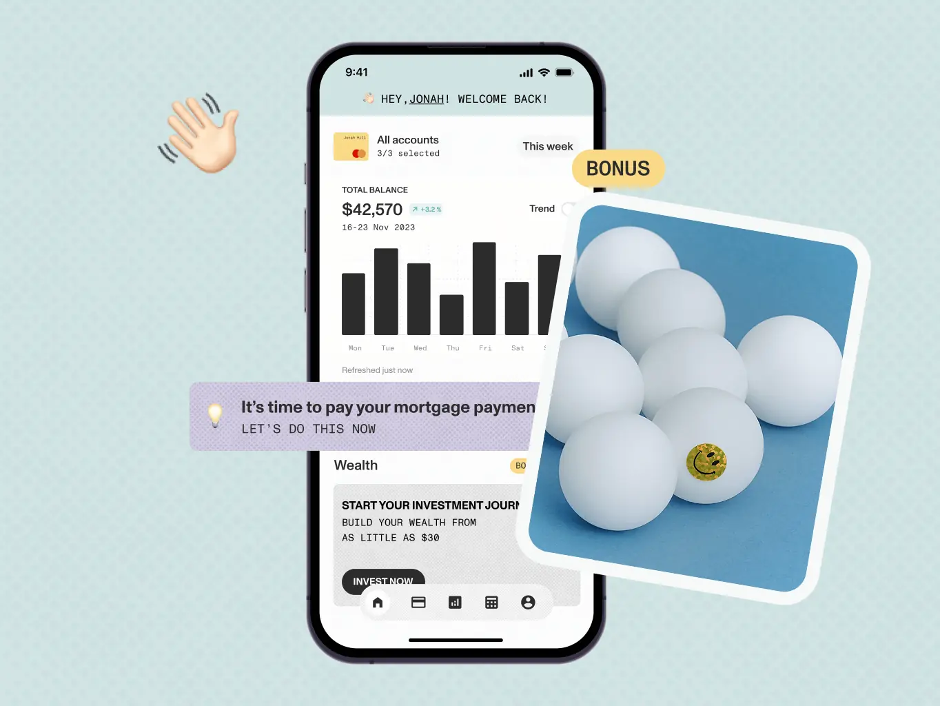
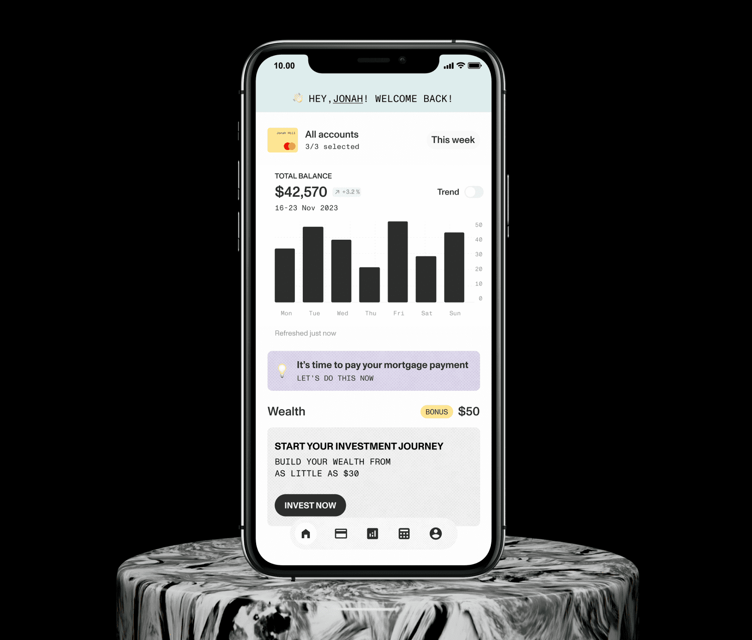
UI Design
Finally, in the UI design stage, we brought everything to life. We made sure every detail looks polished and visually appealing. This includes choosing fonts, colors, and images that not only match the design concept but also enhance the overall user experience. The goal here is to make Keap not only functional but also aesthetically pleasing and easy to use.
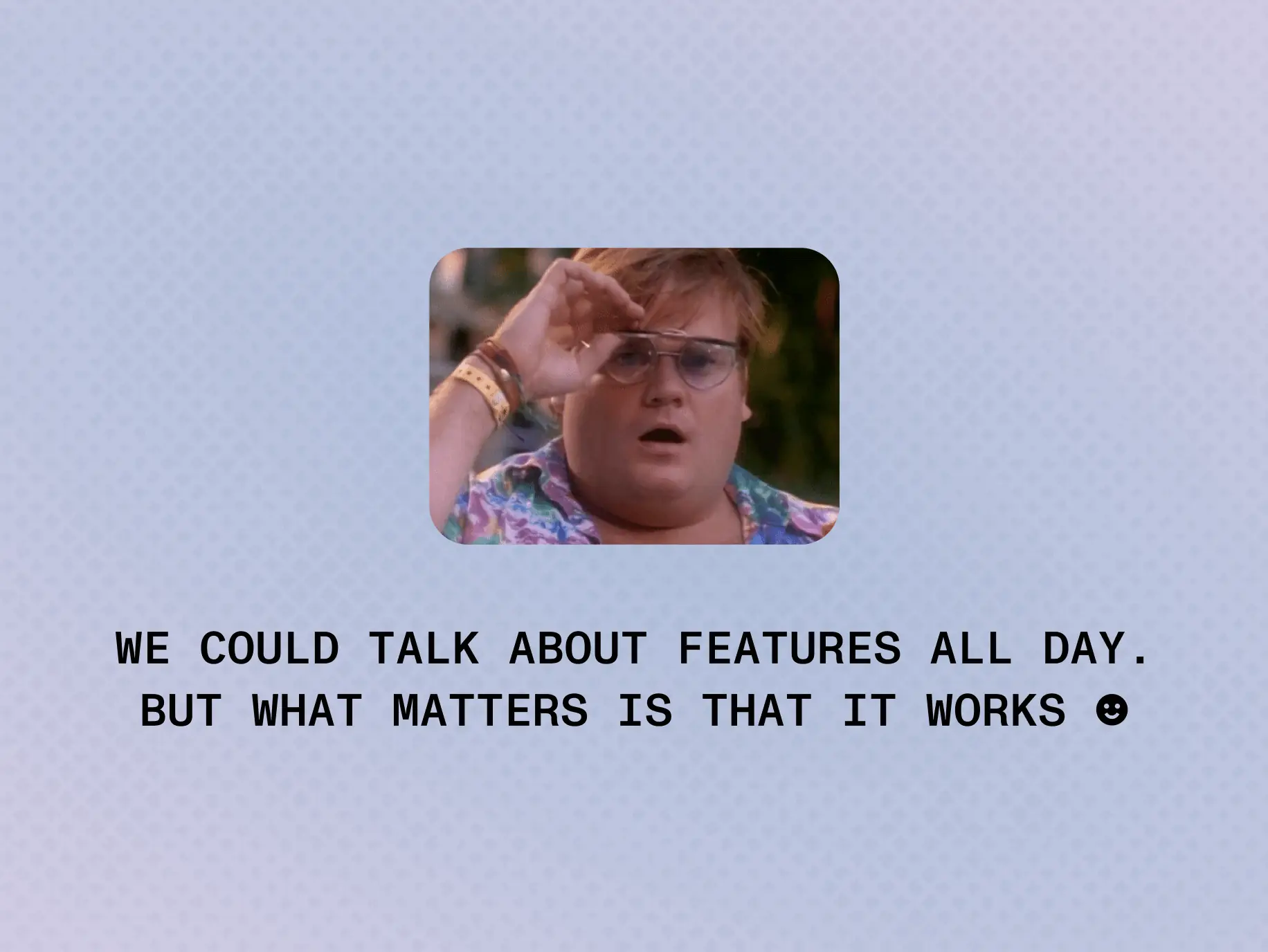
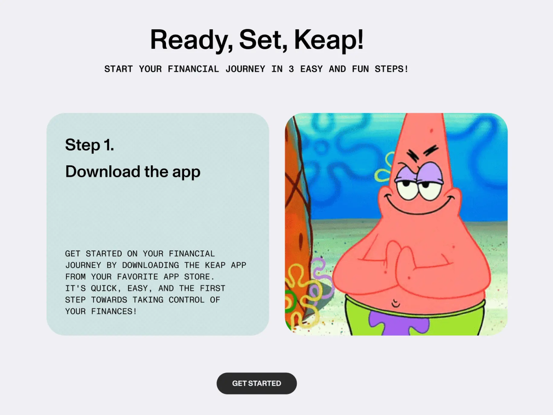
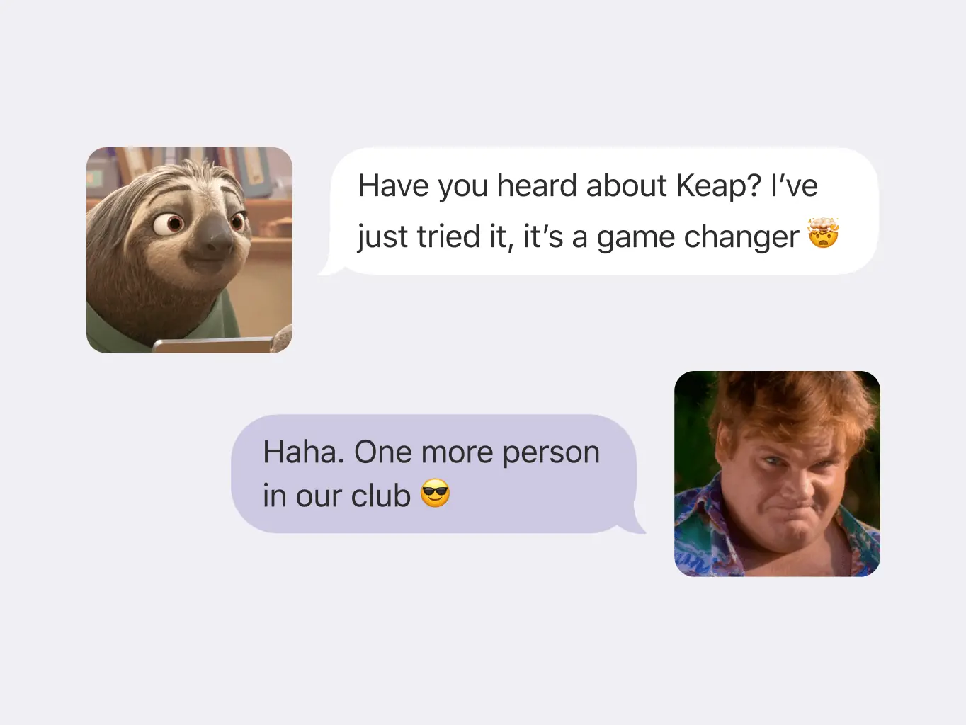
GIFs and Memes
We added funny GIFs and memes to the Keap promo website to make it more enjoyable, especially for millennials and Gen Z. These are like short, funny videos and pictures that you might see on social media. It's our way of making finance stuff less serious and more fun, so it feels relatable and friendly, especially for younger audience.
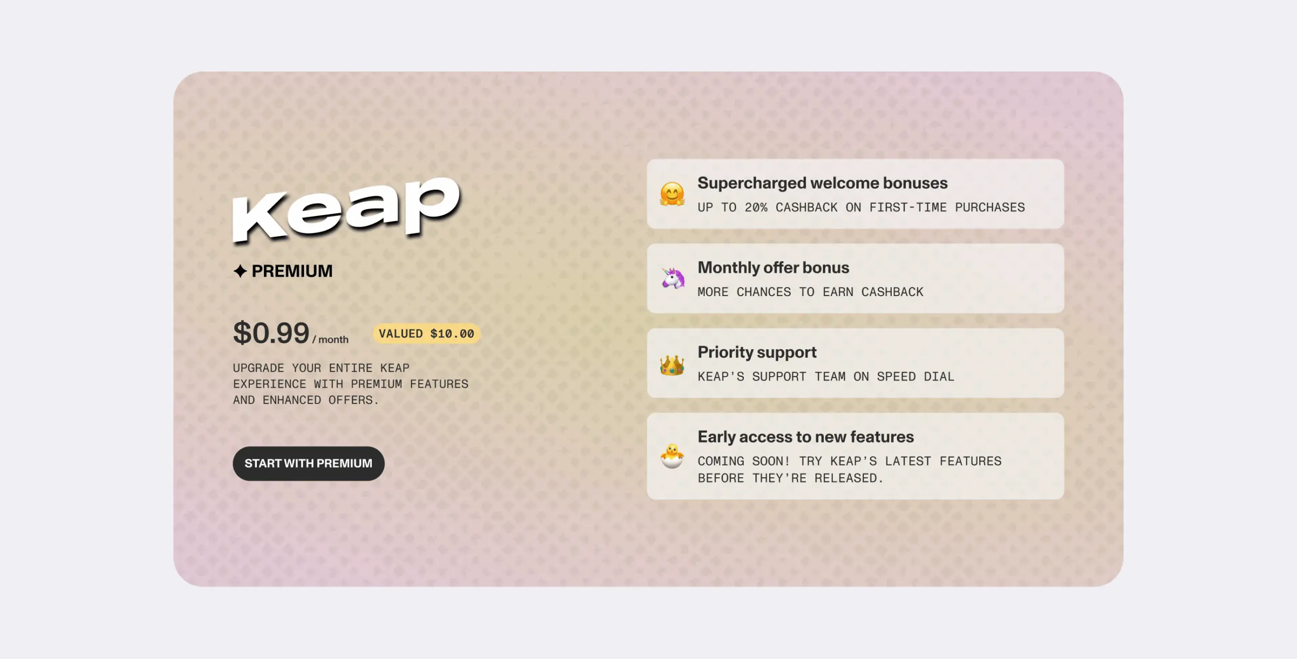
Educational Resources
We've included helpful stuff like articles and guides on the Keap promo site to teach you about money things, like how investments work or smart ways to manage your finances. It's like having a friendly guide to help you understand the financial world and get the most out of Keap.
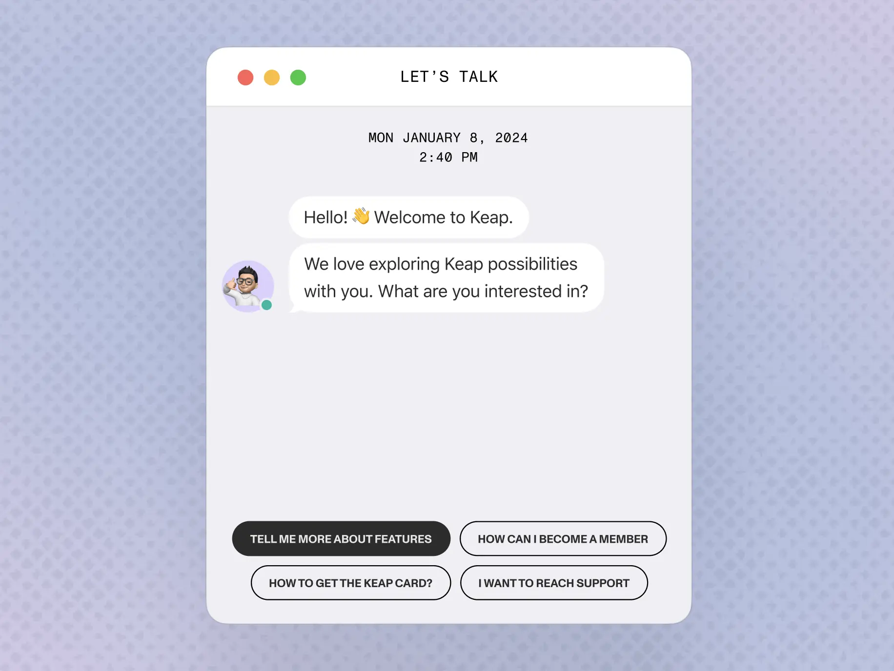
Live Chat Support
Need help right away? No problem! We've set up a live chat feature on the promo site. It's like having a direct conversation with us. If you have questions about Keap or get a bit stuck while exploring the site, just send us a message, and we'll be there to assist you instantly. It's like having a friendly helper right at your fingertips!
Video Tutorials
We are planning to include video tutorials that walk users through key features of Keap. Visual explanations can be powerful tools for demonstrating how to use the app effectively.
Gamified Elements
We are going to introduce gamified elements to make learning about finance and using Keap more engaging. This could include quizzes, challenges, or reward systems for achieving financial milestones.
Localized Content
We are planning to cater to a broader audience, so we need to prepare content in multiple languages. This can enhance accessibility for users from different regions and cultural backgrounds.
#Website design #Website development
Easily, LLC
USA
USA
#Mobile app design #Mobile app development
Keap, LLC
USA
USA
Have a project in mind?
Let's chat
Have a project to
discuss?
discuss?

Have a partnership in
mind?
mind?
