Development
Research
Client
Easily, LLC
 USA
USA
USA
Services
The client’s request was to create a dynamic and visually appealing promotional website that effectively communicates the key features, benefits, and unique selling points of Easily. The goal was to engage the target audience, primarily millennials and Gen Z, and showcase the app’s diverse functionalities.
Our role
Our team was excited to bring client’s vision to life and create an engaging platform that reflects the unique spirit of Easily. So we designed a website with an intuitive design that aligns with Easily’s user-friendly ethos. Highlighted Easily’s diverse features, focusing on finance management, travel planning, and the fast delivery marketplace. We also used straightforward language and intuitive design to convey the ease of integration into daily routines.
When we launched the Easily promo site project, we closely examined similar services and identified our potential users and their needs. This insight helped us differentiate Easily from competitors and tailor our offerings to meet users’ exact needs.
It’s all about crafting a promo site that’s not just different but also perfectly matches what our users want.
- Competitor analysis
- Persona analysis
- Mapping
Competitor analysis
In our approach to the Competitor Analysis for the Easily promo site, we started by identifying key players in the same field. We focused on the user experience of their platforms, analyzing how users interacted with features.
We also explored the design and branding strategies of our competitors, aiming to understand what appeals to users. By analyzing user feedback, we gained valuable insights into user preferences and the pain points experienced on existing platforms.
Persona analysis
In developing User Personas for the Easily promo site project, we began by identifying potential users and understanding their needs, behaviors, and preferences through research.
Creating User Personas enables us to customize the promo site to appeal to our target audience. It informs decisions on content, design, and engagement strategies, ensuring that Easily meets user needs and expectations effectively.
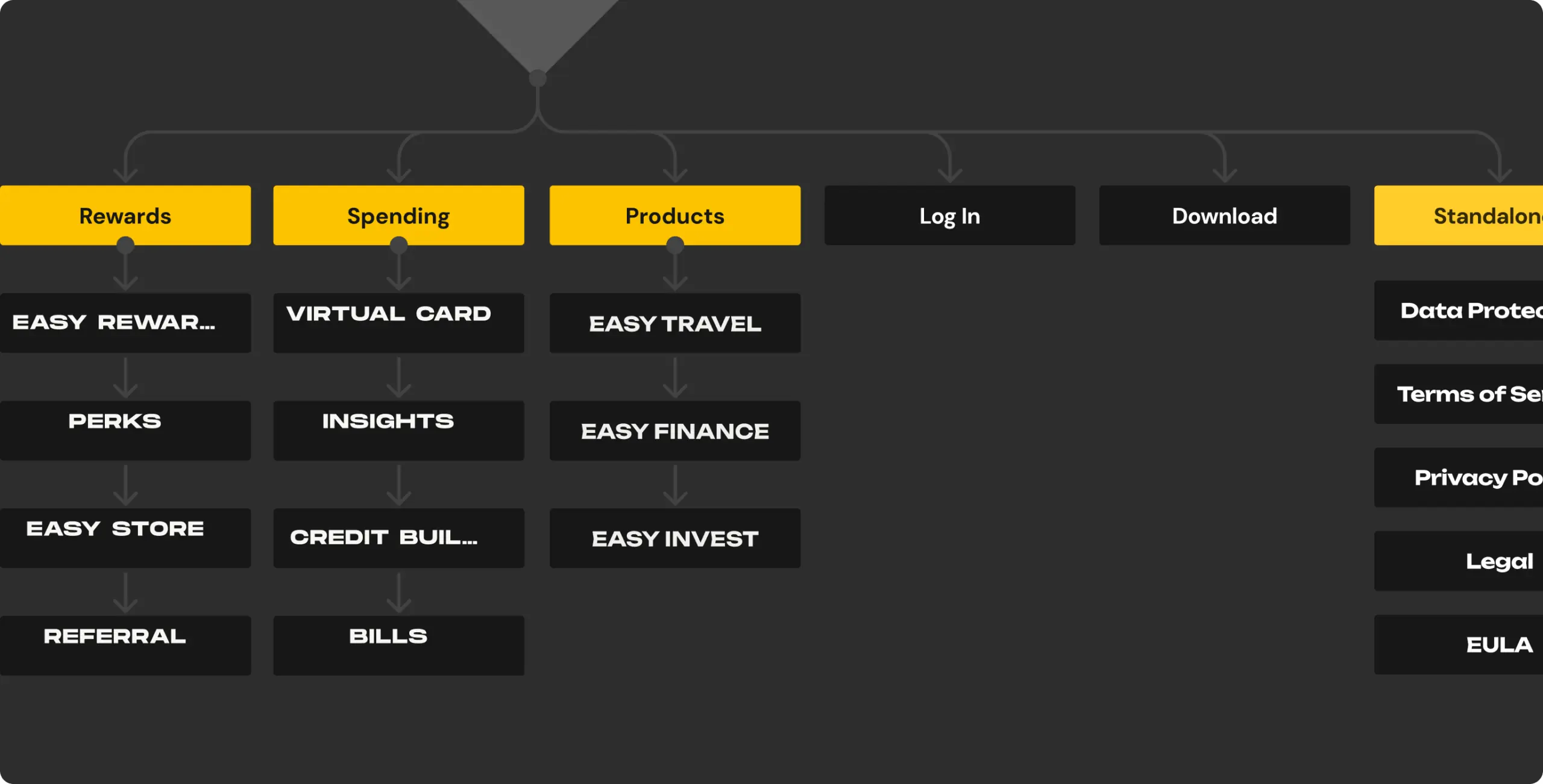
Mapping
Our team created the app architecture based on insights gathered from competitor analysis, persona analysis, and valuable feedback from the client. The design process was guided by these key elements, ensuring a well-informed and user-centric app structure.
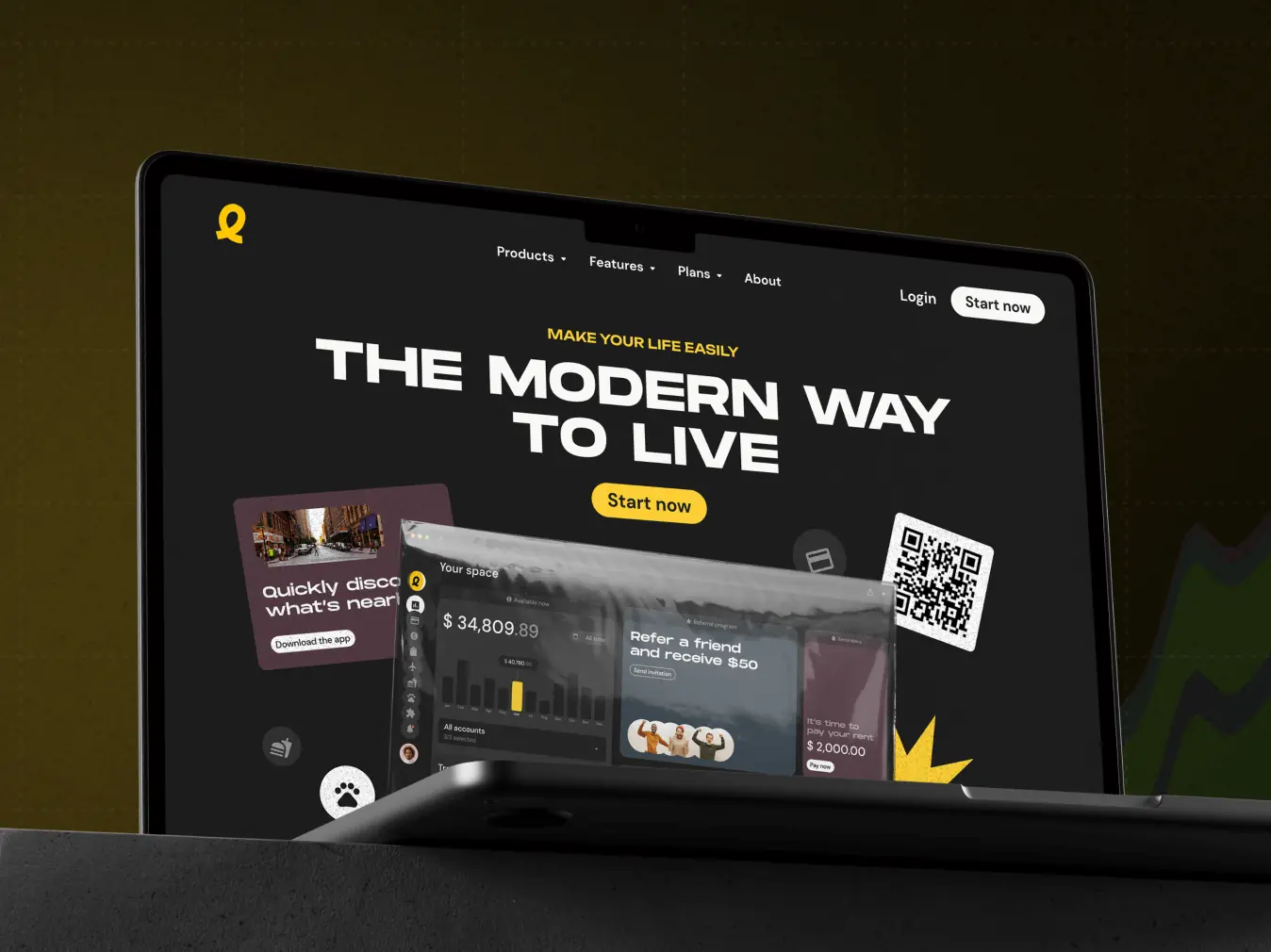
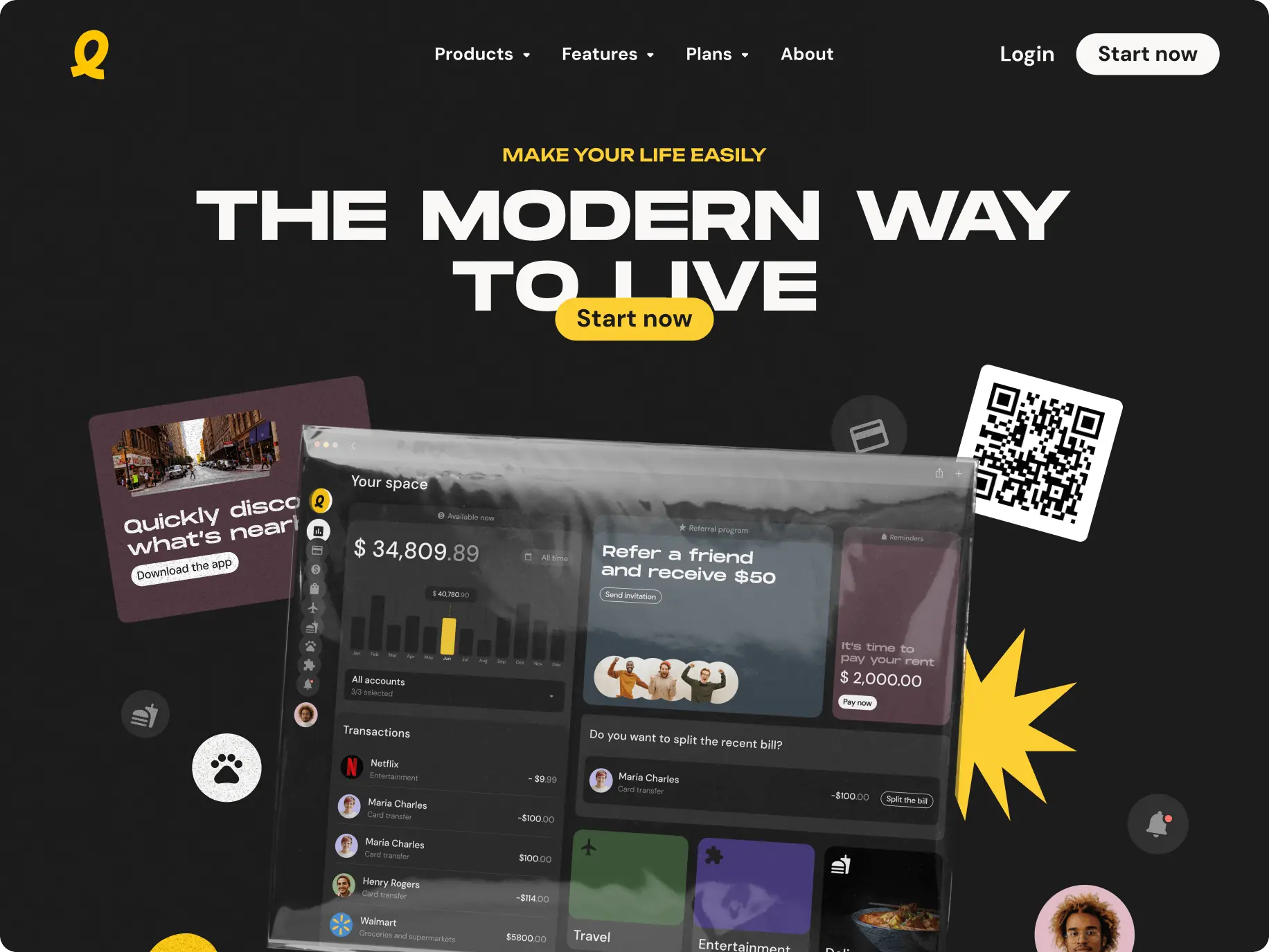
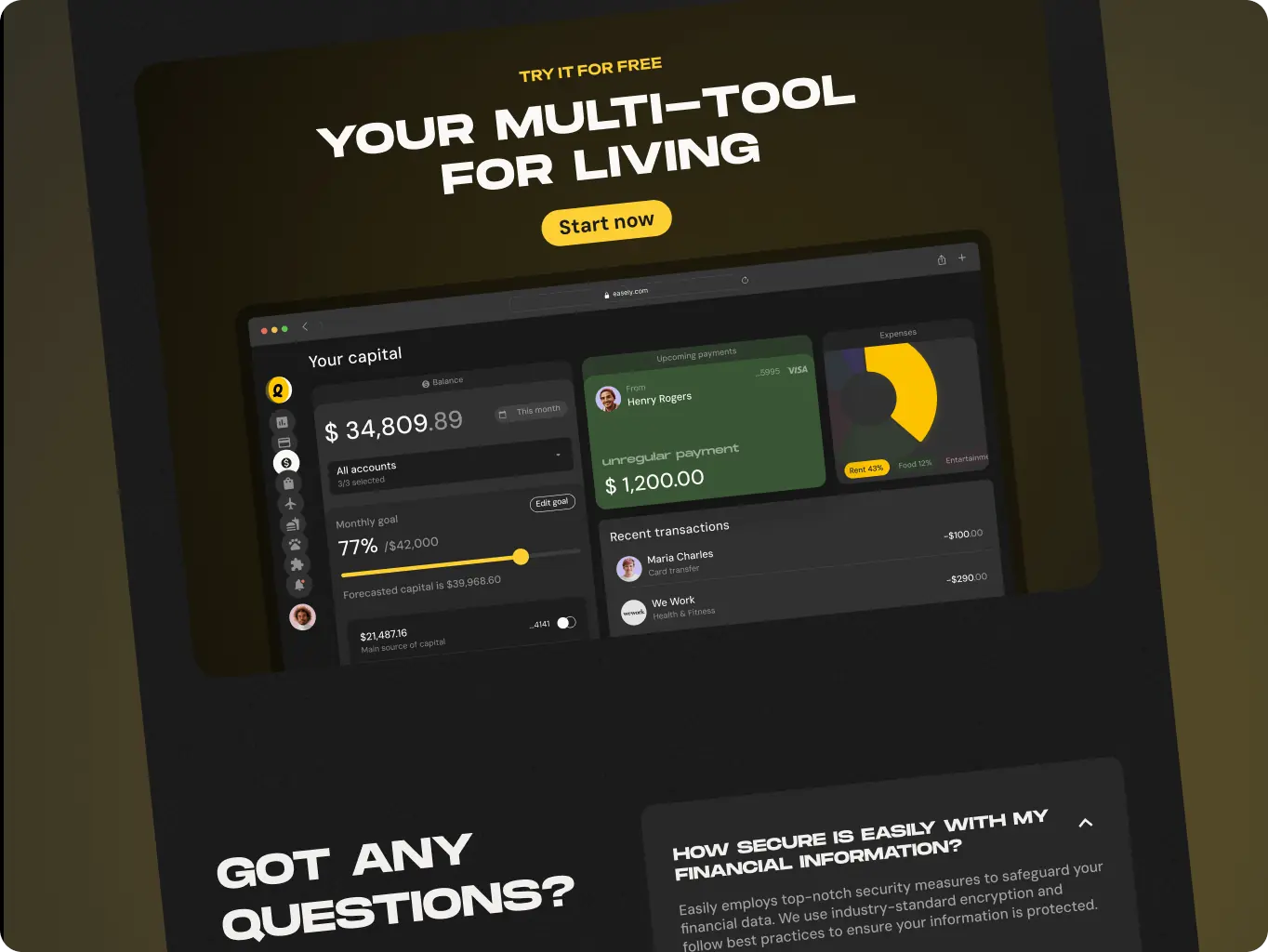
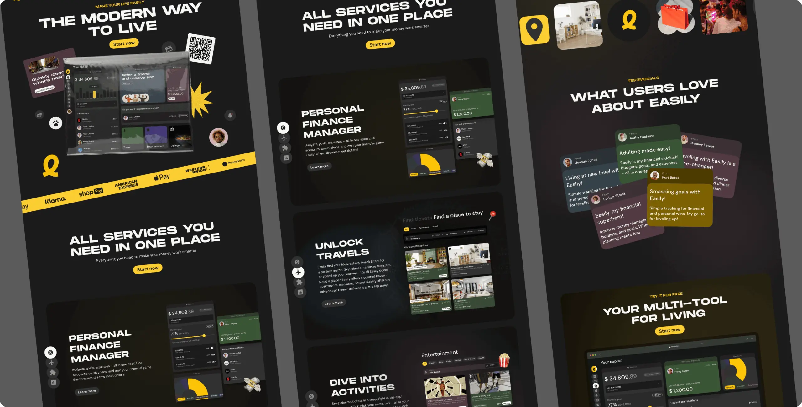
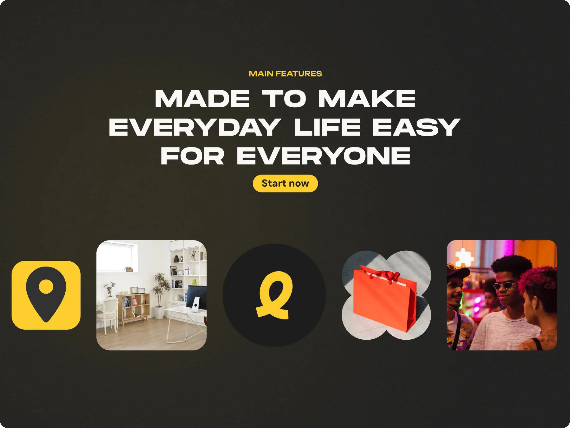
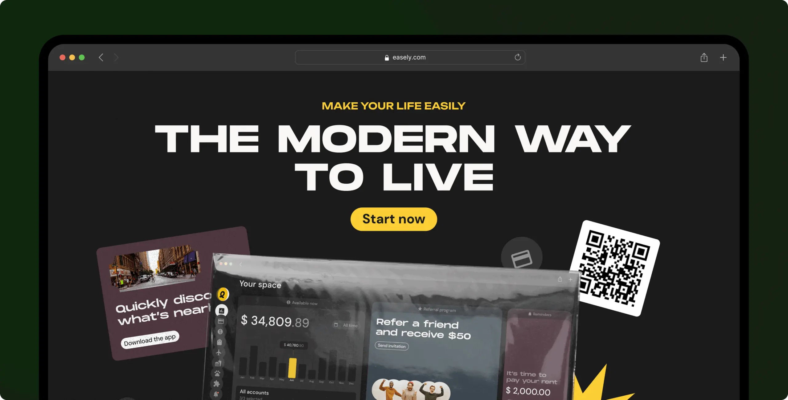
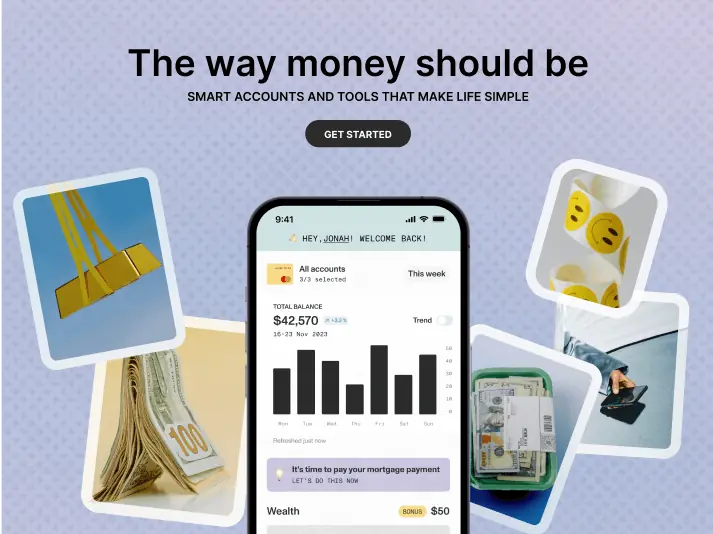
We were thrilled to design the promo site for Easily, a comprehensive web super app that consolidates essential services. Our goal was to create an attractive, informative website that clearly communicates what Easily offers. The site serves as a welcoming gateway, introducing users to the functionalities and benefits of Easily.
- Wireframe
- Moodboard
- Design Concept
- UI Design
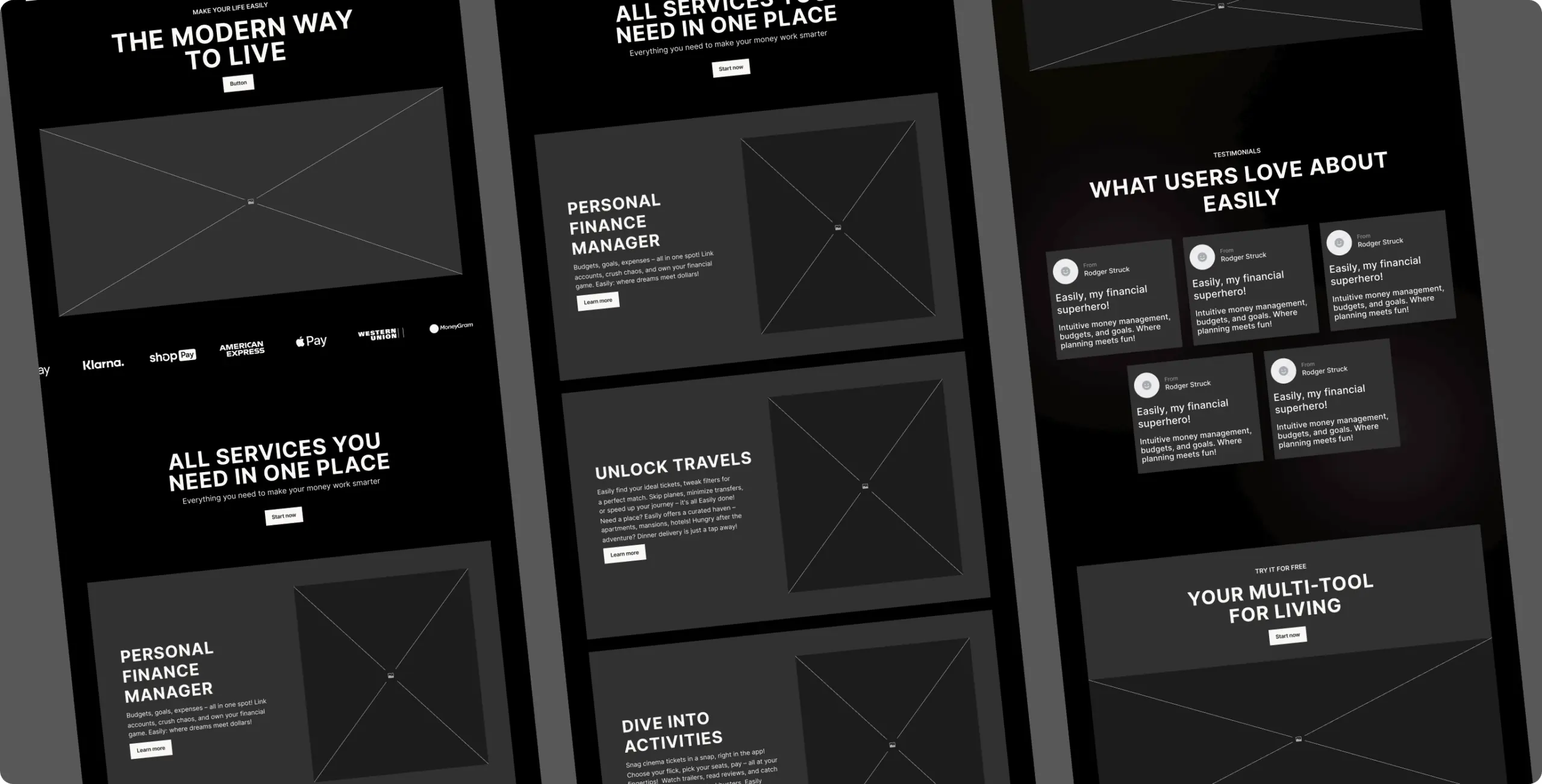
We created detailed wireframes to map out the product’s appearance and functionality. This planning helped us determine the placement of key elements and how users would interact with them. It’s akin to drafting a blueprint before moving on to the UI design stage.
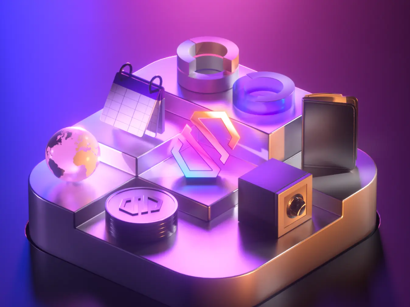
We crafted a set of visuals, including images, colors, typography, and more, to set the mood and style of the design, all in line with the existing Easily branding. This step helped us agree on how the design should look and feel, creating a unified visual language for the project.
These visuals served as a guide and inspiration throughout the following design phases, guaranteeing a cohesive and captivating user experience.
Once the Moodboard and Concept got the green light, we jumped into UI design to give the design concept a real presence. The goal here was to craft an interface that’s not only user-friendly but also looks good, all in harmony with the overall design vision.
To streamline the process for our developers, we created design components that are integrated into the Design System, ensuring a smooth transition from design to development.
Interactions
In this phase, we built a prototype to mimic how users would interact with the product. This gave us and stakeholders a firsthand experience of the features and functions before the actual development began.
Prototyping was key to testing design choices, collecting feedback, and refining the user experience through iterations, all of which informed the final product development.
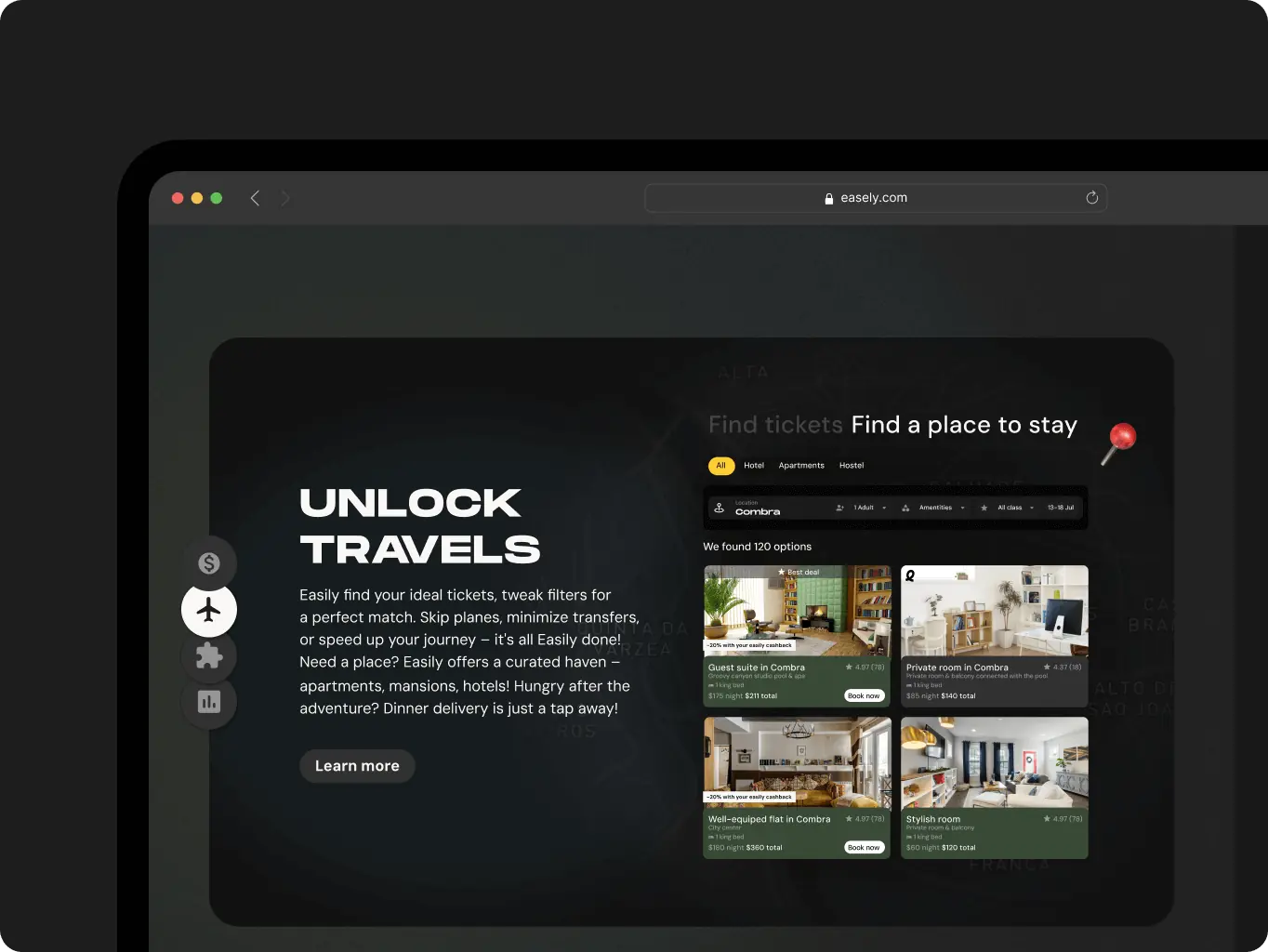
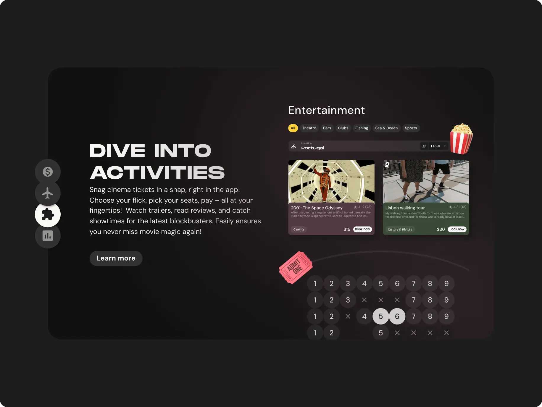

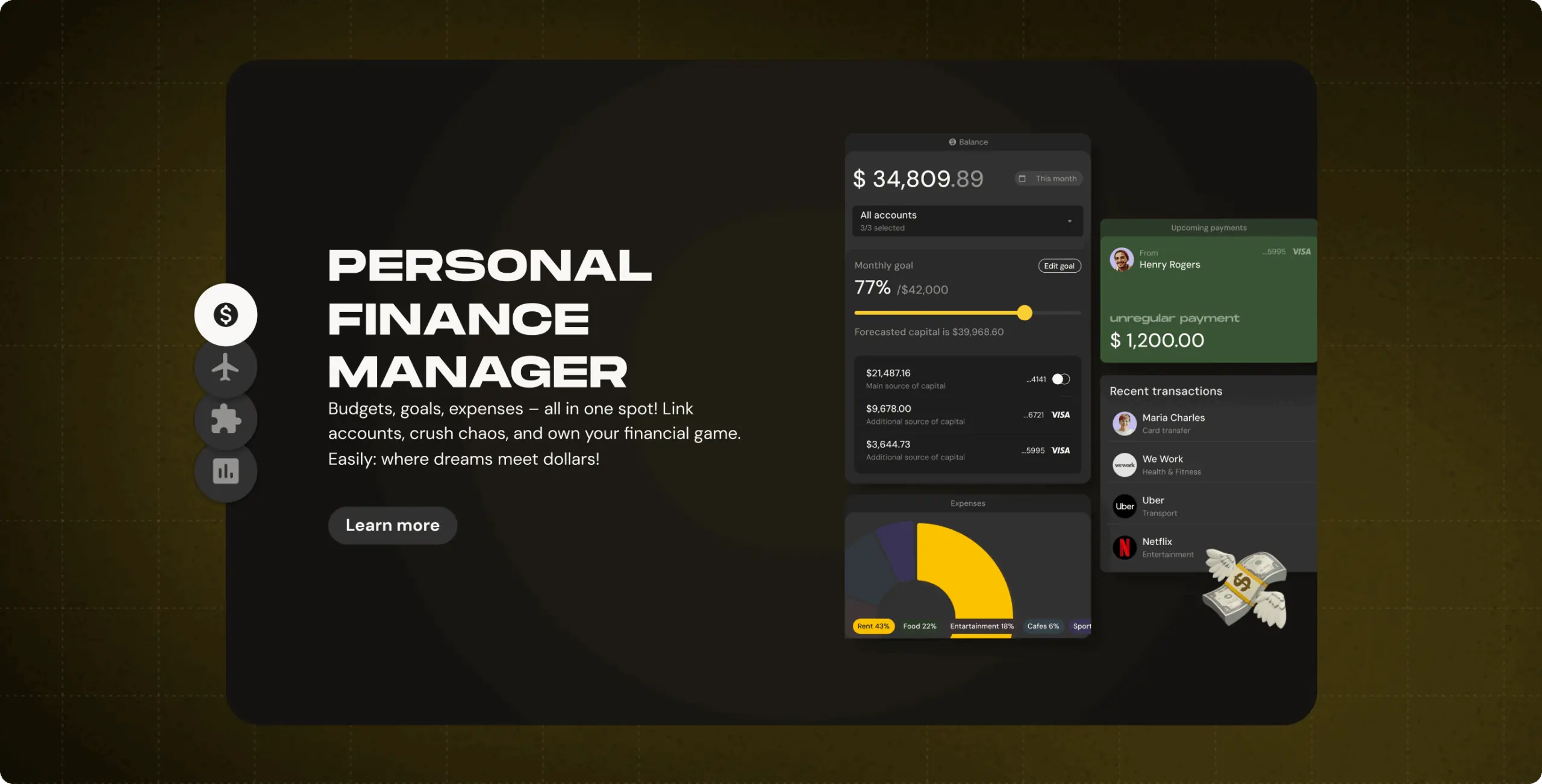
Clear Representation of Features
A dedicated section on the promo website that provides an organized and visually appealing display of the key features offered by the Easily web app. This feature effectively communicates the value proposition of Easily, allowing users to swiftly identify the services that align with their needs and interests.
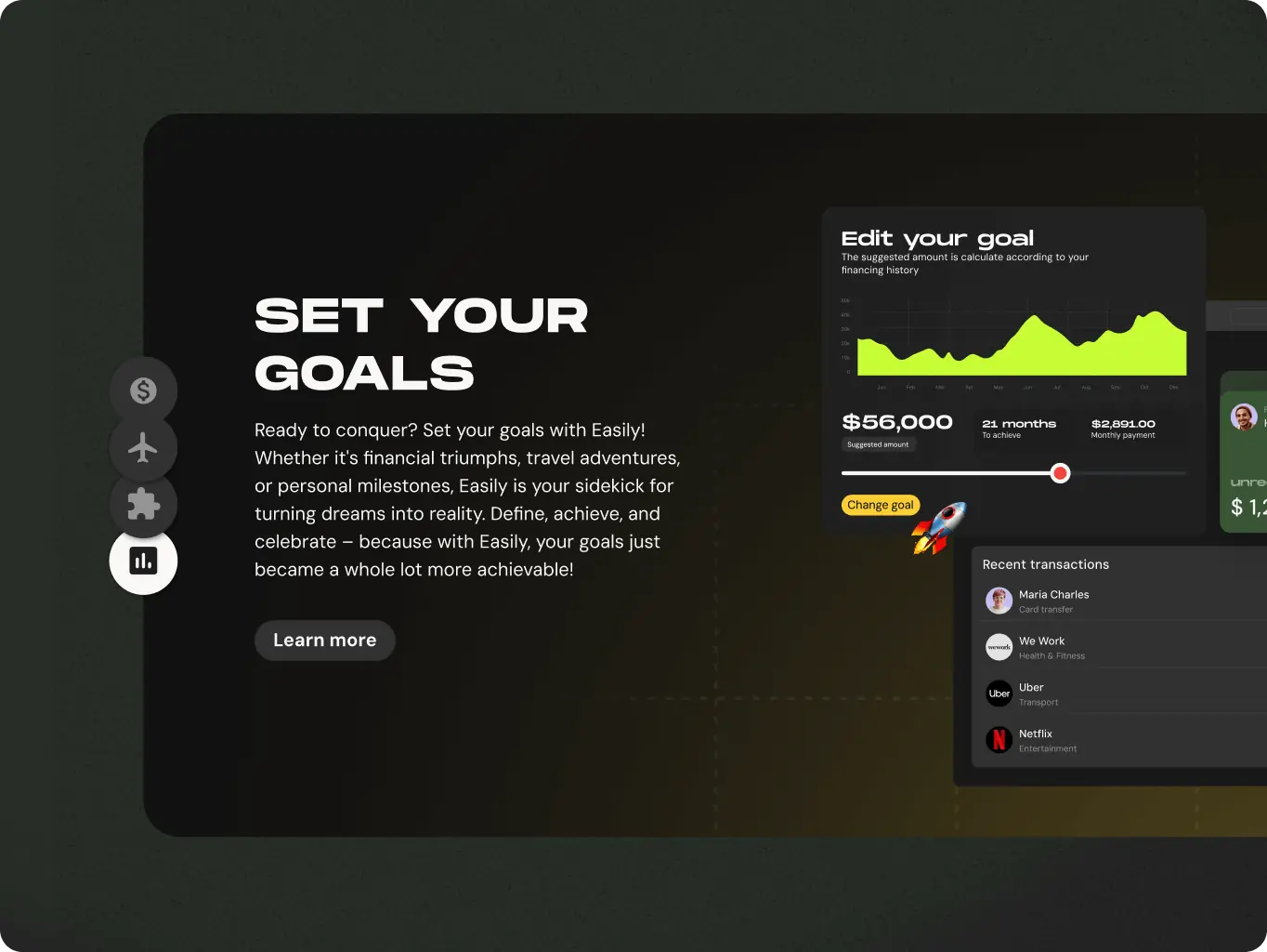
User-Friendly Experience Emphasis
A key feature of the promo website is its emphasis on the simplicity and user-friendliness of the Easily web app. We used clear language, straightforward step-by-step guides, and interactive elements to create an intuitive environment. This design showcases how effortlessly users can navigate and utilize the app's functionalities.
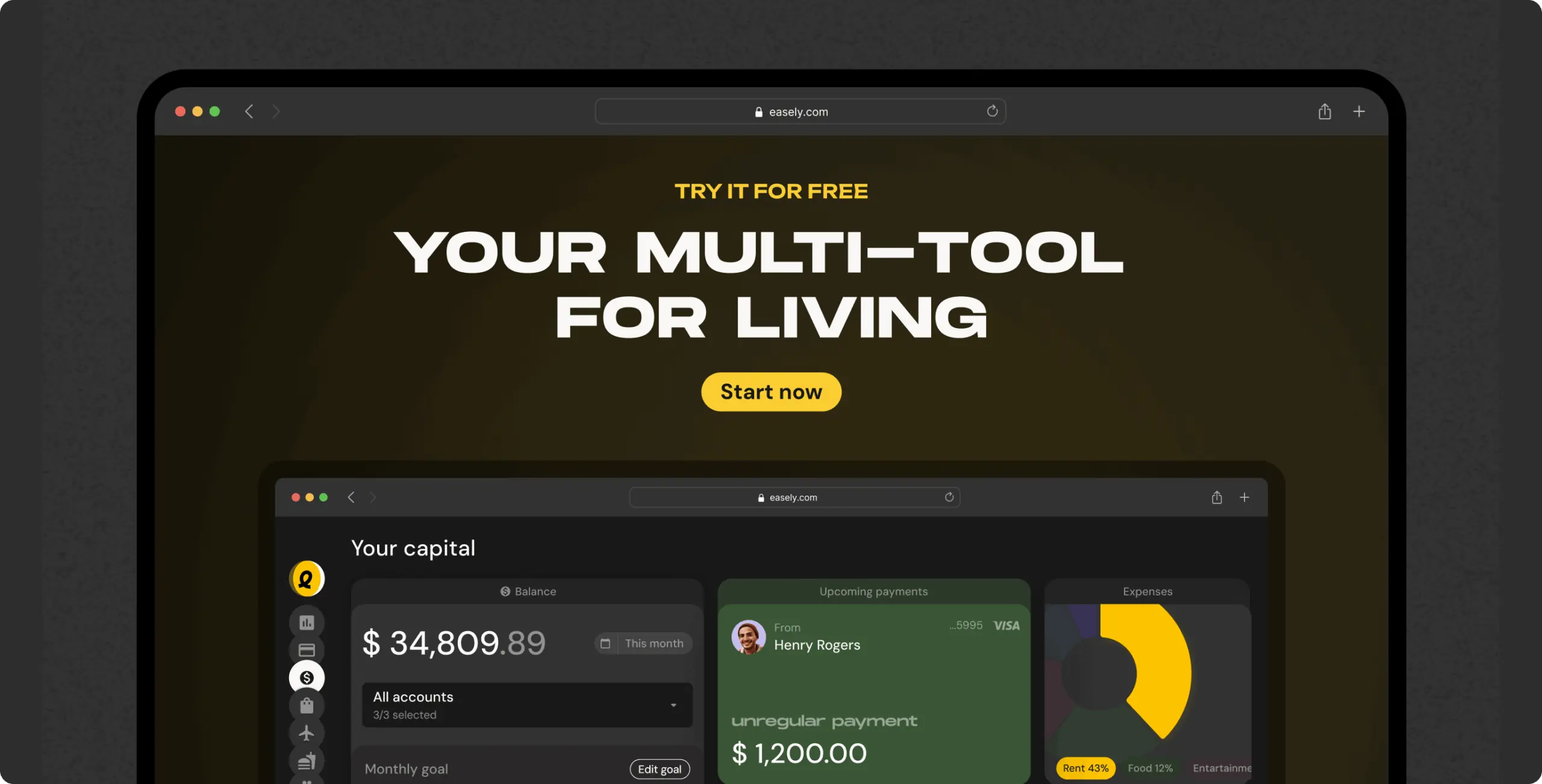
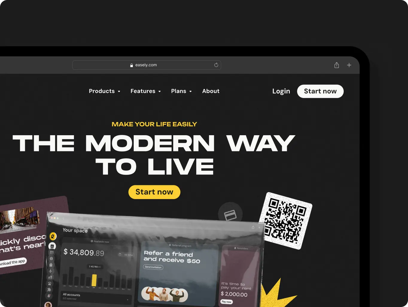
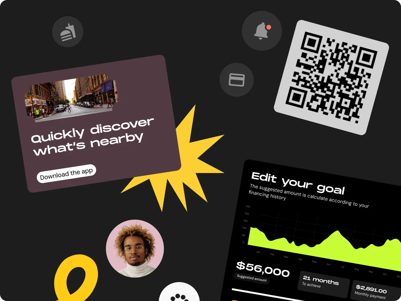
Dynamic Visual Elements
We integrated dynamic visuals, animations, and interactive elements to boost the website's visual appeal and engagement. These features create a more immersive user experience. Whether through clickable functions or scroll-triggered animations, these interactive elements encourage users to actively engage with the content, enhancing their overall experience.
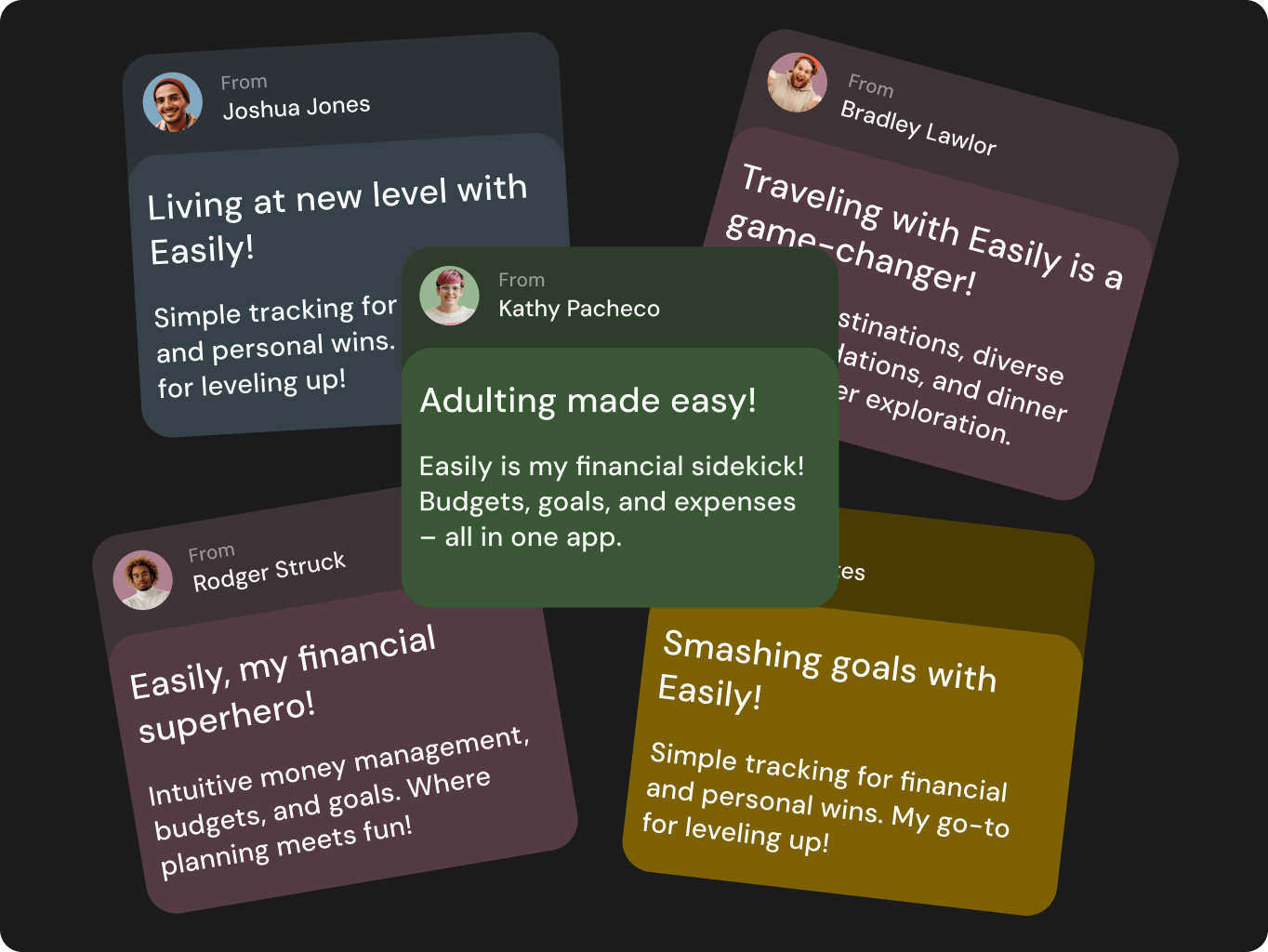
User Feedback Loop
We are planning to implement a feedback system on the website to gather insights from users. After that we can analyze feedback regularly and use it to make informed adjustments to improve the user experience.
Interactive Features
We are considering adding more interactive features to keep users engaged, such as quizzes, polls, or interactive tutorials, to make the user experience more dynamic.
Community Building
We envision a community section on the website where users can share experiences, tips, and feedback. This will foster a sense of belonging and loyalty.
#Website design #Website development
Keap, LLC
USA
USA
#Branding
Sway Finance
 Switzerland
Switzerland
Have a project in mind?
Let's chat
Have a project to
discuss?
discuss?

Have a partnership in
mind?
mind?
