Design
Development
Research
Launch
Evolve
Extend
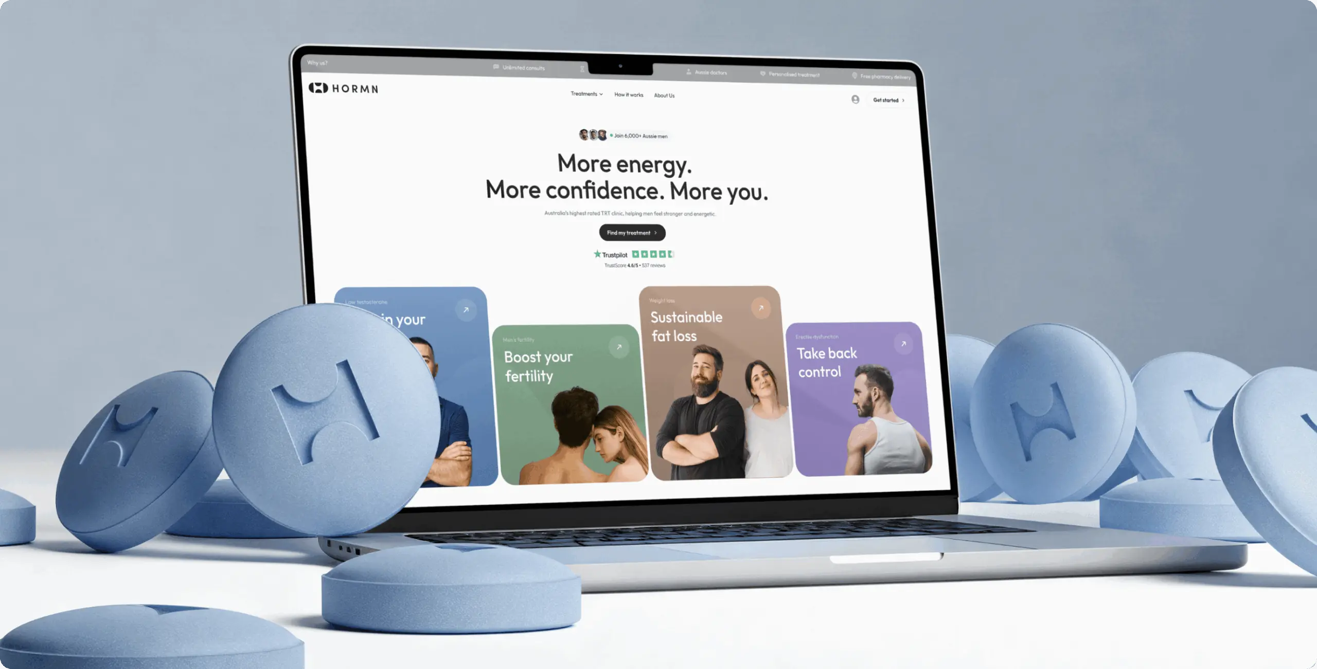
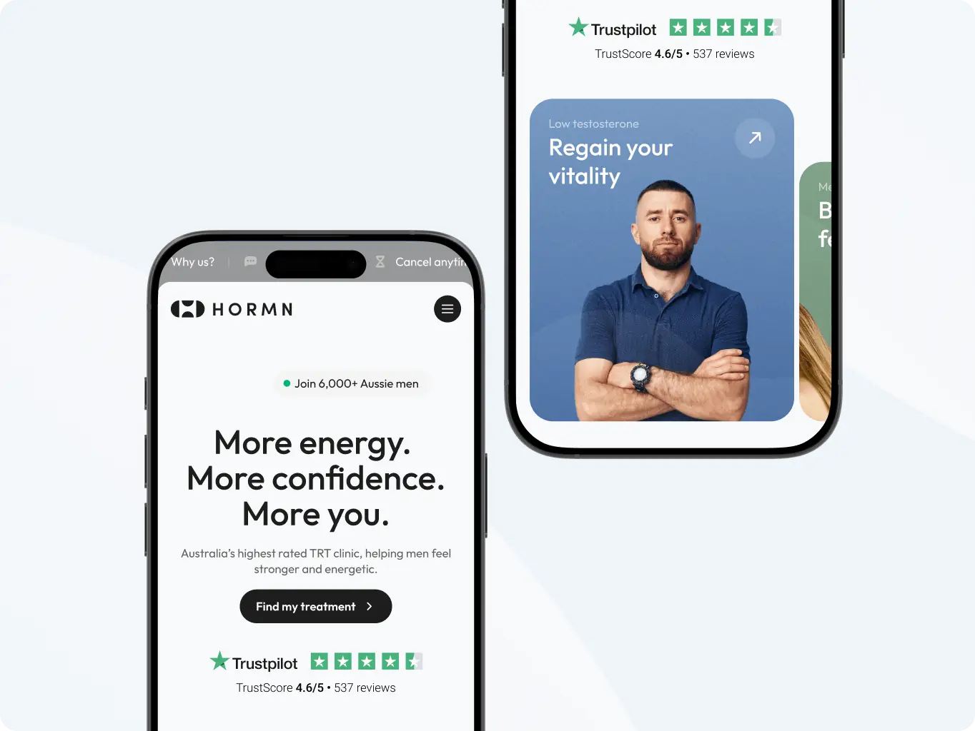
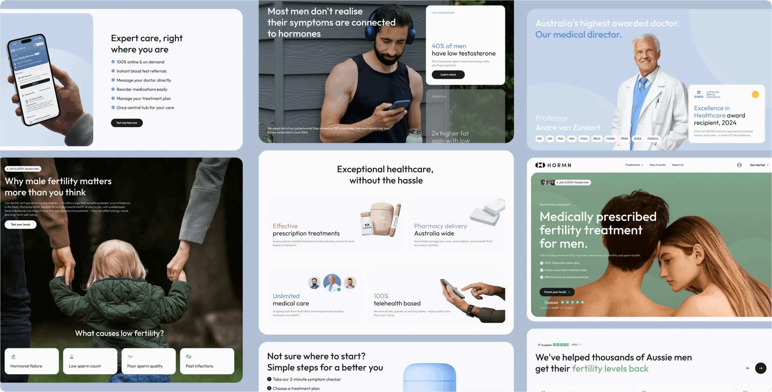
Hormn: Australia’s highest rated TRT Clinic
View Website

After our project was completed, the design was modified by the client to meet new business needs
 Australia
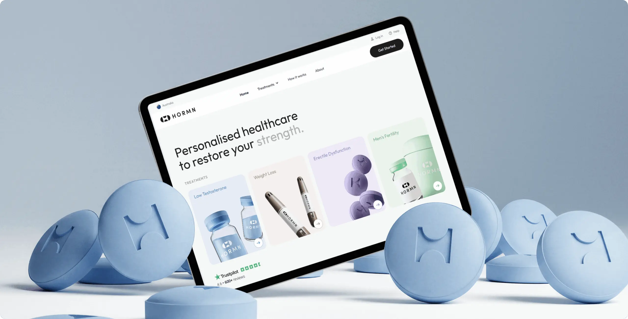

The client approached us to update the HORMN website during their transition into a modern online men’s health clinic.
The objective was to present HORMN not just as a treatment provider, but as a streamlined, guided service where men can evaluate their symptoms, understand potential conditions, and begin personalized care in a clear and approachable way.

We started with research to understand how men search for health support online and what prevents them from taking the first step. We reviewed competitors and leading telehealth brands to identify patterns that felt clear, calm, and trustworthy — qualities essential for a medical experience.
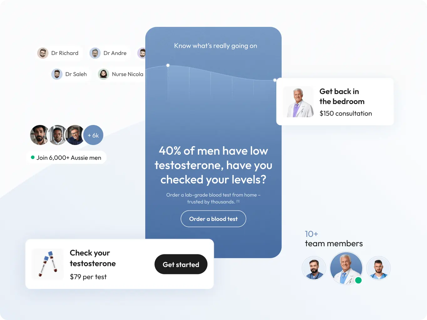
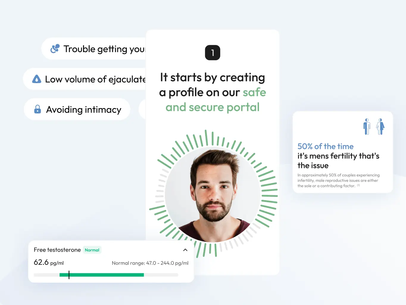
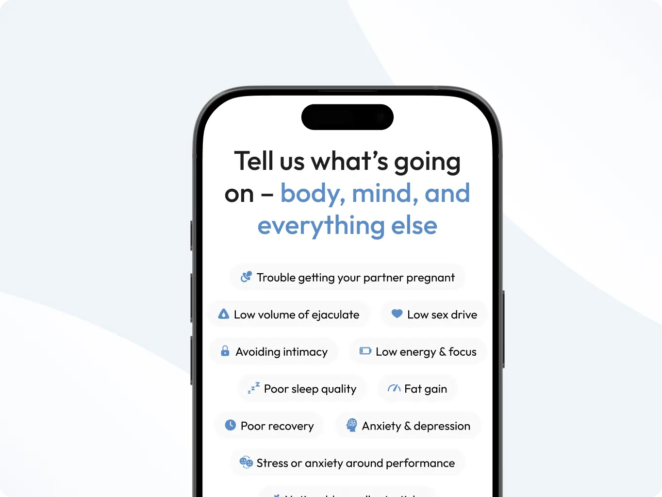
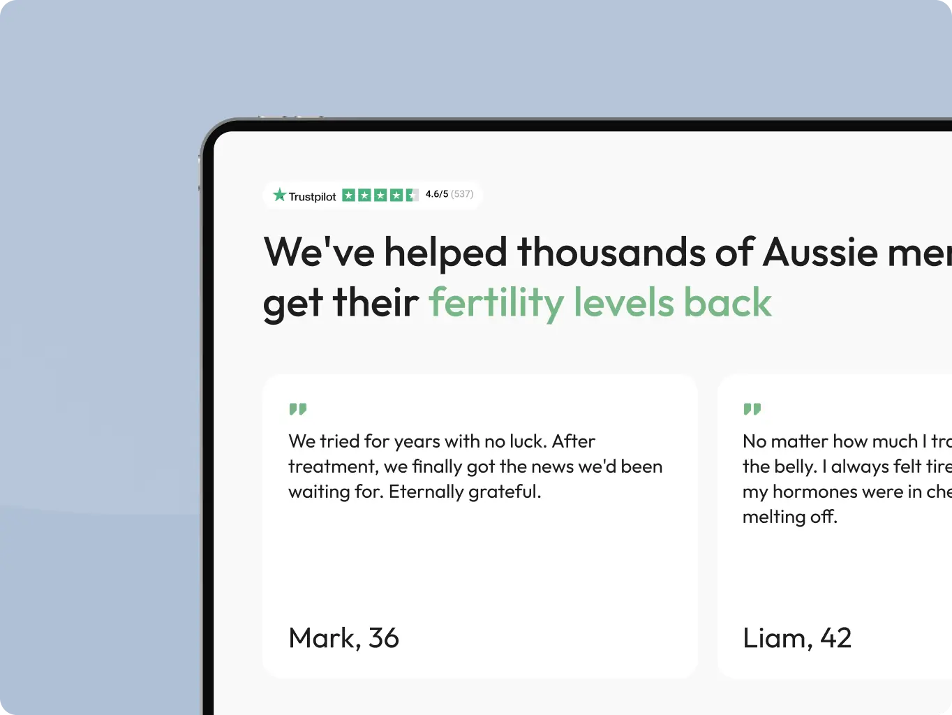
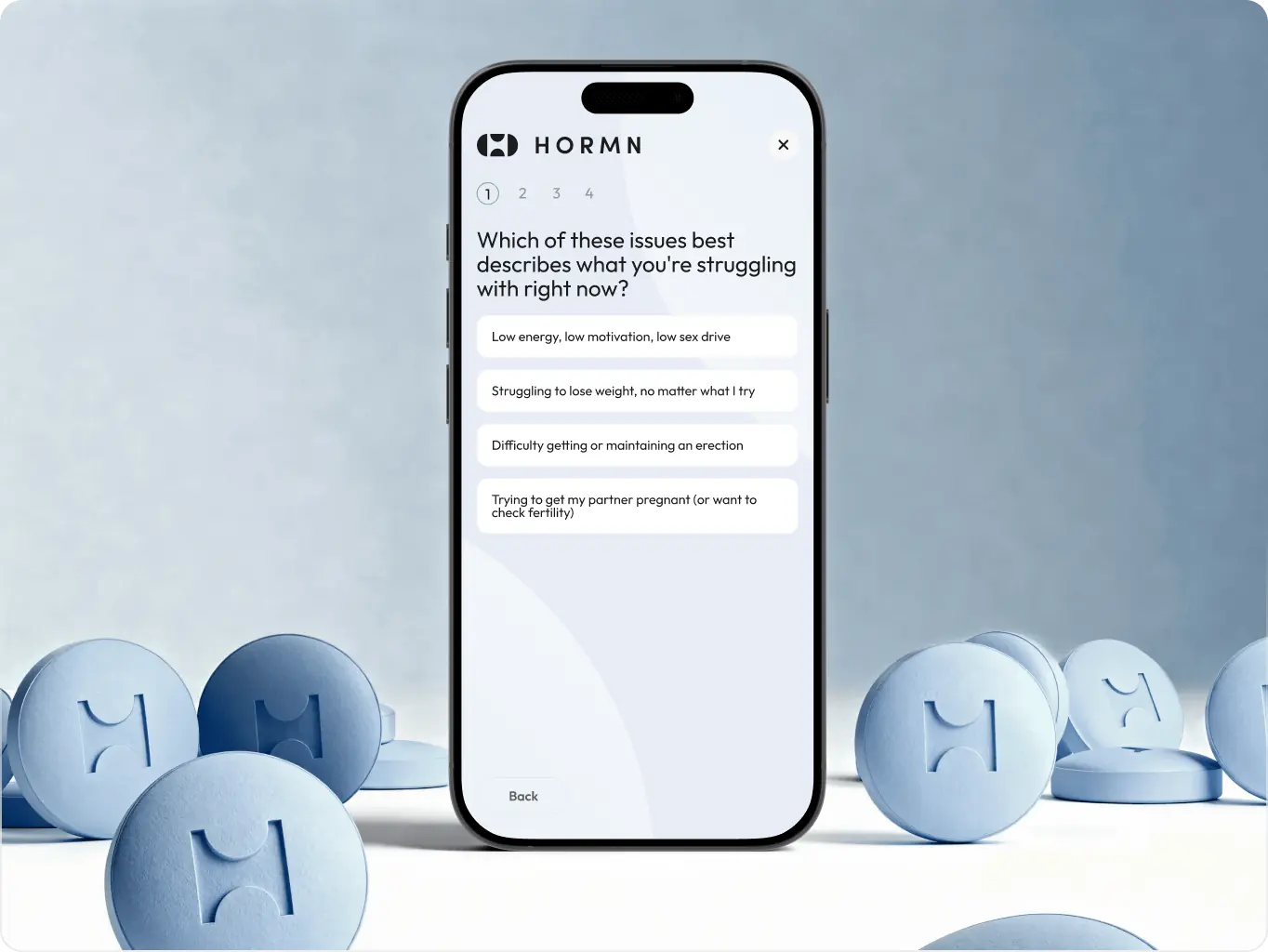
Using these insights, we defined user flows focused on reducing friction. Instead of pushing users directly into registration, we introduced a guided symptom quiz that helps them reflect on their experience and understand possible treatment directions. This creates a more personal and supportive entry point.
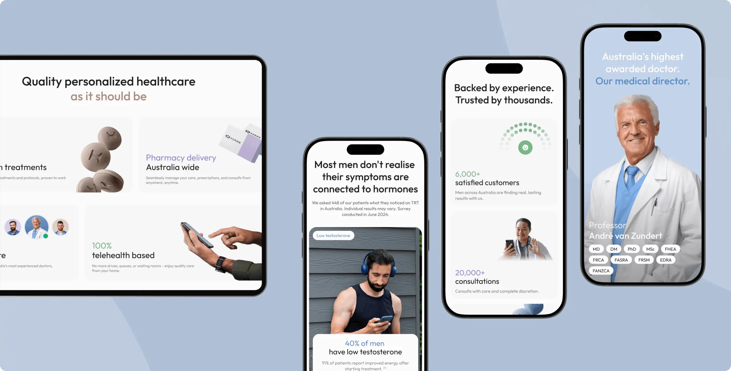
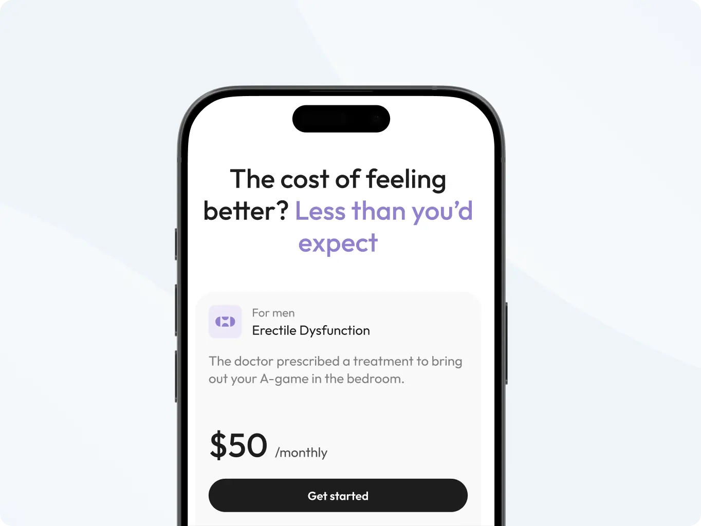
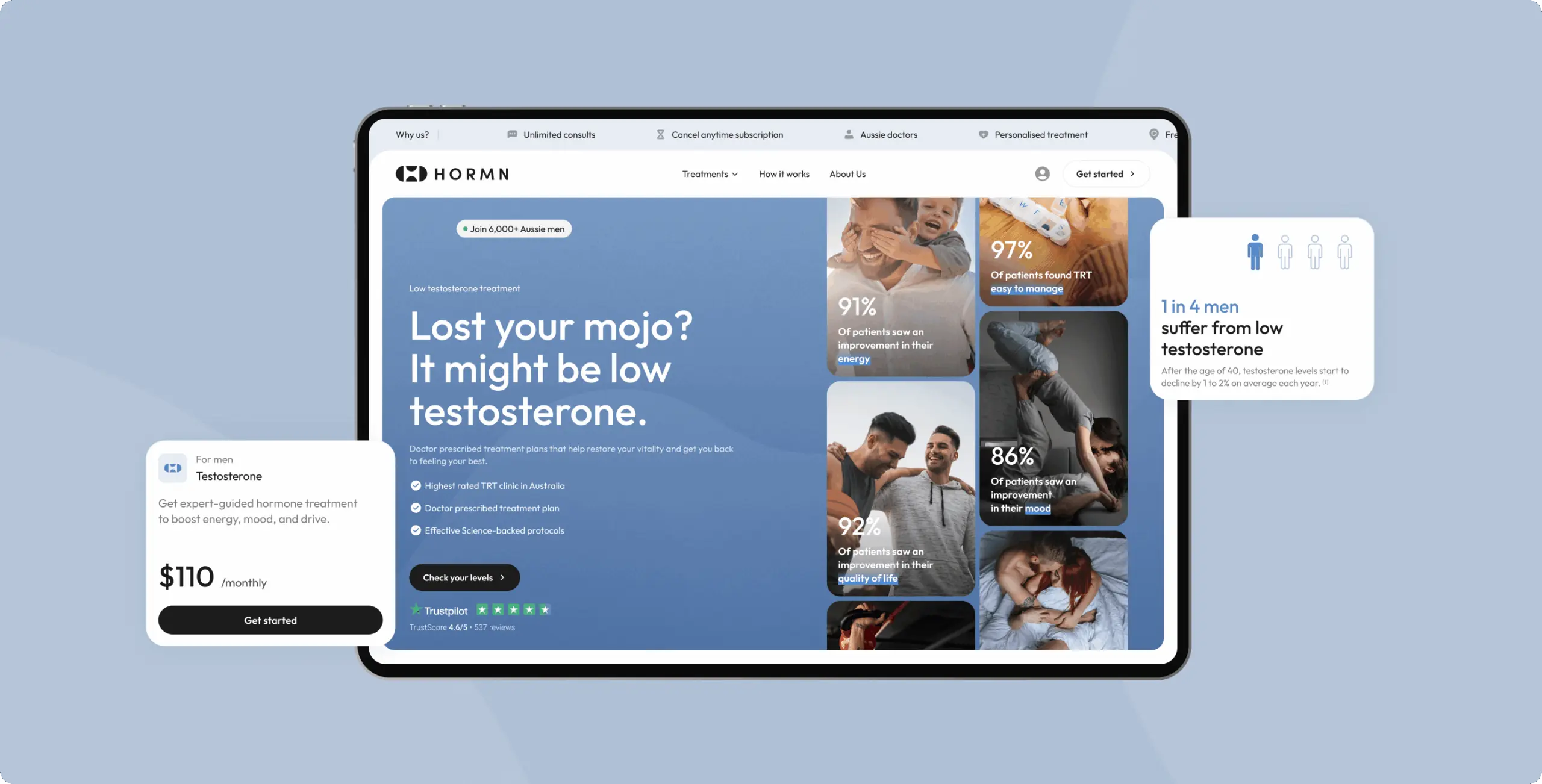
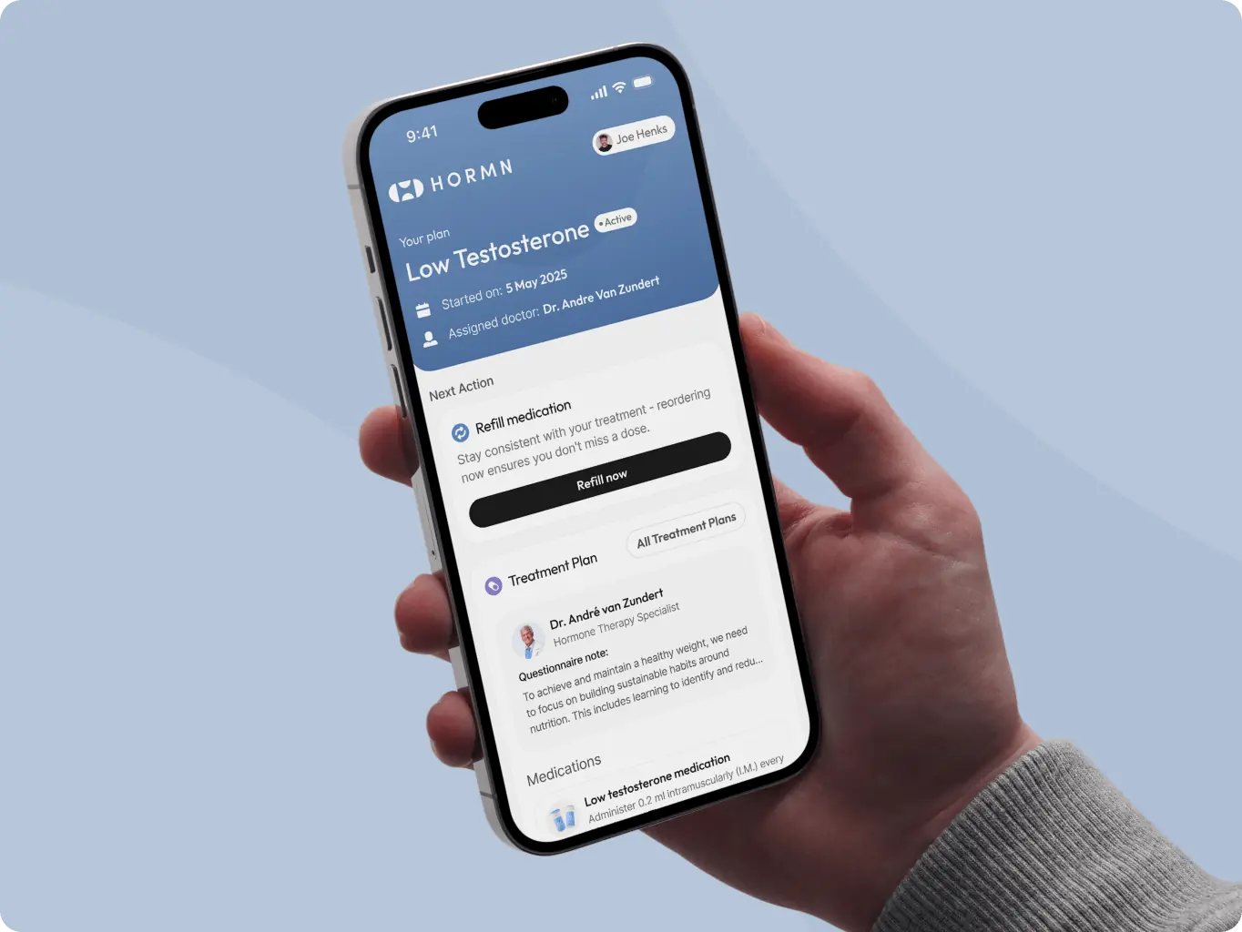
Visually, the interface was designed to feel modern, clean, and reassuring. A refined color system, clear spacing, and confident typography help communicate credibility, while structured content sections make the full range of services easy to understand. The final result creates a smooth and approachable online clinic experience — one that feels simple, human, and trustworthy.
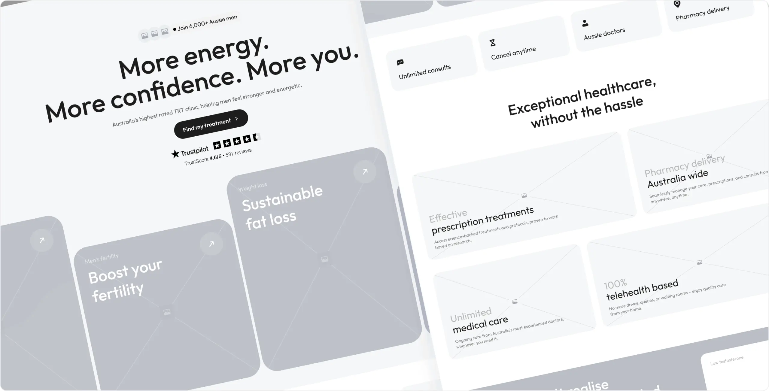
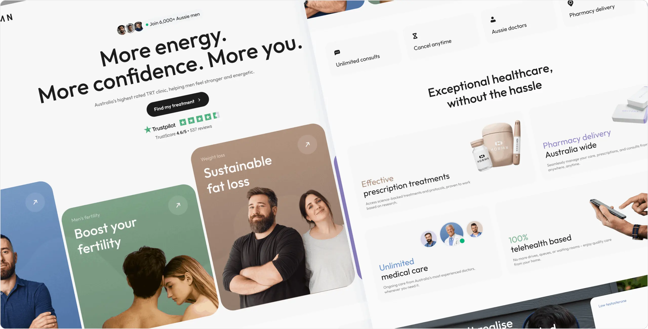
We implemented the new HORMN identity in Webflow and structured the site to support a straightforward, guided user journey. Animations and interactions were kept minimal and purposeful, emphasizing clarity and ease rather than visual noise.
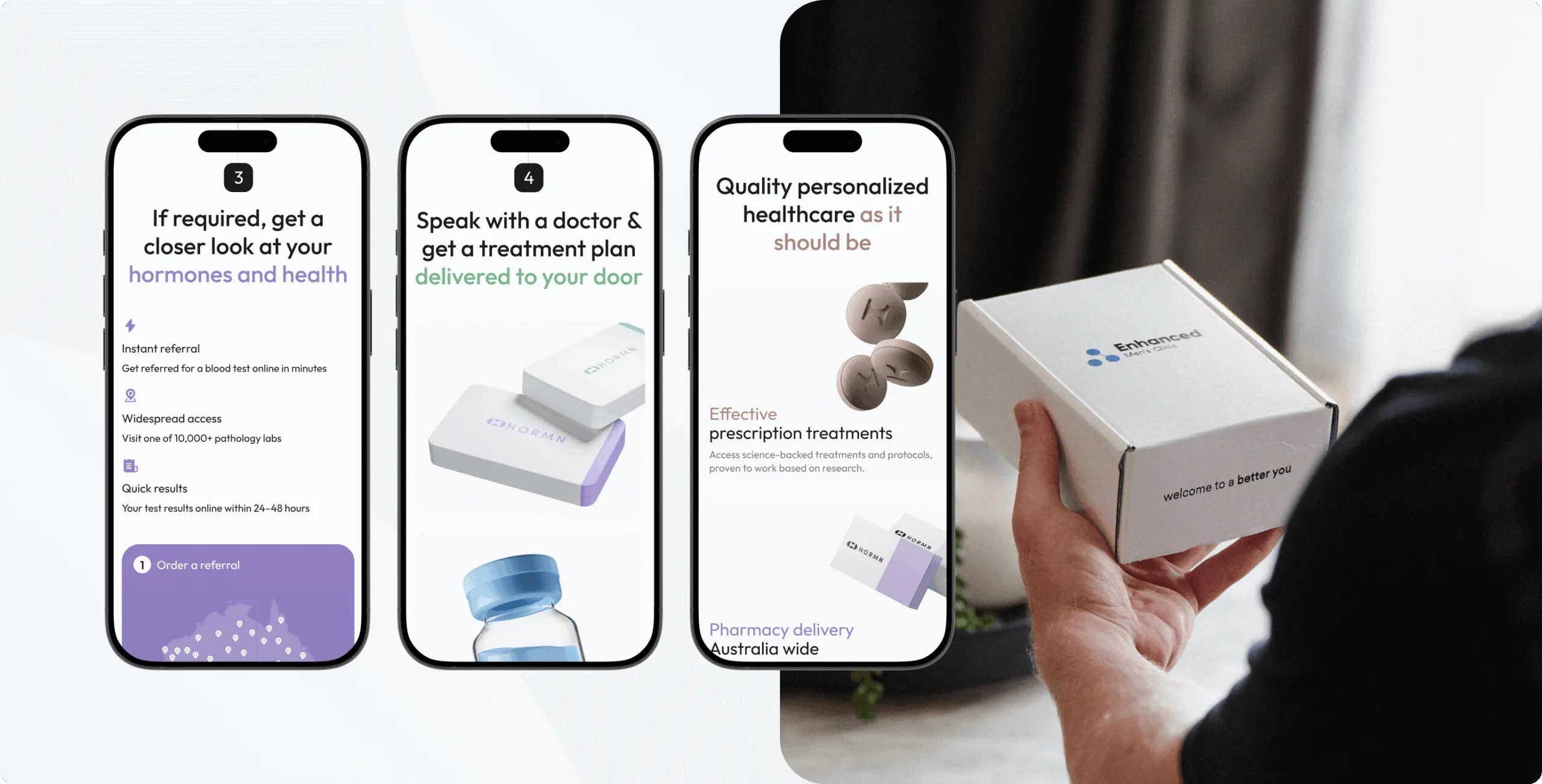
We configured the primary calls-to-action to lead into a short symptom quiz, helping users understand their situation and move toward the right treatment pathway. This approach reduces hesitation and creates a smooth transition from awareness to consultation.
The result is a fast, responsive website that communicates HORMN’s services clearly and makes it easy for users to take the next step.

Webflow

After our project was completed, the design was modified by the client to meet new business needs
#Website design #website development
EVERON
 USA
USA
USA
#Website design #Website development
Philip Lewis
 Finland
Finland
#website design
Tyler Ussery
 USA
USA
USA
Have a project in mind?
Let's chat
Have a project to
discuss?
discuss?

Have a partnership in
mind?
mind?
