Development
Research
 USA
USA Bubble
The client asked us to create a Proof of Concept for a digital platform that would simplify the journey of adopting wind energy. They wanted to test how users could explore suitable locations, select the most efficient turbine for their needs, and even simulate the ordering process directly through the service.
Beyond the initial setup flow, the client emphasized the importance of showcasing how users might gain real-time access to performance indicators, energy output, and other key data — presented in a way that feels clear and approachable even for non-technical audiences.


At the UX research stage, we focused on understanding how people approach wind energy and what stops them from making confident decisions. We conducted a market review and analyzed competitor platforms to see how turbine selection, installation, and data monitoring are currently presented.
This helped us to see that most solutions overwhelm users with technical details and lack guidance on where to start. These insights gave us a direction to design a product that simplifies choice, installation, and daily monitoring into a transparent, user-friendly experience.
Stages
- Competitor Analysis

We studied platforms like ONYX Insight, Dewesoft, Clir Renewables, and WindSim to see how they handle turbine monitoring and site selection. Most focus on technical analytics and enterprise-scale operations, which makes them powerful but difficult for non-experts to use.
This showed us a gap in the market: users need clarity, not complexity. Greenow simplifies the process by guiding people through location selection, turbine comparison, and performance monitoring with clear dashboards and accessible insights.


We began with wireflows that mapped out the main user flows, including turbine selection, installation, and monitoring. This step helped us validate the logic of the platform quickly and gave the client a clear picture of how users would interact with the service.
Once the structure was approved, we developed design concepts to set the visual direction. The client confirmed the initial concept, which allowed us to move quickly into detailed UI design.
Stages
- Wireflows
- Mockups design

During the this stage, we focused on defining the core structure of the platform and translating user needs into clear, logical flows. All key screens were sketched to reflect the main steps of the journey: choosing a location, comparing turbine models, completing installation, and accessing performance data.
Wireflows also served as an early validation tool for the client. By visualizing the navigation, hierarchy, and interactive elements, we were able to confirm that the platform covered all required scenarios without unnecessary complexity.


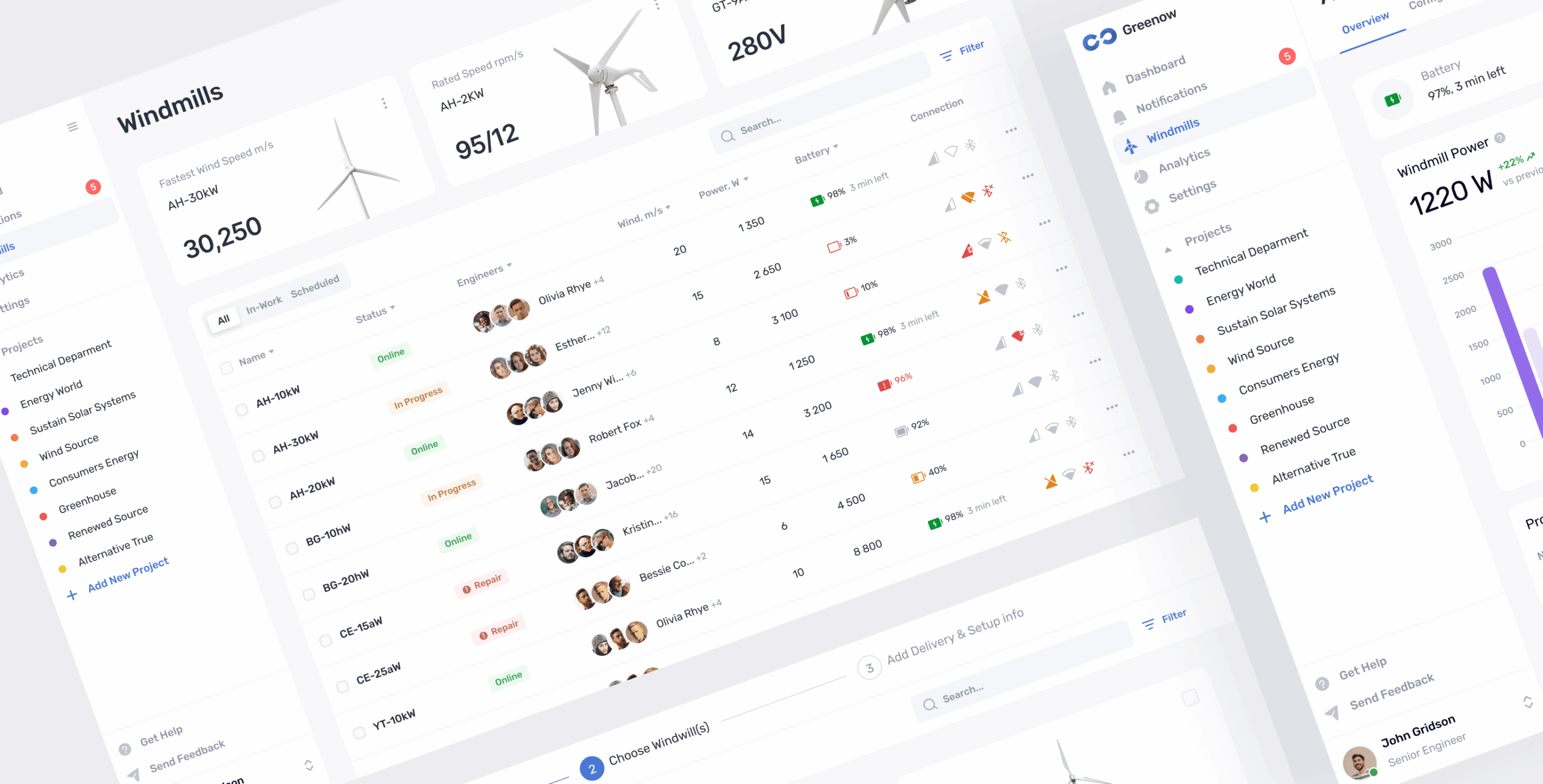
The UI design was focused on implementing key features quickly and effectively while keeping the experience simple. We created widget-based analytics to present only the most important data, such as energy output, battery status, and temperature, in a clear and accessible way.
To support the platform’s wide functionality, we developed a design system with interactive components like hovers, drags, and clicks. These elements made navigation intuitive and reduced the time needed to complete actions, turning a complex service into an easy-to-use product.


Turbine details
Each model comes with clear specifications, including power output, size, and efficiency. Users can easily compare options and explore details to choose the best turbine for their location.
Informative widgets
Key turbine data like wind speed, power output, battery status, and connection health is displayed through compact widgets. This format highlights only the most relevant metrics, making complex information quick to read and easy to act on.
Customizable sidebar
The sidebar can be tailored to user needs, allowing quick access to the most important sections and projects. With adjustable order and highlighted notifications, navigation stays clear and efficient.
Location selection
The platform guides users in choosing the best spot for a wind turbine by analyzing terrain, wind conditions, and accessibility. With clear recommendations and visual cues, the process becomes simple and reliable.
To bring the product to life quickly, we used Bubble, a no-code platform that allowed us to combine design and development in parallel. This approach helped us move from wireframes to a functional product in just weeks instead of months.
The result was a fully working proof of concept that demonstrated the core features of turbine selection, installation flow, and performance monitoring. The demo was polished enough for investor presentations while remaining flexible for future iterations, giving the client a fast and cost-efficient way to validate the idea.

Bubble


#branding
NDA
 Australia
Australia

#Branding
Hyperscale
 United States
United States

#landing page design
bm Śladewska
 poland
poland
Have a project in mind?
Let's chat
Have a project to
discuss?
discuss?

Have a partnership in
mind?
mind?
