Design
Development
Research
Launch
Evolve
Extend
DoMORE — mobile redesign for a ticket subscription platform
Client
Domore
 USA
USA
USA
Services
Technologies
 React
React
 TypeScript
 Vite
Vite
 Radix Primitives
 Stripe
 ZOD
ZOD
 Tanstack Router
 KY
KY
Client came to us with a working product but an outdated design that no longer matched their growing vision. Our task was to reimagine the DoMORE experience with a modern, mobile-first interface that feels dynamic, user-friendly, and conversion-focused.
Alongside the redesign, we were asked to improve the registration flow, implement personalized ticket suggestions, and build a landing page that clearly communicates the value of the DoMORE membership — all while staying true to the brand’s bold, playful voice.

We began with a full UX audit of the existing web app, analyzing user flows, friction points, and visual inconsistencies. This helped surface key usability issues, including a bloated onboarding process and unclear navigation paths.
To complement this, we conducted a competitive analysis of event discovery and membership-based platforms. The goal was to understand what users expect, where others fall short, and how DoMORE could offer a standout experience.
Insights from both audits shaped a redefined information architecture and content hierarchy. We prioritized reducing cognitive load and guiding users quickly toward the app’s core value: free event access.
These early research stages laid the groundwork for a design system that feels intentional, easy to use, and emotionally engaging — setting the stage for the UI to shine and the product to scale.
Stages
- UX audit
- Competitors analysis
- Information architecture
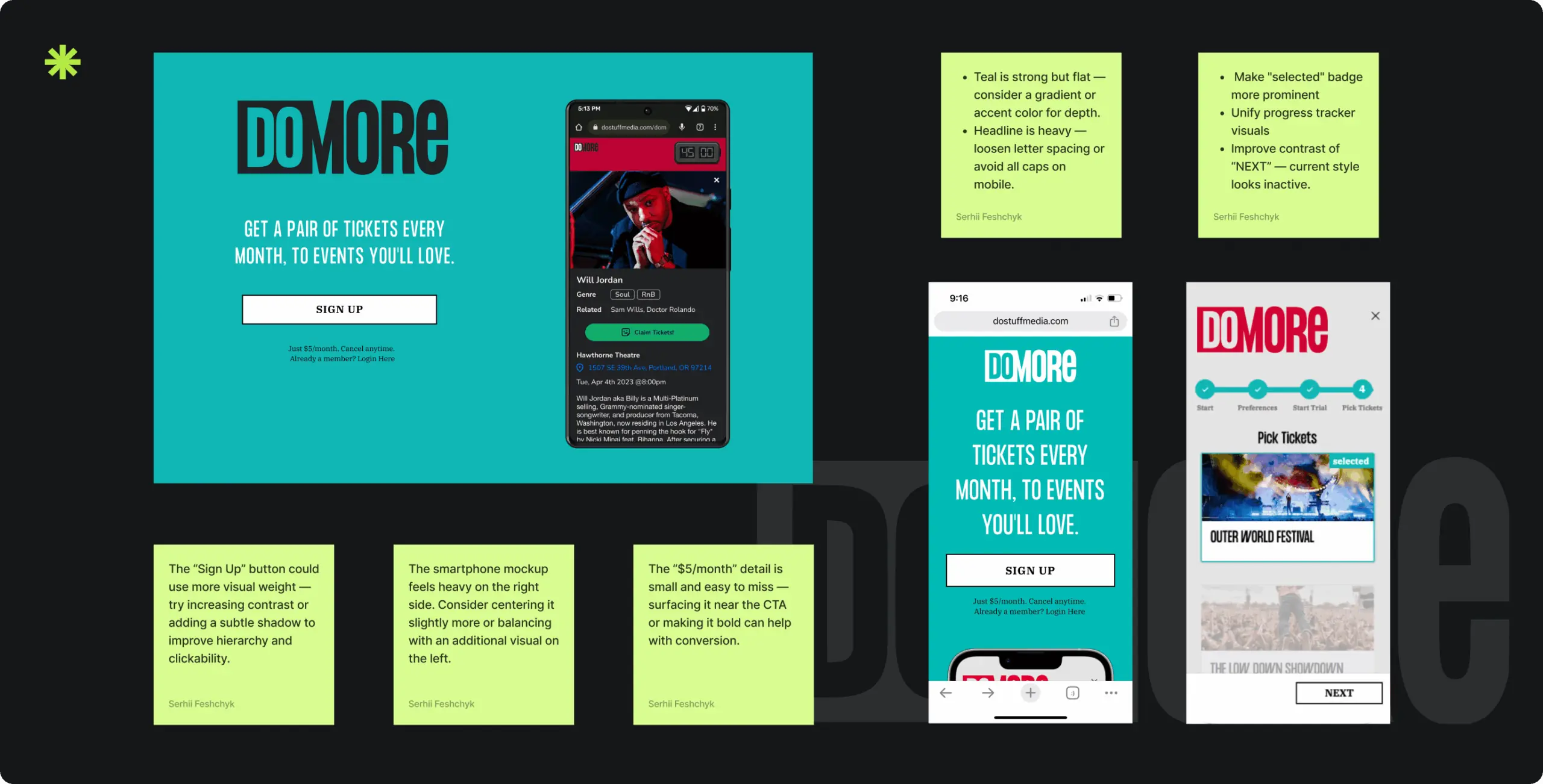
We conducted a detailed UX audit of the existing DoMORE web app, reviewing core user flows through the lens of usability heuristics, industry standards, and client feedback. This helped us identify key friction points, including high drop-off during onboarding, unclear ticket selection, and inefficient navigation.
Alongside these issues, we proposed hypotheses for improvement— such as simplifying registration and enhancing micro-interactions to guide users more effectively.
We also assessed the visual layer, revealing outdated patterns and missed opportunities for emotional engagement. Together, these insights shaped the foundation for a redesign aligned with both user needs and business goals.
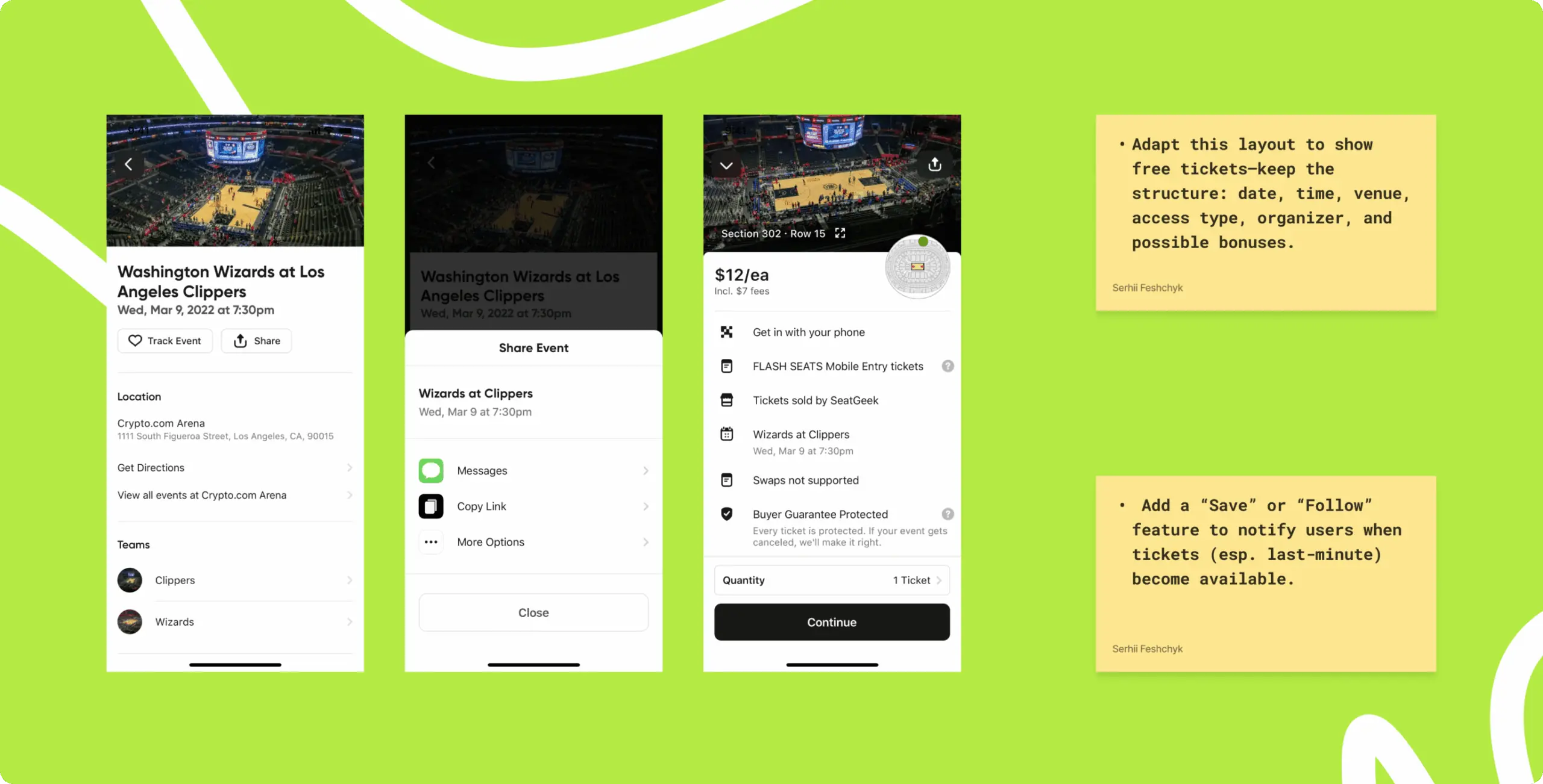
To position DoMORE more effectively, we analyzed leading platforms in the event discovery and membership space. This helped us identify UX trends, user expectations, and opportunities to differentiate.
We looked closely at how competitors approach onboarding, personalization, and event selection. These insights guided us in integrating proven patterns — like swipe-based interest selection and time-sensitive bonus tickets — without losing the product’s unique feel.
The research helped us make informed design decisions that balanced familiarity with innovation, ensuring a smoother, more engaging user experience.
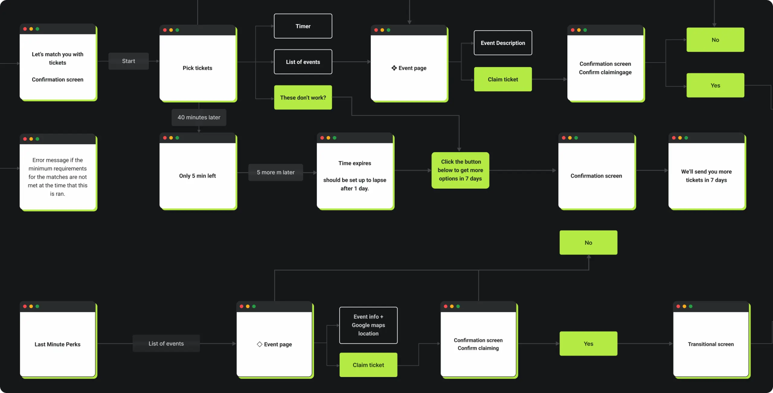
We redesigned the wep app’s structure from the ground up to make navigation simple and intuitive. The new architecture puts core actions like ticket claiming and event discovery front and center, reducing the steps needed to reach value.
Flexible and scalable, the updated layout supports future features without overwhelming the user. Clear hierarchy, logical grouping, and consistent patterns help users move through the web app with ease and confidence.
To build a bold and engaging experience for DoMORE, we started with wireframes that defined clear, logical flows and allowed for rapid iteration. Once the structure was in place, we crafted a moodboard to shape the project’s emotional tone — energetic, urban, and spontaneous.
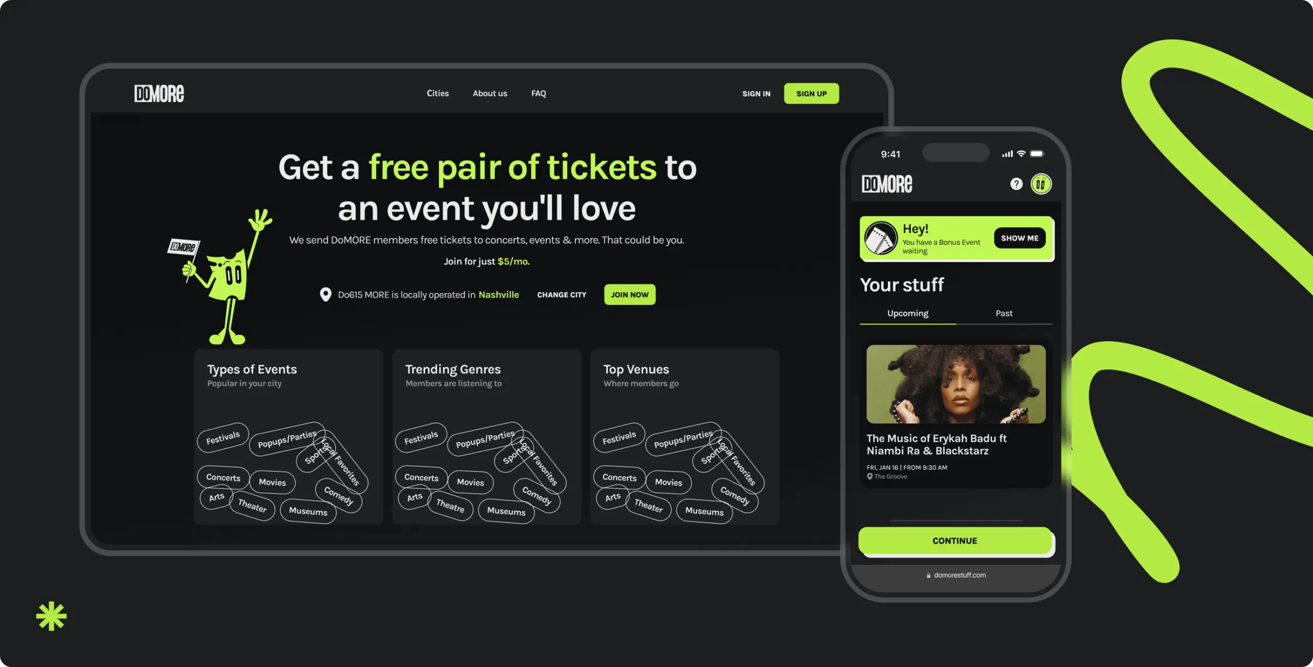
This visual direction informed the design concept, featuring a dark theme, swipe-based navigation, and a custom character. The final UI layered in motion, contrast, and refined details to deliver a dynamic, modern interface that resonates with users both visually and emotionally.
Stages
- Wireframe
- Design direction
- Mascot design
- UI design
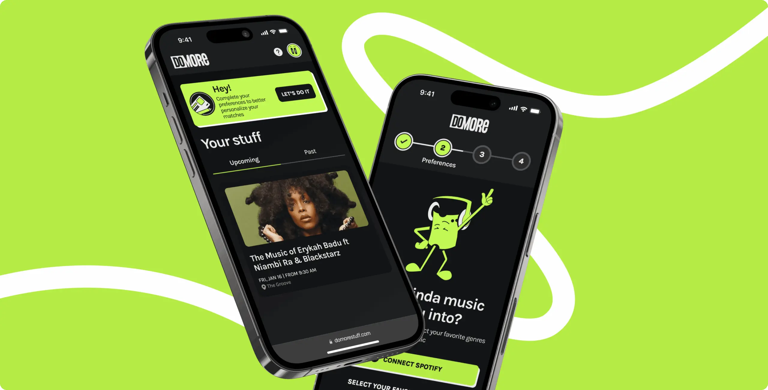
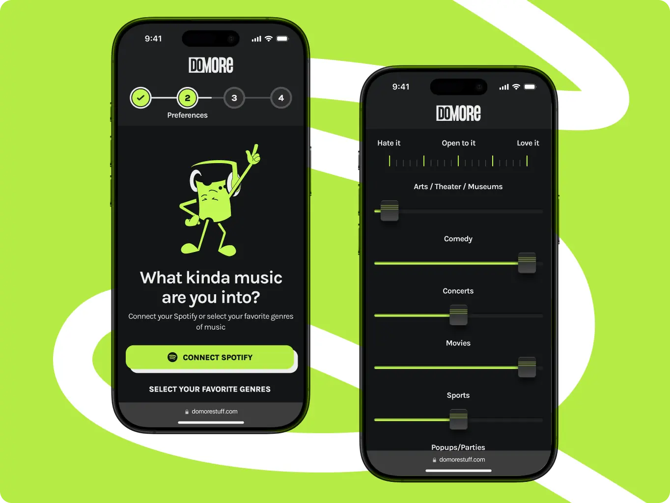
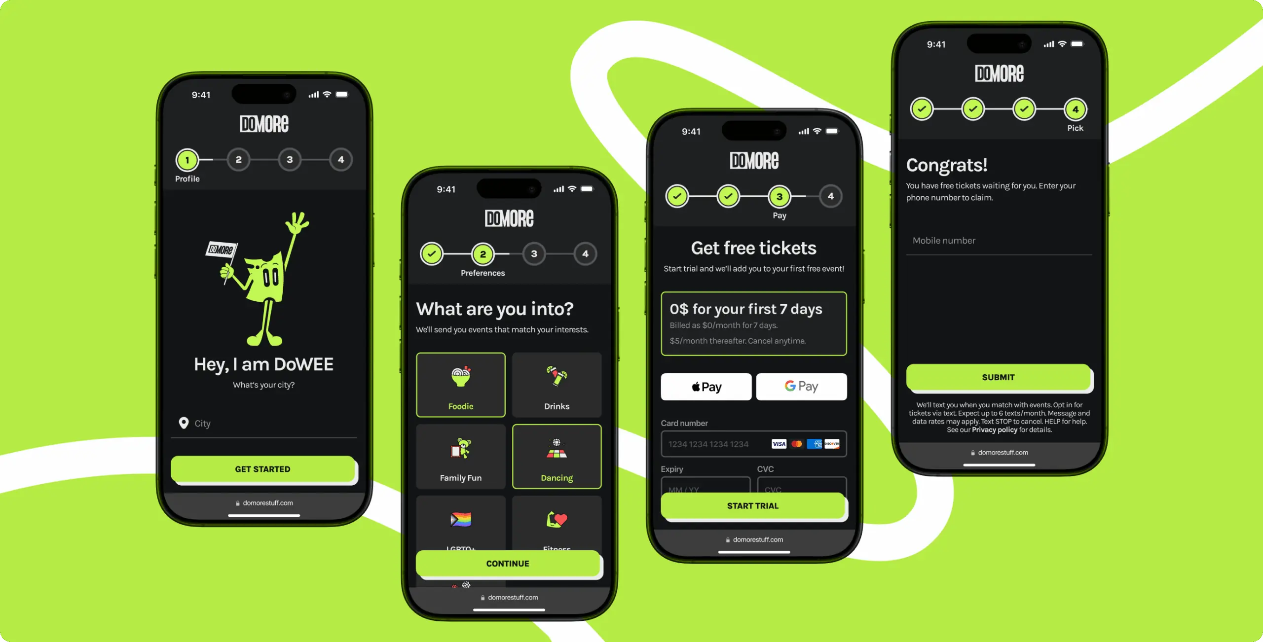
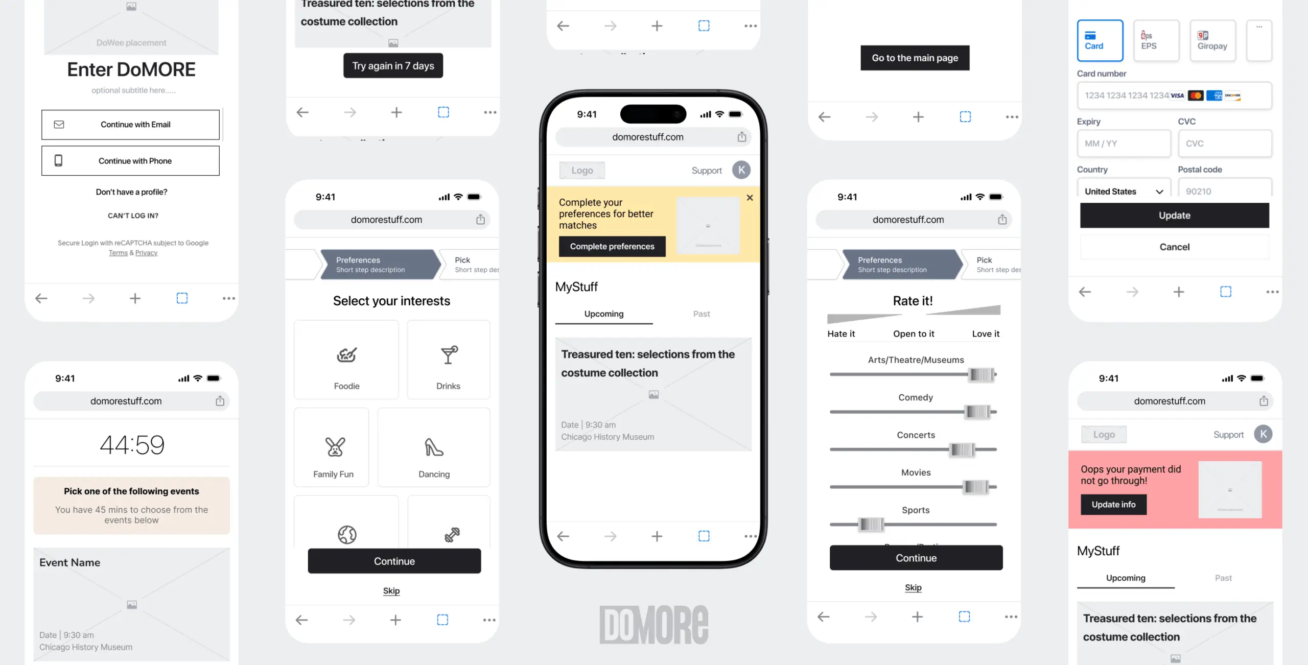
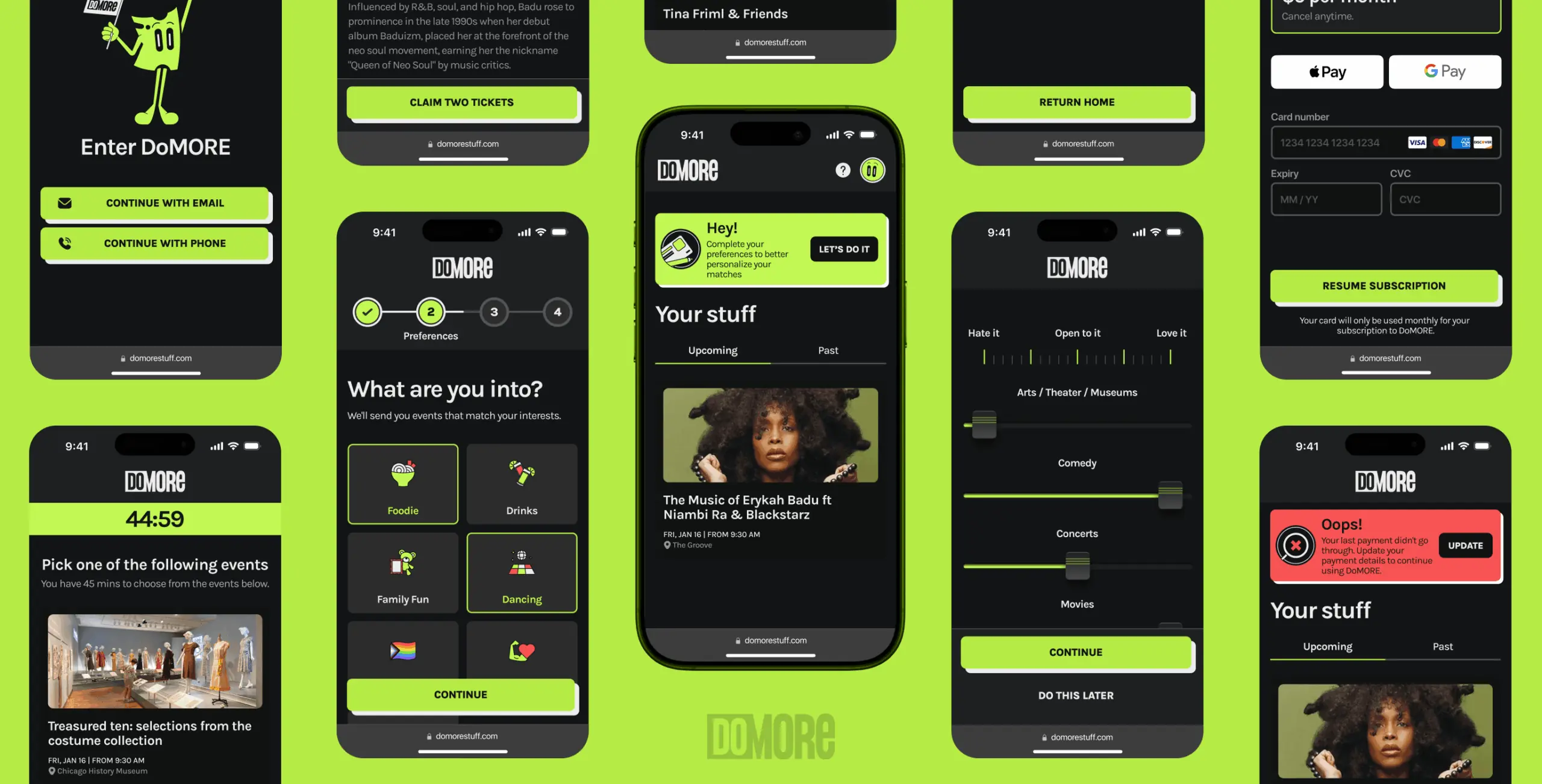
At the wireframe stage, we focused on simplifying the user journey and visualizing key interactions without distractions. One of the main goals was to streamline the registration process. We mapped out a reduced number of steps, introduced social login, and added an optional profile setup to help users access the app faster.
We also prototyped a quick preference setup flow, allowing users to personalize their experience right from the start. This included an early concept of Spotify integration, which enabled automatic syncing of music tastes for more relevant event suggestions without manual input.
To establish the right visual tone, we created a moodboard with a strong focus on illustration. Our main goal was to define the look and feel of the character who would guide users through the platform. We gathered diverse references for style, emotion, and movement, exploring how the character could enhance interactions without overwhelming them.
Together with the client, we reviewed options and refined the direction until we landed on a concept that felt both friendly and distinctive.
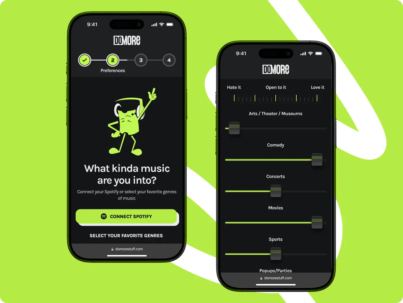
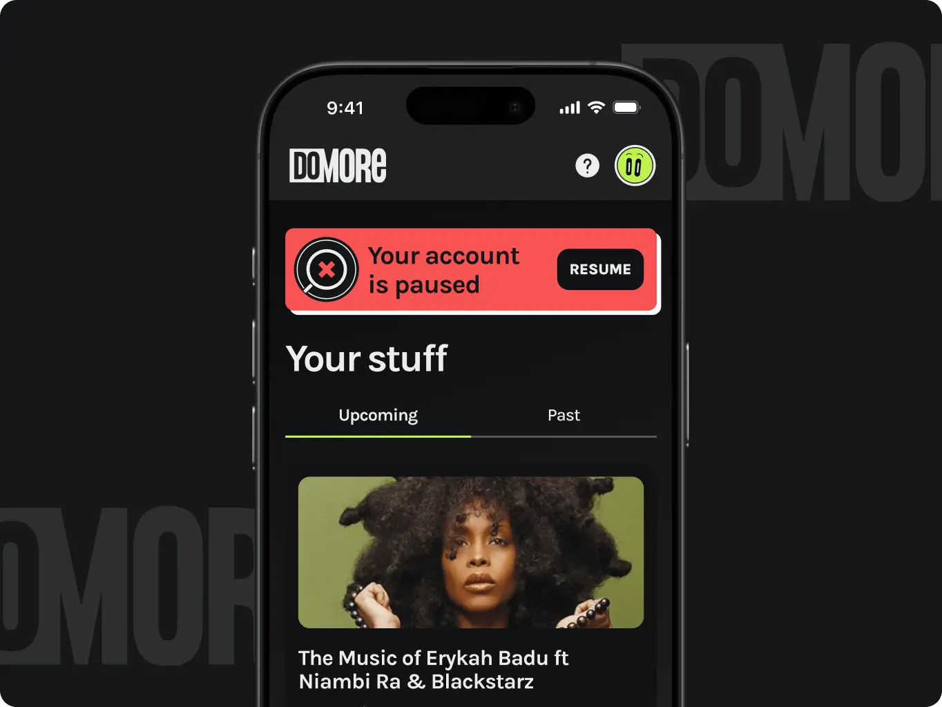
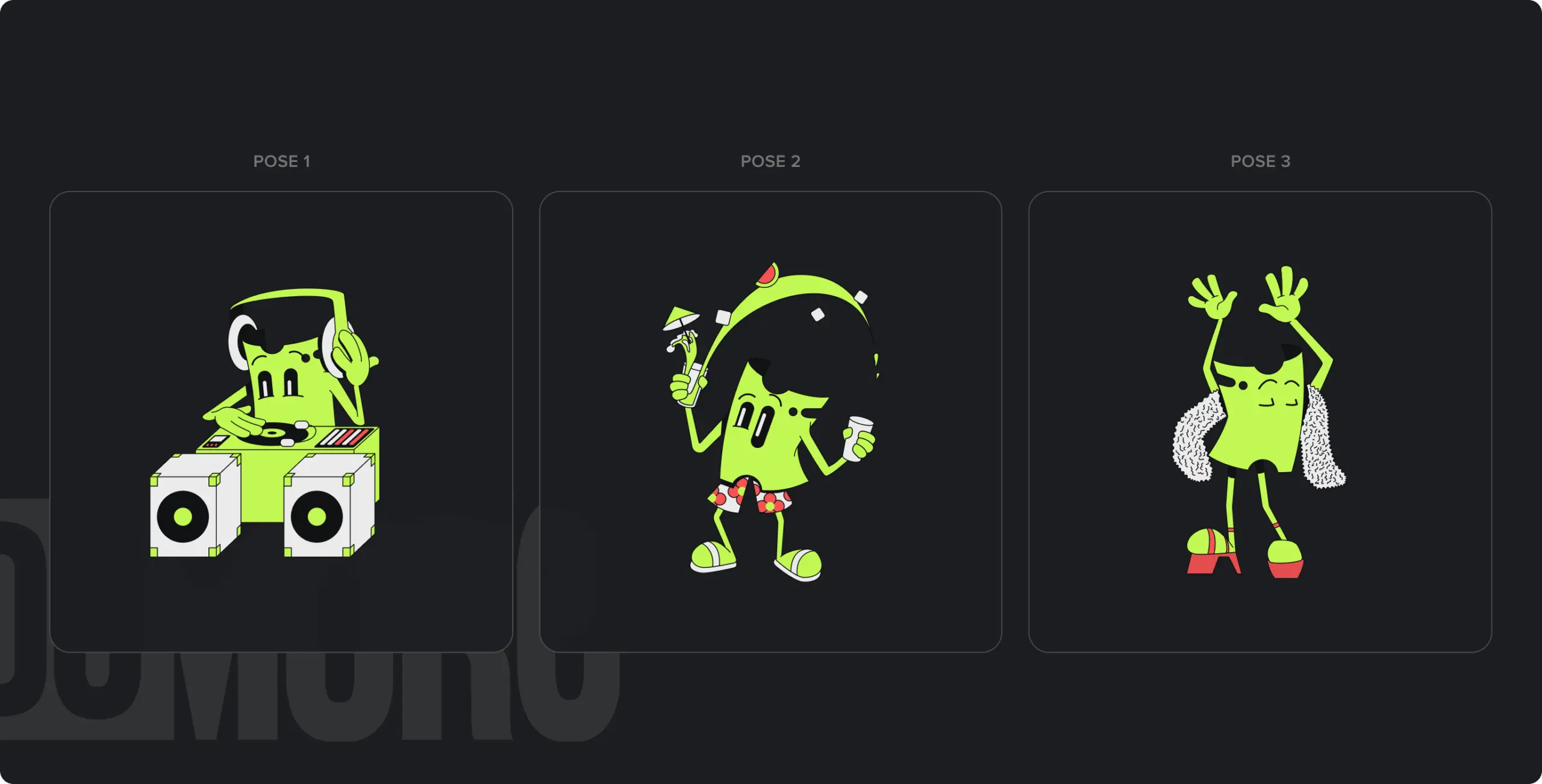
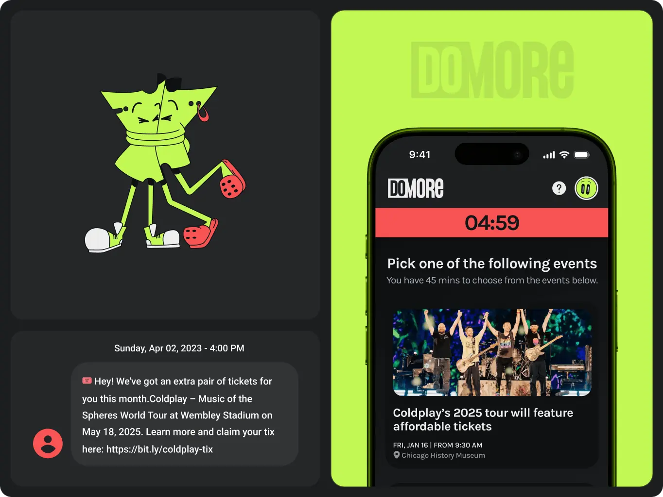
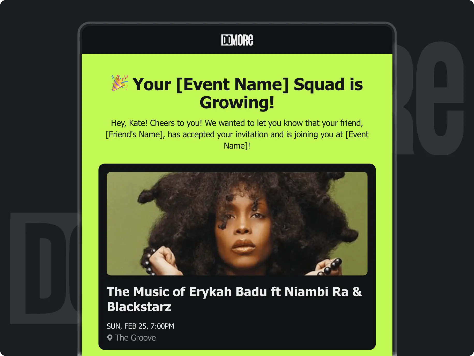
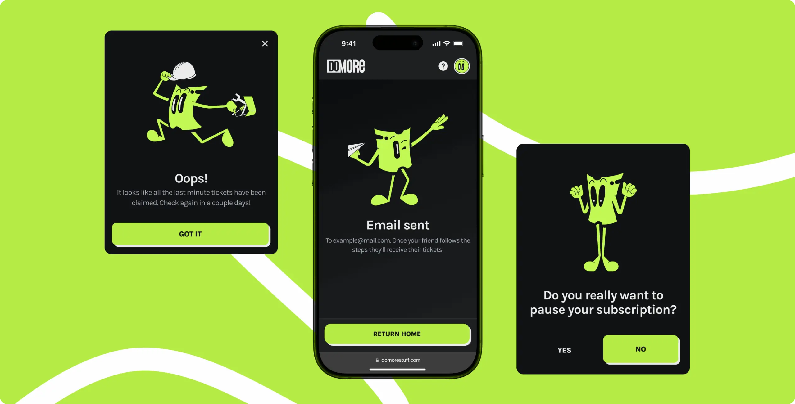
We created a cheerful ticket character to give the platform a warm, approachable feel. This little visual element adds a playful touch to the experience and helps reinforce the idea that discovering new events should feel fun and easy — not transactional.
The character appears in key user moments like onboarding, ticket confirmation, and empty states. Its simple shape, expressive eyes, and soft motion create a light emotional connection without distracting from core interactions. It’s more than a mascot — it’s a subtle UX tool that humanizes the product.
With the concept approved, we moved into full UI design and developed all key screens with a focus on clarity, rhythm, and consistency. The dark theme became the core of the visual identity, giving the app a bold, contemporary feel suited to its mobile-first audience.
We created a dynamic character system with expressive illustrations that appear during key interactions like registration, ticket selection, and bonus rewards. Layouts were refined to support quick decision-making and highlight offers, following a sales-friendly approach that balances usability with visual impact.

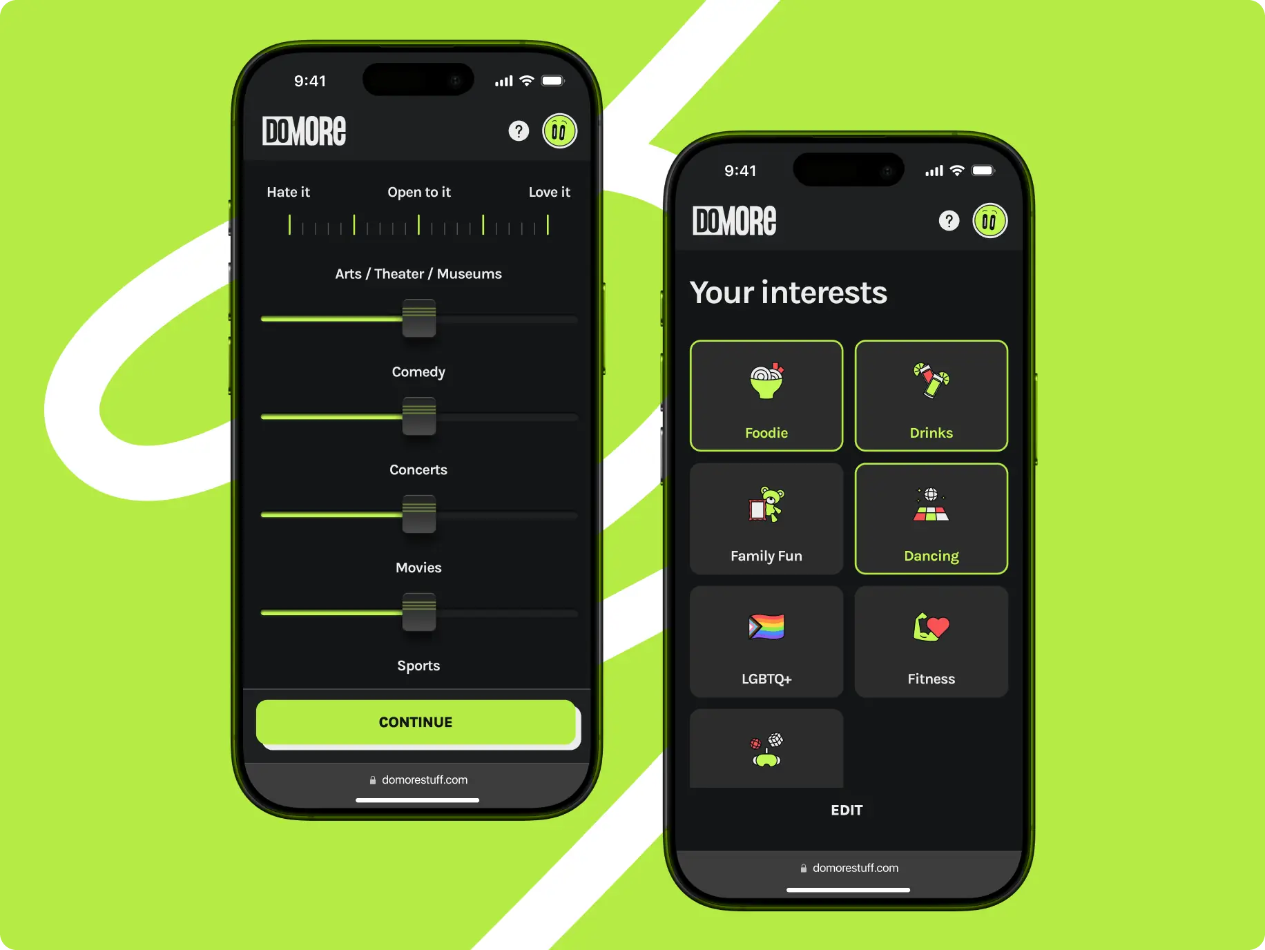
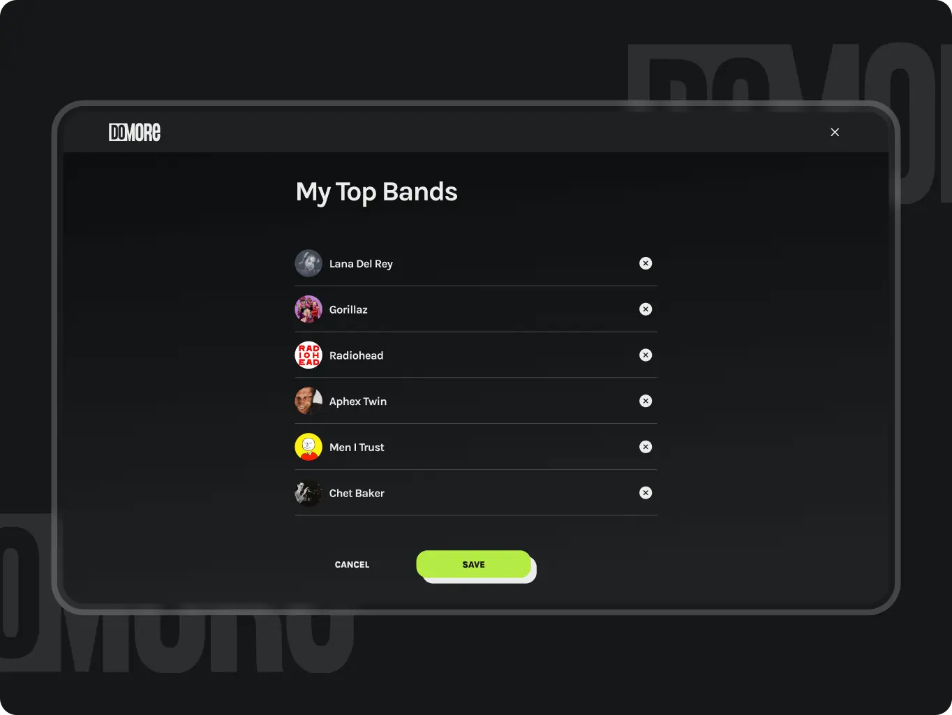
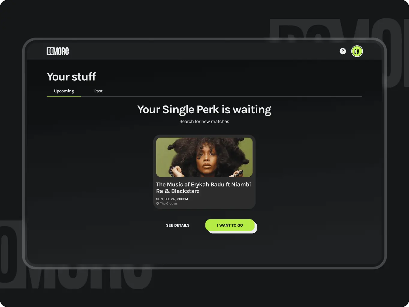
Personalized tickets by interest
Users select their interests through a swipe interface, and the app curates event suggestions that match their preferences — making discovery fast, relevant, and engaging.
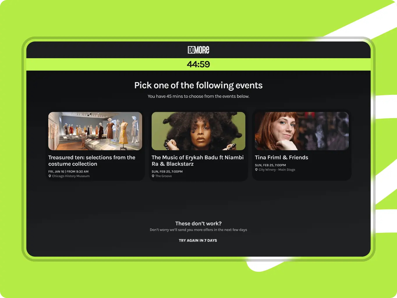
Last-minute ticket bonus
We introduced a unique feature that offers users an extra ticket when others go unclaimed. It’s a surprise element built into the experience, designed to feel like a spontaneous reward.
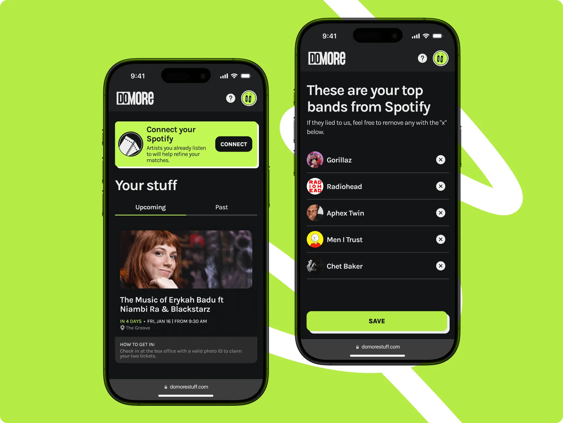
Spotify-based preference sync
Users can connect their Spotify accounts to instantly sync music preferences with the app. This allows the system to suggest events based on real listening habits, making recommendations smarter and more relevant from the start.
Consistent and adaptive email design
We created a set of responsive email templates that reflect the app’s visual identity and tone of voice. Each message feels like a natural extension of the product, with clear layout, friendly language, and visual consistency.
Development ran smoothly with tight coordination between frontend and backend. We synced updates from both sides in real time, adapting systems to match each other’s logic and flow. This balance kept the process efficient and flexible, even during fast-paced iterations.
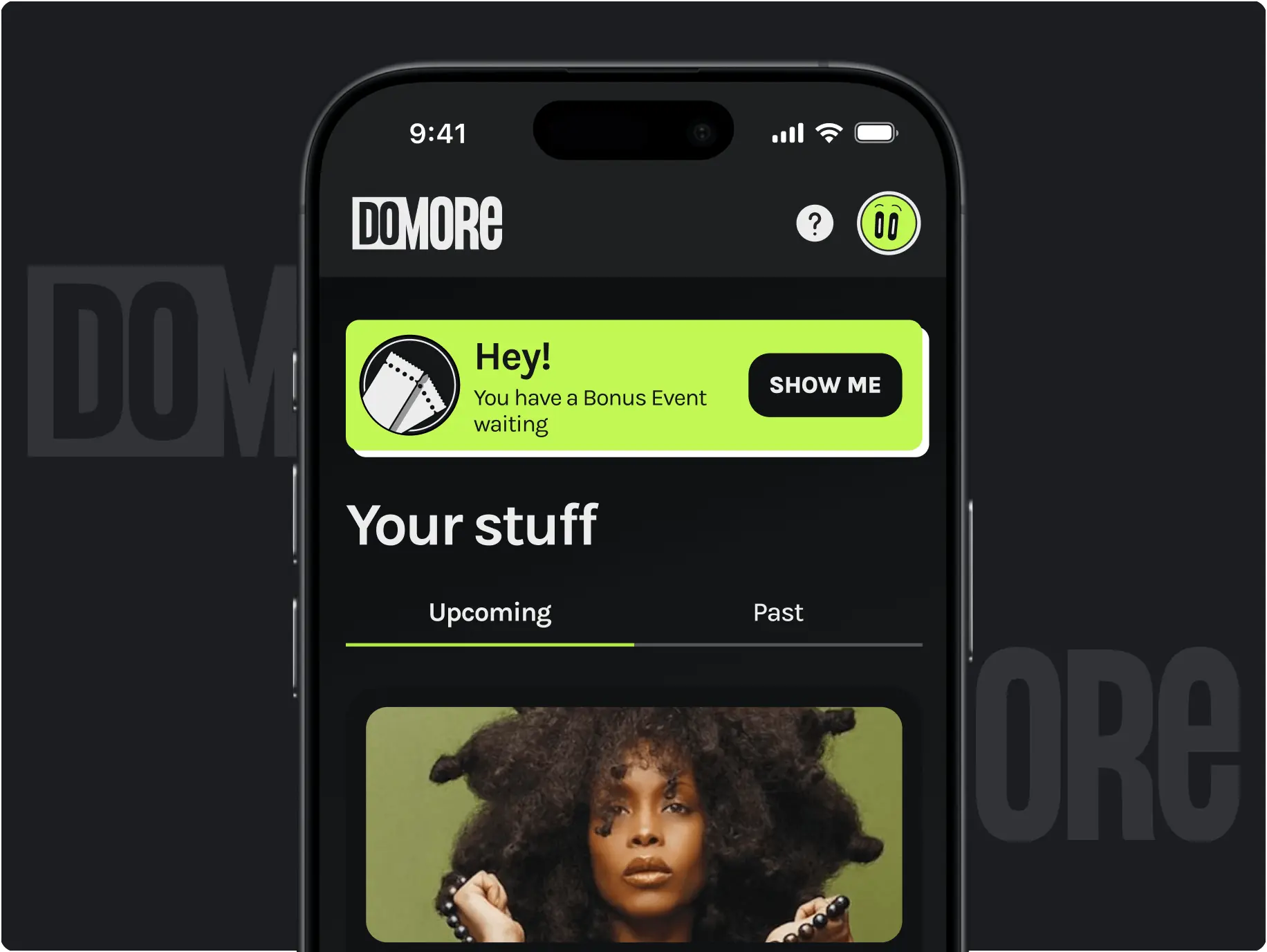
One highlight was building the persistent notification system. We designed it to handle multiple data types, prioritize them intelligently, and display messages based on custom rules — always timely, relevant, and non-intrusive.
React
TypeScript
Vite
Tanstack Query
Radix Primitives
ZOD
KY
Stripe
Tanstack Router
React-hook-form
After launch, we continue to support DoMORE through an iterative approach focused on stability, growth, and user feedback. Together with the client, we plan updates based on real usage patterns — optimizing flows, fine-tuning interactions.
By maintaining close collaboration and regular checkpoints, we ensure the platform evolves in line with both user needs and business goals. Our goal is to keep the experience fresh, relevant, and enjoyable long after the first release.
#Product redesign
AdFlux Co.
 USA
USA
USA
#Branding
Pragmatike
 France
France
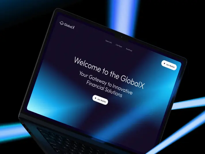
#Website design #Website development
GlobalX
USA
USA

Joshua Caleb
Working with the team on our landing page was incredibly productive and enjoyable. From the very beginning, the team demonstrated high professionalism, thoroughly understanding our goals and requirements. Not only did they create an attractive and modern design, but they also made the site user-friendly and functional.
Have a project in mind?
Let's chat
Have a project to
discuss?
discuss?

Have a partnership in
mind?
mind?
