


Atelier Meredian – how a digital exhibition space builds collector trust before a single physical show opens
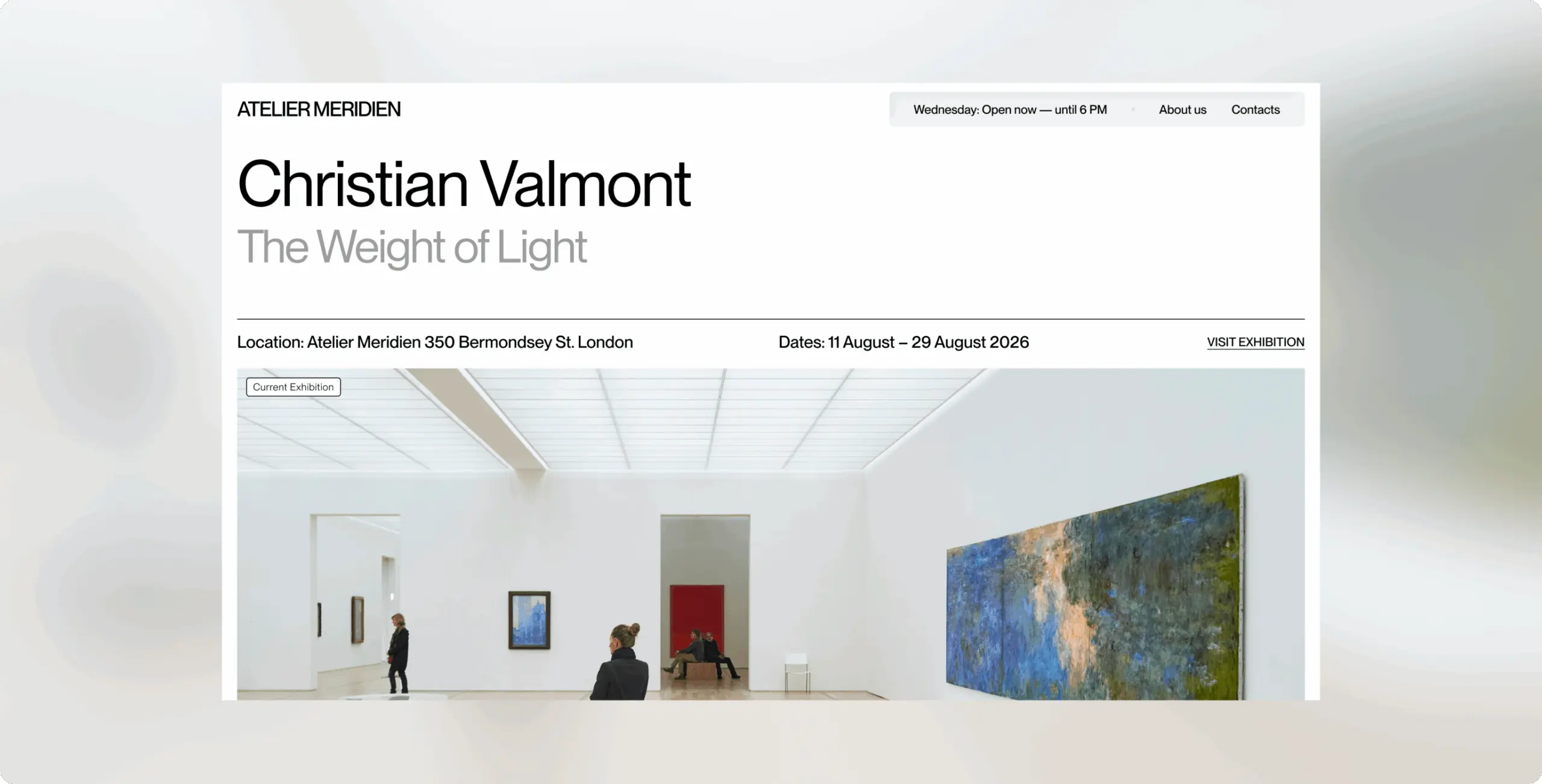
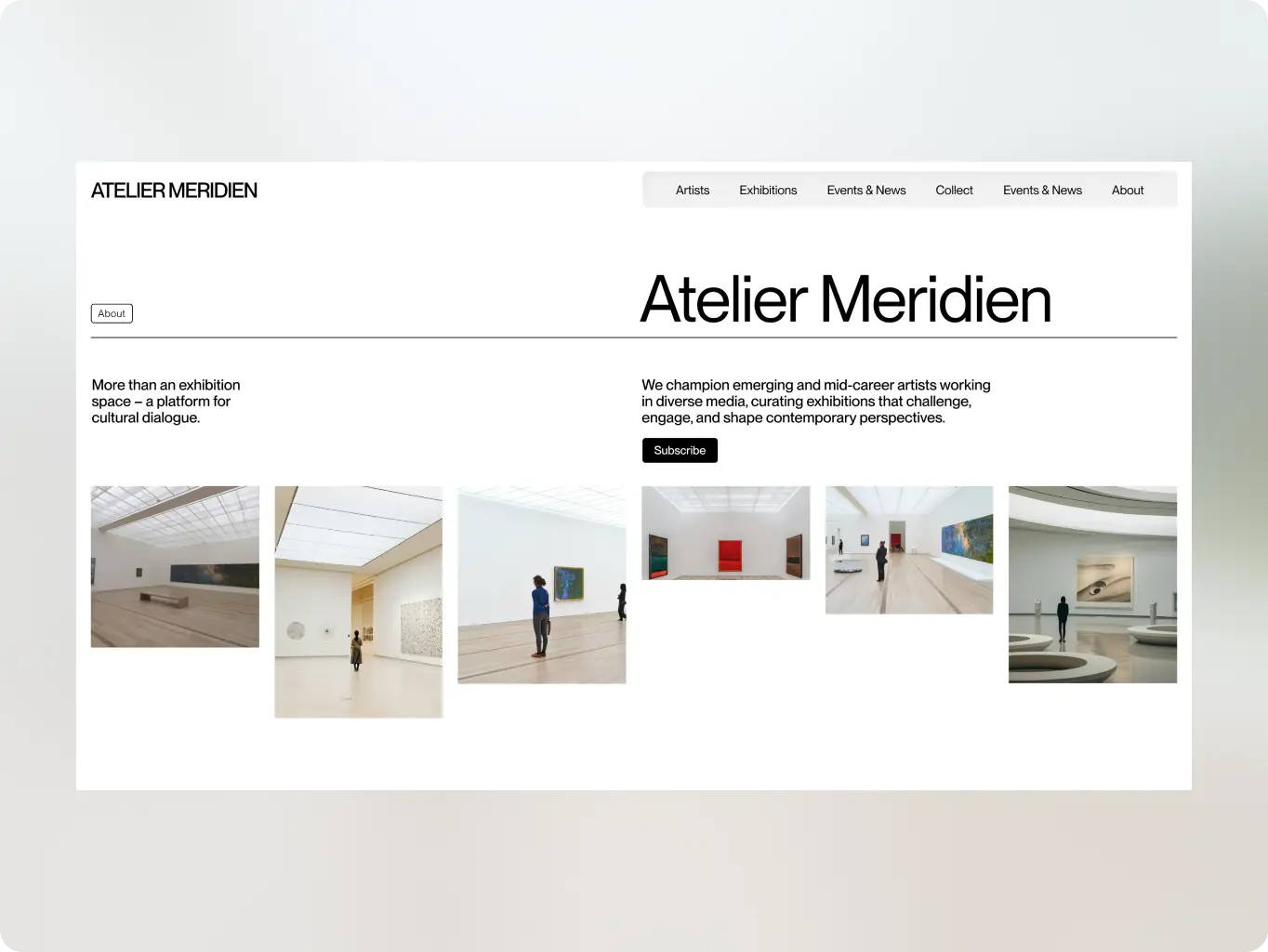
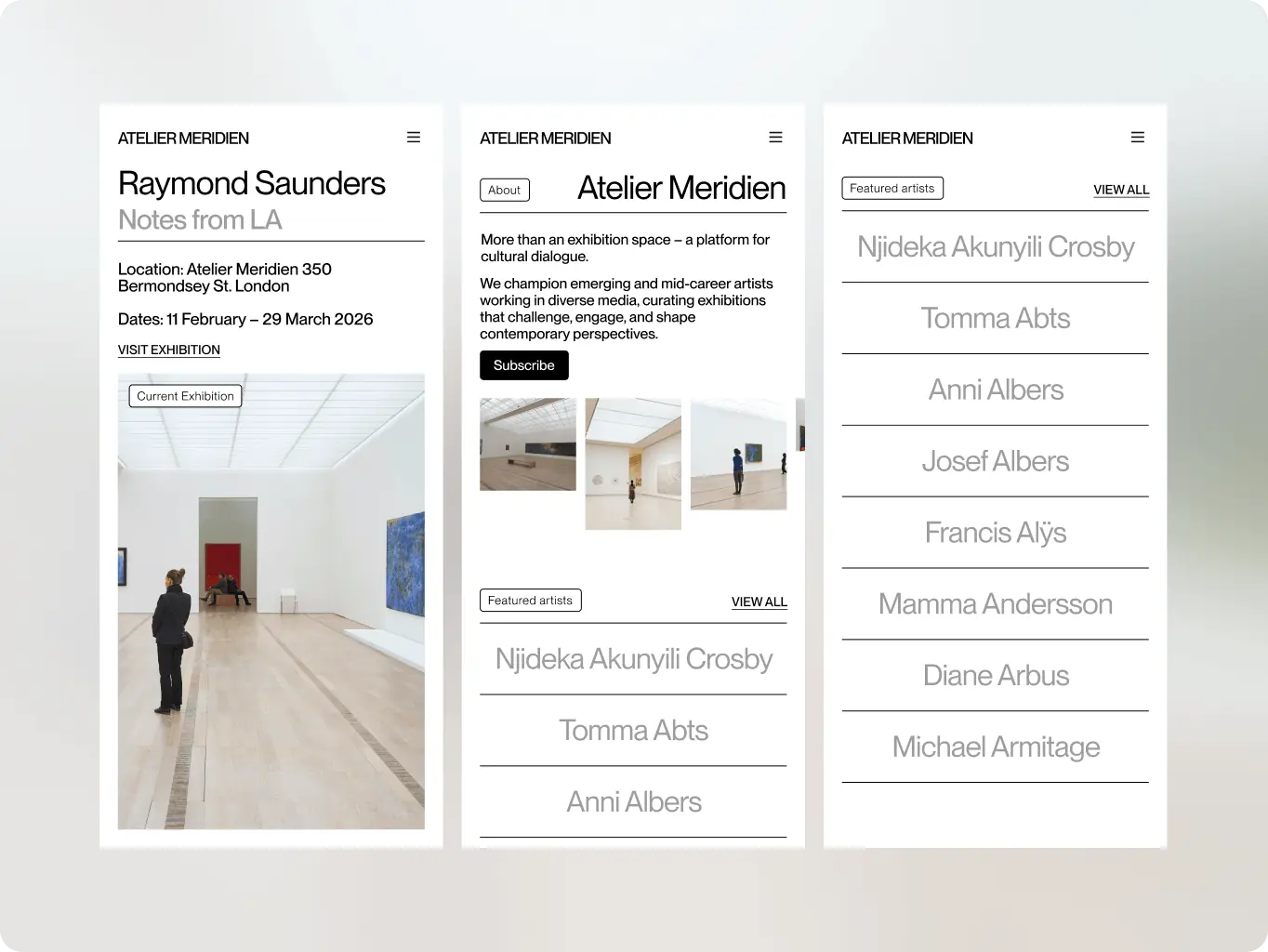
Atelier Meridian represents emerging and mid-career artists across painting, sculpture, digital, and mixed media, and positions itself around curation and conversation rather than transactional sales. Without a site to match that positioning, the gallery risked being read as a catalog rather than a curatorial voice — the exact trap the brief identified in most competitor sites, where galleries land either on a static, catalog-only site or an overdesigned one that competes with the art it’s meant to showcase.
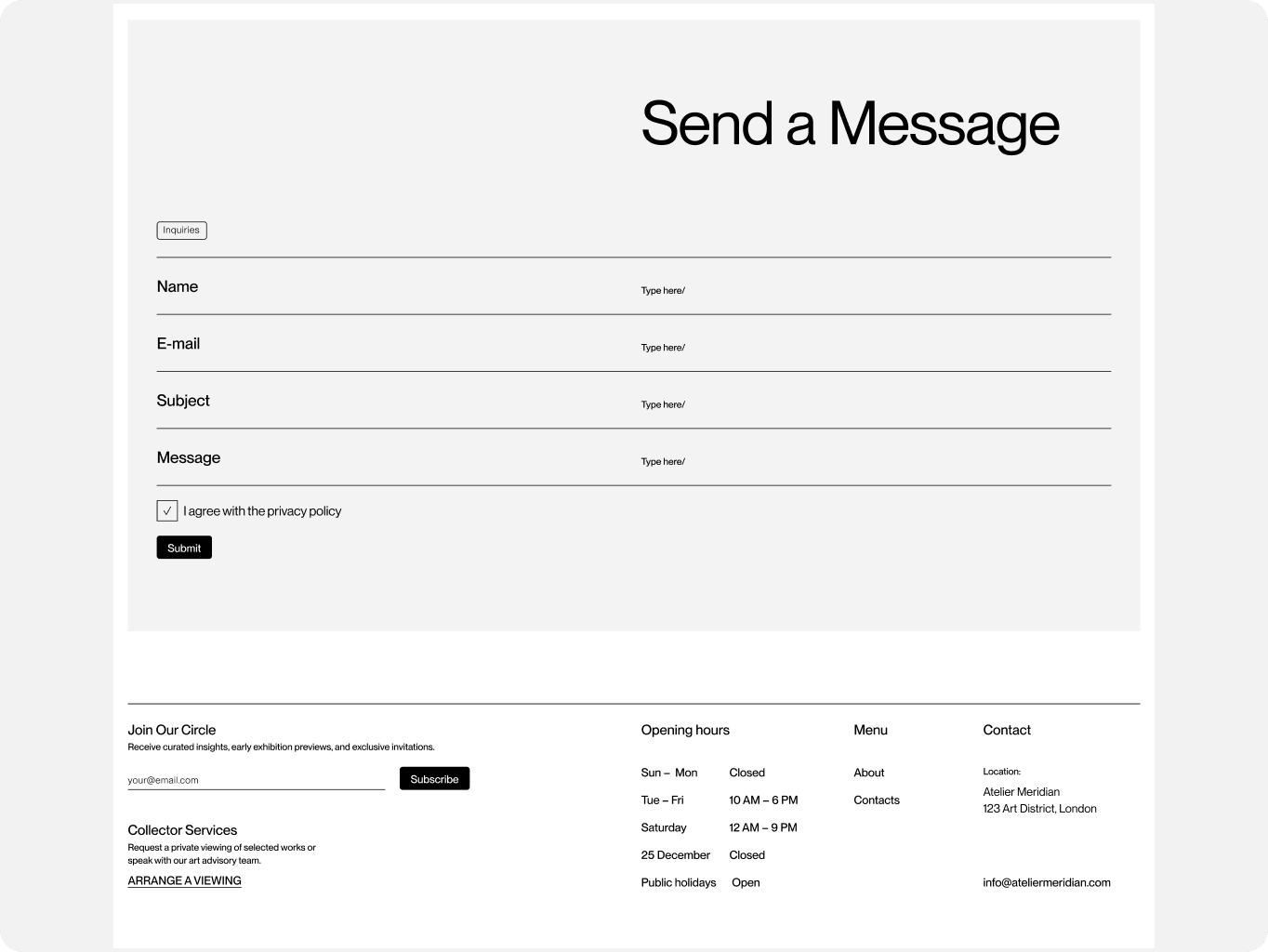
The gallery needed a site that functioned as a credible digital exhibition space from launch: one that let artists’ narratives carry the page, gave collectors and advisors the provenance and context they need to move a decision forward, and opened a direct line to the gallery without adopting e-commerce mechanics that would undercut the tone.
Across all three, the shared pattern was an “invisible” interface: large, high-quality imagery, no aggressive marketing calls to action, and a contextual “Inquire” flow in place of pricing or cart mechanics. That pattern set the floor for Atelier Meridian. The gaps found in each site set the brief for where it could differentiate.
Stages
- Competitor matrix
The competitor review showed a shared baseline of restrained layouts, large-format imagery, and inquiry-led browsing — but clear gaps in engagement and discovery. David Zwirner lacked an on-site private viewing and audio experience, White Cube offered limited guidance for first-time buyers, and Victoria Miro’s 80+ artist roster lacked medium and style filters. These gaps shaped Atelier Meridian’s direction: private viewing, collector onboarding, and a more flexible artist discovery experience.
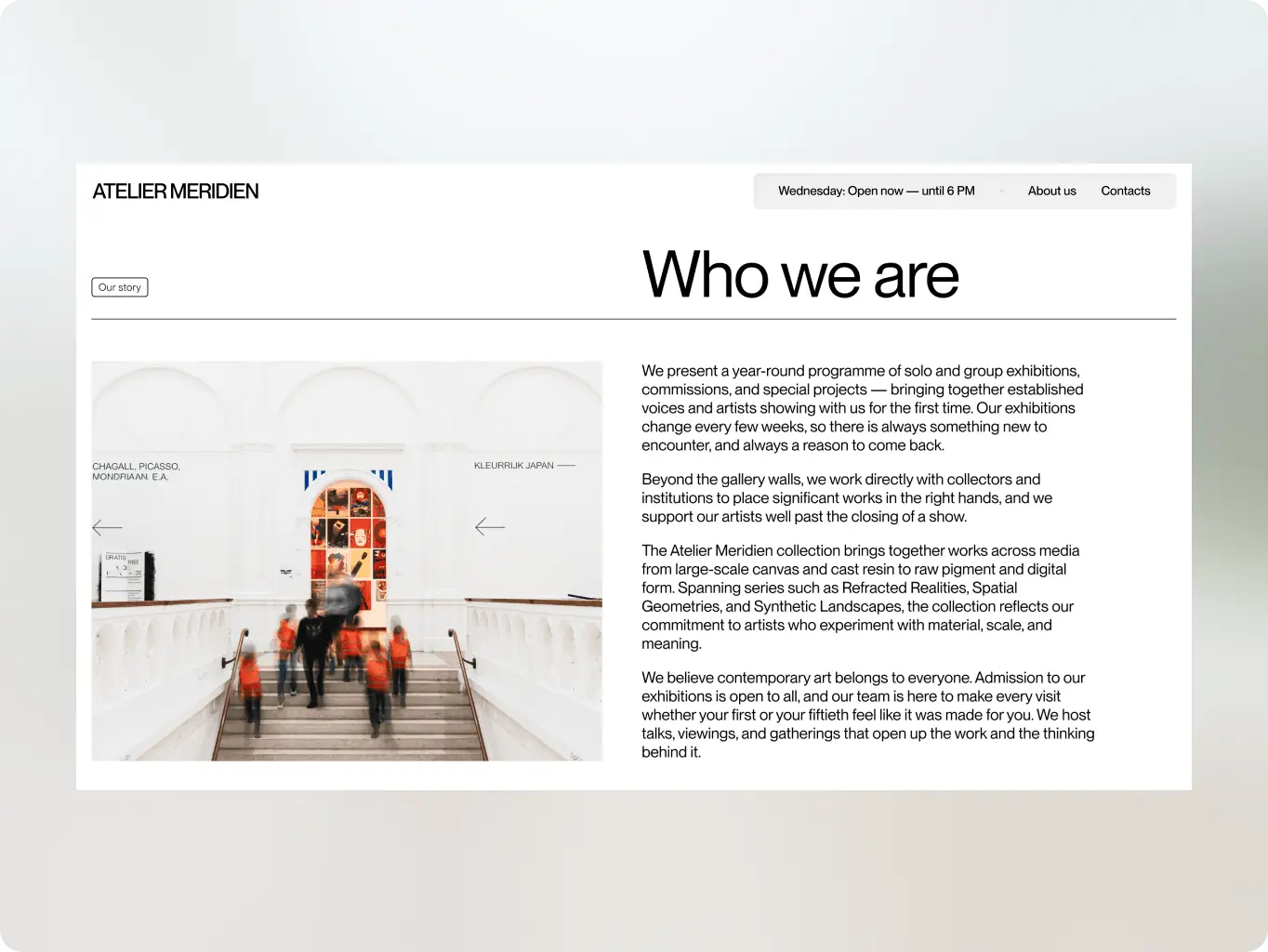
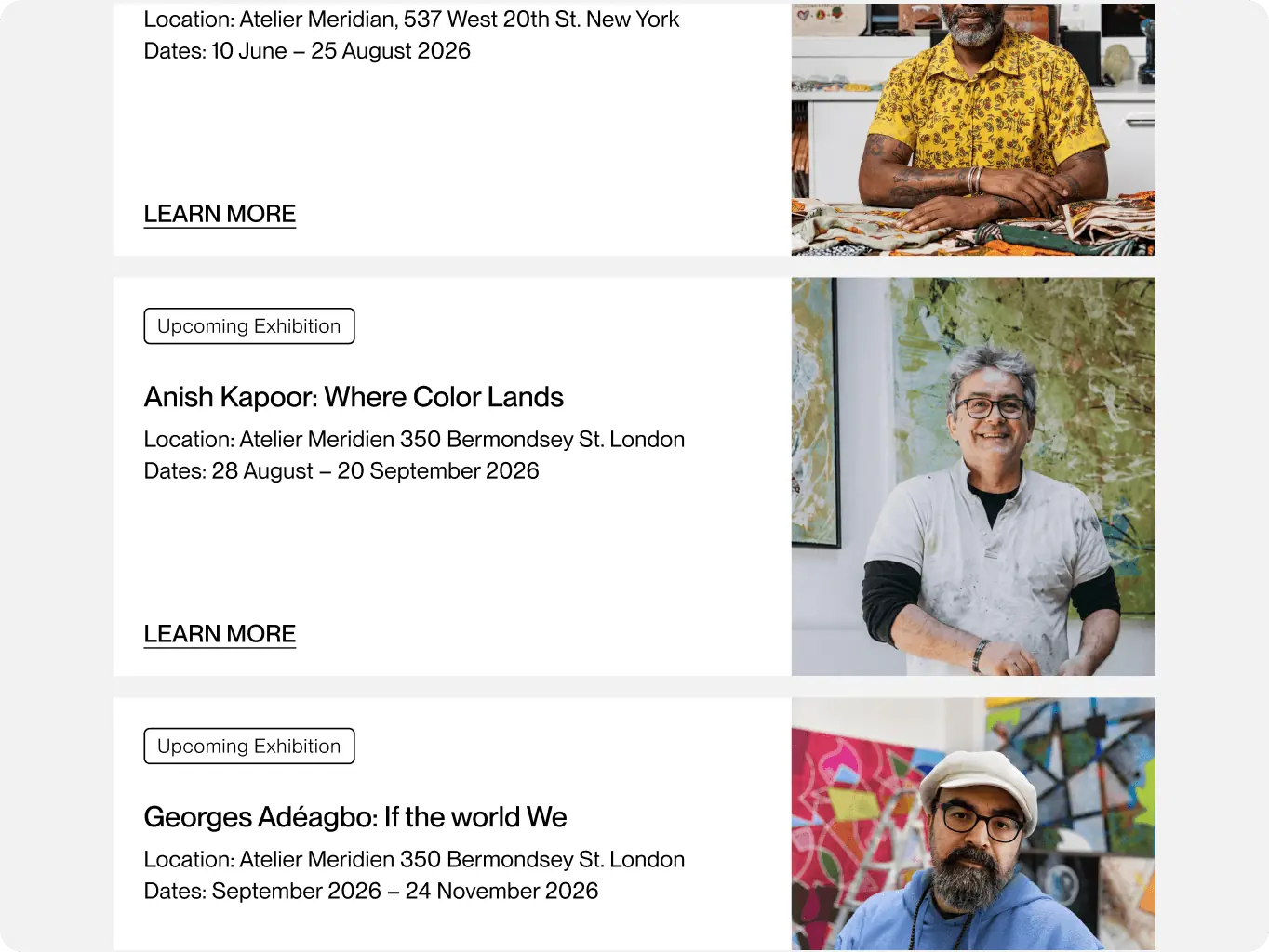
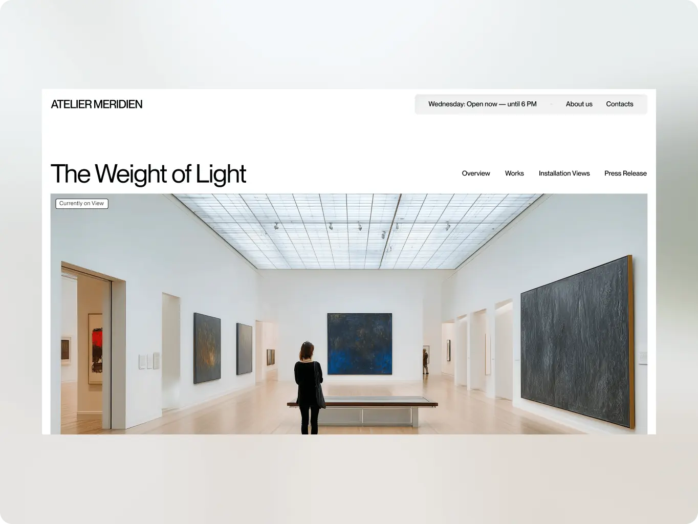
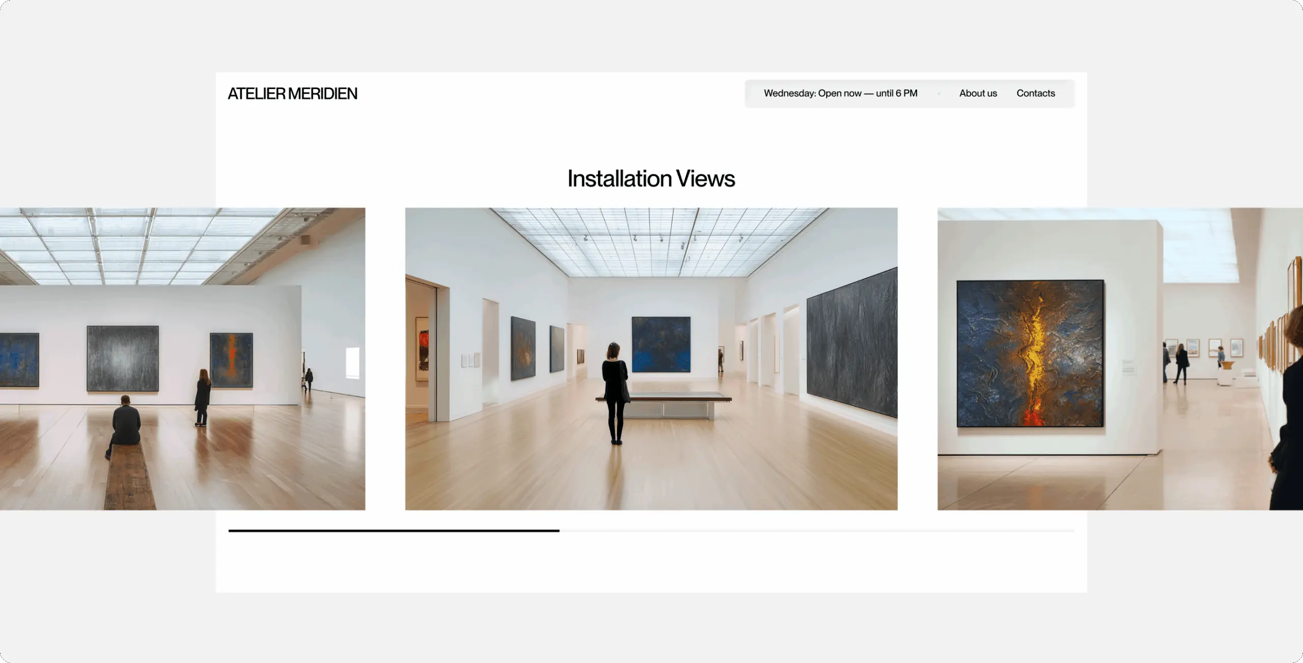
With the audit setting the floor — restraint, large imagery, contextual inquiry — and the brief setting the differentiators — filtering, motion, onboarding for new collectors — design moved from open visual territory into a working system: which direction balanced prestige with warmth, how the grid organizes 80+ artists and works into something browsable, and which UI decisions make every artwork page function as both an exhibition view and an inquiry starting point.
Stages
- Visual direction
- Wireframes
- UI design
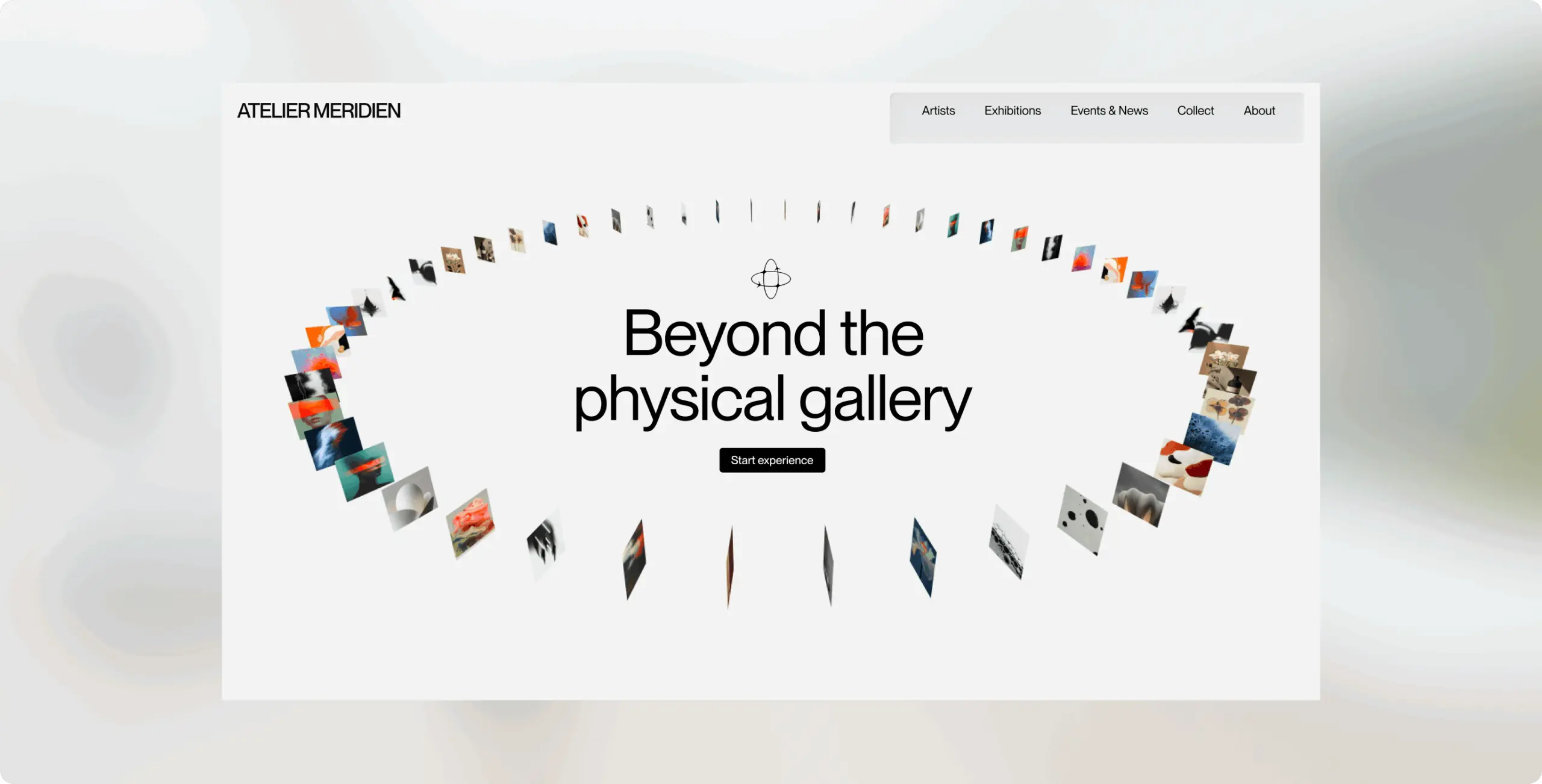
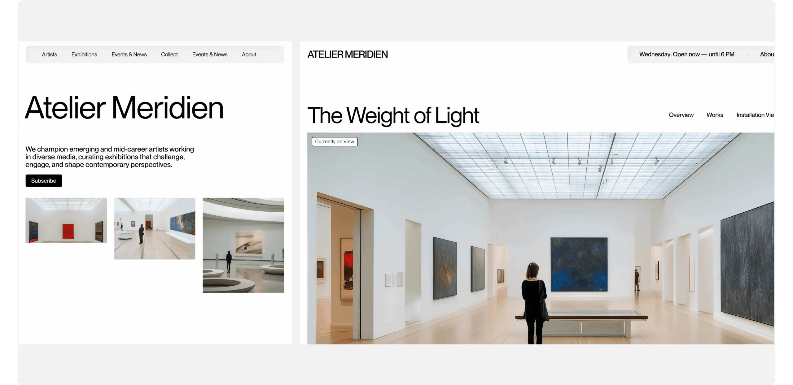
Tested multiple directions against a single question: does this keep the artwork as the visual hero, or does the interface start competing with it. The direction carried forward leans on a high-contrast black-and-white palette, a restrained modular grid, and a single refined display typeface for titles and artist names — the combination that read as institutional and credible to the target collector profile without tipping into the overdesigned territory the research flagged as a competitor failure mode.
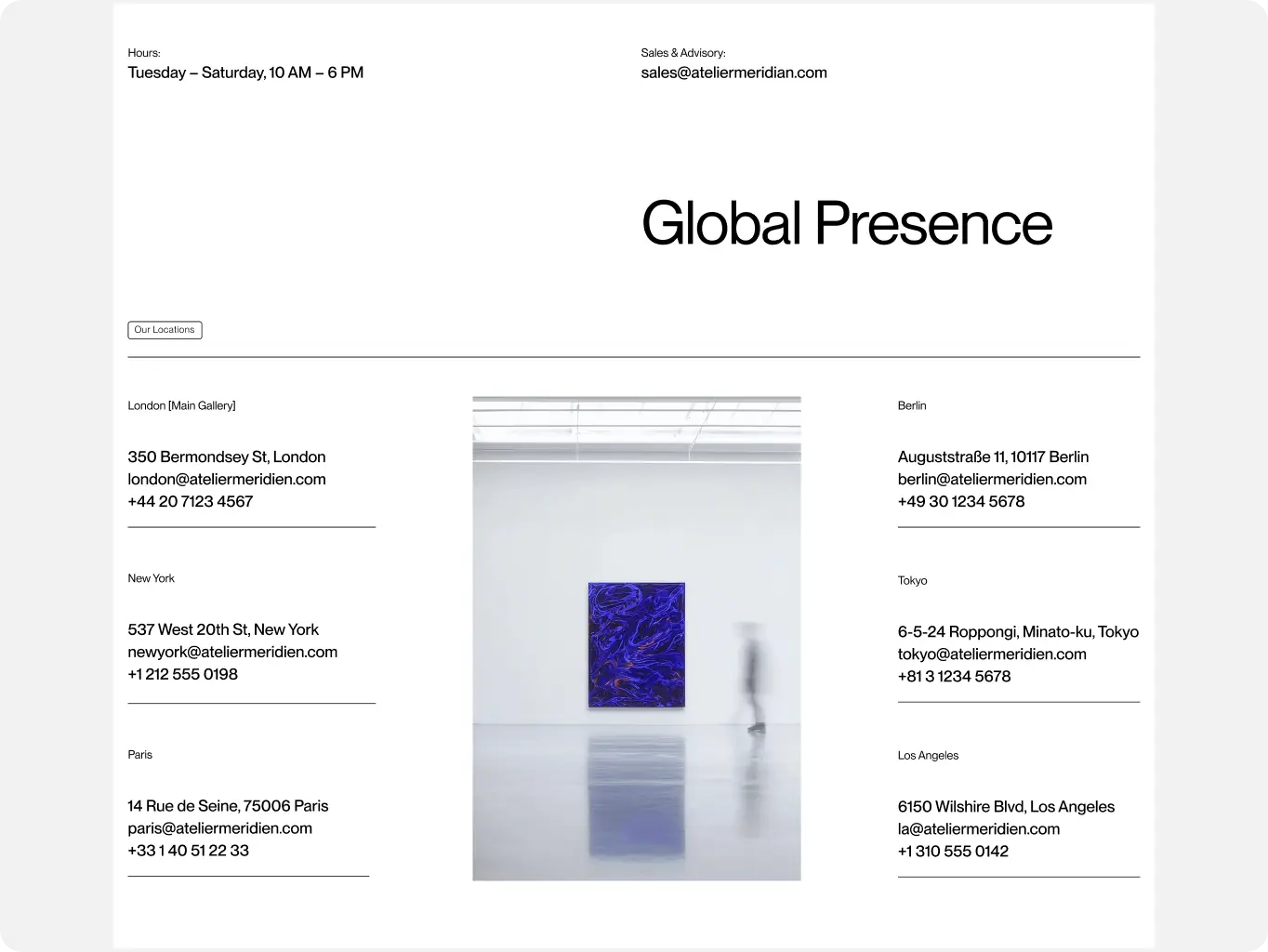
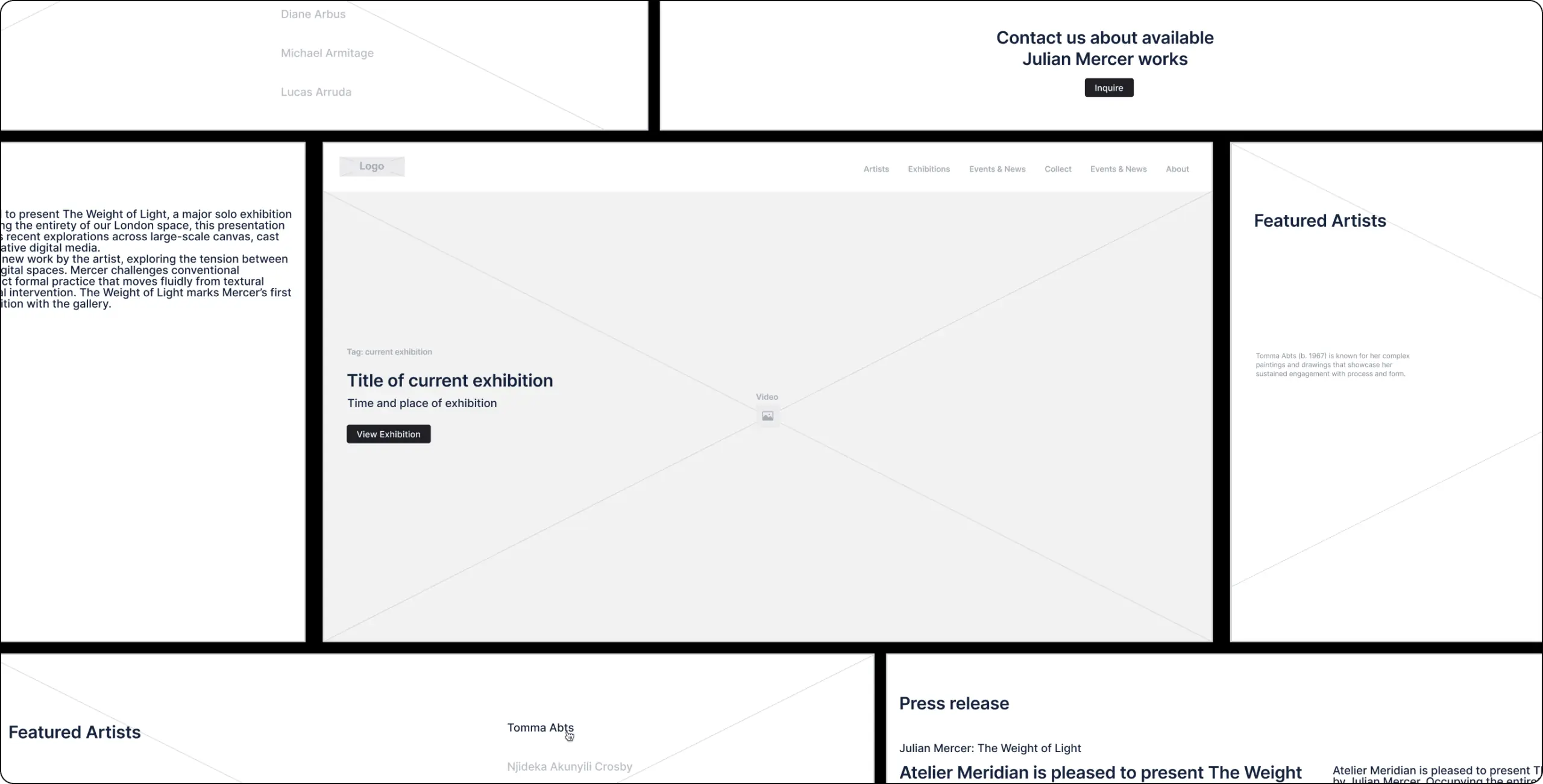
Structured the navigation and content hierarchy for the homepage, artists directory, exhibitions, and artwork pages before any visual styling was applied, so the core browsing pattern — scan the roster, filter by medium, land on an artwork, inquire — worked as a sequence of decisions rather than a sequence of screens. The inquiry overlay was wireframed early as a layer over the artwork rather than a separate page, locking in the “no navigation away from the piece” rule the Solutions block depends on.
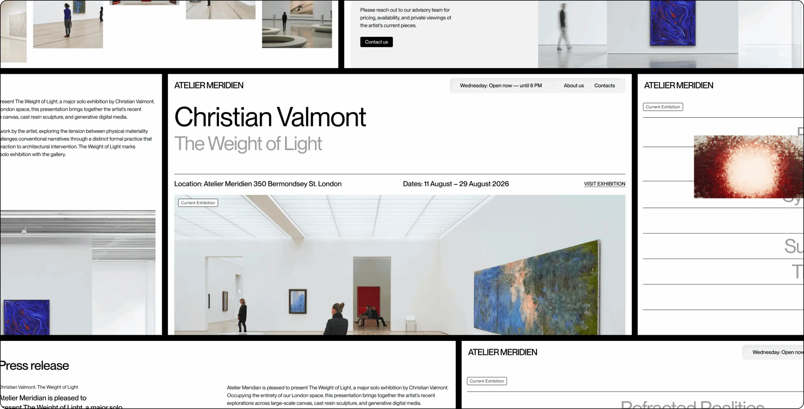
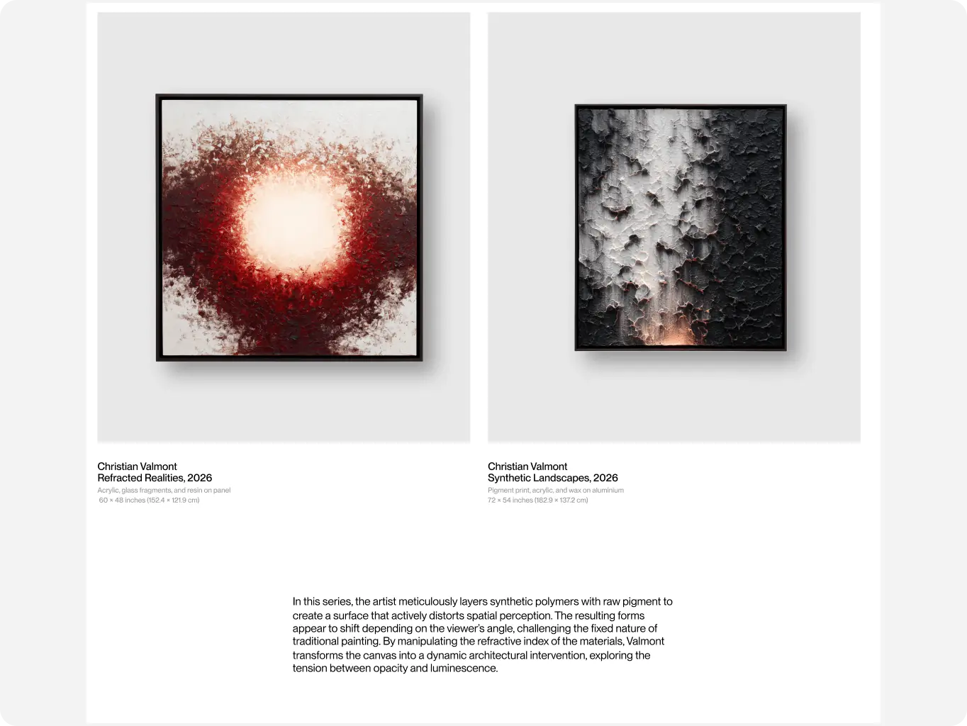
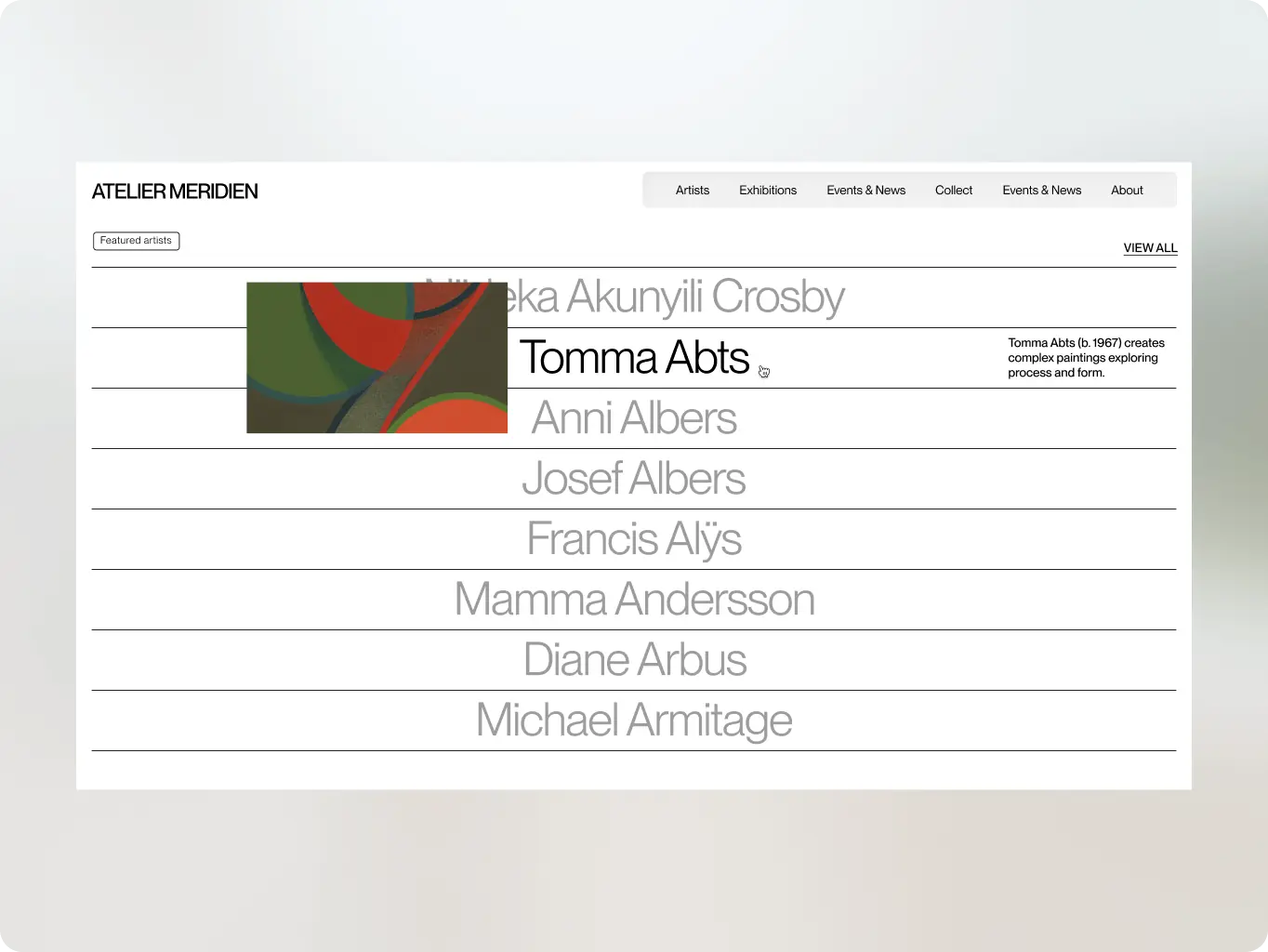
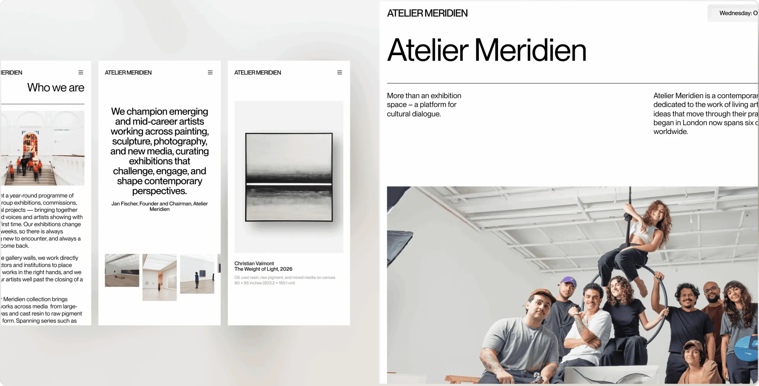
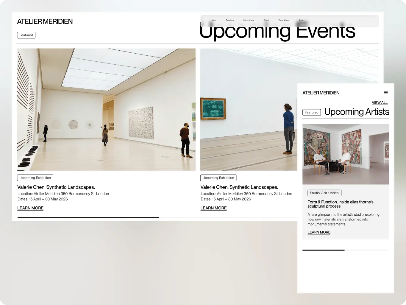
Applied the chosen direction to final screens: large-format artwork imagery with high-resolution zoom, restrained typography for biography and provenance text, a filter interface for the artists directory, and availability status shown as a plain label rather than a price tag.
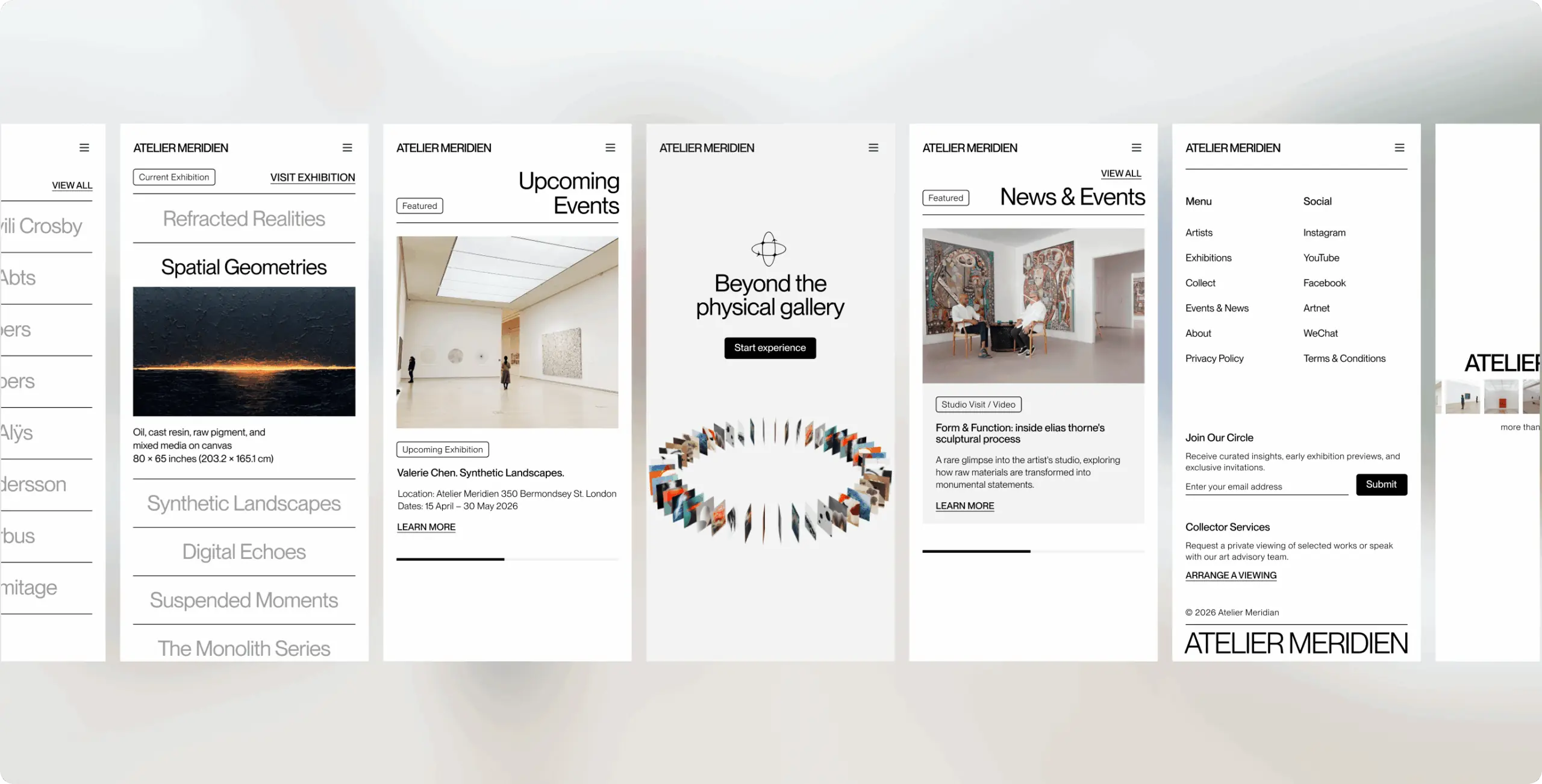
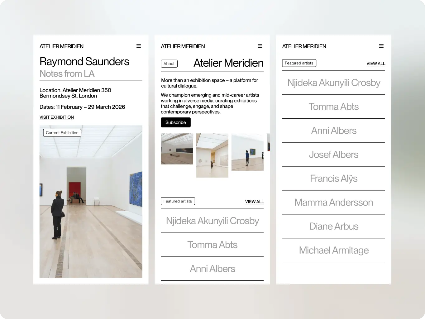
The site runs on Webflow, chosen so the gallery team can publish exhibitions and artist updates without a developer, while still delivering the page transitions and subtle motion the research showed was missing from every benchmark site. The main challenge was keeping that motion fast on pages carrying high-resolution artwork — interactions trigger on viewport entry rather than on load, and images load progressively, so the effect reads as paced movement through an exhibition rather than a delay the collector waits through.

Webflow
#Website design #website development
vita travels
 USA
USA
USA
#Website design #Website development
Lucas Keller
USA
USA
#branding
veridian
USA
USA
