Development
Research
Apr 30, 2026
9 min read
summary
Why SaaS and Fintech products look identical in 2026 — and how a SaaS design agency can break the pattern with stronger UX and product design decisions
Artem Izmalkov Lead UI/UX Designer | April 2026
In modern product development, “best practices” have become the default starting point. Teams analyze market leaders, adopt familiar UX patterns, implement design systems, and rely heavily on data to guide decisions. Each of these steps is rational. They reduce uncertainty, improve usability, and help products ship faster.
But when combined, they produce a different outcome — one that is rarely discussed. Products begin to converge.
Across SaaS platforms, fintech apps, and digital services, interfaces start to look and behave in remarkably similar ways. Layouts follow the same logic. Interactions feel predictable. Visual language becomes interchangeable.
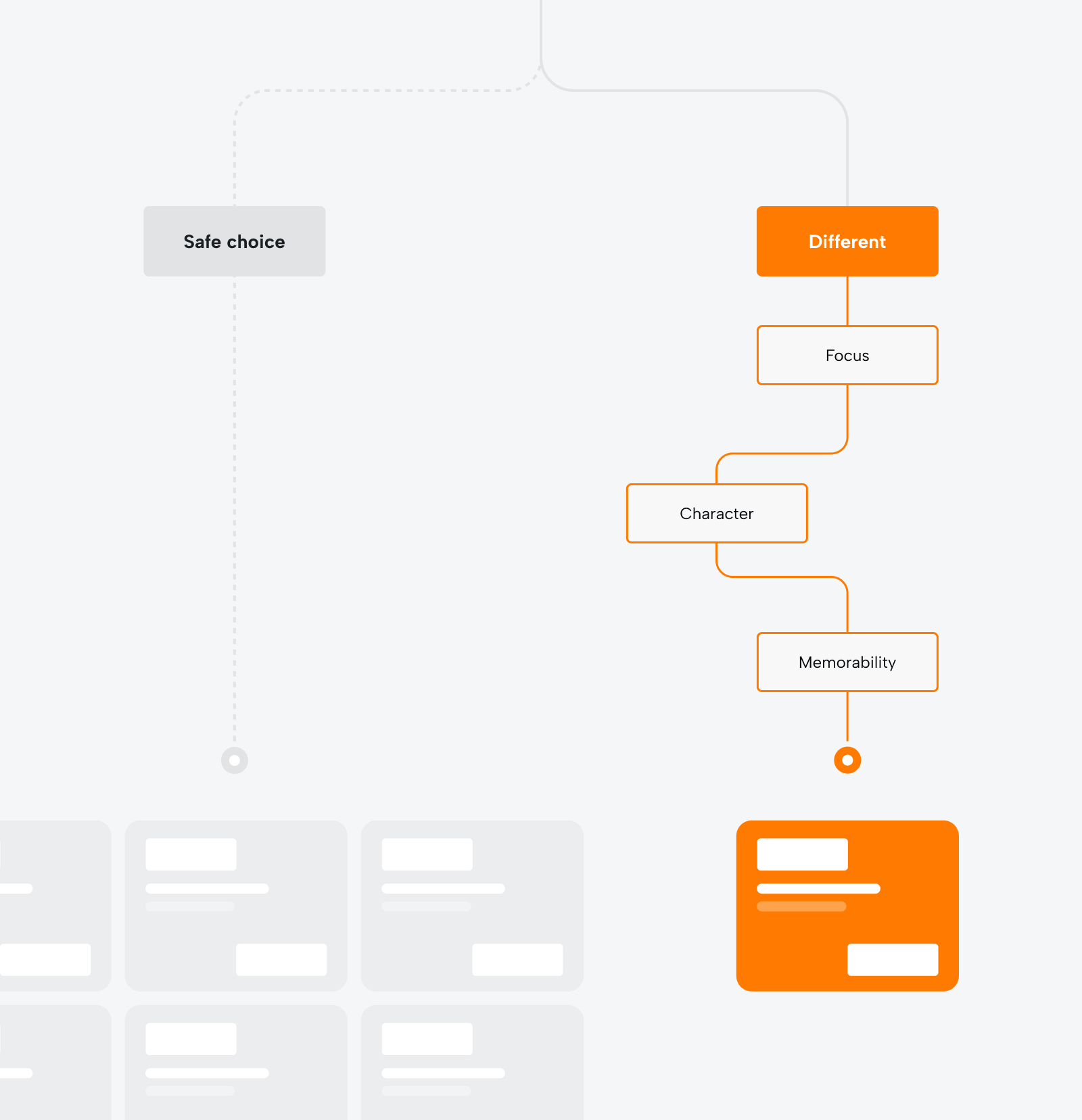
The result is not poor design. The result is design that works — but fails to differentiate. And the critical point is this: this outcome is not accidental. It is the direct consequence of how modern product decisions are made.
Why products become generic
Generic products are not the result of weak execution. They are the result of consistent, well-intentioned decisions that compound over time. Each decision, in isolation, improves the product but tohether they systematically remove its identity.
Risk aversion as a decision framework
In most organizations, design decisions are evaluated through the lens of risk. A familiar pattern is easy to justify: users already understand it, it has been validated elsewhere, and it is unlikely to harm key metrics. A new or unconventional approach, by contrast, introduces uncertainty.
This creates a predictable bias. Teams don’t ask: “What would make this product distinct?” They ask: “What is least likely to fail?” Over time, this mindset eliminates variation. And without variation, differentiation cannot exist.
Benchmarking that replaces thinking
Competitor analysis is meant to inform decisions, not define them. However, in practice, it often becomes the foundation of design direction. Teams collect patterns from leading products, identify commonalities, and assemble a solution that reflects the category standard.
The logic seems sound: if it works for others, it should work for us. But this approach leads to a structural limitation.
If every product is built by referencing existing products, the system cannot produce anything fundamentally new. It can only produce increasingly refined versions of the same idea.
This is how categories become visually and functionally saturated — not through imitation alone, but through collective alignment around the same references.
Standardization through design systems
Design systems are essential for scale. They provide consistency, speed, and operational clarity. But they also standardize decisions that were once expressive.
Spacing, typography, component behavior, interaction patterns — all become predefined. And while this improves efficiency, it also reduces the number of deliberate choices a team actively makes.
The consequence is subtle but significant. When the majority of decisions are inherited rather than created, the resulting interface reflects the system more than the product’s identity.
Without a strong point of view, design systems don’t just support the product — they quietly shape it into something familiar.
The limits of data-driven design
Data is a powerful tool for optimization. It helps refine flows, remove friction, and improve conversion. But optimization has a direction: it improves what already exists. It does not introduce new mental models, new visual languages, or new emotional experiences.
When teams rely exclusively on data, they gravitate toward incremental improvements — the version that performs slightly better within an existing framework.
This creates a gradual narrowing effect. The product becomes more efficient, but less exploratory. More predictable, but less memorable.
Over time, optimization reinforces sameness.
The cult of convenience as a trap
Usability was once a competitive advantage. Today, it is the baseline expectation. Every product aims to be intuitive, fast, and frictionless. And in most cases, they succeed. The problem begins when usability becomes the only objective.
In the pursuit of convenience, products are continuously simplified. Interactions are reduced, decisions are streamlined, and anything that might introduce hesitation is removed.
But in removing friction, teams often remove something else: character. Distinctiveness rarely emerges from perfectly smooth systems. It emerges from choices — visual, behavioral, or structural — that create contrast.
Convenience ensures functionality. Character ensures recognition. Without recognition, a product remains interchangeable — regardless of how well it performs
The economics of standing out
Differentiation is often framed as an aesthetic decision. In reality, it is a business variable. In saturated markets, visibility is expensive. Products that look and feel similar compete for attention through marketing spend rather than through intrinsic recognition. Distinct products operate differently.
When Monzo introduced its coral-colored cards, the decision was not purely visual. It created a recognizable signal in a category where all alternatives looked identical. The card itself became a distribution mechanism — visible in everyday contexts, shared organically, and immediately associated with the brand.
Lyft’s early positioning followed a similar logic. By rejecting the restrained, premium tone of Uber and introducing a more playful, human-centered identity, it established a distinct mental model. Users didn’t just compare features — they perceived a different type of service.
In both cases, differentiation reduced the cost of being noticed. It shifted part of the growth mechanism from paid visibility to inherent recognizability.
When “standard” becomes the enemy
Design standards are useful because they create familiarity. But when overapplied, they create indistinguishability. The most recognizable products understand this tension and make deliberate choices about where to conform — and where not to.
Uber embraced control and minimalism, reinforcing a sense of precision and reliability. Duolingo rejected neutrality entirely. Its interface is expressive, reactive, and intentionally persistent. The product communicates constantly — through motion, tone, and feedback — creating a rhythm that feels alive.
What matters is not the direction of the choice, but the clarity of it. Both products deviate from the “average” in different ways. And that deviation is what makes them identifiable.
Standardization solves usability. Deviation creates identity. Without the latter, the former is not enough.
How to design a product with character
Differentiation is not the result of isolated visual decisions. It emerges from a consistent point of view — one that shapes not only how a product looks, but how it behaves, communicates, and evolves over time.
In practice, this means moving beyond surface-level design choices and working with deeper levers of identity.
Define your point of contrast
Every category develops its own set of conventions — visual patterns, interaction logic, tone of voice, and even emotional positioning. Most teams absorb these conventions without questioning them. They become the invisible default.
Designing with character starts by making these defaults explicit and asking a more fundamental question: “Where should we deliberately be different?”
This point of contrast does not need to be dramatic. But it must be intentional. It can exist in:
- visual language (e.g., restraint vs expressiveness)
- interaction behavior (fast and minimal vs rich and reactive)
- tone (formal vs conversational, neutral vs opinionated)
- structure (standard flows vs rethought journeys)
What matters is not how bold the difference is, but how consistently it is applied. Without a defined contrast, a product inevitably blends into the category — regardless of execution quality.
Design behavior, not just interface
Most design decisions focus on static elements: layouts, typography, colors. But users don’t experience products as static compositions. They experience them as sequences of interactions over time. This is where differentiation often lives.
Behavioral design includes:
- how quickly the interface responds
- how elements animate and transition
- how feedback is delivered
- how the system reacts to user input
These micro-moments form a rhythm — a kind of “digital body language” that users intuitively recognize. Two products can share the same layout and still feel completely different because of how they behave.
A product that invests in behavior creates a distinct sensory experience, not just a visual one.
Use language as a design tool
Interface copy is often treated as a functional layer — something that explains actions or labels elements. In reality, it is one of the most direct ways to express identity.
Language defines:
- how the product addresses the user
- how it explains complexity
- how it handles errors and edge cases
- how it acknowledges progress or success
Most products default to neutral, system-like phrasing because it feels safe. But neutrality is also what makes experiences forgettable.
A product with character uses language deliberately. It aligns tone with positioning, reinforces the brand’s perspective, and creates consistency across the entire experience.
Importantly, this does not mean being overly playful or informal. It means being recognizably intentional.
Introduce intentional friction
In product design, friction is usually treated as something to eliminate. And in many cases, that’s correct — unnecessary friction creates confusion and reduces efficiency.
However, not all friction is negative. Some of the most memorable experiences include moments that are not optimized for speed, but for meaning.
This can take many forms:
- a transition that slows down to emphasize a key moment
- a confirmation step that adds weight to an action
- a visual pause that creates a sense of space or premium quality
- a playful interaction that adds delight without functional necessity
These moments interrupt the purely functional flow — and that interruption is what makes them noticeable. Without any friction, an experience becomes invisible. It is used, but not felt.
The goal is not to reintroduce inefficiency, but to design moments of emphasis that give the product texture and presence.
Build consistency through perspective
A product does not gain character from a single decision. It gains character from alignment. If visual style, motion, language, and structure all follow different logics, the experience becomes fragmented — even if each part is well designed.
Consistency is not about repetition. It is about coherence. This requires a clear internal understanding of:
- what the product stands for
- how it should be perceived
- what it should feel like in use
When that perspective is defined, design decisions become easier — not because there is a single correct answer, but because there is a clear direction.
Without that perspective, teams default back to patterns, trends, and external references. And that is precisely how products become generic.
Conclusion
A product without character does not fail immediately. It performs. It converts. It meets expectations. But it does not build attachment.
Over time, this becomes a structural disadvantage. If users perceive no meaningful difference, switching becomes effortless. The product competes on convenience alone — and convenience is always replicable.
Differentiation, by contrast, compounds. It builds recognition, reduces reliance on external visibility, and creates a sense of familiarity that extends beyond functionality.
Convenience attracts users. Character retains them. The most effective products do not treat these as opposing forces. They treat convenience as the baseline — and differentiation as the multiplier. Because in an environment where everything works, the products that succeed are the ones people can recognize without thinking — and remember without effort.
Share this opening with friends


May 20, 2026
6 min read
In 2026, product strategy is no longer about delivering features on time — it’s about creating measurable business outcomes. Discover the essential elements that separate high-impact strategies from those that fall short.

May 20, 2026
7 min read
Running a UX audit in 2026? Our UX audit services uncover the exact friction points that kill your conversions — from Core Web Vitals to behavioral signals. Trusted by growth-stage product teams. Get a free audit estimate.
Have a project in mind?
Let's chat
Have a project to
discuss?
discuss?

Have a partnership in
mind?
mind?
