



Aug 13, 2026
7 min read
summary
Learn how product design strategy aligns customer needs, business goals, growth loops, roadmaps, and UX metrics to build products that perform and scale.
A strong product design strategy ties customer needs to business goals and to a growth model, then validates all three before engineering starts.
Key Takeaways
- Product design strategy holds only when desirability sits beside viability and feasibility, validated in parallel rather than one stage at a time.
- Growth belongs inside the product. Figma’s 2017 Team Libraries turned a single-user tool into a shared workspace through one viral loop.
- Weak onboarding, not price, drives roughly 40% to 60% of early SaaS cancellations.
- Phenomenon Studio rebuilt KlickEx’s core flows and lifted the deposit journey by 35.3% and money transfers by 30.7%.
By Oleksandr Kostiuchenko | Marketing Manager, August
Where product design strategy breaks down
The question we hear most from founders after a stalled build sounds almost rhetorical. They shipped the whole roadmap, so why did the core numbers stay flat? The answer usually sits upstream, inside a strategy that never aligned three separate forces.
A useful product design strategy lives where three forces meet. Desirability asks whether real users want what you plan to build, before a line of code exists. Viability weighs the business model against margins and the true cost to serve each account. Feasibility is blunt about whether the current stack can ship the idea without heroics. Stanford’s d.school and IDEO turned this triad into standard practice years ago.
Treat the three forces in sequence and you burn capital fast. Teams build viable business models for features that engineering cannot actually deliver. Others polish interfaces for a need that no real user has. Validating all three at once is the cheapest insurance against both failures.
Alignment is not a soft concern. Product-alignment research suggests a stark contrast. In strongly aligned companies, roughly 80% of product teams feel empowered to make local calls. In weakly aligned ones, that figure drops under 20%. That gap is where product design work quietly loses its return.
According to Atlassian’s State of Product 2026, 84% of product professionals worry their product will miss market expectations. (Atlassian, State of Product 2026)
From business goals to a roadmap you can defend
Executives and product teams rarely speak the same language. Leadership talks in outcomes like revenue growth and retention. Product talks in outputs like releases and bug fixes. A roadmap earns trust when it maps one cleanly onto the other.
Teresa Torres offers a clean bridge with her Opportunity Solution Tree. The root holds one quarterly outcome the team can actually move. A realistic root reads like cutting voluntary monthly churn from 6% to 4%. Underneath sit customer opportunities, phrased in the user’s own words. Beneath those sit competing solutions plus cheap tests that kill weak ideas early.
Framing matters more than most teams expect. Saying that users struggle to share reports with external clients is a real opportunity. Saying add a PDF export button is a solution wearing the costume of one. We see the second pattern constantly, and it collapses product discovery before it starts.
Roadmaps also carry a hidden cost called experience debt. That debt is the accumulated friction and broken flows that drain value while a feature still technically works. Jeff Gothelf and Josh Seiden reduced the whole problem to one demand worth stealing. Name who will do what, and by how much. Our take on the key elements of a successful product strategy starts from that same insistence on a measurable target.
A UX audit is where that debt becomes visible. When a product has live users and a revenue target, focused product discovery pays for itself in avoided rework. For a throwaway prototype built over a weekend, the same sprint is pure overhead.
A roadmap tells you what to build. It says nothing about whether the thing keeps growing after launch.
Designing for growth, not just for launch
Most teams design for launch day and then stop there. The old AARRR funnel treats growth as something you buy at the top and drain out the bottom. Cut the ad budget and the growth stops with it. Growth loops behave differently, because each cycle feeds the next one.
Figma shows the loop in its purest form. A designer shares a view-only link with a developer who never installed the tool. The developer sees the value and signs up, then pulls in the next colleague. That single sharing mechanic outperformed any campaign, and it lives inside the product design itself.
Growth also depends on the first session, not the first month. Roughly 40% to 60% of early SaaS cancellations come from weak onboarding rather than price. Users who feel no value inside 72 hours rarely return at all. So the practical target for self-serve products is value in under five minutes.
Short guidance beats a thorough tour here. Interactive tours with three steps finish far more often than tours with seven. Duolingo pushed the idea further with streaks that trade on loss aversion. A user with a long streak fears losing it more than they enjoy the next lesson.
Knowing whether the strategy worked
Good strategy dies without a scoreboard. Google’s HEART framework gives product teams a shared way to read quality. Retention and task success sit beside softer signals such as reported satisfaction. Each goal runs through a signal and then a single metric a team actually watches. The point is to retire vanity numbers like raw download counts.
Metrics still miss the deeper why. Clayton Christensen’s Jobs to Be Done framework fills that gap well. People do not buy products so much as hire them to make progress. Once you know the job a user hires for, feature choices stop being guesswork.
When a UX design agency turns strategy into shipped product
Most internal teams can write a strategy. Fewer can staff every discipline that strategy demands at the same time. That gap is the honest reason to bring in a UX design agency rather than hire piecemeal. The right UX agency closes the distance between a validated plan and a product in production.
Enterprise ux design raises the stakes further. Regulated data and multi-currency flows leave little room for error, and legacy systems narrow it more. A product design agency that has already shipped in healthcare and fintech knows those constraints cold. We meet those limits across projects rather than discovering them fresh on your build.
Phenomenon Studio keeps design and development under one roof, which removes the handoff layer where weeks usually vanish. A discovery sprint runs about two weeks. A focused redesign typically ships in one to two months. One squad of four to six senior specialists covers research through front-end delivery. Some clients want the full cycle owned end to end. Others need a dedicated squad on a fixed roadmap, or a few specialists slotted into an existing team. That single-team model is the real argument for a full-cycle product design agency.
What separates the best UX company from the rest
The best UX company rarely wins on adjectives. Not every UX agency deserves the label. It wins on proof a buyer can independently check. Look past any claim of being the best UX design agency and ask for named clients with real numbers. The best ux agencies show outcomes, while the weakest ones show mood boards.
Trust signals do the qualifying work here. Phenomenon Studio holds a 5.0 rating on Clutch across more than 50 verified reviews. Companies it has supported have raised over $500M between them. An Awwwards Site of the Day and independently assessed HIPAA compliance round out the record. A serious product design agency lets you audit those claims. Among design and development firms, the best ux design companies tend to carry that kind of checkable proof.
Inside a fintech redesign: the KlickEx build
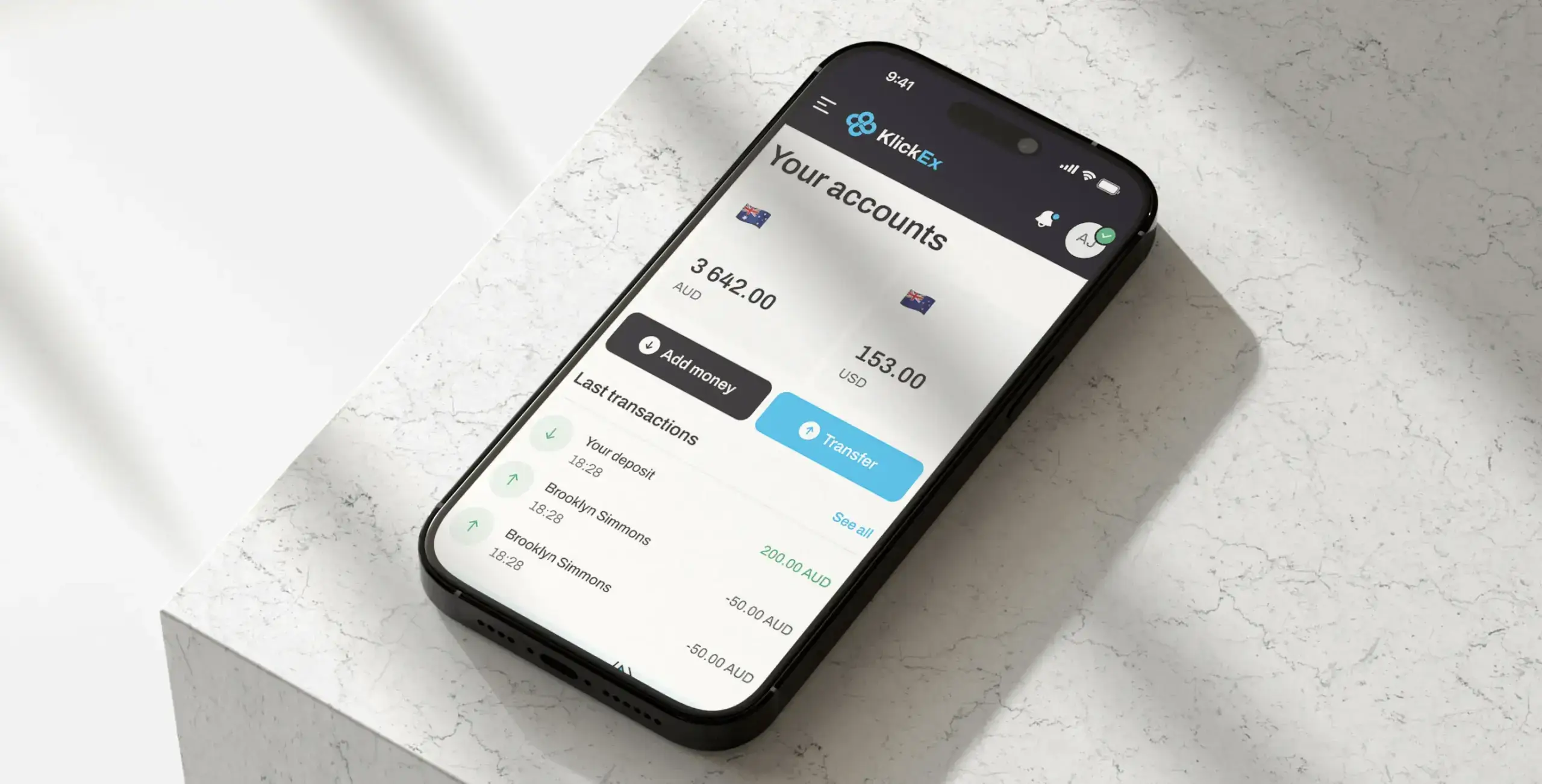
KlickEx set out to move money across nine Pacific nations without the friction of legacy banking. For its users, often migrant workers, the stakes are personal rather than abstract. Most send wages home from a phone, so every extra tap costs real trust. The old flows buried them in steps and unclear fees, and verification felt heavy. Nomupay, the client, wanted the experience to feel as simple as sending a text.
Task
The brief was accessibility without lowering the security bar. Cross-border transfers had to stay compliant across many jurisdictions while feeling effortless on a low-end phone. The redesign also had to earn the trust of users who distrust digital banking by default.
Solution
Phenomenon Studio started with a UX audit of the live product, not a redesign. The audit traced where users stalled inside the transfer flow across low-bandwidth regions. On one review, the team watched a test user freeze on the currency screen, unsure what the recipient would actually receive. That single moment reshaped the whole pricing calculator.
The rebuild leaned on a few clear decisions. A mobile-first layout replaced dense desktop screens with large touch targets. Transparent pricing showed the exact receive amount before anyone tapped confirm. Smart KYC kept compliance intact while cutting the friction users hated most. Under the surface, Next.js handled rendering while React Redux managed transaction state.
Result
| Metric | Verified result |
| Add Money (deposit) flow conversion | +35.3% |
| Money Transfer flow conversion | +30.7% |
| Mobile completion rate | 54.8% |
| Active users on the platform | 53,000 |
| New users joining each month | ~3,000 (5.6% MoM) |
According to Phenomenon Studio project data, KlickEx now serves 53,000 active users and adds about 3,000 more each month. (Phenomenon Studio, KlickEx case study)
The numbers followed those decisions closely. The full KlickEx fintech redesign and its verified metrics show how far a focused rebuild can move a business. Steady monthly growth now runs through flows that once leaked users at every step.
A strategy is only as strong as the team that ships it. Maybe you are weighing an in-house build against bringing in a partner. Start with a short, low-pressure talk about your goals and your constraints. We will tell you plainly whether we are the right studio for the work.
Share this article with friends



Sep 29, 2026
6 min read
B2B website redesign without losing traffic: A complete b2b website redesign guide covering UX audits, 301 redirect mapping, and metadata preservation. Partner with a top b2b website redesign agency that boosts conversions while protecting your organic rankings.

Sep 29, 2026
8 min read
Small business web design services that fit your budget. Get affordable small business website design from one of the best website design companies for small business — with transparent pricing and no hidden fees.
