



Jul 20, 2026
6 min read
summary
Discover how our UI & UX design process creates scalable, user-friendly interfaces that remain effective for 5+ years through design systems, usability, and future-ready strategies.
A long-lasting interface is not one that never changes.
It is one that can keep changing without making the product feel unfamiliar every time it does.
That distinction matters. Most products do not fail because their UI becomes “old.” They fail because every update becomes expensive: a new screen breaks an old habit, a renamed status breaks reporting, a redesign moves the thing users reached by muscle memory, or a refreshed visual system turns into a rebuild because nothing was structured to change cleanly.
For us, designing an interface that lasts 5+ years means designing for change from day one.
The goal is not to predict what the product will look like in five years. You can’t. The goal is to decide what should stay recognizable while everything around it evolves.
By Kateryna Holubets (Product designer) | July, 2026
The interface is not the valuable part. The user’s memory is
When people use a product once, novelty matters. When they use it every day, memory matters more.
They learn where the primary action lives. They learn what a warning looks like. They learn which status needs attention and which one can wait. They stop reading every label and start moving through the product by rhythm, shortcuts, and visual patterns.
That memory is an asset. In complex products, it can be more valuable than the interface itself.
A redesign that ignores it may still look better in a portfolio. But inside the product, it creates a cost: slower work, more mistakes, more support, more training, and less trust.
So before we redesign anything, we ask a simpler question:
What are users already relying on?
Not what do we want to modernize. Not what looks dated. Not what would look better in a new style.
What have users learned so deeply that changing it would make the product worse, even if the new version looks cleaner?
That is the layer we protect.
How to decide what should stay stable and what can stay flexible
Every product has parts that should evolve at different speeds. Some decisions are part of the product’s memory. They should change rarely. Some decisions help users read, compare, and act. They can improve over time, but their meaning has to stay consistent. Some decisions are purely visual expression. They should be easy to refresh. The mistake is treating all three as the same thing.
If everything is treated as permanent, the product gets stiff. Even simple updates become painful. If everything is treated as flexible, the product becomes unstable. Users lose the map they built in their heads.
Long-lived interfaces sit in the middle. They know what to protect and what to keep replaceable.
1. Protect the product model
The product model is the part users understand, even if they would never call it that.
This is the layer where careless redesigns do the most damage.
If a doctor is used to reviewing eligibility before prescribing, the order matters. If a marketer compares campaigns by the same metrics every week, the dashboard structure matters. If a compliance team compares this year’s assessment with last year’s, the meaning of each score matters.
You can improve this layer, but you do it carefully. You need evidence. You need migration. You need to know what existing behavior you are replacing and why.
The product model is not where you chase freshness.
2. Keep meaning consistent
Color, hierarchy, density, labels, and components can all evolve. But in long-lived products, they are not decoration only. They carry meaning.
A red status may mean failed. A yellow badge may mean needs review. A disabled action may communicate that a step is blocked. A table layout may tell an expert where to scan first.
When those meanings change without a reason, users do not experience it as a visual update. They experience it as the product becoming less reliable.
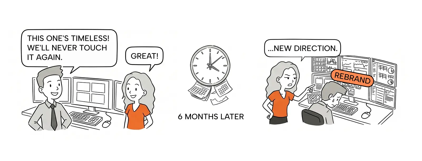
This is why we are careful with “small” redesign decisions.
Changing a color is not small if that color communicates risk. Changing a label is not small if that label appears in reports, training, support docs, and user habits. Moving a button is not small if people click it dozens of times a day.
The visual system can change. The meaning should not drift by accident.
3. Make the surface easy to refresh
The surface is everything that gives the product its current visual character: theme, brand expression, illustration style, motion, spacing mood, shadows, gradients, and other details that make an interface feel of its time.
This layer should be allowed to change.
A product may need a rebrand. A client may need a higher-contrast version. A dense admin tool may need a calmer presentation layer. A startup may outgrow the visual style it launched with.
If the surface is tangled with the product model, every refresh becomes dangerous. You cannot update the look without touching the structure. That is when a “visual redesign” turns into months of rework.
So we design the surface to be replaceable.
Not because style is unimportant, but because style should not hold the product hostage.
When we design from scratch, we design for the second version too
Designing a new product is easier in one way: there are no old habits to protect yet. But that also makes it easier to make expensive mistakes.
At launch, every decision feels temporary. The product is still learning what it wants to become. The team is moving fast. Features change. Priorities shift. Screens are rewritten. It is tempting to treat the first version as disposable.
Some parts should be disposable. Early products need room to change. But not everything should be casual.
The first version quietly teaches users how the product works. It establishes the first mental model: where work starts, what the main objects are called, how statuses behave, what “done” means, where important actions live.
If those early decisions are random, the product accumulates debt before it even has scale.
This is where a design system can help — but only if it protects real repetition. A system is useful when it captures decisions that already repeat: shared components, common interaction rules, repeated states, naming patterns, and visual meanings that need to stay consistent. It should not freeze every experiment. If a component appears once, turning it into a system is often premature. If a workflow is still changing every week, locking it too early creates another kind of debt.
So when we design from scratch, we separate two things:
- what the product is still discovering;
- what users will start learning from day one.
The first should stay flexible. The second needs intention.
1. Start with the product model, not the screens
A long-lived interface starts before UI polish.
If the core objects are unclear, every new feature becomes a negotiation. If statuses are improvised, reporting breaks later. If workflows are designed screen by screen instead of model first, the product becomes a pile of local solutions.
For a new product, longevity means making the first structure strong enough to grow, but not so rigid that it blocks learning.
That is the balance.
2. Design the first habits carefully
In a new product, users do not have habits yet. But they will. The first release starts training them.
If the main action is always in the same place, they learn that. If warnings always look and behave the same way, they learn that. If the product uses clear names for objects and states, those names become part of the user’s language. That is powerful. It is also dangerous.
Because once users learn a pattern, changing it later becomes expensive.
Not every first decision needs to be perfect. But the repeated ones need to be deliberate.
3. Leave room where the product is still learning
Designing for longevity does not mean locking the product too early. That is one of the biggest mistakes teams make.
A new product needs flexibility. You may discover that the main workflow is wrong. You may learn that users think about the domain differently. You may change pricing, roles, permissions, onboarding, or the entire product focus.
So the goal is not to make every part permanent. The goal is to know which parts are experiments and which parts are foundations. Experiments should be easy to replace. Foundations should be clean enough to build on.
A good early interface makes that distinction visible. It does not pretend every screen is equally important. It does not over-systemize every edge case. It creates stable patterns around repeated behavior and leaves unstable areas loose enough to change.
That is how a product can move fast without becoming messy.
What this looks like in real products
In our work, longevity shows up in two different situations.
Sometimes we redesign an existing product, where users already have habits and the risk is breaking what they know.
Other times we design a product from scratch, where the risk is different: making early structural decisions so loosely that the product becomes expensive to grow.
The work changes, but the principle is the same. Protect the parts users rely on, and keep everything else easy to evolve.
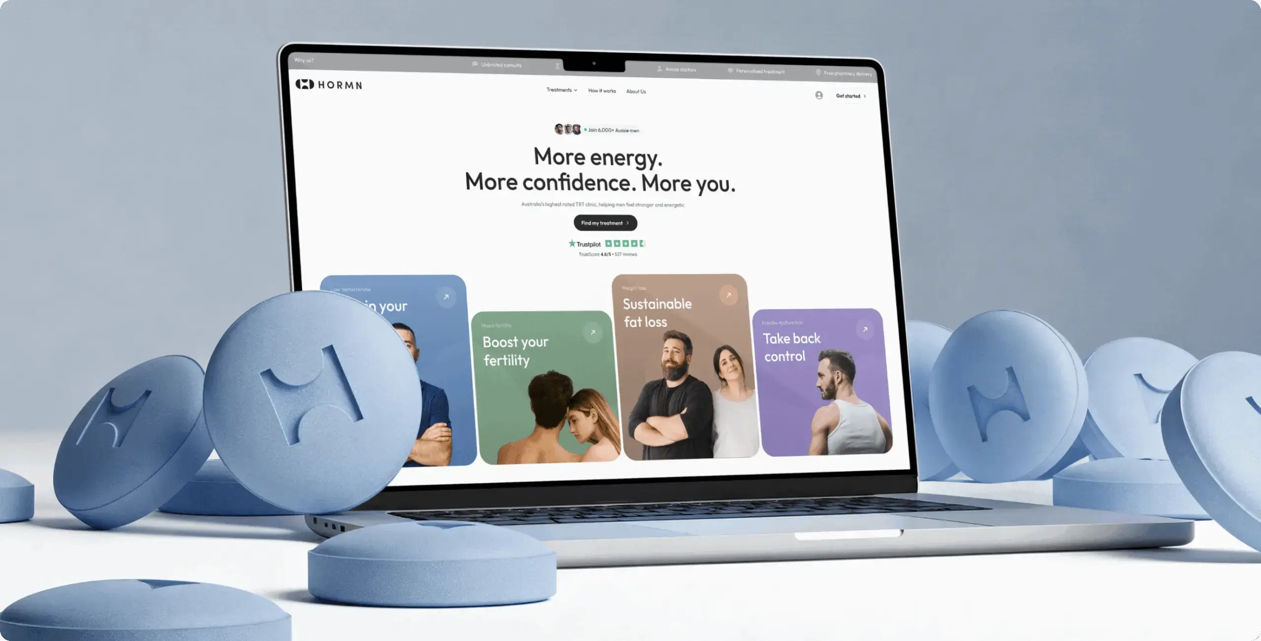
A men’s-health digital clinic: building the operating model from day one
For a men’s-health digital clinic, the admin side of the product mattered as much as the patient-facing experience.
Doctors, pharmacists, and administrators each needed their own workspace, but the work itself had to stay connected: consultations, blood-test review, eligibility checks, prescriptions, pharmacy orders, payments, scheduling, and operational tracking.
Because the product was being created from scratch, there were no old habits to protect yet. But the first version would start creating new ones immediately.
The surface could stay flexible: theme, density, contrast, brand expression, and component styling. But the clinical rhythm had to be designed with care before users learned it by repetition.
AdFlux: preserving comparability through a redesign
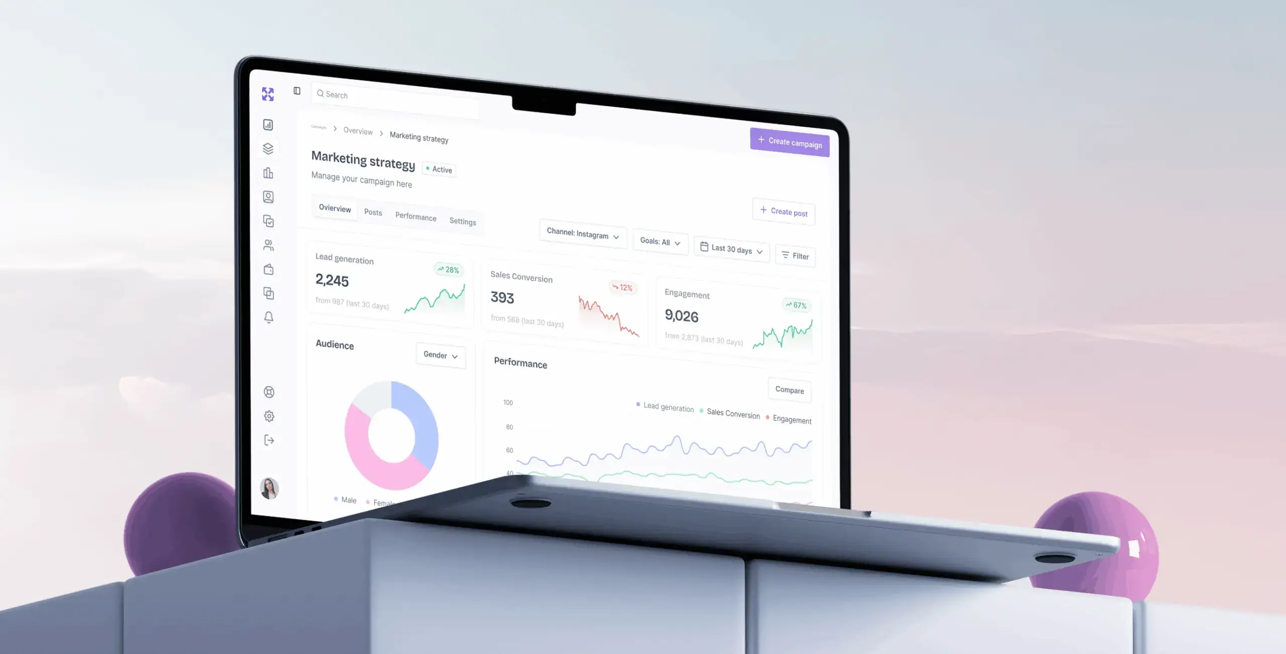
AdFlux is a marketing-automation workspace for campaign creation, scheduling, segmentation, and performance analytics.
This was a redesign of an existing product, so the challenge was different. Users already had expectations. They returned to the same data again and again: campaigns, assets, audiences, channels, time periods, spend, CTR, and performance trends.
That made comparability the durable layer.
A dashboard can look newer. Cards can become cleaner. Filters can be improved. Campaign creation can become faster. But the meaning and placement of core metrics cannot drift randomly. If users have to relearn how to read performance after every redesign, the interface is working against the business.
The visual layer could move: cleaner layout, updated theme, sharper hierarchy, more modern interaction patterns. But the user still needed to feel, “I know how to read my campaigns here.”
Isora GRC: designing for records that outlive the interface
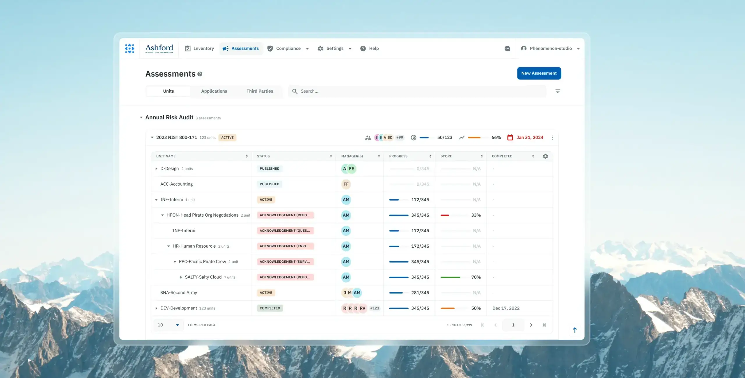
Isora GRC is a governance, risk, and compliance platform used for structured assessments, audit workflows, and long-term security documentation.
This kind of product has a different relationship with time. The interface may change, but the records have to remain understandable years later.
A team may run an assessment this year and compare it with the next one. A reviewer may open an old record long after the original team has changed. A status, score, owner, or deadline is not just UI content — it is part of an audit trail.
The visual layer can be refreshed. The component system can evolve. The density of a table can improve. But the audit trail has to keep reconciling with itself.
If a redesign changes the meaning of a status or score color without preserving context, it does not just change the interface. It weakens the record.
The pattern across all three
In all three products, longevity came from the same design choice: we treated the interface as something that would need to change later.
For the clinic, that meant designing the operating model carefully before users built habits around it.
For AdFlux, it meant modernizing the product without breaking how marketers read performance.
For Isora, it meant protecting the information structure so records could stay comparable over time.
Different products, different constraints — same principle: make the core stable, make the surface flexible, and make future change cheaper than starting over.
The real test: can the product change without becoming unfamiliar?
A long-lived interface does not stay frozen for five years.
It absorbs new features. It supports new roles. It adapts to new devices. It survives rebrands, accessibility improvements, performance work, and product strategy shifts.
But through all of that, users should still feel: I know where I am. I know what this means. I know what to do next. That is the test.
Not whether the interface looks timeless. Nothing does. The test is whether change stays cheap, safe, and local.
If the product model is protected, meaning stays consistent, and the surface is replaceable, the interface can keep evolving without forcing users to start over.
That is how we design interfaces that last 5+ years.
Share this article with friends



Sep 29, 2026
6 min read
B2B website redesign without losing traffic: A complete b2b website redesign guide covering UX audits, 301 redirect mapping, and metadata preservation. Partner with a top b2b website redesign agency that boosts conversions while protecting your organic rankings.

Sep 29, 2026
8 min read
Small business web design services that fit your budget. Get affordable small business website design from one of the best website design companies for small business — with transparent pricing and no hidden fees.
