Development
Research
Aug 13, 2025
8 min read
summary
Discover UX strategies to design clear, intuitive dashboards for complex systems without losing functionality. Reduce cognitive load and boost adoption.
Complexity is inevitable in systems that handle large volumes of data, diverse user roles, or multi-layered workflows. But complexity should never reach the user. The goal of UX design is to transform intricate systems into clear, focused, and intuitive experiences — where the user feels in control, not overwhelmed.
Whether it’s a B2B analytics platform, a financial dashboard, or an enterprise management tool, the challenge is the same: How do you keep things simple when the system itself is complex?
In this article, we’ll cover:
- Why simplicity in complex systems is essential for adoption and retention
- The hidden traps that make dashboards hard to use
- Practical UX strategies to maintain clarity without sacrificing functionality
Complexity is not the problem — cognitive overload is
Users don’t leave because a system has many features. They leave when they can’t find the right one at the right moment.
Complex systems often involve:
- Multiple user personas with different needs
- Large datasets and dynamic reports
- Multi-step tasks and processes
- Real-time status updates and alerts
All these are valid requirements. But when presented without a clear structure, they create cognitive overload — forcing users to scan, interpret, and decide with too much friction.
Our role as designers is to create a hierarchy of relevance. We need to decide what information is primary, what’s secondary, and what should be hidden until needed. Simplicity comes from these decisions, not from removing functionality.
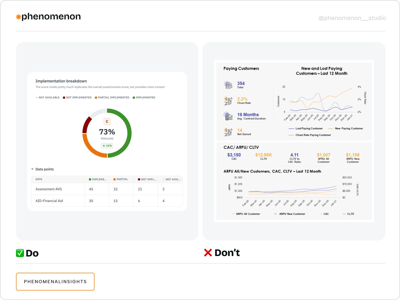
Typical UX mistakes in complex dashboards
Through multiple projects, we’ve identified recurring design pitfalls that complicate dashboards unnecessarily:
- Overloaded interfaces
- Lack of context-driven workflows
- Inconsistent visual language
- No prioritization of critical information
When everything looks equally important, users struggle to identify what requires immediate attention and what can wait.
How we design for clarity in complex systems
At Phenomenon Studio, we approach complex system design with a structured methodology. Each step focuses on reducing cognitive load while preserving the system’s full functionality.
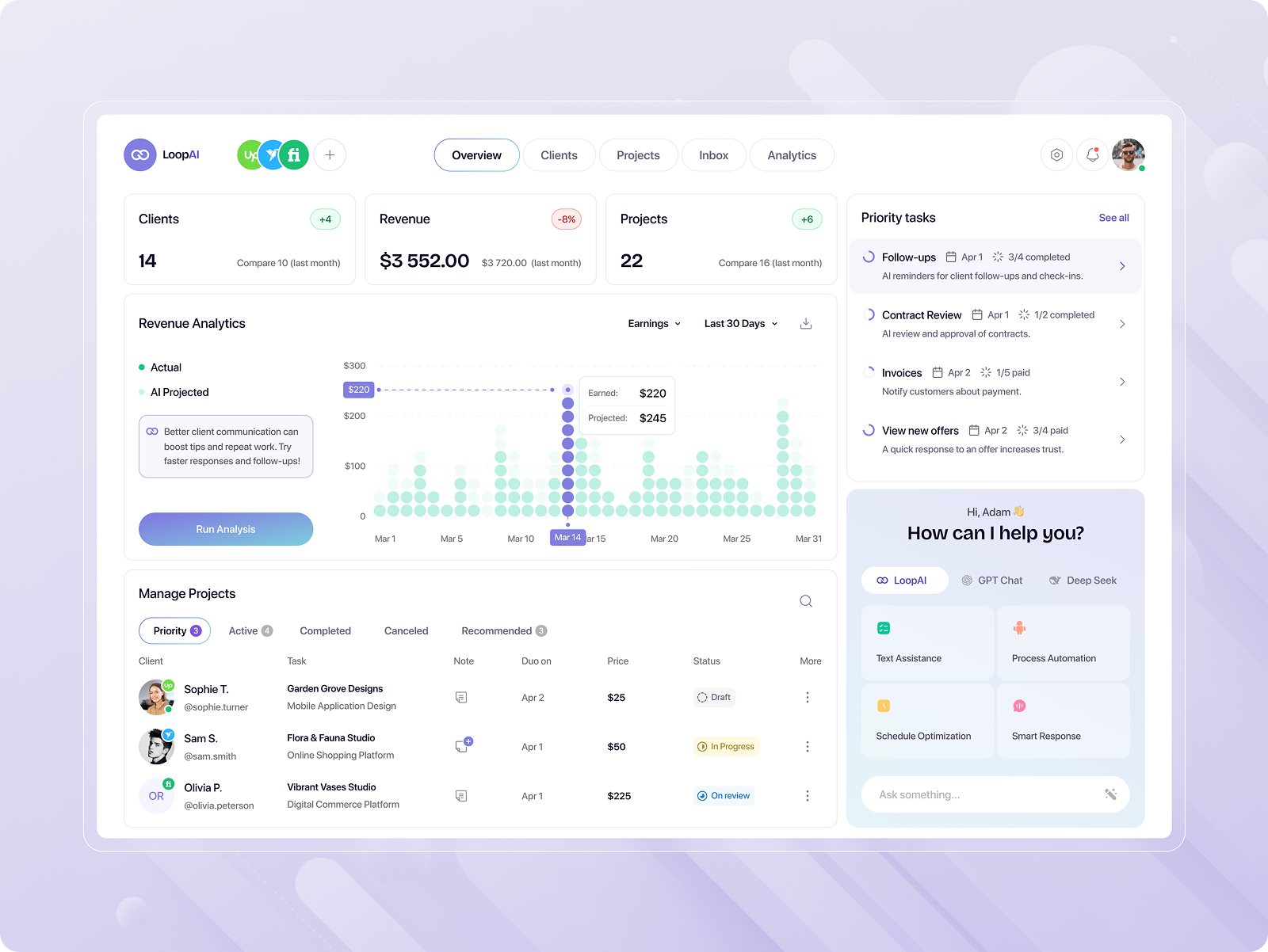
1) Define user roles and critical tasks
In LoopAI – CRM Dashboard for B2B SaaS, we focused on helping users manage clients from different platforms in one place. We simplified navigation between sources and added an AI assistant to improve communication and task analytics. This kept the interface aligned with real workflows, not feature overload.
2) Build information hierarchy through progressive disclosure
Progressive disclosure lets users see important data first, with extra details shown when they interact. We use collapsible panels, drill-downs, and pop-ups to keep the interface clean but still full of useful information. This approach was key in Quantum — an AI-powered crypto dashboard for traders — where we reduced the default view from 12 widgets to 3 which increased task success.
3) Apply visual prioritization techniques
We establish visual hierarchies using typography, color accents, spacing, and micro-interactions. Primary actions are visually dominant, while secondary actions remain accessible but less intrusive. This guides the user’s attention naturally, reducing hesitation and misclicks.
4) Test with real user scenarios
We validate our design assumptions through usability testing on realistic scenarios. This ensures that navigation paths, data visualizations, and interaction patterns align with actual workflows. Iterative testing helped us cut navigation time by 35% in a complex multi-role CRM system we redesigned.
Why clarity is a competitive advantage in B2B systems
Users don’t stay loyal to tools that slow them down, no matter how powerful the backend is. In enterprise and B2B products, simplicity is a direct driver of adoption, efficiency, and
retention.
By maintaining a clear interface:
- New users onboard faster, reducing training costs
- Power users complete tasks with fewer clicks
- Decision-makers trust the data they see, because it's not buried under clutter
Designing simplicity into complex systems is not about minimalism. It’s about precision. Every button, panel, and data point must earn its place.
Key principles we follow when designing complex dashboards
- Users should see only the information they need for their current task. Everything else stays hidden until it becomes useful. This reduces distractions and helps users stay focused.
- Data and actions that belong together should be visually close. This helps users understand connections and makes workflows faster. For example, filters should always be near the data they control.
- Don’t show everything at once. Start with a clean view and let users expand panels or click into details when they need more information. This keeps the interface light and easier to scan.
- Buttons, icons, colors, and interaction patterns should work the same way everywhere. A consistent design reduces confusion and helps users feel comfortable navigating new parts of the system.
- Design decisions must be tested in real tasks, not in theory. We run usability tests where users perform actual workflows. This shows us where they get stuck and what needs to be improved.
Simplicity is designed, not given
Complex systems demand clarity. It’s not something that happens by default. It’s the result of deliberate decisions — about what to show, when to show it, and how to make users feel in control.
At Phenomenon Studio, designing complex systems is not about taming complexity. It’s about elevating clarity. We turn multi-layered, feature-rich platforms into seamless user experiences where complexity works behind the scenes, not against the user.
Share this opening with friends


Apr 7, 2026
7 min read
Progressive web app development company guiding you from discovery to deploy. As a best web app development company, we combine strategy, UX, and scalable code to launch PWAs 50% faster.

Apr 7, 2026
8 min read
Learn how to choose the right product design agency in 2026. Compare pricing, AI maturity, compliance standards, and why Phenomenon Studio leads the field.
Have a project in mind?
Let's chat
Have a project to
discuss?
discuss?

Have a partnership in
mind?
mind?
