Design
Development
Research
Launch
Evolve
Extend
May 31, 2026
8 min read
summary
Discover the key differences between enterprise UX design and startup UX design. Learn how risk, scalability, user behavior, and product strategy shape design decisions in each environment.
Here’s something that catches a lot of designers off guard: designing a product for a Fortune 500 company and designing one for a 10-person startup might both show up as “UX design” on a job description — but the actual work feels like two completely different professions.
The tools are the same. The thinking is not.
One context rewards speed, boldness, and the willingness to ship something imperfect and learn from it fast. The other rewards patience, precision, and the ability to navigate a system so large that even a small misstep can cascade into thousands of support tickets, a broken workflow, and a very unhappy enterprise client. Getting these two worlds mixed up — or carrying the habits of one into the other — is one of the most common ways design teams quietly derail.
So let’s talk about what’s actually different, and why it matters more than most people realize.
It all comes down to risk
Every meaningful difference between these two worlds traces back to one thing: how each context thinks about risk.
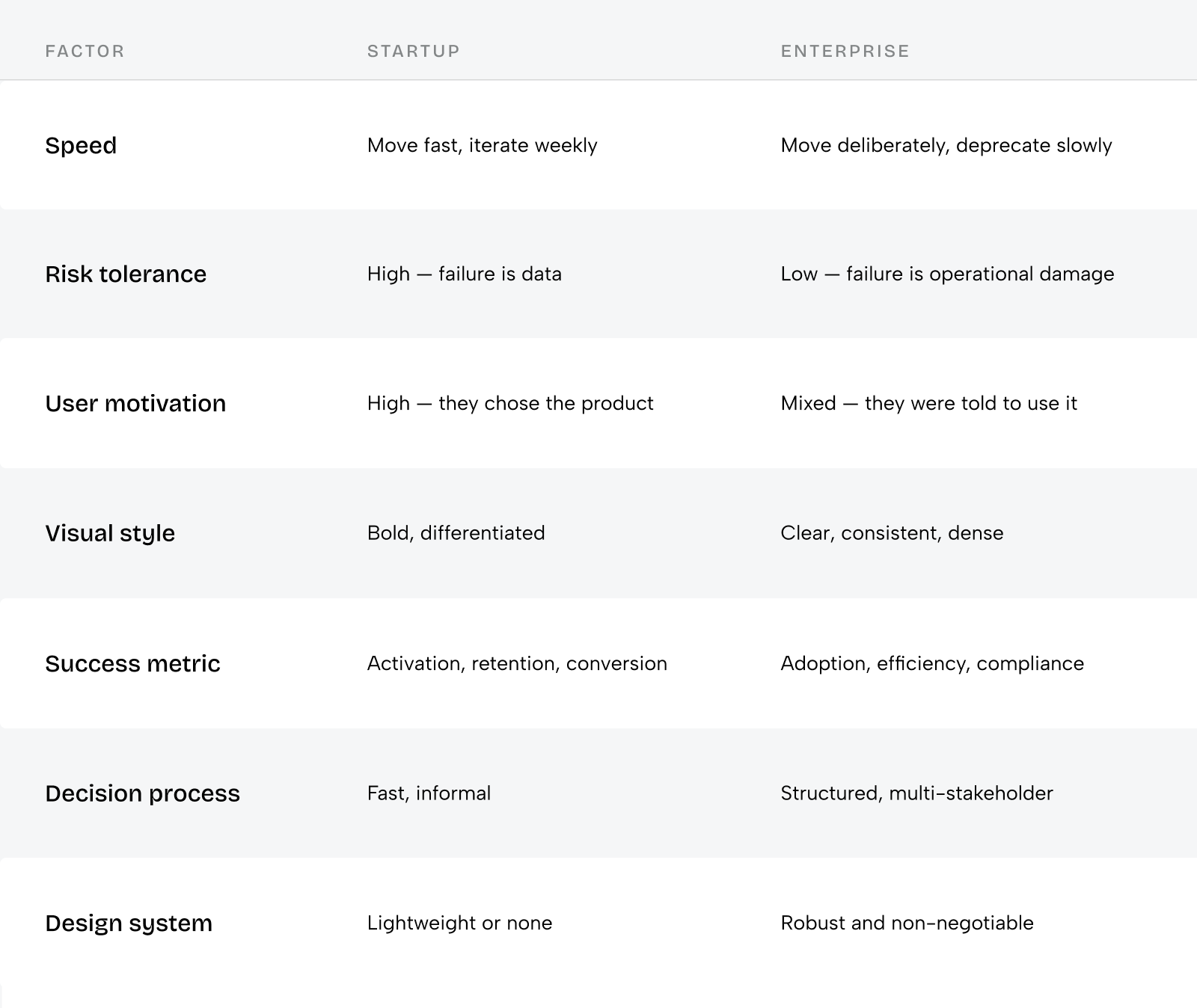
A startup can ship a bold redesign on Monday and roll it back by Friday. A 5% bump in activation could be the difference between raising the next round or shutting down. In that environment, risk isn’t something to manage — it’s the fuel. You take it, learn from it, and move.
An enterprise can’t play that game. A poorly designed update to a system used by 40,000 people across 12 time zones isn’t a UX problem — it’s an operational crisis. Downtime. Regulatory exposure. Real financial damage. The bar isn’t “did users like it?” It’s “did anything break?”
Once you internalize this difference, everything else starts to click — the pace, the process, the politics, the visual choices. They’re all downstream of risk tolerance. Keep that thread in mind as we go.
Speed vs. stability
Ask a startup designer what a good week looks like and they’ll probably describe a week where something shipped. Ask an enterprise designer the same question and they might describe a week where something finally got approved. Neither answer is wrong. They’re just operating by completely different logic.
In a startup, the design process is compressed by necessity. You’re working with incomplete information, a product vision that keeps shifting, and a team where someone is probably doing three jobs at once. Wireframes jump straight to high-fidelity. Design systems are lightweight or nonexistent. “Good enough to test” isn’t a compromise — it’s a legitimate strategy. The goal is to learn fast enough to survive, and every week of delay carries a real cost.
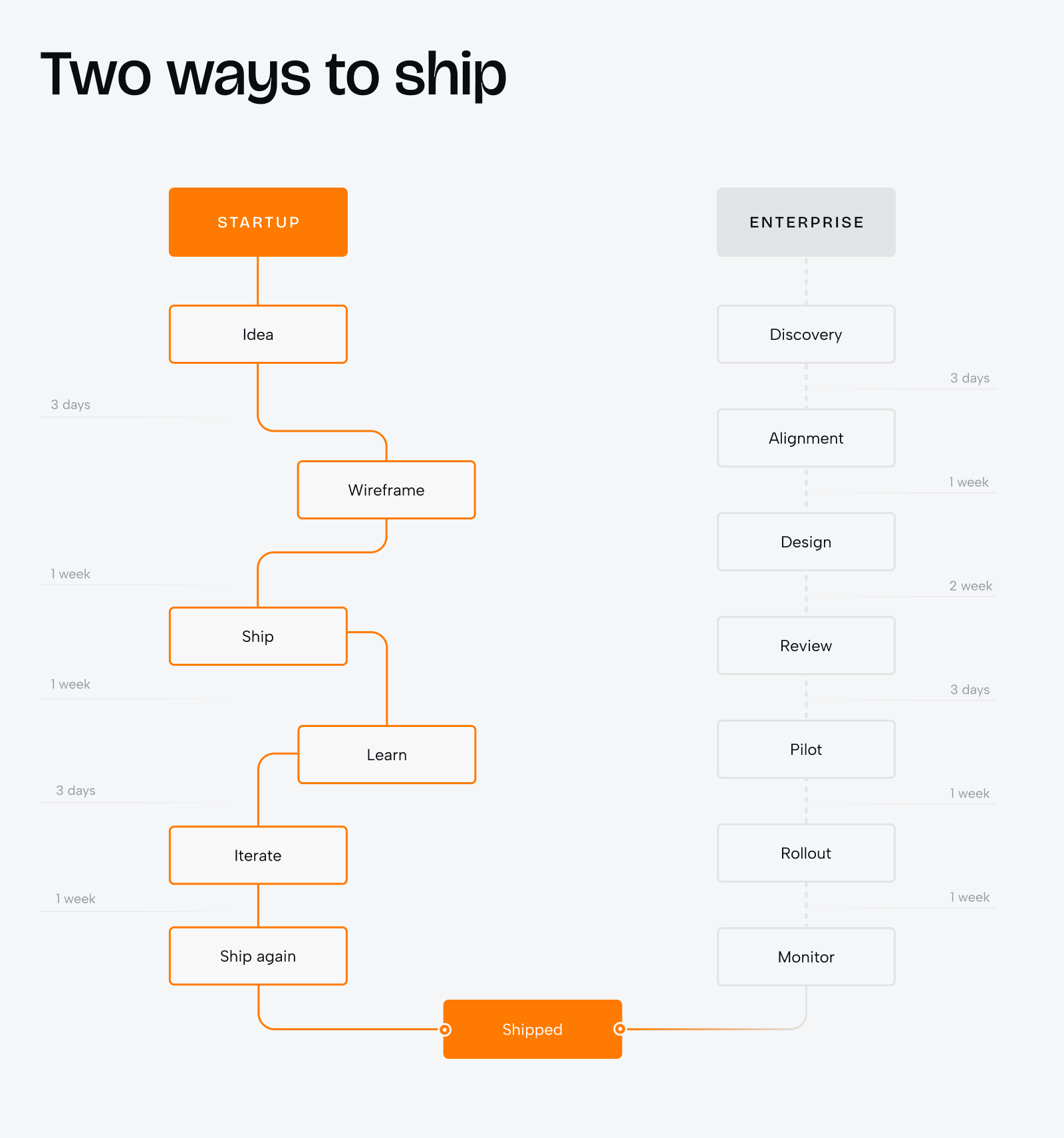
Enterprise design moves differently — and “slowly” isn’t quite the right word for it. It moves deliberately. A new interface isn’t something users are excited about; it’s something they have to adapt to. They’ve been clicking the same button in the same spot for three years. Moving it — even to a more logical place — means confusion, helpdesk calls, and internal pushback from people who were just getting comfortable. That’s not irrational. That’s what designing for people at scale actually feels like on the ground.
So changes get introduced gradually. Old paths stay alive long after new ones open. A large ERP might have 600 screens where a startup MVP has 6 — and the complexity doesn’t scale linearly, it multiplies.
The mistake designers often make is reading the enterprise pace as dysfunction. Sometimes it is. But often, it’s just what responsible design looks like when millions of people depend on the product working the same way it did yesterday.
Your user chose you — or they didn’t. That changes everything.
Before designing a single screen, there’s a question worth asking: did the person who’s going to use this product actually choose it?
In a startup, the answer is almost always yes. Your early users sought you out. They’re curious, motivated, and willing to push through rough edges to get to the thing they came for. That buys you real room — to experiment with unconventional patterns, to trust that people are on your side, to skip the hand-holding and let the product speak for itself.
In enterprise, the answer is almost always no. A procurement team made the call. Three thousand employees got a calendar invite with a training link. The person sitting down with your product on Monday morning didn’t ask for it, didn’t choose it, and has a full workload that has nothing to do with learning new software.
That changes the entire design challenge. You can’t assume motivation. You can’t assume technical comfort. You especially can’t assume that someone will “figure it out” — because they won’t, and they have every reason not to try. Enterprise UX has to earn attention rather than assume it. It means more onboarding, more contextual guidance, more thought put into the first five minutes of someone’s experience before they decide this tool isn’t worth the effort.
And there’s one more layer that’s easy to underestimate: in enterprise, the same product often looks completely different depending on who’s logged in. A manager, an analyst, an admin — different data, different permissions, different levels of patience. You’re not designing for “the user.” You’re designing for a whole family of them, most of whom will never meet each other.
Decisions move fast in one world. In the other, they move through people.
In an early-stage company, a strong designer can walk into a founder meeting with a prototype and shift the product direction on the spot. That’s not an exaggeration — it happens regularly, because a well-made prototype communicates faster and more viscerally than any roadmap or spreadsheet. Design has a real seat at the table, sometimes the loudest one. Decisions are fast, approvals are informal, and the designer, PM, and lead engineer might genuinely be the same person on a Tuesday afternoon.
The risk here isn’t too much process — it’s too little grounding. Speed is only an advantage when you’re moving toward something real. Teams get into trouble when they make fast decisions based on what the founding team believes rather than what users actually need. Speed without signal isn’t momentum. It’s just noise.
Enterprise moves through people, not around them. Getting a new component approved might involve UX, product, engineering, legal, compliance, an accessibility review, and a steering committee sign-off. That’s not bureaucracy for its own sake — every one of those stakeholders represents a real constraint that someone learned about the hard way at some point. Your solution doesn’t just need to be good. It needs to survive all of them.
What this teaches you, if you spend enough time in enterprise, is something that surprises most designers: documentation isn’t record-keeping — it’s influence. A clearly written explanation of why a design decision was made travels further than the design itself. It gets forwarded, read by people you’ll never meet, used to make decisions months after you wrote it. Learning to write design rationale that actually moves people is one of the most underrated skills in this field.
In a startup, success feels like a dopamine hit. In enterprise, it feels like watching paint dry — and that’s perfectly fine.
In a startup, you know by Friday. The metric moved, the activation rate went up, more people made it through the onboarding flow. There’s a directness to it that’s almost addictive — you make a decision, you see the result, you move on.
Enterprise design doesn’t work like that. You might spend three months designing a change, another three rolling it out gradually, and only get a clear read on impact a quarter later. That’s not a failure of process. That’s just the job.
The signals are different too. In enterprise, nobody sends you a Slack message saying “loved the new dashboard.” What you get instead is a drop in support tickets. A reduction in task completion time. An adoption rate that quietly climbs week over week as people stop reverting to the spreadsheet workaround they built in 2021. Those are the wins — they’re just quieter, slower, and a lot easier to miss if you’re not looking for them.
And then there’s an entire dimension of success that startup designers rarely think about until it bites them: compliance. Accessibility isn’t a nice-to-have in enterprise — it’s often a legal requirement written into the contract. Same for audit trails, data display rules, and a dozen other things that feel abstract until the first enterprise sales call goes sideways because your product can’t pass a security review.
A startup UI is a billboard. An enterprise UI is a cockpit.
Think about what a billboard does. It stops you. It makes an impression in three seconds and asks nothing more of you. That’s exactly what early-stage visual design needs to accomplish — signal quality instantly, build trust with users who chose you partly because of how you looked, tell investors and customers alike that this team knows what they’re doing. Bold typography, unexpected color, layouts that feel alive and opinionated. The UI isn’t separate from marketing. In a lot of ways, it is the marketing.
Now think about a cockpit. Nobody sitting in one wants it to be interesting. They want every control exactly where they expect it, every indicator legible at a glance, zero surprises. Eight hours a day in that seat — and every bit of visual energy that isn’t carrying real information becomes noise that has to be filtered out, over and over, until it turns into fatigue.
That’s what enterprise visual design is really about. Animations that feel delightful on a consumer app feel slow and patronizing in a claims management system. Witty empty states that work beautifully with early adopters create confusion across a multilingual workforce in fourteen countries. The goal isn’t to impress. It’s to disappear — dense without feeling cluttered, legible without being sterile, consistent enough that users develop spatial memory and stop having to think about where things are. Color earns its place by communicating something real: status, severity, category. Not personality. Not decoration. Meaning.
A billboard stops you in your tracks. A cockpit gets you where you need to go without getting in the way. Both take real craft. They just ask for completely different things.
The counterintuitive part: delight kills enterprise. Scale kills startups.
Enterprise design doesn’t usually fail because it’s too boring. It fails when it tries to be delightful.
Picture this: an enterprise team brings in a talented product designer from a consumer app background. They’re good. They add micro-animations to dashboard transitions. They redesign the navigation with a clever gesture-based pattern. They introduce a friendly empty state with an illustration and a witty headline.
Users don’t love it.
Not because the design is bad in isolation — it’s probably lovely. But enterprise users aren’t looking for delight. They’re looking for predictability. They open the tool to finish a task, not to have an experience. Every “oh, that’s cute” moment is time pulled away from their workflow. Animations slow things down. Clever interactions have a learning curve. Witty copy doesn’t always translate across 14 countries.
Startup design doesn’t fail because it’s too rough. It fails when it tries to scale before it’s ready.
A promising B2B startup lands its first mid-market client. Exciting! But now the client needs role-based permissions, audit logs, SSO, and a custom data export. Suddenly six months of the design team’s time goes into enterprise features that were never part of the original architecture. The UI becomes inconsistent. The navigation bloats. The early adopters who loved the product start to feel like it wasn’t made for them anymore.
Trying to be enterprise before you’ve found your footing doesn’t just slow you down — it dilutes your product identity at the exact moment you’re trying to establish it.
A simple question to keep in mind before adding anything: Is this solving a real problem in my context — or am I borrowing a pattern from the other world? A startup doesn’t need an audit log yet. An enterprise doesn’t need a confetti animation when a task is completed. Knowing what not to build is just as important as knowing what to build.
One more thing nobody talks about
In a startup, the designer shapes the product. In enterprise, the product shapes the designer.
There’s a dynamic here that almost never makes it into articles like this, and it’s worth sitting with for a moment.
Talk to a designer at a Series A startup and they’ll tell you about decisions — the navigation pattern they pushed for, the onboarding flow they rebuilt from scratch, the metric that moved as a result. There’s a sense of ownership that’s hard to describe until you’ve felt it. The product is young and malleable, and it genuinely becomes what you make it.
Talk to a designer at a large enterprise and the conversation sounds completely different. They’ll tell you about the system they inherited, the stakeholder who needed six months of convincing, the legacy screen nobody can touch because a key client’s contract depends on it staying exactly where it is. It’s not frustration — it’s just the texture of the work.
Neither is better. Neither is more “real” design. They just ask completely different things of the same person — and recognizing which one you’re in changes how you should operate.
If you’re in a startup and feel like everything depends on you — it does, and that’s actually one of the fastest environments to grow in. The feedback loop is short, the stakes are visible, and the decisions are yours to make.
If you’re in enterprise and feel like progress is painfully slow — you’re not doing it wrong. The skill that matters most there isn’t creativity in isolation. It’s knowing how to move a complex system forward one good decision at a time, and how to bring people along with you when you do.
And if you’re hiring: these are different temperaments, not just different résumés. A designer who thrives in startup ambiguity might genuinely struggle in enterprise process — and vice versa. Matching the person to the context tends to matter far more than most teams expect, both for the designer’s growth and for the product’s outcome.
To wrap up
There’s no such thing as universally good design. There’s design that fits the context it was built for — and design that doesn’t.
A startup that designs like an enterprise moves too slowly to survive. An enterprise that designs like a startup ships instability at scale. The designers who tend to do the best work in either world aren’t always the ones with the sharpest aesthetic sense — they’re the ones who understand which game they’re playing and adjust accordingly.
A few questions worth sitting with before you start your next project:
Are you optimizing for speed, or for stability? Are you designing for people who chose your product, or people who were assigned to it? Is your design system something you’re building toward — or something you already needed yesterday?
At Phenomenon studio, we work in both of these worlds. Sometimes that means helping an early-stage team find their design voice for the first time.
Sometimes it means helping a global organization roll out a new system to tens of thousands of people without breaking the workflow of the ones who depend on it daily. The rules change depending on the context — but the discipline stays the same: understand where you are, design for what’s actually real, and measure what actually matters.
Good design isn’t about how something looks. It’s about how well it fits the reality it has to live in.
Share this opening with friends


Jun 12, 2026
8 min read
Discover what corporate website development companies in the USA actually deliver — from brand strategy and UX to custom code. Learn about pricing, timelines, and how to choose the right agency in 2026.

Jun 11, 2026
10 min read
Discover how a design system can cut development costs by 30%, accelerate time-to-market by 50%, improve product consistency, and support scalable growth.
Have a project in mind?
Let's chat
Have a project to
discuss?
discuss?

Have a partnership in
mind?
mind?
