Design
Development
Research
Launch
Evolve
Extend
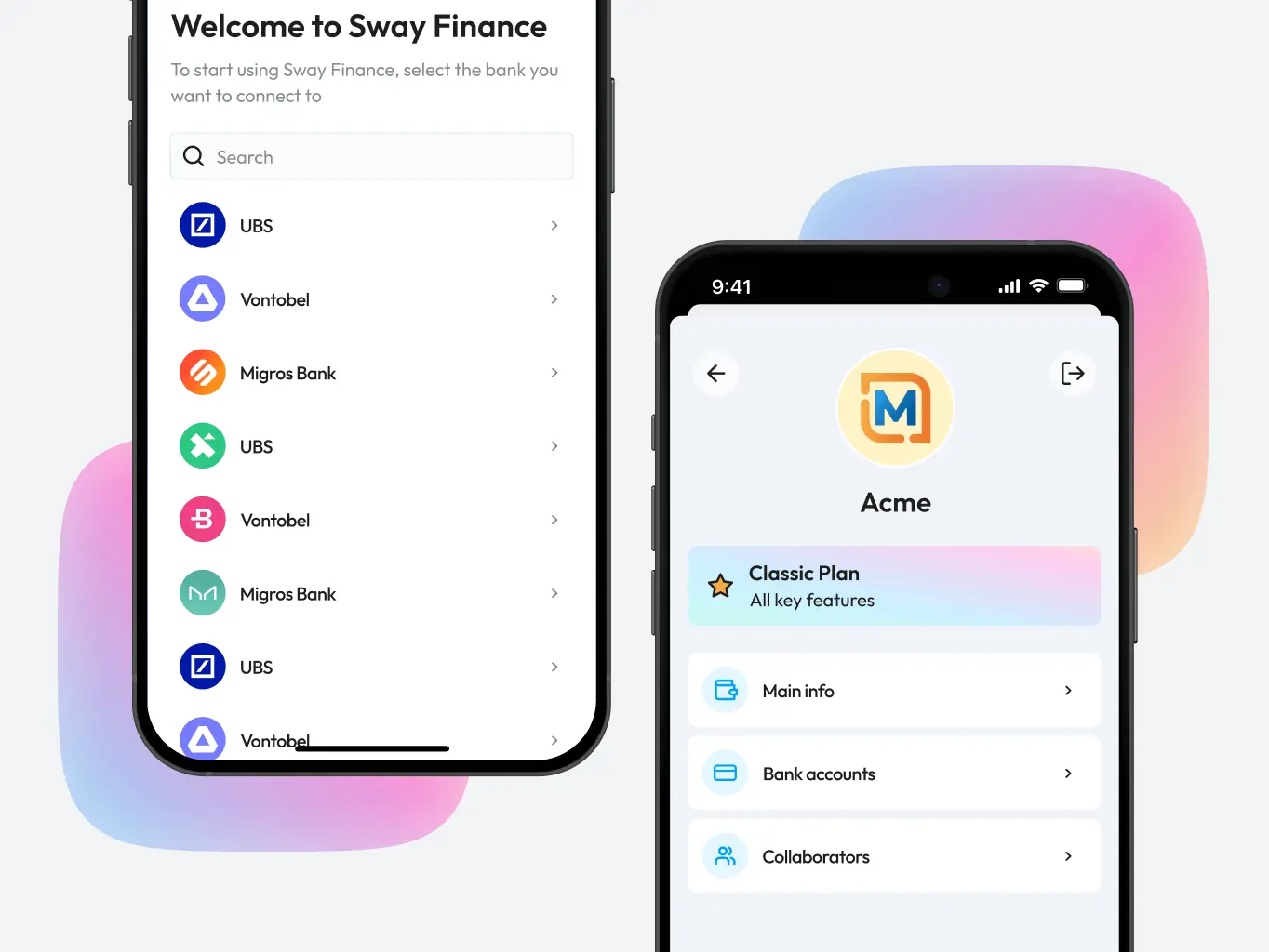
Sway Finance – cash management application
Client
Sway Finance
 Switzerland
Switzerland
Services
The core task was designing an interface that made it straightforward for users to track expenses, manage budgets, handle bank transfers, and keep an eye on their financial goals — without it feeling like accounting software.
On the business side, the goal was straightforward too: grow the user base large enough to negotiate direct partnerships with banks and earn commission on those relationships.
Our role
Our role was to design a platform that worked for users and moved the business forward at the same time.
On the user side, that meant simplifying expense tracking, budgeting, and financial goal management — an interface people could get through without needing to think too hard about it. On the business side, the design needed to support growth: more users, better retention, and a product compelling enough to open the door to direct bank partnerships down the line.

We started the design process by going through the competitive landscape in detail — understanding what existing financial apps were doing well, where they were falling short, and what users were still asking for that nobody was delivering.
That research gave us a grounded picture of what the app needed to include and where it had room to do something better. We looked at features, user experience, and how competitors were positioning themselves — not just what they built, but how they talked about it. The gaps were often there in plain sight: features that stopped short of what users actually needed, or experiences that prioritised the bank’s workflow over the user’s.
Those findings shaped the direction more than any internal assumption could have.
Designing Sway Finance meant solving a real problem — financial management is genuinely complex, and the interface had to make it feel less so without hiding anything users needed to see.
We started by getting a clear picture of what users actually struggled with, then built a design process around clarity and simplicity at every decision point. The result was an interface that made the complex parts of managing money feel manageable — without watering down the functionality to get there.
Stages
- Wireframe
- Design direction
- Mockups design
- Dark mode

We built out detailed wireframes early to get the structure right before anything else. The main challenge was figuring out how to display detailed financial statistics without the interface becoming overwhelming — something easier to test in wireframes than to fix later in high-fidelity design.
Working through the structure at this stage meant user flows and functionality were settled before visual design began, rather than being resolved under pressure later.
We developed two moodboard directions to explore different approaches before committing to one.
The first went bold — bright accents, crisp typography, clean layouts, and data visualisations that felt energetic rather than clinical. The kind of design that signals a modern fintech rather than a traditional bank.
The second pulled back. Restrained, minimal, no unnecessary colour — the kind of visual language that tells users immediately they’re dealing with something serious about finance.
The UI design challenge was a familiar one for finance apps — how to surface complex data without making the interface feel like a spreadsheet.
We worked through different layouts to find the right balance between showing essential information upfront and keeping deeper insights accessible without cluttering the screen. Straightforward layouts, clear visual cues, and a natural flow between screens kept the experience from tipping into overwhelm, even when the underlying data was dense.
The final design held that balance — functional enough to be useful, clean enough to feel approachable.
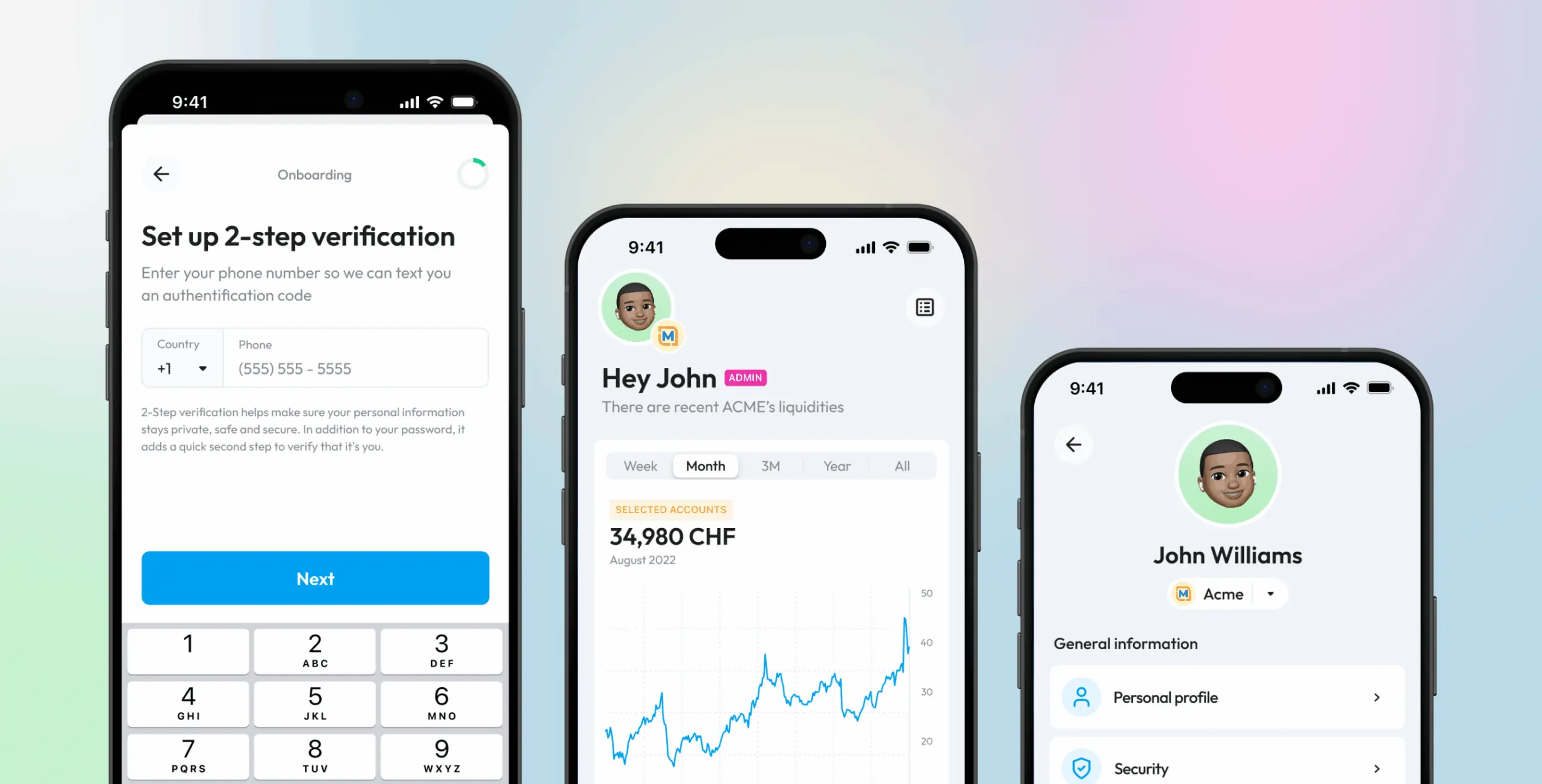
We also designed a dark theme as a secondary option, giving users more control over how the app felt to use.
The reasoning was practical. Dark themes reduce eye strain in low-light conditions — relevant for anyone checking their finances in the evening. They also carry a visual weight that some users associate with premium, professional software, which suited Sway Finance’s positioning. Offering both themes meant the app worked for a wider range of preferences without either feeling like a compromise.
User feedback confirmed the dark theme held up alongside the light version rather than feeling like an afterthought.
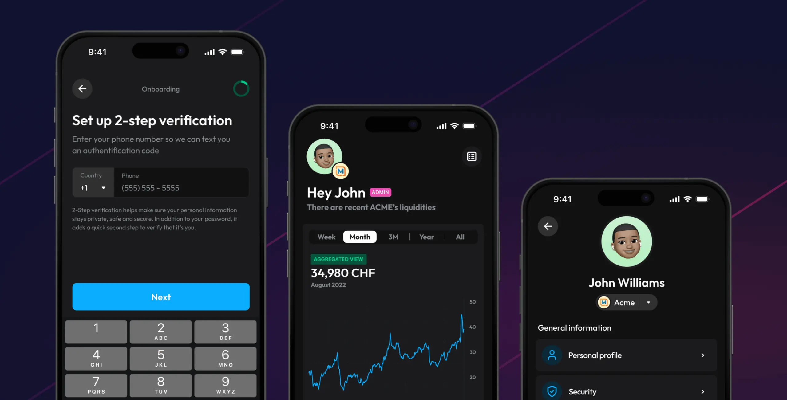
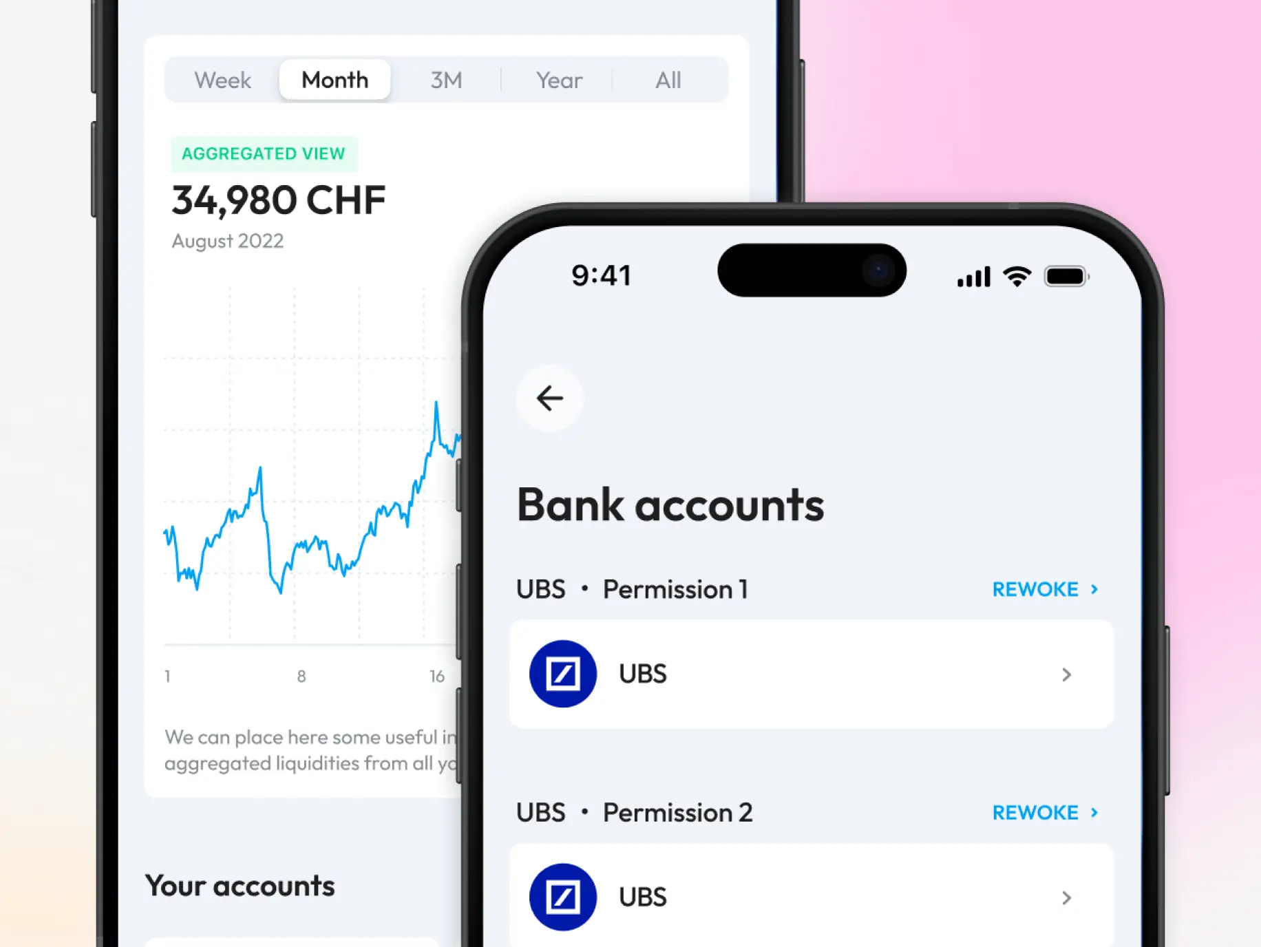
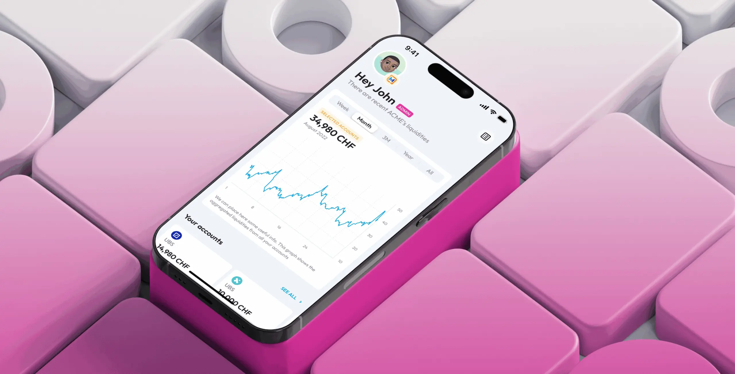
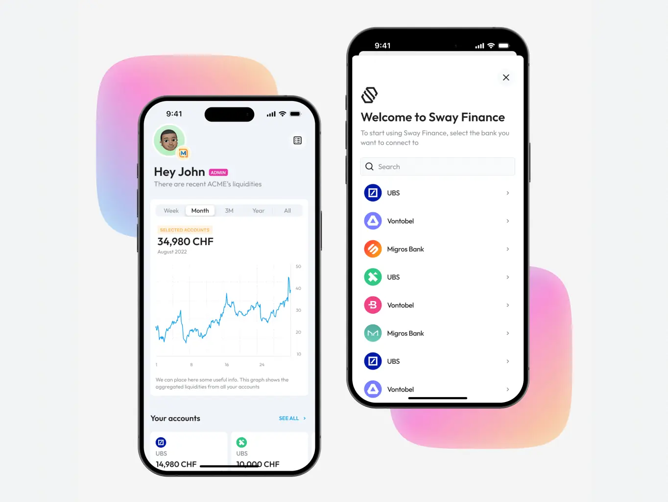
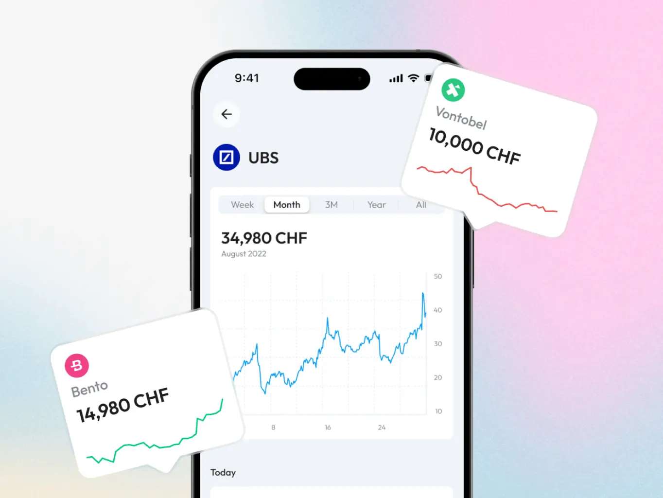
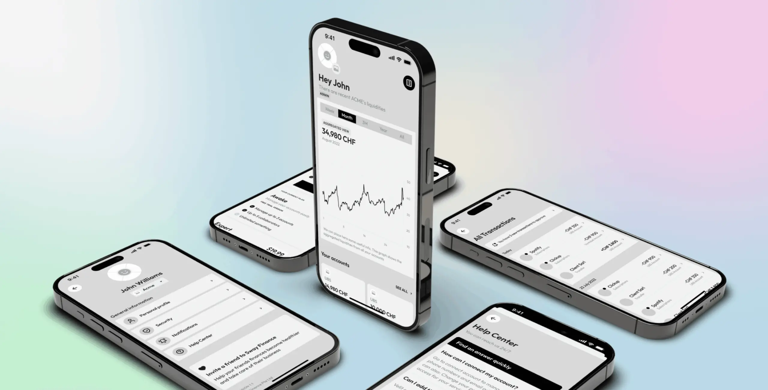
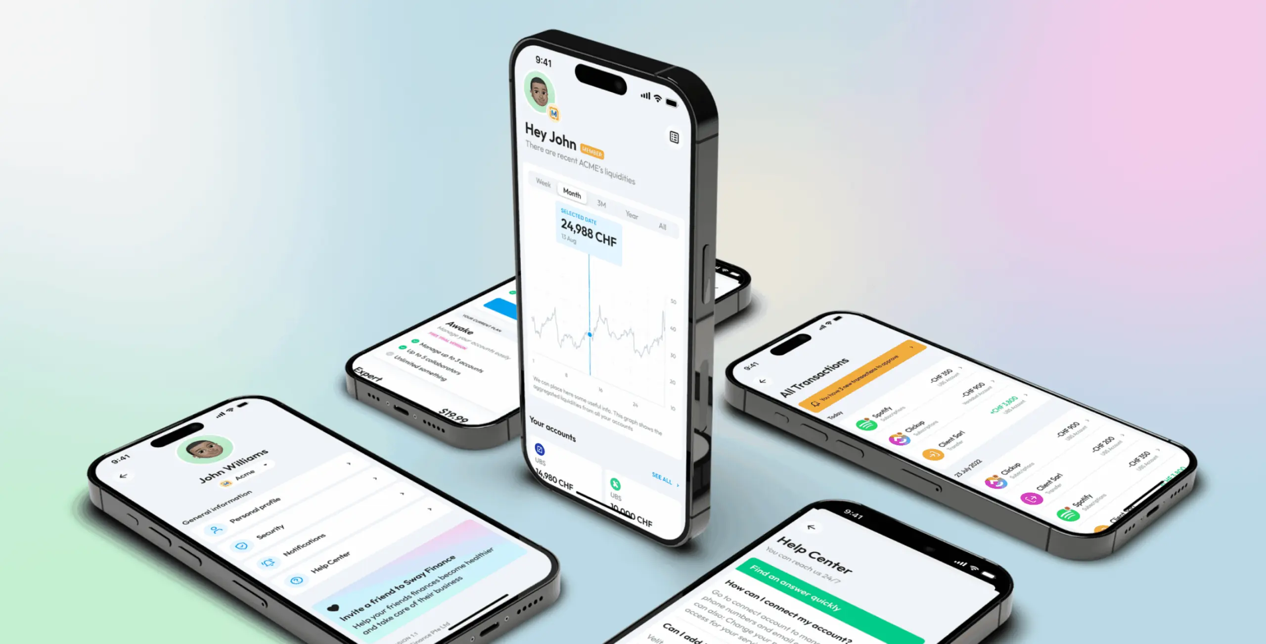
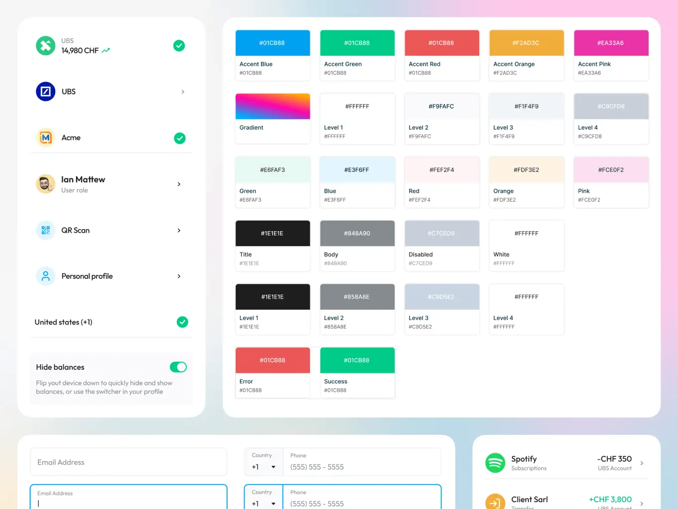
General accounts managment
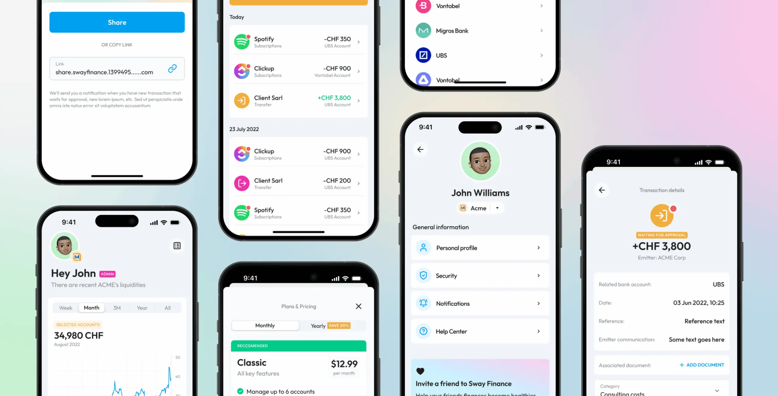
The main screen solves the problem most users came in with — too many accounts across too many banks, no clear picture of where the money was going. Multi-bank synchronisation and detailed expense and receipt statistics, all in one place.
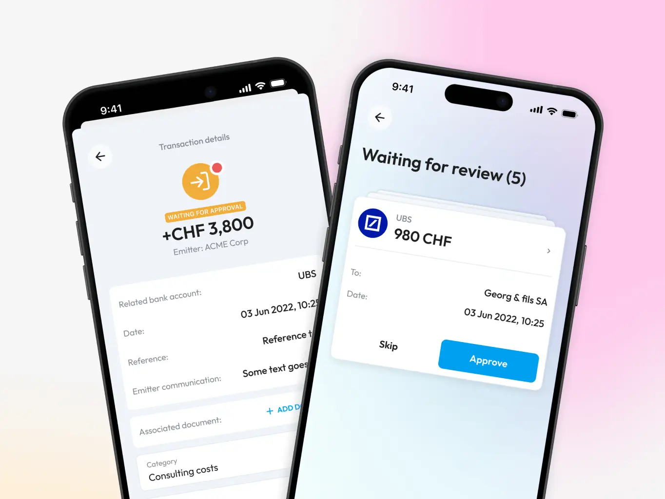
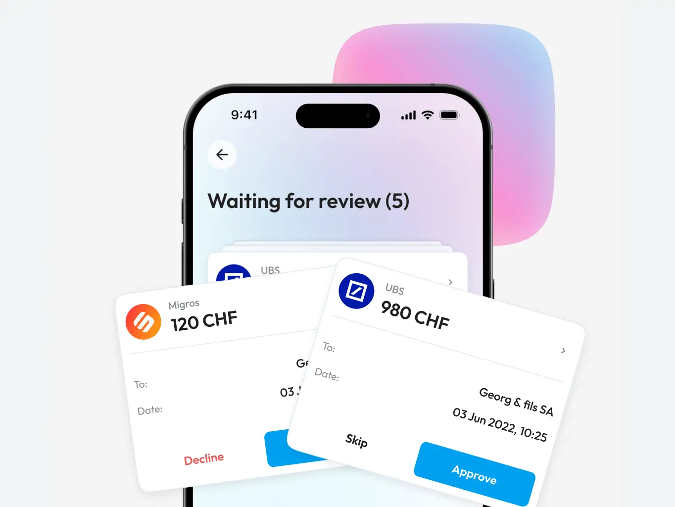
Transaction confirmation
A feature that catches subscriptions and automatic payments users have forgotten about — everything that needs a decision gets surfaced in one place, and a quick swipe confirms or cancels it.
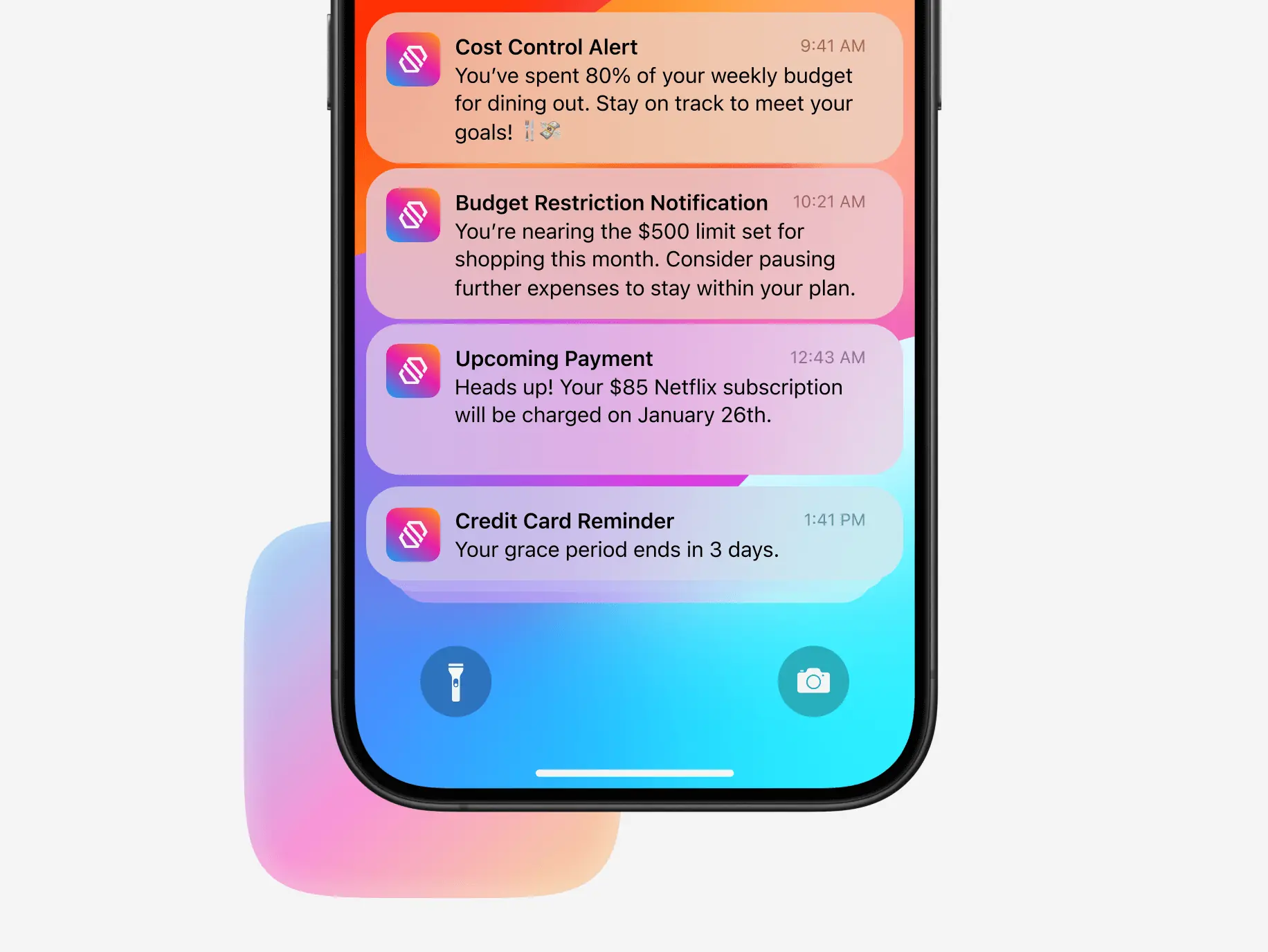
Proactive notifications
Proactive notifications that flag what actually matters — budget limits, grace periods, upcoming payments — without the constant pinging that makes most app notifications worth turning off.
#MVP development
E-manager, LLC
 USA
USA
USA

#Mobile app design #Mobile development
Glume LLC
 Germany
Germany

#MVP development #Mobile app design
Boost
USA
USA
Have a project in mind?
Let's chat
Have a project to
discuss?
discuss?

Have a partnership in
mind?
mind?
