The client wanted to maintain the visual identity of the app, including its color palette and typography, so that users would feel that it is a unified and recognizable product.
At the same time, the client wanted to make the design stand out among competitors and fully meet the needs and expectations of the target audience.
Our role
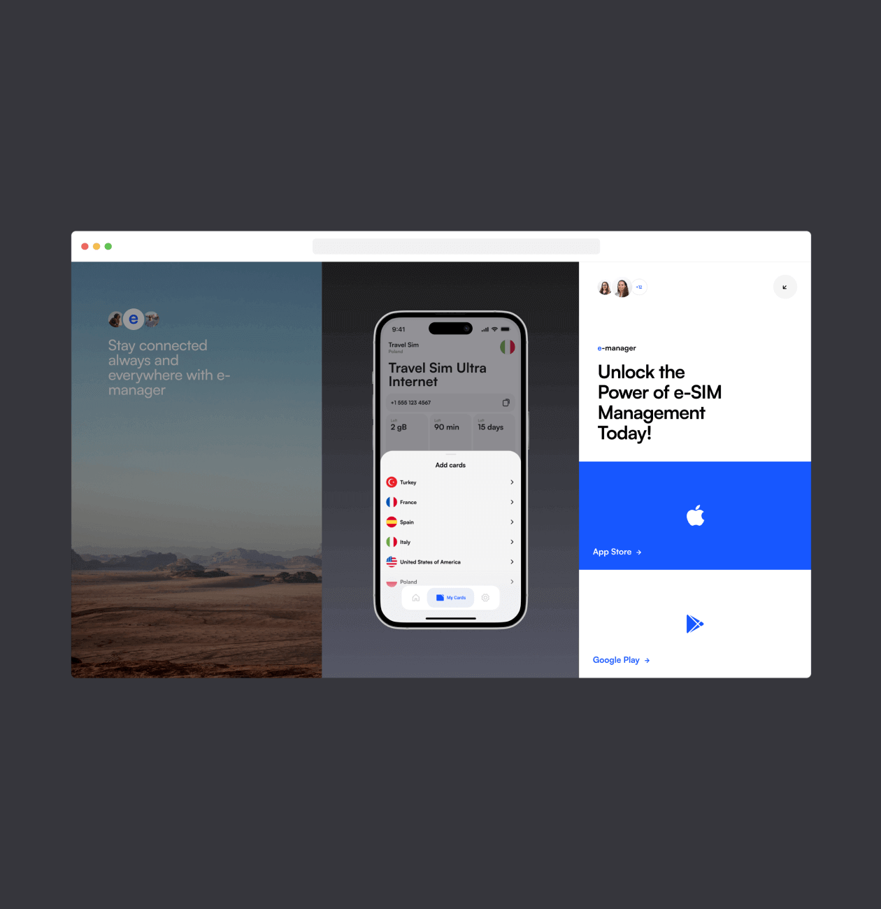
We, as UI / UX designers, set ourselves the task of developing a promo site for the application that best presented the product, emphasized its unique advantages and value for users. Our design had to stand out from the competition and emphasize the core values of the brand.
Through comprehensive competitor analysis, we gained valuable insights into the project’s primary and secondary objectives, as well as the critical features of the application. Understanding the significance of the visual aspect, we carefully preserved the app’s visual identity, including its color palette and typography.
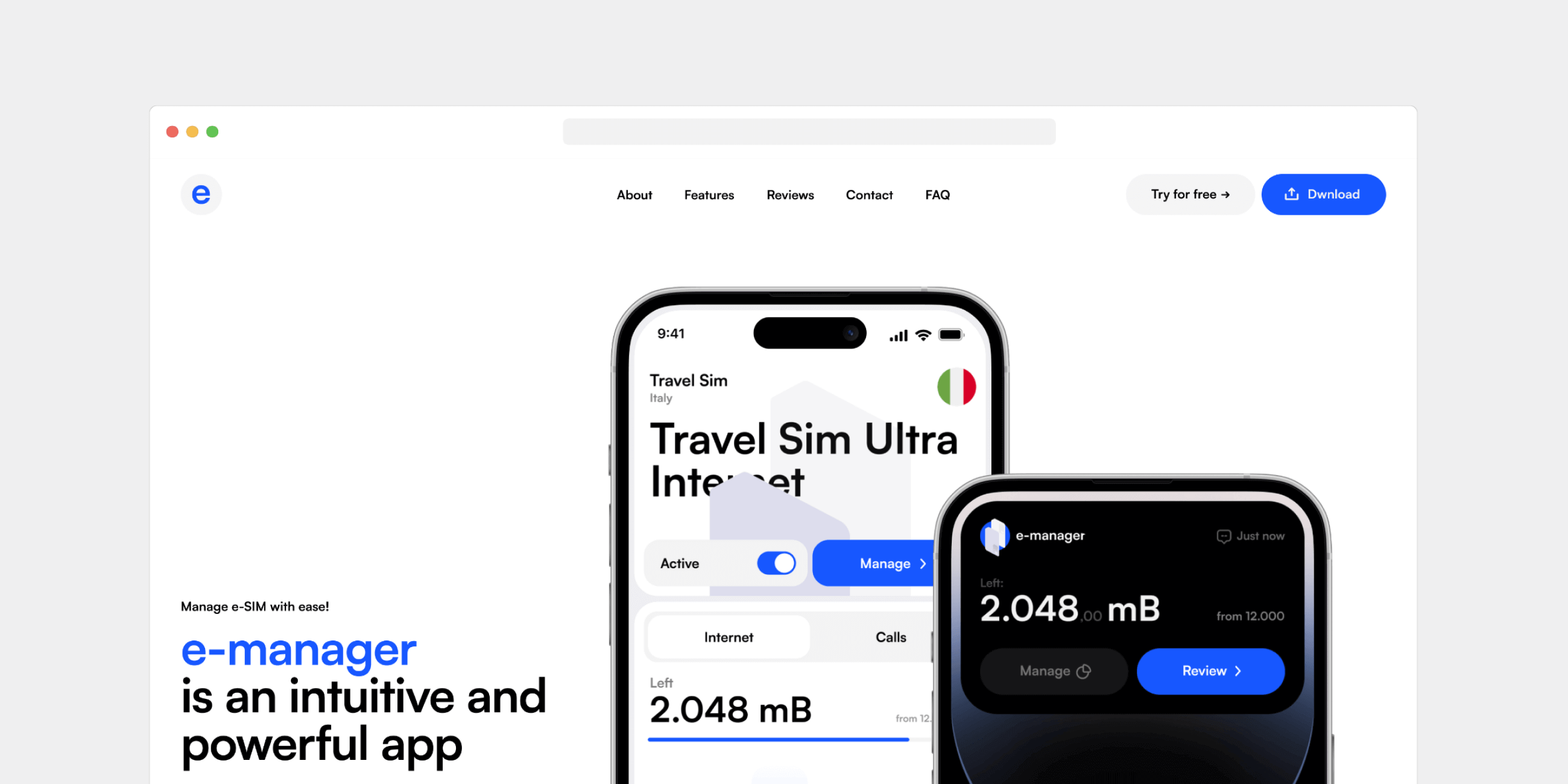
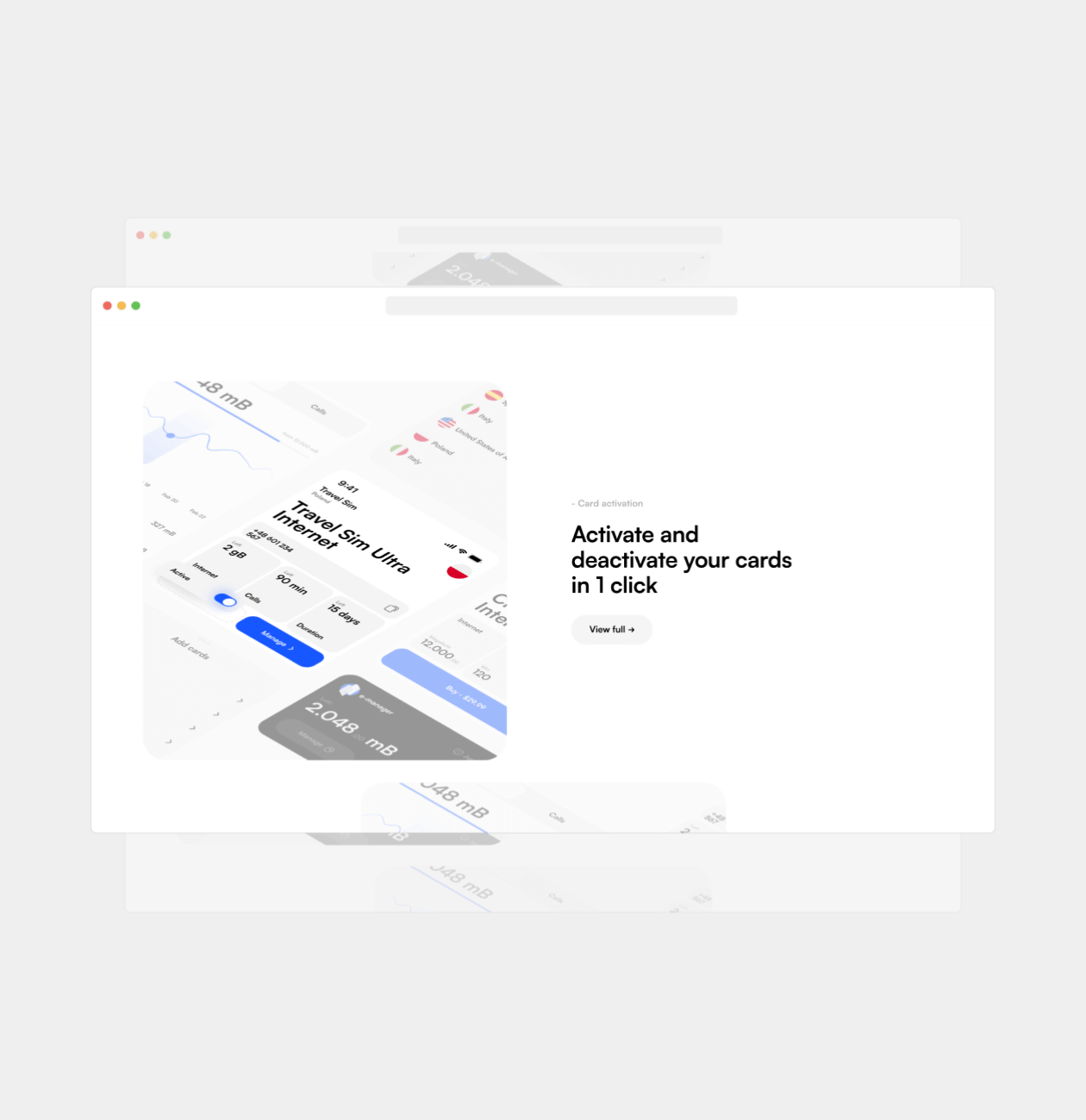
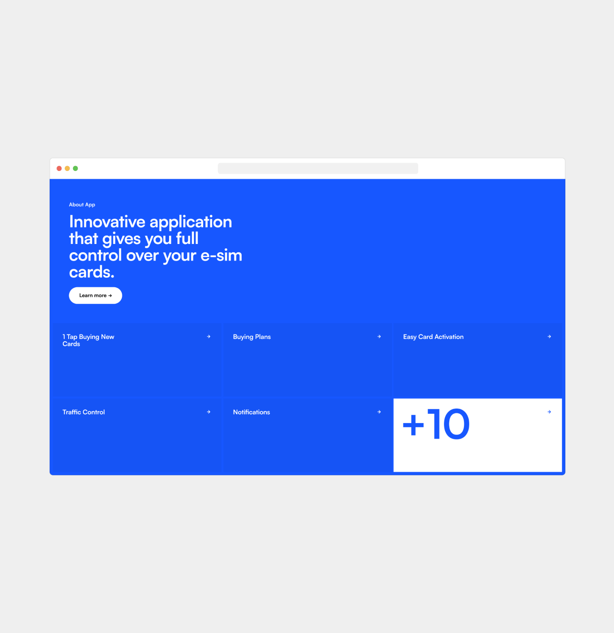
With all research phases in mind, we strategically designed the site’s structure and individual blocks to highlight essential aspects of the application, showcasing its unique offerings in the best possible light. Our goal was to convince users that e-manager is the ultimate and unparalleled solution in the market.
- Competitor analysis
By undertaking a thorough competitor analysis, we aimed to meticulously study web and mobile app-related promotional websites. The objective was to comprehensively evaluate their strengths, weaknesses, and potential opportunities and threats in the market. Our keen focus was on understanding how these apps showcased their functionality, unique selling proposition, and overall market positioning.
This analysis provided us with valuable insights on areas where we could distinguish ourselves and effectively demonstrate our app’s uniqueness and capabilities to potential customers. By leveraging this research, we strategically identified the most compelling and user-friendly methods to present information, effectively communicating our app’s unique selling proposition and highlighting its numerous benefits.
After establishing a solid analytical foundation, our E-manager website design process focuses on creating a user-friendly interface, searching for visual metaphors, and carefully crafting the structure. We strive to provide our users with an intuitive experience while seeking a visual style that reflects the values and uniqueness of the application.
- Wireframe
- Moodboard
- Design Concept
- UI Design
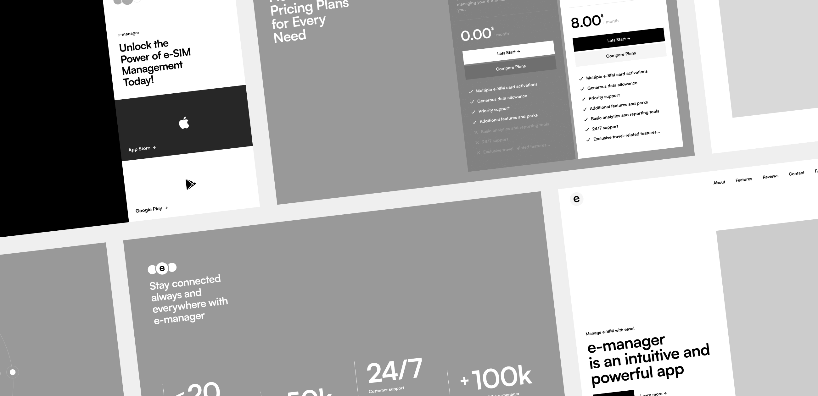
Wireframes play a crucial role in the product design process as they offer an initial visual representation of the product’s layout and functionality. Their primary objective is to present a basic outline of the product’s functioning without getting into intricate details and stylization. This process enabled us to emphasize effective ways of conveying essential information while ensuring the interface remained uncluttered, while also fine-tuning interactive and animated elements.
In search of the concept, we spent an intensive brainstorming session, trying to discover visual metaphors that would perfectly capture the essence of the project and match the values of the target audience. Our goal was to find something that blended with the business and would be perceived by the user with ease and inspiration. That’s how we discovered the visual metaphor that became the basis for the expressive and unique look of the project.
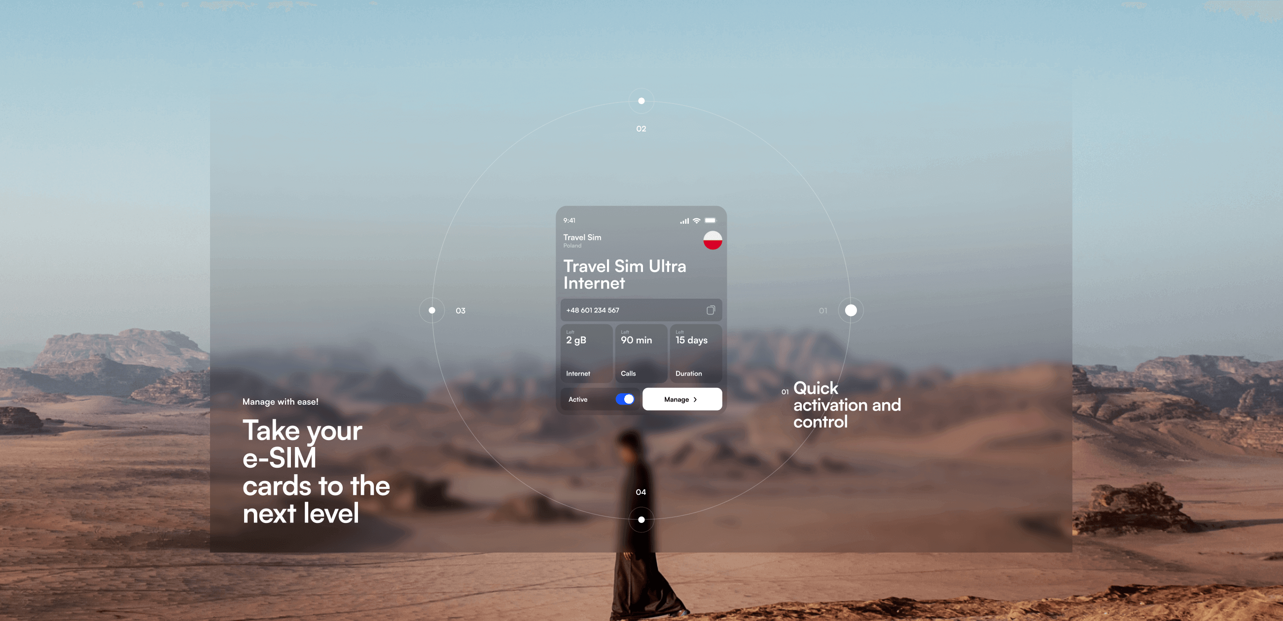
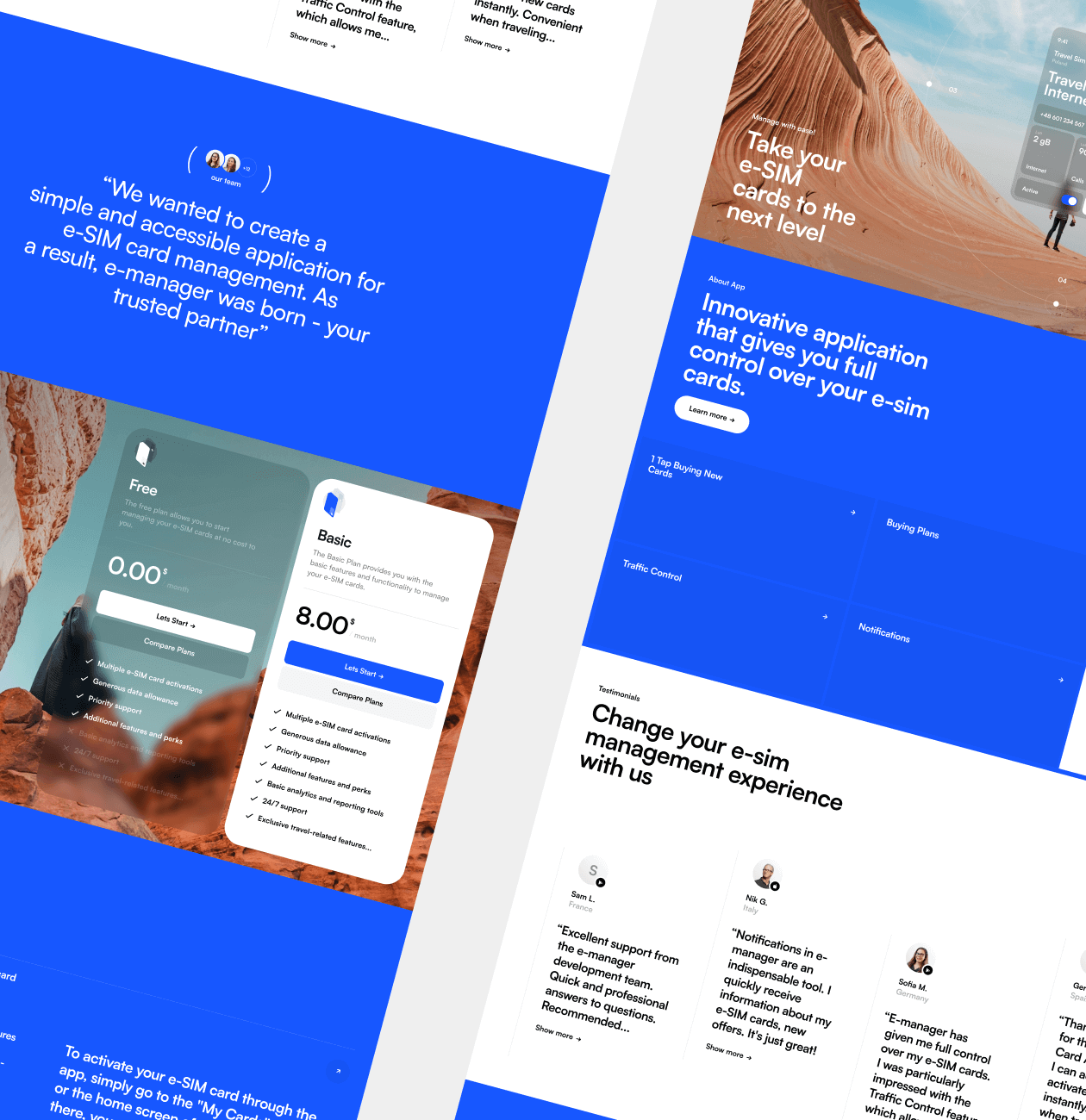
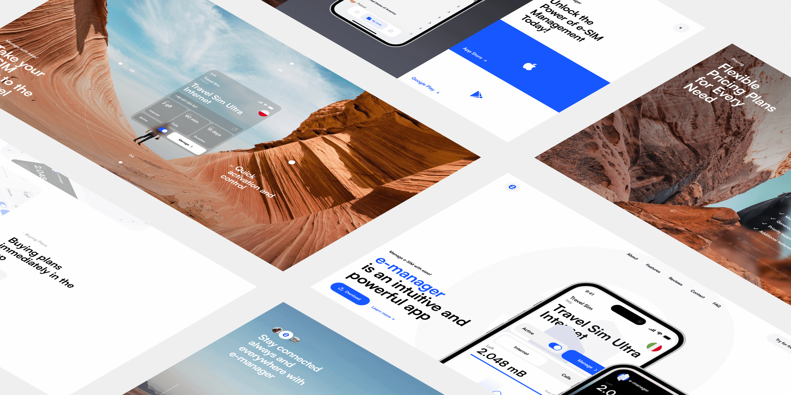
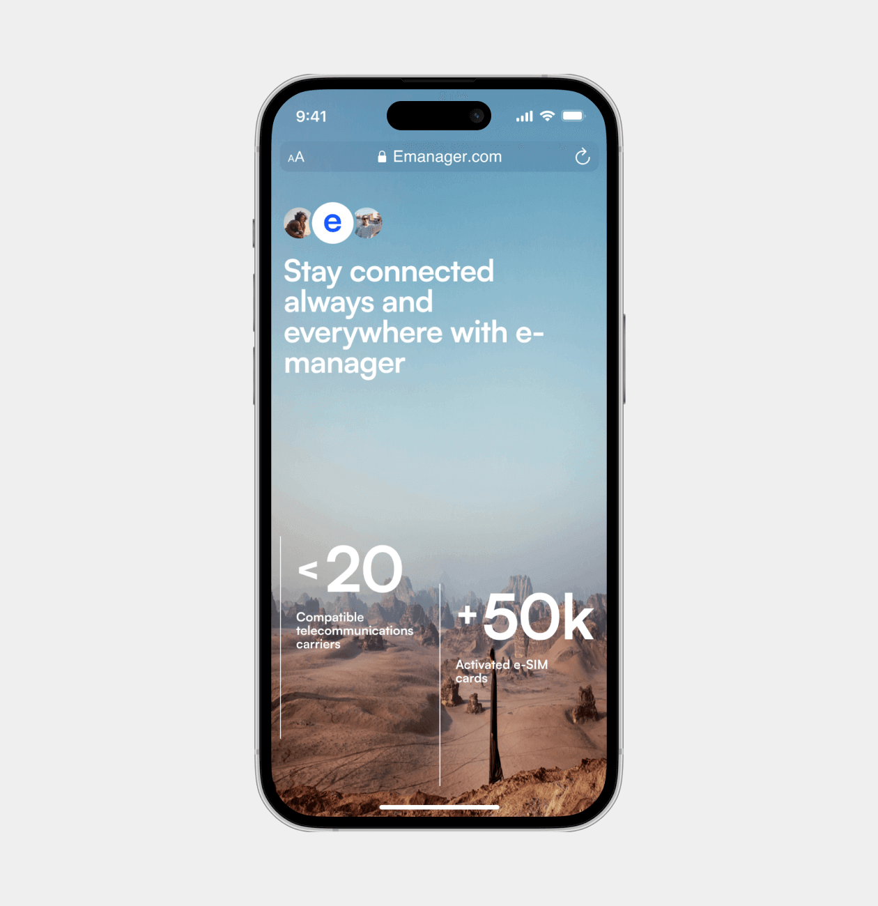
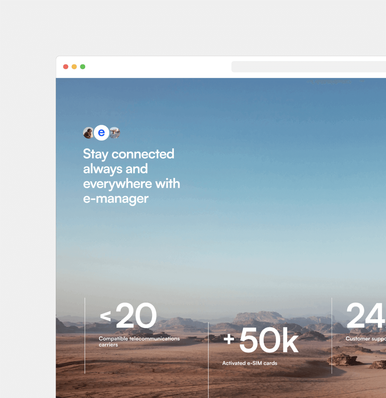
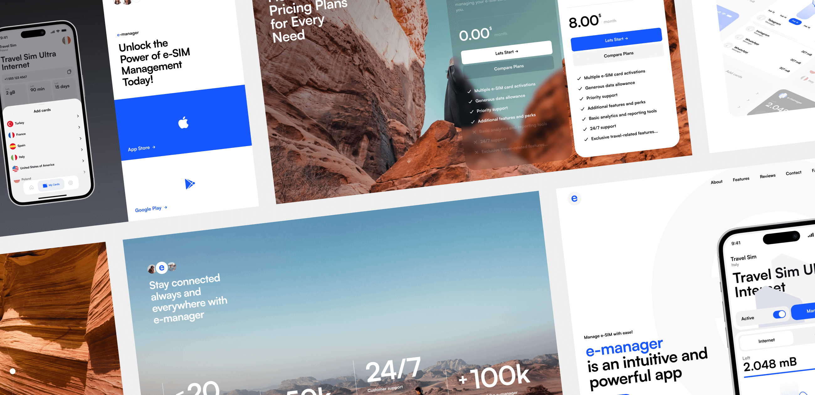
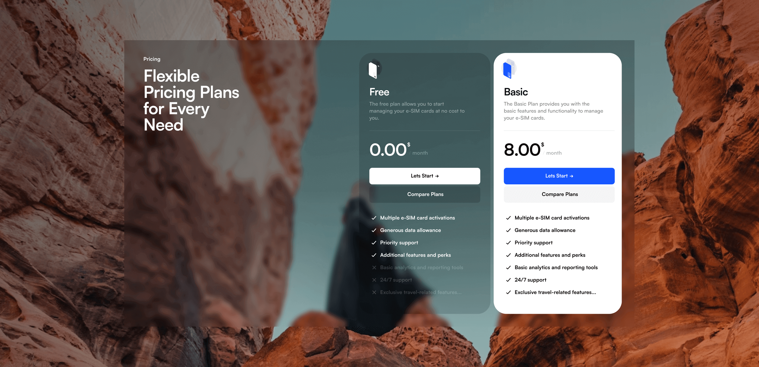
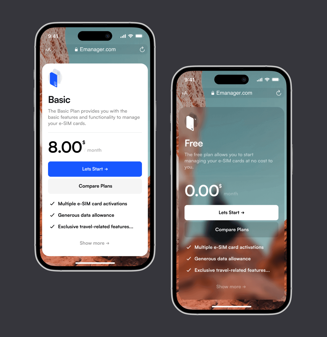
The visual metaphor we discovered and used for the E-manager project is the exciting and free world of adventure and travel. We applied bright and high-quality images of nature, symbolizing freedom and lightness, to create an atmosphere of joy and possibilities for the app’s users. This metaphor became the basis for the design, conveying a sense of simplicity and pleasure in using E-manager, while the application functionality remains a convenient and powerful tool for managing e-SIM cards.
After defining the concept and visual metaphor, we started developing the visual part of the project, which included creating the user interface (UI). This stage played a key role in bringing the whole idea to life and making the site attractive and user-friendly.
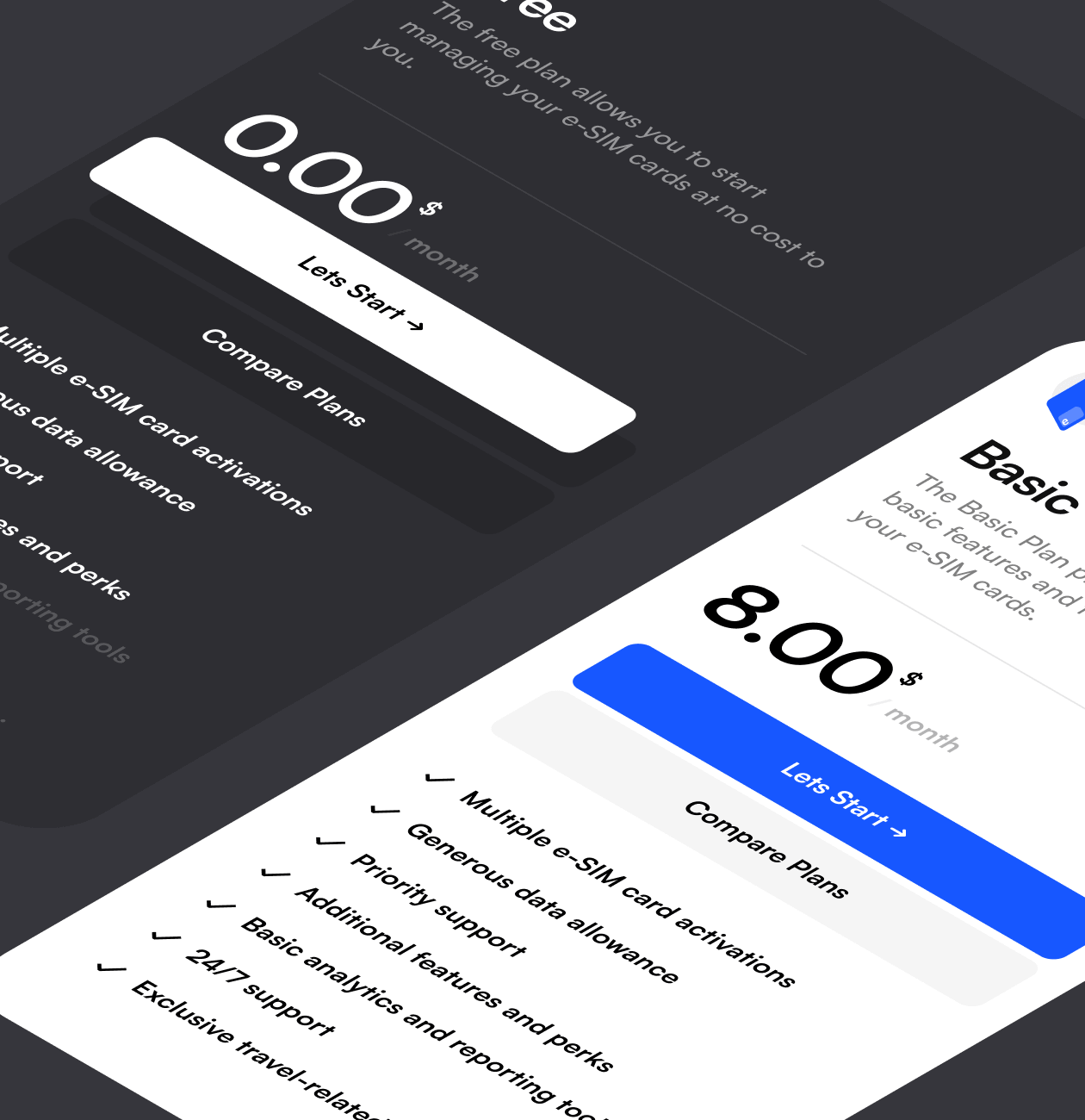
To start with, we defined basic color schemes, fonts and icons that matched the overall visual style of the E-manager application. This allowed us to keep the brand unity and create a sense of belonging of the site to the application itself.
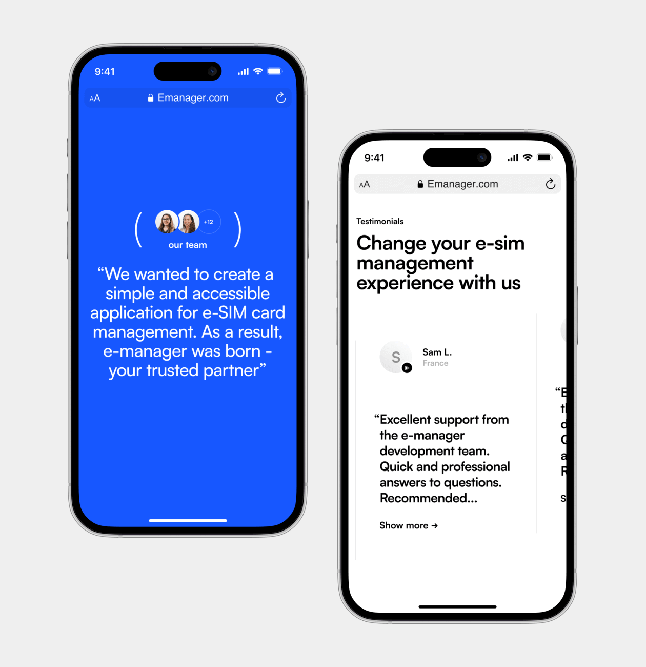
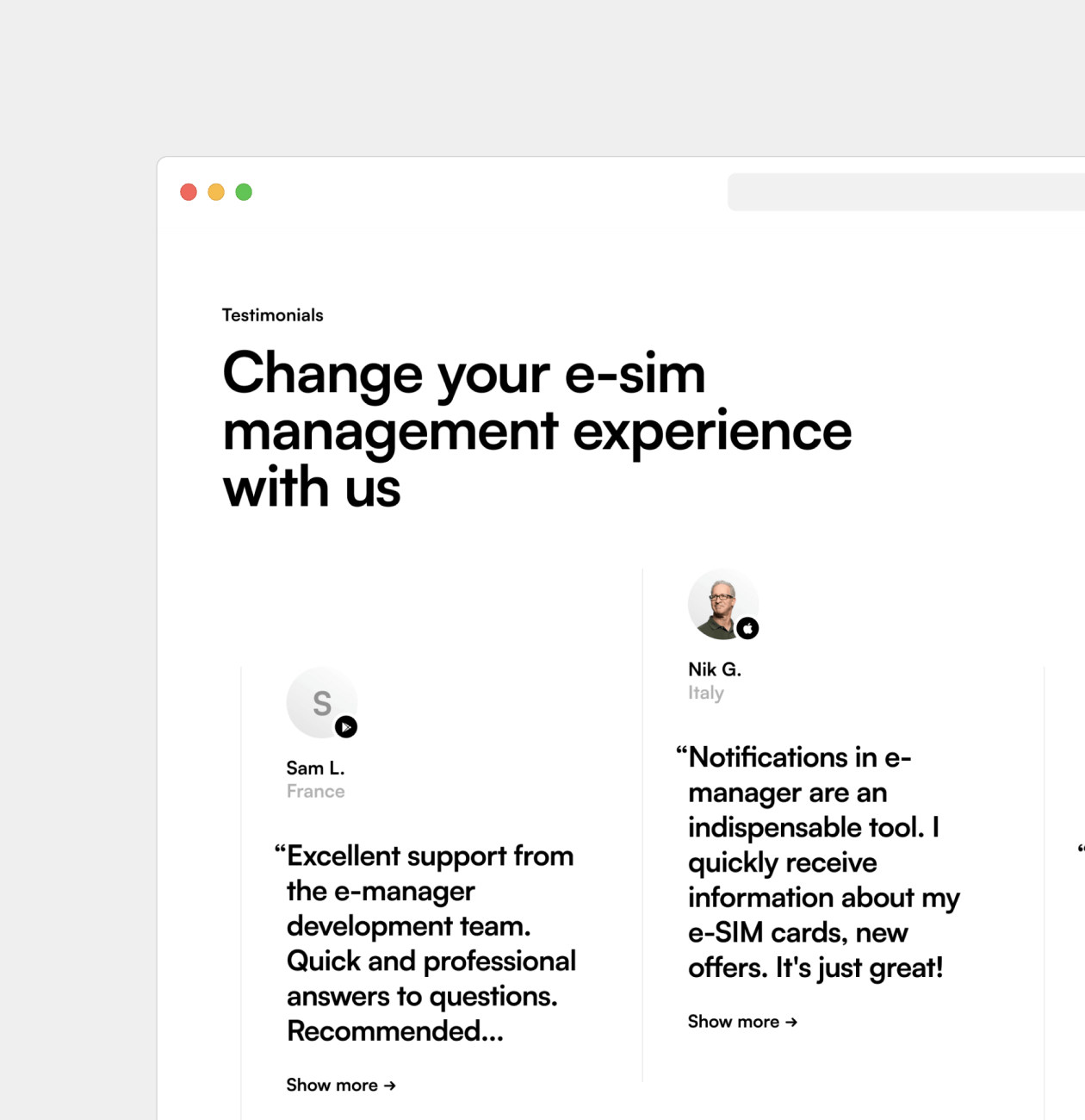
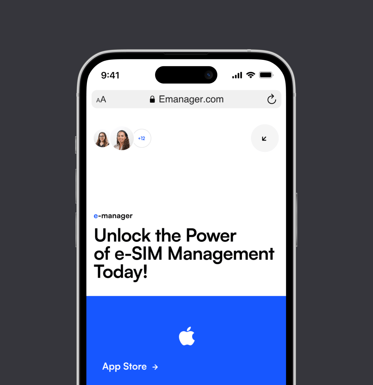
As a result, our team developed an attractive and user-friendly user interface that reflects all the benefits and features of the E-manager application. This will allow our client to present their product in the best possible light and attract the attention of their target audience.


 USA
USA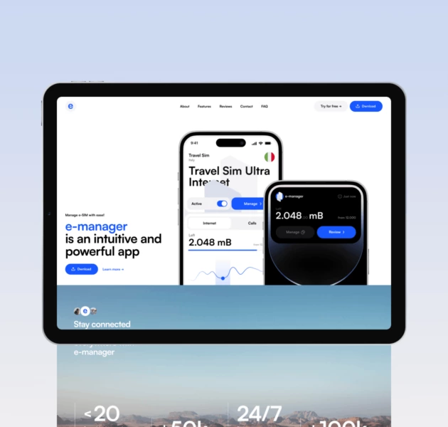
 UK
UK

