Development
Research
May 27, 2025
9 min read
summary
This article is for product designers, design leads, and cross-functional teams who want to move fast and stay scalable. Whether you’re working solo or in a large design system, we’ll show you exactly what slows Figma down and how to fix it — with structure, clarity, and team-first practices.
Figma is one of the most powerful design tools out there — flexible, collaborative, and constantly evolving. But that evolution comes at a cost: if your design files don’t evolve with it, they quickly become outdated, clunky, and hard to manage.
Frequent updates bring powerful new features — like variables, component properties, and auto layout improvements — that can significantly boost team productivity. But if your file structure is stuck in 2021, you’re not just missing out on speed; you’re making your team’s life harder.
This article is for product designers, design leads, and cross-functional teams who want to move fast and stay scalable. Whether you’re working solo or in a large design system, we’ll show you exactly what slows Figma down and how to fix it — with structure, clarity, and team-first practices.
Messy files = slow teams
Figma files are like design systems in miniature. If they’re messy or outdated, everything on top of them becomes fragile.

Use plugins Rename It to batch rename layers or clean up naming automatically.
Copy-paste? Big mistake.
Still duplicating the same button 20 times? Every update becomes a mess of manual edits — and the perfect setup for design debt.
How to fix:
- Use Components for every repeatable UI element.
- Leverage Variants for states like hover/disabled.
- Use Component Properties instead of detaching.
Auto layout: from nice-to-have to must-have
At Phenomenon Studio, Auto Layout isn’t just a best practice — it’s our default. We use it across all projects to build scalable, responsive designs that feel like real UI, not just static mockups. It’s not only about working faster — it’s about accuracy, adaptability, and developer-friendliness.
How we use it:
- Apply Auto Layout to every section, container, and frame.
- Nest Auto Layouts to mirror real structure (card → list → page).
- Use direction, padding, and alignment settings to control spacing and behavior precisely.
- Simulate flexbox behavior with features like horizontal/vertical resizing and wrap — useful for handling dynamic content, responsive grids, and tag-like elements. Smart wrapping allows elements (like badges, filters, tags) to flow automatically without manual frame resizing — a huge boost in speed and layout precision.
- Test responsiveness early by changing content and resizing frames — no more surprises in dev handoff.
- It might feel complex at first, but once you master Auto Layout, your workflow will become significantly more efficient — saving hours of manual work and making your designs cleaner, smarter, and easier to maintain.
Use variables like a pro
If you’re working on large projects, Figma Variables are exactly what you should use to structure all your design tokens — like spacing, colors, text, numbers — in one place and reuse them consistently.
How to use:
- Define color schemes: primary, secondary, background.
- Set spacing tokens: 4px, 8px, 16px for paddings/margins.
- Use text Variables for multi-language UIs.
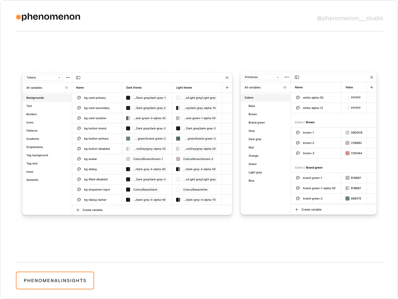
You can use Tokens Studio for Figma plagin to manage design tokens like colors, spacing, typography, and more — all directly in Figma, and sync them with your codebase.
Power up with component properties
Component properties make your system smarter and lighter — fewer variants, faster edits. By using boolean toggles, text inputs, and variant swaps within a single component, you can manage multiple states and styles without duplicating assets. This not only reduces file size and clutter but also streamlines updates, ensuring consistency across your entire design system with minimal effort.
Boolean properties (Hide/show icons or elements without extra variants)
Use for:
- Toggle badges or tooltips
- Switch icon visibility
- Enable/disable elements
Instance Swap (Swap icons, avatars, or logos without detaching)
Use for:
- Icon sets in navigation
- Avatar images in messaging
- Brand elements in cards
Text Properties (Change labels, titles, or numbers without editing the component frame)
Combine:
- Show badge (Boolean)
- Icon (Instance)
- Title (Text)
Real-world impact
In a complex fintech dashboard redesign, we optimized a dynamic table component used across 25+ screens. Originally built from multiple detached frames, the table had inconsistent cell behaviors and styling overrides that slowed down updates. We rebuilt it using nested instances with Component Properties for cell states (default, hover, error, active), conditional icons, and row-level toggles.
By standardizing cell variants and using boolean toggles for content like badges, tooltips, and inline actions, we cut the time to update or QA a full table layout by 50%. What used to take hours of manual edits became a controlled system where changes to a base cell reflected instantly across all data tables — significantly improving speed, consistency, and handoff clarity.
Performance killers inside the file
Keeping your Figma files clean and structured isn’t just about aesthetics — it directly affects performance. We’ve all seen the dreaded yellow and red “death banners” when files get out of control:
🟡 Yellow warning: “This file is getting heavy.”
🔴 Red alert: “Performance issues detected” or “File too large to edit.”
These alerts show up when your file is overloaded — too many frames, components, or images all dumped in one place. They signal lag, crashes, and painful loading times for the entire team. Scroll down to learn how to optimize file handling so that Figma doesn’t crash.
Separate design system file
For large or growing projects, your design system should live in its own dedicated Figma file. This separation keeps your working files lighter, reduces memory load, and avoids those dreaded yellow and red “death banners” warning about performance issues.
Linking the DS as a library ensures that your components stay consistent across all product flows while allowing each file to load and render faster.
For smaller projects, keeping the DS on a separate page within the same file can work, but once it grows — split it out.
Giant images = giant problems
That 5MB PNG? It’s killing load times — especially when repeated across multiple pages.
How to use:
- Compress images before importing (use TinyImage).
- Prefer SVGs or vector shapes.
- Avoid image nesting inside global components.
Prototypes that lag
When every frame is connected with dozens of arrows, performance tanks — especially in large systems.
How to use:
- Keep flows scoped per page.
- Prototype only high-value paths (e.g., login > dashboard).
- Use Figma’s built-in Flow Starting Point to isolate flows.
Unused junk
Old flows, early mocks, outdated iterations — they clutter files, confuse stakeholders, and waste memory.
How to use:
- Move old work to an 📦 Archive page.
- Use section dividers and emojis to signal status.
- Hide archived pages by default.
- Move unused materials to another file (best option).
For large teams, setting up file hygiene check-ins monthly or quarterly can prevent overload.
Collaboration blocks
At Phenomenon studio, we care about all team members, especially our developers. When it comes to handing over a project to development, it is very important that our colleagues clearly understand the flow, the purpose of elements and their states. You need to remember that Figma is a team tool — but only if you treat it like one.
No Documentation = guesswork
When developers or teammates don’t know what something does, they ask — or worse, guess. Guessing leads to errors, rework, and wasted hours.
How to use:
- Use Descriptions for components and frames.
- Add sticky notes or annotation plugins like Design Annotations.
Detail logic like:
- “This nav collapses on scroll.”
- “Follow WCAG AA for modal contrast.”
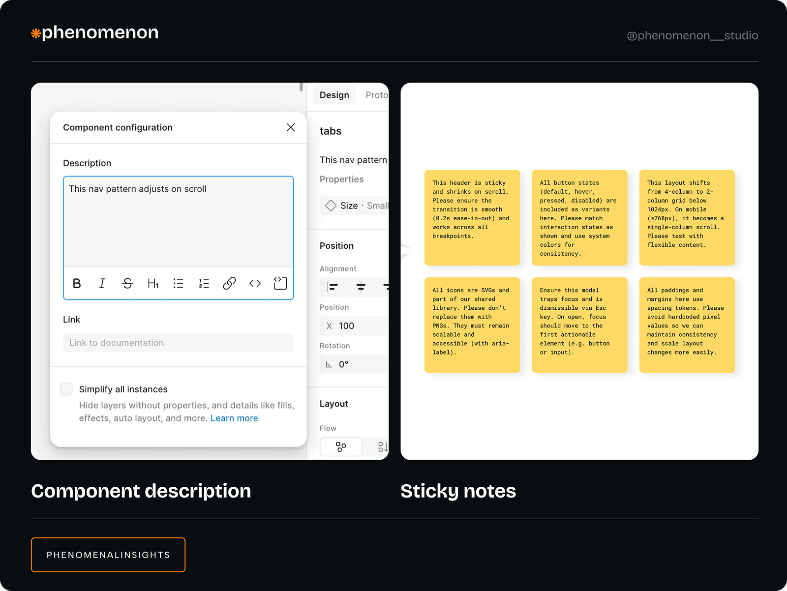
Our case
During a recent redesign of a financial dashboard, we added sticky notes and in-file comments to clearly explain UX logic across critical flows — such as transaction approvals, error handling, and responsive behavior. Each note detailed the reasoning behind interactions, not just the implementation (e.g., “This dropdown appears only after step 2 to reduce cognitive load”). We also left precise comments on components with development guidelines (e.g., “This tooltip follows WCAG AA — trigger on hover & focus”).
This approach led to a 70% reduction in Slack messages from developers requesting clarification during handoff. Fewer interruptions meant developers could work faster and with greater confidence, significantly speeding up the development cycle. The improved communication minimized errors and rework, resulting in higher-quality releases delivered on time — ultimately driving better business outcomes through efficient, reliable product delivery.
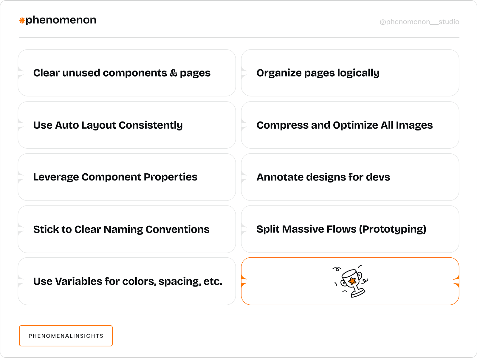
Figma speed boost checklist
At Phenomenon Studio, we stick to a few simple rules to keep our Figma files fast, clear, and scalable. These aren’t just “nice-to-haves” — they’re habits that reduce design debt, improve collaboration, and help teams ship with confidence.
Keep this checklist nearby to maintain speed, structure, and sanity — especially in fast-moving projects.
Here’s what we use on every project:
Figma is fast — if you let it be
Figma gives you the tools to work at lightning speed — but only if you use them right.
Run a quarterly “Figma Health Check” for your next project:
- Clean files
- Archive drafts
- Audit components
- Update libraries
- Review Variables
At Phenomenon Studio, we run this check-up for our team and clients. It’s not just cleanup — it’s an investment in team productivity, design clarity, and faster product delivery. If you want your design to work for you (not against you), start with a cleaner, smarter Figma workspace.
Share this opening with friends


Mar 19, 2026
7 min read
Poor UX leads to burnout and errors. Learn how a UX-first approach improves safety and cuts costs in HealthTech

Mar 19, 2026
9 min read
Learn how UX-focused design reduces logistics errors by 62%, cuts picking time by 48%, and delivers measurable ROI through role-based interfaces and AI integration.
Have a project in mind?
Let's chat
Have a project to
discuss?
discuss?

Have a partnership in
mind?
mind?