



May 13, 2024
9 min read
summary
While the final product is a culmination of many intricate stages, similar to a well-crafted picture, we confidently assert that user flows and wireframing are arguably the most critical stages impacting your product’s success. Here’s why: user flows and wireframes take center stage in determining whether people will enjoy using your product. A user-friendly experience translates directly into avoiding unplanned expenditures. Think about it: confusing interfaces lead to frustrated visitors who abandon ship, requiring constant customer acquisition and support—both significant cost drivers.
Our blog has already discussed the importance of easy navigation, usability, and overall customer-centricity. But at Phenomenon, we stand by what we endorse, so this article will explore the advantages of smart predesign decision-making, specifically wireframes and user flows. These steps in information architecture are often overlooked, a major mistake that can lead to irreversible consequences. If users have a negative experience with your website, web app, or mobile app, 88% of them will never return, meaning you only have one chance to impress your visitors. It takes the visitors only 0.05 seconds to determine whether to stay or leave.
While the final product is a culmination of many intricate stages, similar to a well-crafted picture, we confidently assert that user flows and wireframing are arguably the most critical stages impacting your product’s success. Here’s why: user flows and wireframes take center stage in determining whether people will enjoy using your product. A user-friendly experience translates directly into avoiding unplanned expenditures. Think about it: confusing interfaces lead to frustrated visitors who abandon ship, requiring constant customer acquisition and support—both significant cost drivers.
User flows and wireframes act as guiding blueprints, ensuring clarity in project scope and functionality upfront. This minimizes the likelihood of costly revisions and rework during development, ultimately leading to reduced development cost creep and overall product costs.
Ecommerce Website Wireframes: Key Takeaways
- Wireframes and user flows help businesses save costs in the short and long run.
- Skipping these steps leads to several issues connected to usability and the product’s overall performance.
The Problem: Development Cost Creep
Let’s dive in and decode this fancy way of saying “budget overruns.” Development cost creep refers to the tendency for project costs to gradually increase over time beyond the initially estimated or budgeted amount. It often occurs due to various factors such as scope changes, unexpected challenges, delays, or inefficiencies during the development process. As the project progresses, new requirements may emerge, technologies may evolve, or unanticipated complications may arise, all of which can contribute to higher costs than initially anticipated. Development cost creep can pose significant challenges to project managers and stakeholders, leading to budget overruns and potentially jeopardizing the project’s success. But what increases the chances of development cost creep at times? We have a definitive answer: poorly done or absent wireframes and user flows. Skipping steps in the UX design process, such as thorough planning and visualization, increases the risk of cost creep by allowing misalignments and missed requirements to go unnoticed until later stages.
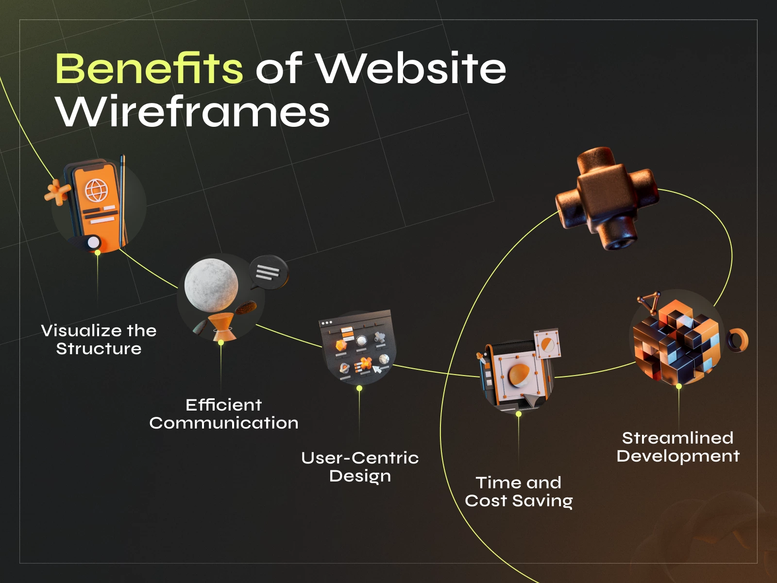
The Solution: Design Thinking with Wireframes & User Flows
Wireframes, developed early in a project after the research stage (competitors analysis, UX audit, etc.), depict the layout and functionality without design elements, serving as blueprints for stakeholders to validate structure before detailed work. User flows outline user pathways through diagrams, aiding in understanding visitor interactions and improving the overall experience. Creating user flows with a user flows focus is essential, as it ensures the design prioritizes user goals and user actions, considering varied user paths and behaviors.
A step by step guide to building and optimizing UX flows can help teams build user flows that align with user goals and improve the overall user experience. Now, before proceeding with how to save a project from cost creep by utilizing the two, let’s review some numbers:
- Using wireframes can reduce design time by up to 50%.
- Companies that value design beat their competition by 219% on the S&P 500 index.
Wireframes and user flows each offer unique benefits: while wireframes clarify structure, user flows focus on mapping out user actions and the different paths users may take to achieve their goals. When using Figma templates, the design team builds user flows by following a structured process for creating user flows, ensuring all user interactions are considered.
Website visitors often leave within 10–20 seconds, but those with a clear purpose stay longer.
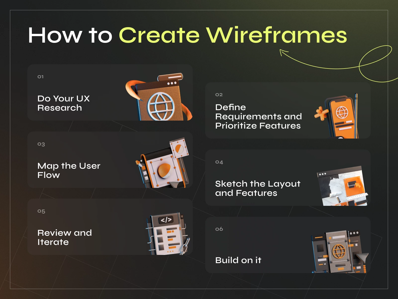
A. Wireframes and User Flow Diagrams:
Designing an app without a wireframe is like embarking on a road trip without a map. This initial step serves as a skeleton, helping stakeholders understand how the app, website, or final product will look, including screen layout, navigation bars, interactive elements, and other UI/UX components. Wireframes can also be used to create a basic user flow chart or flow chart, which visually maps out the user interface and navigation, making it easier to design and link screens for a clear understanding of user journeys.
A clear wireframe gives designers room to iterate, incorporating feedback without distracting them with too many visual design details. Wireframes are especially useful for mapping out mobile screens and simplifying complex processes, as they help visualize interactions and workflows even on small devices and across different departments.
- Without a wireframe to outline the project’s structure and functionality, there’s a higher risk of scope creep. Scope creep occurs when additional features or requirements are introduced during development, increasing development time and costs. Without a clear roadmap by wireframes, stakeholders may request changes or additions not initially accounted for, resulting in budget overruns.
- Without a visual representation of the project’s layout and functionality, there’s greater potential for misinterpretation of requirements between stakeholders, designers, and developers. This can lead to misunderstandings and discrepancies between the customer’s expectations and what is delivered. As a result, developers may need to make revisions or rework features to align with the customer’s vision, increasing development time and costs.
- Without the guidance of wireframes, developers may proceed with implementing features based on incomplete or inaccurate information. As a result, they may need to backtrack, redo work, or iterate multiple times to align with the actual customer needs or desired functionality. Each iteration requires additional time and resources, leading to increased costs for the customer. Reviewing user logs during this process can help validate wireframe assumptions and improve the user interface by identifying real user behaviors and navigation patterns.
- Skipping the wireframing stage can lead to user experience (UX) issues discovered later in development. Without a clear understanding of the user flow and interaction points, the final product may not meet customer expectations or be difficult to navigate. Addressing UX issues post-development requires additional time and resources, which may involve redesigning features or restructuring the application architecture. This, in turn, leads to extra spending.
- The absence of wireframes can delay the development process, as stakeholders may need to review and approve designs at later stages. Delays in the development timeline can result in missed market opportunities or increased competition, ultimately impacting the project’s profitability.
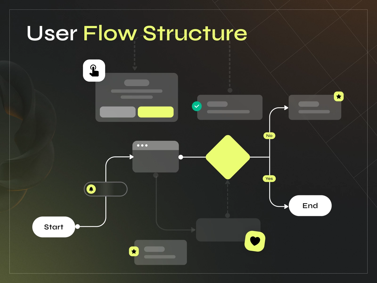
Mapping User Journeys with User Journey Maps
Mapping out the user journey is essential to creating a user flow. It involves identifying the different touchpoints along the way and understanding how the consumer interacts with each one. This can be done by conducting user research, analyzing data, and creating user personas.
Once the journey has been mapped out, it can be used to create a user flow. It should be designed to guide the user through the product or service logically and intuitively. It should be easy to navigate and provide clear feedback to people at each step.
By creating a user flow, designers can identify areas for improvement and save on expenses by avoiding costly redesigns later on. User flows can also test different design concepts and ensure that the final product or service meets the user’s needs.
User Flow Diagrams
User flow diagrams are powerful visual tools that map out the complete path a user takes when navigating a website, app, or digital product. These diagrams start at the entry point—such as a landing page or app home screen—and chart every step the user takes to accomplish a specific task, whether it’s signing up, making a purchase, or finding information.
By illustrating each action, decision point, and possible route, user flow diagrams help design teams gain a deep understanding of how users navigate and interact with a product. This visual representation makes it easier to spot potential friction points—areas where users might get confused, frustrated, or drop off. With this insight, designers can optimize the user experience, ensuring that every step feels intuitive and seamless.
Creating user flow diagrams is essential for anyone looking to improve usability and boost conversion rates. By clearly mapping the user’s journey, teams can make data-driven decisions that enhance the overall user experience and support business objectives.
Efficiency in Design
Wireframing and flows can save a lot of costs in the long run, but only if implemented effectively. Here are some tactics to make the most of these design methods.
The key to efficient design is to keep it simple. Wireframes should be basic, understandable, and not overly detailed or complex. This helps reduce the time and resources required to create them. Designers should focus on the core elements of the design, such as navigation, content, and user flows.
In our design process at Phenomenon, we prioritize efficiency and effectiveness by using a robust design system and a set of pre-built components within Figma. Instead of following a formulaic approach, we emphasize rapid iteration and problem-solving tailored to our clients’ needs. Our systematic approach allows us to quickly create high-quality visuals and prototypes, all while ensuring alignment with our clients’ challenges and objectives. By utilizing Figma’s collaborative features and extensive library of components, we streamline our workflow and empower our designers to focus on delivering tailored solutions for each project. This integration of design system principles and agile methodologies allows us to maintain a rapid pace of iteration without sacrificing quality, ultimately delivering exceptional results for our clients.
We utilize Figma for our design system and component library, enabling rapid iteration and high-quality visual outputs. Additionally, for collaborative tasks such as user flow mapping, we use Figjam to ensure efficient communication and problem-solving.
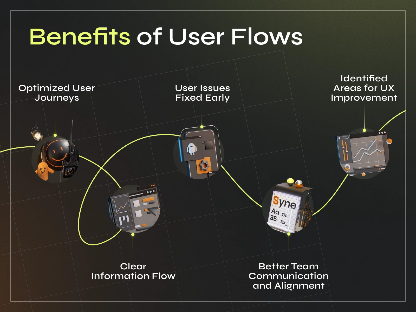
From Wireframes to Prototype: Where Product Discovery Fits
Wireframes and user flows are the first half of the story. The second half is the design prototype that turns those static blueprints into something stakeholders can actually click through and react to. A product discovery process that skips this step and jumps straight from wireframe to final visual design misses the exact validation moment where the cheapest, fastest feedback is still available.
Product discovery itself should happen before either wireframes or a design prototype exist. This is the research phase, competitor analysis, user interviews, assumption mapping, that grounds every subsequent decision in something more solid than a stakeholder’s opinion. Skipping the product discovery process and moving straight to prototype ui ux work tends to produce a polished mockup that solves the wrong problem elegantly, which is a more expensive mistake to catch than a rough wireframe with the wrong layout.
An mvp prototype built on validated wireframes and user flows behaves differently than one built on assumption alone. The mvp prototype stage is where product discovery services, if a team lacks this expertise internally, earn their cost: turning validated user flows into a clickable product prototype design that investors, stakeholders, or early users can actually react to, rather than a mockup prototype that looks finished but was never tested against real behavior.
Ux prototype fidelity should match the question being asked. A low-fidelity ux design prototype is enough to validate whether a user flow makes logical sense. A higher-fidelity ui design prototype, closer to final visual polish, is what’s needed once the goal shifts to testing emotional response or investor-readiness, the same distinction covered earlier when comparing wireframes to full user flow diagrams.
For teams without in-house design capacity to run this discovery-to-prototype pipeline, a prototype agency or a broader product discovery services provider can shortcut the learning curve significantly. A prototype web design engagement scoped correctly, discovery first, wireframes second, ui ux prototype last, mirrors exactly the sequence this article has argued for from the start: never skip a step to save time upfront, because the cost resurfaces later, and it’s always higher.
Best Practices for User Flows
Building effective user flows is key to designing products that users love. Here are some best practices to ensure your user flows are intuitive, user-focused, and drive results:
- Keep it simple and intuitiveStrive for clarity in your user flows. A simple user flow is easier for both teams and stakeholders to understand, and it helps users move through the product without confusion.
- Focus on the user’s goalsCenter your user flows around what users want to achieve. By aligning each step with user objectives, you create a more satisfying and effective user experience.
- Identify potential friction pointsUse your user flows to pinpoint where users might encounter obstacles or frustration. Addressing these potential friction points early helps prevent costly redesigns and improves overall satisfaction.
- Use clear and consistent notationStandardize your user flow diagrams with consistent symbols and labels. This ensures everyone—from designers to developers—can easily interpret the flow and collaborate effectively.
- Test and iterate with real usersDon’t rely on assumptions. Test your user flows with real users to observe actual user behavior, then refine your flows based on feedback and insights.
- Consider multiple touchpointsUsers interact with products across various channels and devices. Make sure your user flows account for these multiple touchpoints, providing a seamless experience no matter where the journey begins.
- Leverage user research and testingGround your user flows in real data. Conduct user research and usability testing to ensure your flows reflect how users actually think and behave.
- Collaborate with stakeholdersShare your user flows with the entire team—including designers, developers, and product managers—to build a shared understanding of the user journey and align on business objectives.
By following these best practices, you’ll create user flows that not only improve the user experience but also help achieve your business goals, reduce friction, and ensure your product stands out in a crowded market.
Final Words
Though seemingly complicated, information architecture boils down to this: organizing information in a way that makes sense to users. If users can’t find what they need quickly and intuitively, they’ll get frustrated and abandon your product for something simpler or better. This translates directly to lost revenue and increased costs in the long run. Here’s why:
- Attracting new customers is expensive (marketing, advertising, etc.). When customers leave due to a confusing interface, you’ll need to constantly acquire new ones to maintain your base and revenue.
- Frustrated customers often require more customer support, leading to increased costs for handling inquiries and troubleshooting issues that could have been avoided with a clear information architecture.
- If users can’t find the products or features they’re looking for, they simply won’t buy them, representing a direct loss of potential revenue.
- A confusing experience reflects poorly on your brand. Disgruntled visitors might leave negative reviews, impacting your brand reputation and deterring potential customers.
At Phenomenon, we believe your project deserves the best. That’s why we never skip wireframing and flows, essential steps that translate into your product’s success.
Share this article with friends



Sep 29, 2026
6 min read
B2B website redesign without losing traffic: A complete b2b website redesign guide covering UX audits, 301 redirect mapping, and metadata preservation. Partner with a top b2b website redesign agency that boosts conversions while protecting your organic rankings.

Sep 29, 2026
8 min read
Small business web design services that fit your budget. Get affordable small business website design from one of the best website design companies for small business — with transparent pricing and no hidden fees.
