



Aug 31, 2026
6 min read
summary
Learn how HIPAA-compliant UX design reduces friction, protects patient data, improves accessibility, and builds trust across healthcare products and workflows.
A UX design agency builds HIPAA-compliant healthcare products by designing privacy and security into the interface from the first wireframe, so patients and clinicians stay protected without the friction that pushes people away.
Why It Matters
- HIPAA asks for reasonable and appropriate safeguards, not maximum friction. Good design meets the rule and keeps people moving.
- Healthcare tracking-pixel mistakes have triggered major U.S. enforcement and class-action settlements, and most of that risk sits in the design and analytics layer.
- Passkeys and context-aware sessions satisfy the same access rules that abrupt logoffs and blanket pop-ups handle badly.
- Compliance built in at the wireframe stage costs far less than retrofitting it onto a live product after an audit.
Compliance friction is a design failure, not a legal necessity
Most healthcare software treats security and usability as opponents. The interface fills with pop-ups and forced logoffs, wrapped in dense legal text, all in the name of compliance. None of it is what the law actually asks for.
HIPAA requires reasonable and appropriate safeguards for protected health information. It does not require treating a nurse or a patient like an intruder. The friction is a design choice, and usually a lazy one.
The bill lands on the people using the product. Clinicians hit cognitive overload and documentation errors, which feeds burnout. Patients hit confusing intake and abandon it. Neither outcome shows up on the software invoice, and both show up in retention and safety data.
Consumer UX and healthcare UX are not the same job
| Dimension | Consumer UX | Healthcare and MedTech UX |
| Cost of a usability error | Churn and lost conversions | Misdocumentation and clinician burnout |
| Regulatory surface | A basic privacy policy | HIPAA and WCAG 2.2 AA |
| Accessibility | Often optional | A legal floor on every screen |
| Measure of success | Session length and retention | Task completion under stress |
Blanket session timeouts of 2 to 5 minutes, applied to every screen, are a leading source of clinical workflow disruption. (Phenomenon Studio healthcare UX research, 2026)
The line we hear most from healthcare founders is that their last vendor made it secure, but nobody wants to use it. Secure and unusable is not compliant in any way that helps the business. It just moves the risk from the auditor to the frontline.
Where UX/UI design removes friction from HIPAA workflows
Authentication is where security and usability meet first, and where most healthcare products fail. Strong UX/UI design keeps the safeguard and drops the friction.
Passkeys and biometric sign-in replace six-digit codes retyped from a second device. The user confirms with a fingerprint or face scan in under two seconds, and the system still gets the unique, phishing-resistant identity that the rules require. For a clinician logging in forty times a shift, that is real time returned to patient care.
This sits on top of the backend posture we describe in our HIPAA and GDPR data-security programme, where the server controls have to match what the interface promises.
UI and UX design for sessions and access
Automatic logoff protects an unattended screen. Applied bluntly, it locks a doctor out mid-diagnosis. Effective UI and UX design scales the timeout to the role and the task, holds an active charting session open, and gives a clear 30-second warning with one button to stay in. If a logoff does happen, the unsaved work is held in encrypted local state so the user lands back exactly where they were.
The best UI/UX design services for healthcare compliance
Not every design service reduces regulatory risk. The best UI/UX design services for healthcare start before the first wireframe, with a map of every point where the product touches protected health information.
That map decides where encryption, audit logging, and consent belong. Getting it right early is far cheaper than discovering a gap during an audit. It also tells the team which screens carry the real legal weight.
Accessibility is the next non-negotiable. WCAG 2.2 AA is a legal floor in healthcare, not a nice-to-have, so screen-reader support and contrast belong in the component library from day one. Building it in once beats bolting it onto forty screens later.
The WCAG 2.2 AA standard sets a minimum text contrast ratio of 4.5 to 1 for normal text. (W3C, WCAG 2.2)
UI/UX design agency vs retrofitting compliance
Compliance cannot be painted on at the end. A UI/UX design agency that knows healthcare builds the access rules, the audit trail, and the consent flow into the architecture and the screens together. The honest condition is that this works when compliance is treated as a constraint from scoping. Bolt it on after launch, and you are redesigning under audit pressure.
Healthcare website design that patients actually trust
A patient’s first contact is usually the website, often while they are anxious or in pain. Healthcare website design earns trust in that moment or loses it. The fastest way to lose it is a consent banner built to trick.
Dark patterns bury the reject button, shrink it, or wall off basic health content behind tracking consent. They dent trust and invite enforcement. A high-trust consent screen gives Accept and Reject the same size, weight, and contrast, so declining is as easy as agreeing.
What a healthcare web designer gets right
A healthcare web designer who understands the patient breaks a long intake into short, single-topic steps with a visible progress bar. Conditional logic hides questions that do not apply. Plain language replaces medical jargon, and inline validation catches a mistyped phone number before it becomes a failed submission. Under stress, that structure is the difference between a completed history and an abandoned form.
Healthcare website design services for regulated growth
Growth and compliance are not opposites here. Healthcare website design services that fit a regulated brand pair conversion-focused layouts with privacy-first analytics and honest microcopy. The site can measure what works without shipping protected data to an ad network, and it can convert without a single dark pattern.
How a UI/UX design firm handles compliant analytics
Standard analytics scripts are the quiet compliance risk in healthcare. Default Google Analytics, the Meta Pixel, and session-replay tools capture IP addresses and page context straight from the browser. On a page about symptoms or scheduling, that combination can count as protected health information.
Under HHS Office for Civil Rights guidance, sending that data to an ad vendor without an agreement in place is an impermissible disclosure. The penalties have been steep.
According to U.S. HHS Office for Civil Rights enforcement, healthcare tracking-pixel violations have produced over $100 million in combined penalties and settlements.
A UI/UX design firm that works in healthcare fixes this at the pipeline, not the page. The choice usually comes down to three routes.
Three Analytics Strategies for HIPAA Environments
| Strategy | What you get | What it costs |
| Legacy tracking | Easy setup, a script dropped on the page | Limited privacy controls and high compliance risk |
| Server-side tracking | Signals routed through a server that strips identifiers | Maximum control, with higher engineering effort |
| HIPAA-compliant platform | Built-in filtering with a signed BAA | Simplest deployment and the strongest compliance posture |
What a specialist UX & UI design agency brings to healthcare
A generalist team will not know that an IP address plus a symptom search equals regulated data. A specialist UX & UI design agency does, and it designs the analytics and consent layer around that fact. That domain knowledge is what separates a compliant launch from a costly one.
Why UI/UX developers and designers must own compliance together
The riskiest compliance decisions sit between design and code. What a notification reveals on a lock screen is one. How a session caches unsaved data is another. Each is a design choice and an engineering choice at once, and it fails when the two functions never talk.
When UI/UX developers and designers work as one team, the lock-screen alert stays generic while the real detail waits behind biometric login. The analytics call is scrubbed before it leaves the browser. These are not afterthoughts patched in during QA. They are decisions made once, together, early.
On one healthcare build, a developer flagged in week two that a draft notification would have shown a medication name on the lock screen. The designer reworked the copy that afternoon. In a siloed team, that leak ships to production and surfaces in an audit.
Case study: a men’s health clinic built for clarity and trust
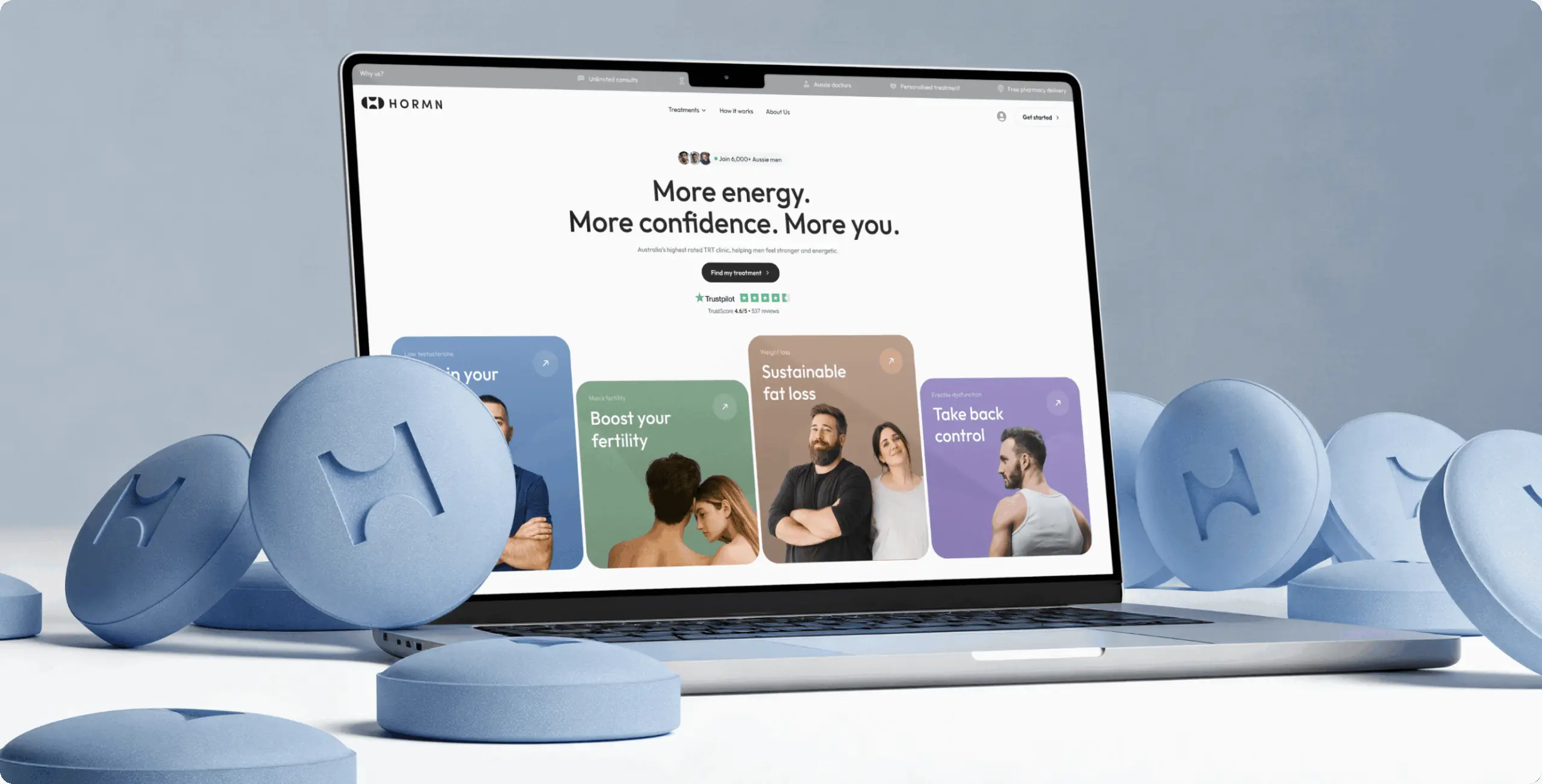
HORMN came to Phenomenon Studio mid-rebrand. It was moving from a single-treatment men’s clinic into a full-service online health brand, but the old website still read as one narrow service. New visitors landed without a clear sense of what the clinic offered or what to do next, and many left before booking anything.
Task. The client asked Phenomenon Studio to rebuild the site so it presented HORMN as a complete men’s health clinic. It needed to guide anxious first-time visitors from symptom to consultation without confusion.
Solution. Phenomenon restructured the brand and the site around a guided path. A short symptom quiz replaced the hard push to register, helping users understand their situation and routing them to the right treatment. Content was reorganized into clear sections in plain language, and the site was built on Webflow for fast, flexible updates.
Result. The redesign positioned HORMN as a modern, full-service clinic with a guided journey and a unified brand. The Webflow build gave the team smooth performance and easy ongoing edits. The clearer structure made the full range of services obvious, and set a foundation for the clinic’s planned subscription product.
“The design team is truly world-class, excelling in both user interface design and creating solutions optimized for conversion.”
Ash Bryant, CEO and Founder, HORMN
The full HORMN men’s health clinic redesign shows how a compliant, low-friction path can still convert. The HIPAA lesson holds even on a marketing site. Clarity and trust are the same job whether the screen handles a symptom quiz or a full patient record.
What HIPAA-compliant UX design costs and how long it takes
Cost tracks scope, and the shape is predictable. Mapping protected data and fixing the highest-risk screens is a smaller budget than a full compliant rebuild, and most healthcare teams should start there.
The lowest-risk path modernizes one workflow at a time. A focused compliance and UX fix on a high-friction area, like intake or login, typically ships in 1 to 2 months without disturbing the rest of the system.
Expect a discovery and ePHI-mapping phase to price separately from build. It protects the far larger development spend that follows, and it is the most expensive corner to cut.
A typical engagement runs with a small senior team, usually four people:
- A product designer who owns the interface
- A UX researcher who tests with real patients and clinicians
- A frontend developer who builds against the compliant backend
- A delivery lead who keeps scope and the audit trail honest
Phenomenon Studio works with over 70 mid-to-senior in-house specialists and runs design and development under one roof. The studio is HIPAA-compliant, independently assessed by Compliancy Group in August 2026, and holds a 5.0 rating on Clutch across more than 50 verified reviews. Awwwards has recognized its work for digital experience design.
“The healthcare products that pass an audit without a scramble are the ones where compliance shaped the first wireframe. Retrofitting it later costs three times as much and still shows.”
The specifics of any HIPAA program should be confirmed with your compliance counsel before launch. Design removes the friction. It does not replace legal review.
If your healthcare product is losing patients at intake or worrying your compliance team, the place to start is the screens. Phenomenon Studio runs a short discovery and UX audit that maps where protected data lives and where the workflow leaks trust, with no obligation to continue. Bring your current product and your biggest compliance worry, and we will come back with a read on what to fix first.
Bibliography
- Phenomenon Studio. Healthcare UX research and analysis (2026).
- Phenomenon Studio. HORMN men’s health clinic case study. https://phenomenonstudio.com/projects/hormn-australias-highest-rated-trt-clinic/
- Phenomenon Studio. (2025, October 24). Phenomenon GDPR-Aligned and HIPAA Compliant, Independently Assessed https://phenomenonstudio.com/article/phenomenon-hipaa-gdpr-compliance/
- U.S. Department of Health and Human Services, Office for Civil Rights. Guidance on online tracking technologies.
- HIPAA Security Rule, 45 CFR Part 164, Subpart C (technical safeguards).
- W3C. Web Content Accessibility Guidelines (WCAG) 2.2, Level AA.
- FIDO Alliance and W3C. Web Authentication (WebAuthn) and FIDO2 passkeys.
Share this article with friends



Sep 29, 2026
6 min read
B2B website redesign without losing traffic: A complete b2b website redesign guide covering UX audits, 301 redirect mapping, and metadata preservation. Partner with a top b2b website redesign agency that boosts conversions while protecting your organic rankings.

Sep 29, 2026
8 min read
Small business web design services that fit your budget. Get affordable small business website design from one of the best website design companies for small business — with transparent pricing and no hidden fees.
