Explore the cutting-edge UX design trends of 2024 with our comprehensive guide. Discover the latest in VR, AI, ethical design, and more to enhance industry user experiences. Stay ahead in the dynamic UX design field and unlock your digital products’ full potential.
Explore the cutting-edge UX design trends of 2024 with our comprehensive guide. Discover the latest in VR, AI, ethical design, and more to enhance industry user experiences. Stay ahead in the dynamic UX design field and unlock your digital products’ full potential.
Over the past decade, UX design has witnessed a user-centric revolution propelled by a deep understanding of user needs and behaviors. Mobile-first strategies have transformed how designers approach interface design, catering to the ubiquitous presence of smartphones and tablets. Responsive design has emerged as the norm, ensuring seamless experiences across various devices, from desktops to wearables. To prove this point, here’s some data:
- 68% of users are more likely to stay engaged on mobile-responsive websites.
- More than half of all users will abandon the website if it takes two or more seconds to load.
- Mobile-optimized websites convert at a 40% greater rate than non-optimized ones.
In recent years, accessibility has also surged to the forefront, with designers creating inclusive experiences for users of all abilities. Integrating technologies such as AI and AR has unlocked new realms of interactivity and personalization, reshaping user expectations. Agile methodologies have ushered in an era of iterative design, allowing for rapid experimentation and refinement based on real-time user feedback. Long story short, a lot has changed. In this article, we’ll discuss the most recent and intriguing trends that shape the expectations of a modern consumer.
. As we look at the latest design trends, also check out our design services that transform the ordinary into the phenomenal!
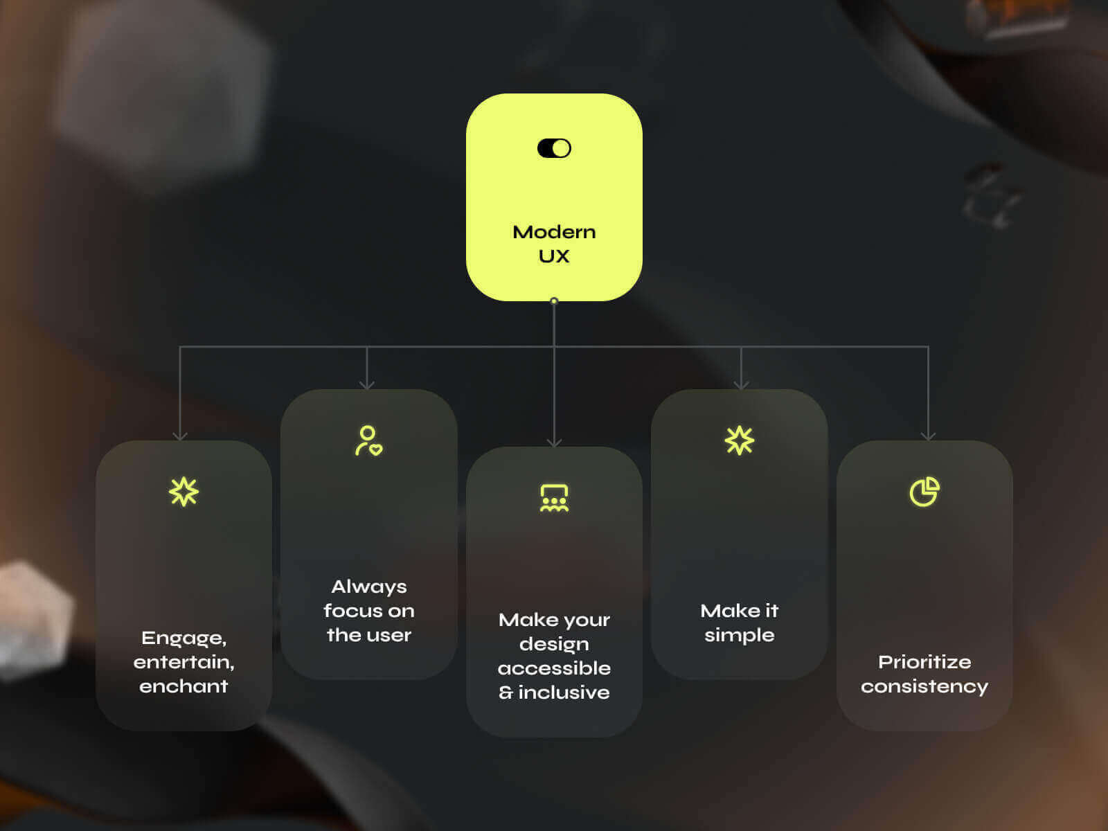
Collaborative Product Design Development: The Core Principles of Modern UX Design
What is UX Design? (A Modern Introduction)
In today’s fast-paced digital world, UX design—short for user experience design—stands at the heart of every successful digital product. It’s more than just making things look good; it’s about crafting digital interfaces that feel intuitive, engaging, and effortless for real users. A user interface design company or ui ux design agency specializes in delivering ui design services that bridge the gap between visual appeal and seamless functionality, ensuring every interaction is meaningful and memorable.
At the core of modern UX design is a deep commitment to understanding user behavior. Through comprehensive user research, a leading ux design agency uncovers the needs, motivations, and pain points of the target audience. This insight drives every decision, from information architecture to the smallest details of motion design. By mapping out user flows and creating interactive prototypes, ui ux design agencies ensure that every step of the user journey is smooth and satisfying.
But great UX doesn’t happen in isolation. It’s a collaborative process that brings together design, development, and business strategy. Our design agency works hand-in-hand with web development teams to transform visually compelling concepts into functional digital products. Whether it’s app design, web design, or digital marketing, our ui ux design services are tailored to each client’s unique project needs and business goals.
We believe in the power of design thinking and iterative processes. Early feedback, user testing, and ux audits are woven into every project, allowing us to refine and optimize the final design before launch. Our approach includes building robust design systems that guarantee brand consistency and scalability across all digital interfaces, whether for a new business establishing its digital presence or an existing product seeking higher conversion and better performance.
Ultimately, the goal of any ux design agency is to deliver digital products that are not only visually compelling but also user-friendly, accessible, and aligned with business objectives. By combining the best of ui and ux design, we help our clients achieve project success, drive user engagement, and create experiences that resonate with real users. If you’re looking to elevate your digital presence and ensure your product stands out in a crowded market, partnering with a design company that offers comprehensive ui ux design services is the key to unlocking your project’s success.
User Empathy: The Golden Rule of Design
Modern UX design should always prioritize understanding users’ needs, goals, and behaviors. His might sound simple, but let’s break down this “user-centric approach.” Although, in some cases, designers may find their work accessible to navigate and intuitive, great designers will always put themselves into another person’s shoes. Usability is not just about elements being located in the right places. It also entails providing valuable and relevant controls (such as buttons, shortcuts, and navigation), increasing page load speed, and simplifying the experience (as previously stated) by employing clear language, interactive features, and design patterns to eliminate visual clutter and useless information.
Empathizing with users and incorporating their feedback throughout the design process is no longer just an option. The Golden Rule differentiates a mediocre designer from a thoughtful one.
Sleek & Chic: Where Less is More
Gone are the days of cluttered interfaces and overwhelming visuals. Today, it’s all about paring down to the essentials, about crafting experiences that are as elegant as they are efficient. In this sleek realm of design, every pixel counts. Think of it as the minimalist décor of a chic boutique: clean lines, uncluttered spaces, and a sense of effortless sophistication that draws you in.
But “less is more” doesn’t mean sacrificing functionality. It’s quite the opposite. By stripping away the extraneous, designers create more intuitive and user-friendly interfaces. Eliminating extraneous elements helps designers cultivate interfaces that prioritize intuition and user-friendliness. This process mirrors curating a wardrobe to include only indispensable pieces, ensuring a sense of effortless elegance with every interaction.
In a sleek and sophisticated design, simplicity stands as the pinnacle. It entails distilling complex concepts into refined solutions and communicating effectively with minimal elements. When engaging with a meticulously crafted minimalist interface, one must acknowledge the meticulous attention to detail and deliberate precision employed to deliver an experience that seamlessly balances aesthetic appeal with functional efficacy.
Stay on Brand, Stay in Line: Ensuring Brand Consistency
This principle emphasizes the crucial role of consistency in digital design, where every element should seamlessly complement each other to create a cohesive experience. Like a synchronized dance performance, every aspect of the interface, from colors to fonts to button placement, should move in harmony, reflecting the brand’s identity at every turn.
To achieve this, designers establish clear brand guidelines encompassing colors, typography, and imagery, ensuring uniformity across all touchpoints. Consistent use of visual elements such as logos and icons reinforces brand recognition and enhances user engagement. The typography remains uniform, maintaining readability while reflecting the brand’s tone and personality. Designers also adhere to predefined color palettes, promoting visual hierarchy and aesthetics. Interaction patterns, like buttons and navigation menus, remain consistent across devices, ensuring a seamless user experience. Brands like Apple, Google, and Nike exemplify consistency in design with their minimalist aesthetics and uniform use of branding elements across products and marketing materials. By maintaining consistency, designers strengthen brand identity and instill trust and loyalty among users, fostering lasting connections with the brand.
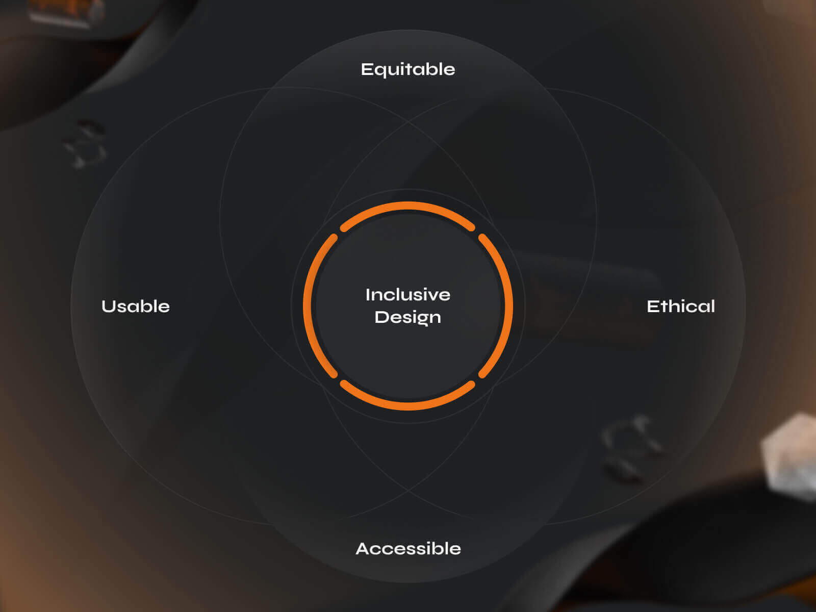
Inclusive Vibes Only: Where Everyone’s a VIP
There has been a shift in the ethos of UX design, one that recognizes the critical importance of accessibility for all users. Despite its significance, many designers and developers overlook accessibility considerations, excluding the portion of the user base with various limitations.
Research indicates that a staggering seven out of ten users with disabilities will promptly abandon a website if it fails to cater to their accessibility needs. Considering this demographic constitutes approximately 15% of the global population, the impact of inaccessible design is profound and far-reaching.
So, how does one discern an accessible program from an inaccessible one? The answer lies in implementing inclusive features that prioritize usability for all. These features encompass a range of elements, including clear hints and explanations, haptic feedback for tactile interaction, intuitive hotkeys for efficient navigation, and contrasting colors to enhance readability for those with visual impairments.
Engage, Entertain, Enchant: Your UX’s Triple Threat
Your digital interface is not simply a functional tool; it’s a journey, an immersive experience that leaves users enchanted and yearning for more. It evokes the sensation of a compelling story unfolding before the user’s eyes, where each interaction delivers a plot twist or a moment of revelation. This paradigm emphasizes creating experiences that engage, entertain, and enchant users, fostering long-lasting connections and memorable encounters.
To achieve this triple threat of engagement, entertainment, and enchantment, UX designers employ various techniques and strategies tailored to captivate and delight users. One approach involves incorporating dynamic animations and interactive elements that bring the interface to life, providing users with immersion and delight. Gamification principles, such as progress bars, achievement badges, and rewards, transform routine interactions into engaging challenges, fostering a sense of accomplishment and motivation.
Furthermore, personalization plays a pivotal role in enhancing the entertainment value of the user experience. By tailoring content, recommendations, and interactions to individual preferences and behaviors, designers create a sense of relevance and connection that resonates with users on a deeper level. Additionally, strategic storytelling techniques, such as narrative-driven onboarding experiences or guided tours, can captivate users’ attention and evoke emotional responses, making the overall experience more memorable and engaging.

Revolutionary UX Design Trends
Integration of AI
Integrating artificial intelligence (AI) in UX design has revolutionized the field, particularly in content generation. Gone are the days of mundane mobile photos; today, vibrant, captivating, and creative images are highly valued. AI brings several advantages to the commercial sphere, including cost savings, speed, and alignment with current trends and patterns.
One key benefit of AI in UX design is its ability to streamline content creation processes. Tasks once performed manually can now be automated, freeing up valuable time and resources. AI algorithms can analyze user behavior, preferences, and trends to generate personalized content tailored to individual users, increasing engagement and satisfaction.
Moreover, AI-powered tools can assist designers in adding a unique flair to their projects. By leveraging AI-generated imagery, designers can inject creativity and innovation into their designs, producing visually stunning and attention-grabbing content. Whether generating dynamic visuals, creating compelling graphics, or designing interactive elements, AI empowers designers to push the boundaries of creativity and deliver impactful user experiences.
Voice User Interfaces (VUIs)
Voice user interfaces (VUIs) are a long-anticipated trend in UX design that offers users a hands-free and intuitive way to interact with digital devices and applications using natural language commands. With the proliferation of smart speakers, virtual assistants, and voice-activated devices, VUIs have become increasingly prevalent in various domains, from home automation and automotive systems to mobile applications and customer service platforms.=
One of the primary advantages of VUIs is their ability to streamline user interactions by eliminating the need for manual input, such as typing or tapping on screens. This hands-free approach not only enhances convenience but also improves accessibility for users with mobility impairments or visual impairments. In addition to convenience, VUIs offer users a more natural and conversational interaction experience. By using natural language processing (NLP) and speech recognition technologies, VUIs can understand and interpret user commands in a human-like manner, providing real-time responses and assistance. This conversational aspect fosters a more engaging and personalized user experience, leading to higher user satisfaction and engagement levels.
VUIs could revolutionize how users interact with digital products and services, particularly in scenarios where traditional input methods are cumbersome or impractical. For example, in automotive systems, VUIs enable drivers to perform tasks such as making calls, sending messages, and controlling navigation systems without taking their hands off the wheel or eyes off the road, improving safety and convenience.
Finally, VUIs can extend the reach of digital products and services to users with limited literacy or technological proficiency. By enabling users to interact with devices and applications using spoken language, VUIs remove barriers and empower more users to engage with digital technology.
Ethical and Inclusive Design
The trend of ethical and inclusive UX design emphasizes the importance of creating digital experiences accessible to users of all abilities, backgrounds, and preferences. This approach acknowledges individuals’ diverse impairments and seeks to design interfaces that accommodate their needs, ensuring equal access and usability.
When designing interfaces with ethical and inclusive principles in mind, it is crucial to consider various types of impairments that may affect user interaction. These include:
- Vision problems, such as impairment, blindness, and color blindness.
- Hearing problems, including impairment and deafness.
- Cognitive challenges, such as logic, memory, and learning ability disorders, which may impact understanding and navigation.
- Motor skill impairments that can impede actions like swiping, touching, or pressing elements on the screen.
- Pronunciation issues that may pose challenges for users interacting with voice user interfaces.
A key aspect of ethical and inclusive UX design is addressing color blindness, affecting the ability to distinguish between colors. For example, charts or graphs that rely solely on color to convey information may be complicated for individuals with color blindness to interpret. To adapt interfaces for color blindness, designers can adjust the brightness settings for each color to ensure adequate contrast and readability.
Tools such as ColourSimulations (for PC) and Sim Daltonism (for Mac) can help designers simulate how interfaces appear to users with color blindness, facilitating the identification of potential issues and guiding color adjustments. Additionally, plugins like Color Contrast Analyzer (for Chrome) enable designers to check color contrast and ensure that text and graphical elements meet accessibility standards.

Understanding your Target User through User Research
In 2024, the hallmark of a successful web product lies in its unwavering commitment to user satisfaction. But how can this principle be effectively implemented?
The cornerstone of customer orientation on a website is a profound understanding of the target audience and their needs. Hence, when embarking on a project, it is imperative to craft a detailed user portrait, taking into consideration key factors such as demographic (age and gender), social (education, income, marital status), and psychological (values, pains, fears).
Why is this understanding so crucial? The specifics of the target audience vary greatly depending on the industry. For instance, the interface plays a supporting role in the fashion sector, where the emphasis should primarily be on the products themselves. Thus, it becomes essential to focus on content presentation, incorporating captivating banners, subtle gradients, unique typography, and unconventional navigation. These elements serve to distinguish the brand and captivate potential buyers.
Consider pharmaceutical websites catering to a broad audience demographic, including elderly individuals and those with vision impairments. In such cases, the paramount focus shifts to the accessibility of the interface. Here, visual and interactive elements take a back seat, while elements such as:
– High contrast between site blocks,
– Appropriately sized buttons,
– Clear typography, and
– Ample spacing,
…become paramount. Success hinges on creating an interface that enables users to effortlessly navigate the platform, whether to compare products, access detailed information or complete a purchase.

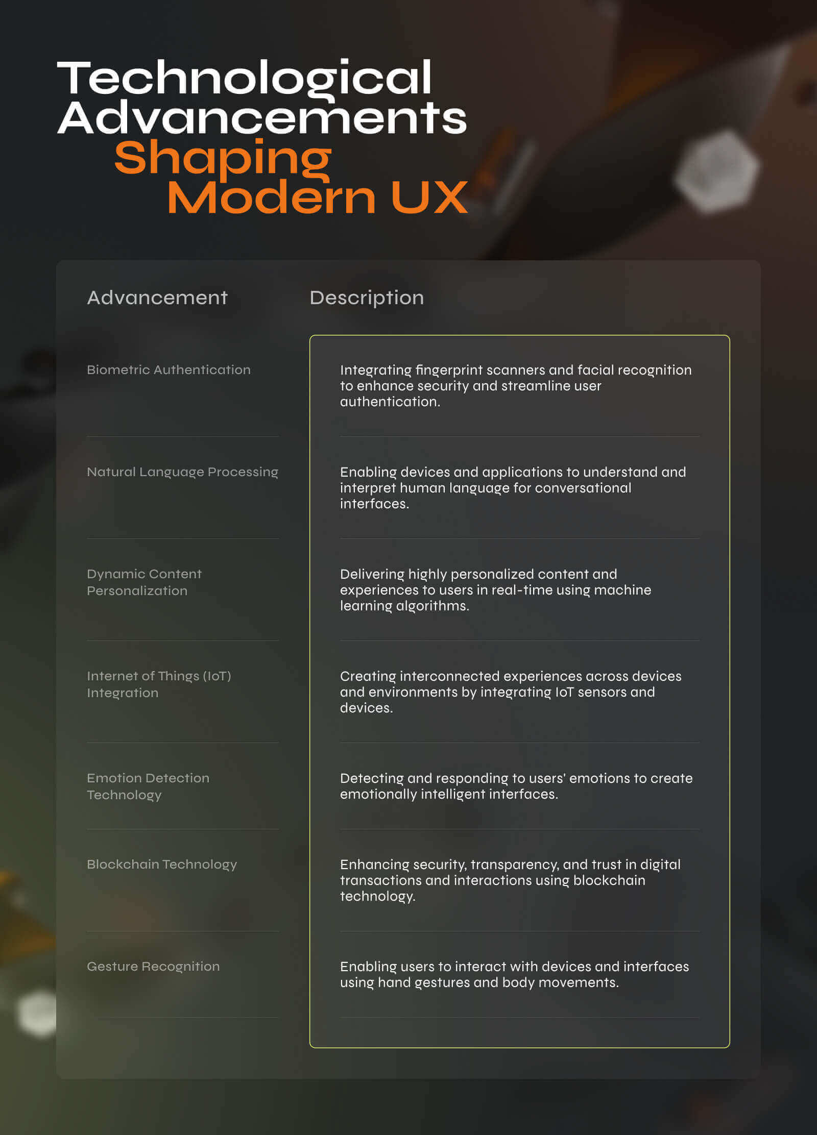
Technological Advancements Shaping UX Trends
– Biometric Authentication. As biometric technology, such as fingerprint scanners and facial recognition, becomes more widespread on devices, UX designers are integrating these features to improve security and streamline user authentication processes. Users can now access their devices and accounts with a simple touch or glance, eliminating the need for cumbersome passwords and improving the overall user experience.
– Natural Language Processing (NLP). NLP enables devices and applications to understand and interpret human language more accurately. UX designers use NLP to create conversational interfaces and chatbots that can understand user queries, provide relevant responses, and even anticipate user needs. This advancement in NLP enhances the usability of digital products by enabling more intuitive and natural interactions.
– Dynamic Content Personalization. With advancements in machine learning algorithms and big data analytics, UX designers can now deliver highly personalized content and experiences to users in real time. By analyzing user behavior, preferences, and demographics, designers can tailor content, recommendations, and user interfaces to individual users, increasing engagement and satisfaction.
– Internet of Things (IoT) Integration. The proliferation of IoT devices presents new opportunities for UX designers to create seamless and interconnected experiences across devices and environments. By integrating IoT sensors and devices into digital products, designers can provide users with contextually relevant information, automate tasks, and create more immersive and personalized experiences.
– Emotion Detection Technology. It allows devices and applications to detect and respond to users’ emotions. UX designers can use this technology to create emotionally intelligent interfaces that adapt and respond to users’ moods and preferences to increase engagement and overall user satisfaction.
– Blockchain Technology. Blockchain offers opportunities to improve UX by enhancing security, transparency, and trust in digital transactions and interactions. UX designers can use blockchain technology to create decentralized applications (dApps) with built-in identity verification, smart contracts, and secure payment systems, providing users with greater control over their data and digital assets.
– Gesture Recognition. This feature enables users to interact with devices and interfaces using hand gestures and body movements. UX designers can incorporate gesture-based interactions into digital products to create more intuitive and immersive experiences, particularly in gaming, virtual reality, and augmented reality applications.
Summary
This article aims to elucidate the dynamics of modern UX design trends. Undoubtedly, there will soon be an even greater emphasis on meeting the needs of target users. Concurrently, with the emergence of the latest, most intriguing, and complex technologies, we can anticipate further evolution in the UX designer profession. Companies, regardless of size, will prioritize effective UX design, as failure to do so would result in losing ground to competitors.
Contact Phenomenon Studio to start an exciting journey toward market domination with our excellent UX/UI designers.


Progressive web app development company guiding you from discovery to deploy. As a best web app development company, we combine strategy, UX, and scalable code to launch PWAs 50% faster.


